Case 23435
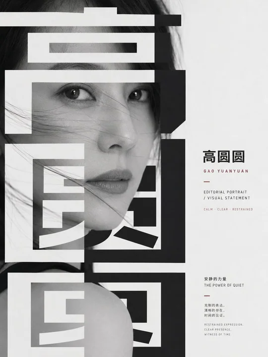
莫文蔚强图形编辑感排版影像
Prompt
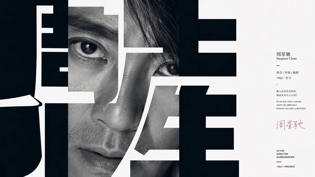
Generate an image with a strong sense of graphic editing centered around any subject: the subject appears as a close-up realistic image's main form, magnified to be almost close to the viewer, partially cut off by boundaries, with the most emotional or representative details located at the visual center; the screen overlays a group of extremely bold and large title glyphs or subject symbols, making the glyphs both an information layer and a masking layer, with strokes passing through, pressing down on, and cutting through the main body, using white negative space and dark solid forms to create a tension between exposure and concealment. The primary reading order is to first see the weight of the huge abstract character blocks, then discover the key expressions, textures, or structures of the subject's main form within the gaps of the glyphs, leaving quiet empty spaces on the right or edges to place small amounts of body-text-style information, forming a rhythmic contrast between loud titles and whispered annotations. Colors are extracted from the subject's own materials, emotions, and narrative context, mapped into large areas of bright and clean background colors, clear dark structures, low-saturation image layers, and small areas of information emphasis colors; maintain high-brightness white space, calm and clear transparency, clean color gradations, and clear light-dark steps, dark colors must be clear and powerful, light colors must be airy and clean, avoiding dirty gray, smoky, retro yellowing, or turbid coverage. The overall texture should be like a mix between a serious publication and a public poster: black and white photographic feel or restrained image texture derived from the subject, hard-edged geometric glyphs, precise typography, tense white space, strong figure-ground relationship, ultimately allowing the subject to be reorganized by the textual structure into an oppressive yet sober, restrained, and memorable visual statement. Subject: Karen Mok. Aspect Ratio 16:9

围绕任意主题对象生成一张强图形编辑感影像:主题对象以近距离真实影像主形体出现,被放大到几乎贴近观看者,局部被边界切断,最有情绪或最能代表主题的细节位于视觉中心;画面叠加一组极粗、极大的标题字形或主题符号,让字形既是信息层也是遮挡层,笔画穿过主体、压住主体、切开主体,并用白色留空和深色实形共同制造显露与隐藏的拉扯。主要阅读顺序先看到巨大抽象字块的重量,再在字形缝隙中发现主题主形体的关键表情、材质或结构,右侧或边缘保留安静空场,放置少量细小正文式信息,形成大声标题与低声注释的节奏反差。色彩从主题自身的材质、情绪和叙事语境中提取,映射为大面积明亮干净底色、清晰深色结构、低饱和影像层和小面积信息强调色;保持高明度留白、冷静清透、干净色阶和明确明暗阶梯,深色必须清澈有力,浅色必须通风洁净,避免脏灰、烟熏、复古泛黄或浑浊覆盖。整体质感应像严肃出版物与公共海报之间的混合:黑白摄影感或主题派生的克制影像质地、硬边几何字形、精确排版、紧张留白、强烈图底关系,最终让主题被文字结构重新组织成一种有压迫感但清醒、克制、可记忆的视觉声明。

主题:莫文蔚

比例16:9
更多提示词
Case 22
定制气球
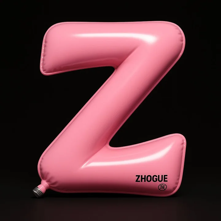
一件高度写实的3D装置艺术:字母Z被设计成充气球囊造型,整体形态如同流畅弯曲的“Z”字路径,由两段斜线和一个折角构成,边缘略微卷翘,充满柔软的气压感。 视角为正面稍仰视角(约10°)的正交投影,主体置于画面正中央,占据几乎全部画幅,背景为纯黑色,形成类似剧院聚光灯的聚焦舞台效果。 材质为高弹性亮面PVC,表面涂有高光清漆。主色为柔亮粉色(#FF96AC),阴影部分渐变为淡紫粉色,表面同时具备镜面高光和柔和漫反射,呈现丝滑、饱满、有张力的视觉质感。 左下角可见一个金属螺旋
minimalisttypographytoy3D渲染
Case 24282
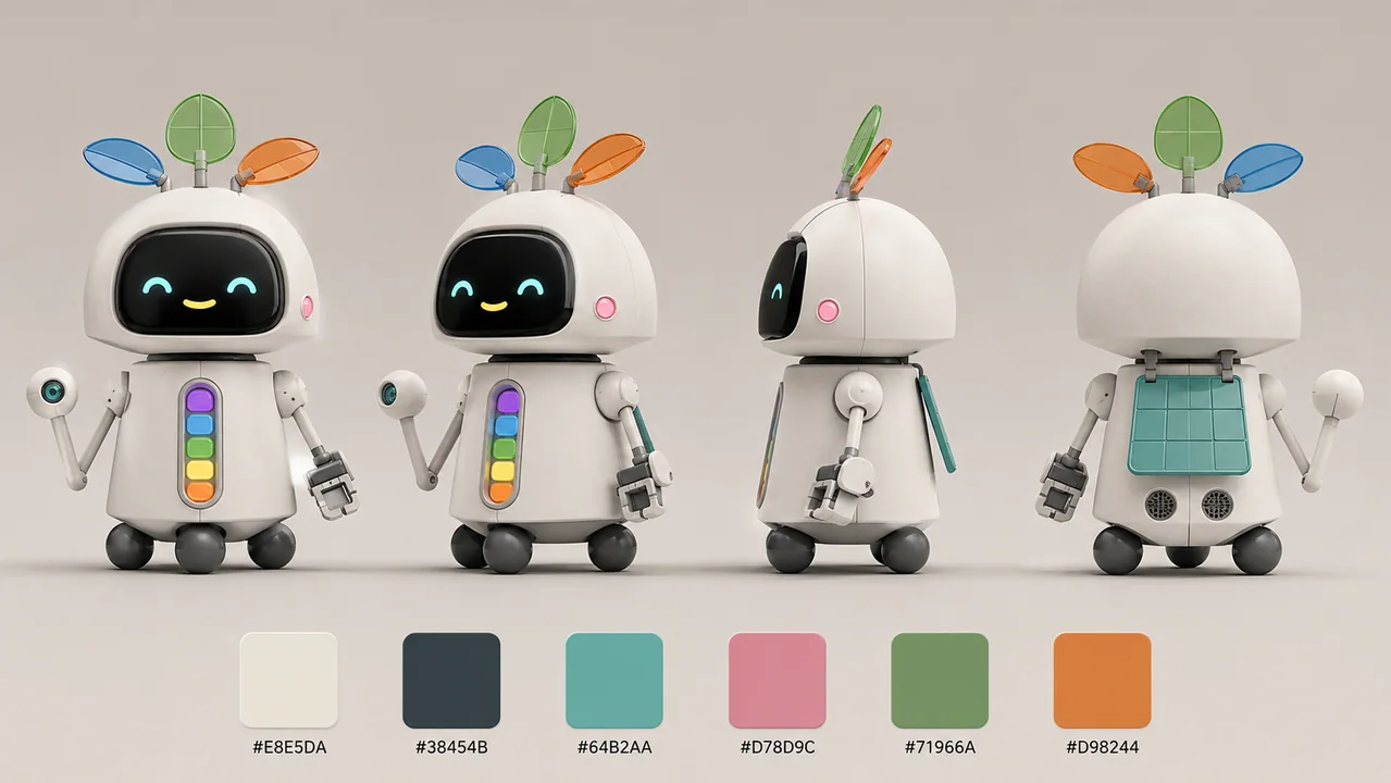
极简工业风智能园艺机器人设定页
极简机器人设定图三维园艺