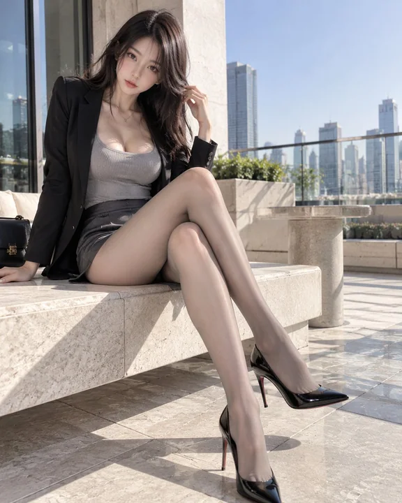
Case 25871
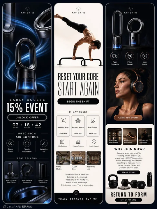
Conception visuelle publicitaire pour écran triptyque de la marque de technologie sportive KINETIQ
Prompt
Créez une campagne publicitaire premium de type triptyque mobile-story pour une marque originale de technologie de bien-être haute performance nommée « KINETIQ », en préservant la logique structurelle exacte de trois panneaux publicitaires verticaux allongés aux coins arrondis, placés côte à côte sur un fond bleu nuit profond, tout en renforçant la logique Orbit et Port. L'image finale doit évoquer le système de campagne définitif et phare d'une marque futuriste de récupération et de performance : axée sur le produit, éditorialement précise, hautement modulaire et immédiatement reconnaissable comme un modèle maître de marque répétable.

Structure générale :
Utilisez trois cartes verticales ultra-allongées aux coins arrondis, avec un espacement étroit et uniforme entre elles, flottant sur un fond bleu nuit profond.
Panneau gauche : histoire de vente produit sombre, atmosphère tech de luxe noire, mise en avant du matériel phare de flux d'air.
Panneau central : histoire d'adhésion à l'entraînement claire, blanc ivoire, mise en page éditoriale de fitness à fort contraste, une figure humaine athlétique dominante.
Panneau droit : histoire hybride premium, crédibilité produit sombre dans la moitié supérieure et contenu de conversion à l'entraînement clair dans la moitié inférieure.
Les trois panneaux doivent partager un système unifié de typographie, d'échelle des icônes, de formes des CTA, d'espacement, de rayons d'arrondi, de proportions des cartes et de rythme éditorial.

Logique Orbit :
Créez une boucle visuelle fermée et délibérée à travers tout le triptyque. Le regard doit entrer par les rubans de flux d'air lumineux et les recadrages de matériel métallique dans le panneau gauche, remonter et converger à travers la typographie de la vente, sauter vers le panneau central par la pose athlétique inversée ou étendue, descendre à travers les cartes d'adhésion modulaires, puis se déplacer vers le panneau droit via la section produit sombre supérieure, balayer vers le bas à travers le portrait des écouteurs et les cartes de cours inférieures, et enfin revenir en courbe vers la gauche à travers des motifs circulaires répétés tels que la forme en boucle sans aube, le disque de l'oreillette des écouteurs, les icônes de fonction, la courbure des haltères et les boutons CTA arrondis. Les trois panneaux doivent être optiquement liés par des arcs récurrents, une géométrie de produit en boucle et une alternance tonale rythmique noir-blanc-noir.

Logique Port :
Transformez cette campagne en super-symbole de marque et en modèle matrice visuel permanent. Verrouillez le système comme suit : carte de vente de matériel sombre à gauche, carte de conversion de performance humaine claire au centre, carte de conversion hybride produit plus mode de vie à droite. Réutilisez les mêmes proportions d'histoire arrondies, les clusters d'icônes, les boutons CTA en forme de pilule, la logique de titres empilés, les modules de cartes, les motifs de produit circulaires et le basculement tonal noir-ivoire afin que l'ensemble de la campagne puisse être étendu aux lancements futurs sans perdre son identité. Chaque décision de design doit sembler standardisée, transférable et incontestablement partie intégrante du langage de la marque KINETIQ.

Monde de la marque :
KINETIQ est un écosystème premium de récupération et de performance combinant des dispositifs de flux d'air intelligents, une audio de récupération immersive et des programmes de mouvement basés sur la science. Le ton de la marque doit sembler futuriste, athlétique, élevé et commercièrement vif, sans jamais devenir bon marché, bruyant ou générique.

Panneau 1, histoire de gauche :
Construisez une publicité produit dramatique de tech de luxe noire centrée sur un dispositif original de flux d'air intelligent sans aube, avec un corps métallique noir graphite et une chambre d'air interne lumineuse bleu froid à la base. Ajoutez deux ou trois recadrages de produit sculpturaux près du haut et des bords inférieurs pour que l'ouverture en forme de boucle devienne un motif répété. Laissez des rubans de flux d'air translucides et élégants dériver en diagonale à travers le panneau et écho subtilement la géométrie arrondie du produit. Intégrez une typographie de vente anglaise originale et audacieuse dans une police sans-serif moderne raffinée :
« EARLY ACCESS »
« 15% EVENT »
Ajoutez un bouton CTA en forme de pilule :
« UNLOCK OFFER »
En dessous, incluez une ligne de compte à rebours numérique avec des chiffres espacés :
« 03 : 18 : 42 »
Ajoutez un titre en bas de page :
« PRECISION AIR CONTROL »
Dans la zone de fonction inférieure, affichez trois appels d'icônes minimaux :
« Sleep Mode »
« Touch Oscillation »
« Adaptive Tilt »
En bas, créez une bande compacte de best-sellers avec trois petites vignettes de produits et des micro-étiquettes. Gardez tout cela net, luxueux, noir, graphite, argent et bleu électrique, avec une hiérarchie forte et sans encombrement.

Panneau 2, histoire centrale :
Construisez une publicité éditoriale lumineuse d'adhésion au fitness sur un fond blanc chaud ou gris très pâle. Placez une figure humaine athlétique réelle dans la moitié supérieure, exécutant une pose avancée de calisthénie ou d'équilibre sur les mains sur des barres parallèles, le corps entièrement étiré, anatomiquement correct, élégant, fort et crédible. La pose doit créer un pont directionnel entre les panneaux gauche et droit. Sous la figure, placez une typographie empilée forte :
« RESET YOUR CORE »
« START AGAIN »
Ajoutez un bouton CTA noir arrondi :
« BEGIN THE SHIFT »
En dessous, créez une mise en page modulaire d'adhésion étroitement organisée avec des cartes d'icônes et des blocs de valeur, en utilisant un texte original tel que :
« 14 DAY RESET »
« Mobility Scan »
« Recovery Session »
« Fuel Starter »
« Value $39 »
« Value $65 »
Utilisez des cartes noires et blanches soignées avec de petites icônes et des proportions cohérentes. Plus bas dans le panneau, ajoutez deux ou trois petites cartes d'images de cours rectangulaires montrant des intérieurs d'entraînement premium. En dessous, ajoutez un paragraphe éditorial compact sur le mouvement, la science, la récupération et la concentration. Terminez par une bande CTA inférieure audacieuse :
« TRAIN. RECOVER. EVOLVE. »
L'ensemble du panneau central doit sembler être le cœur opérationnel propre du système de marque.

Panneau 3, histoire de droite :
Construisez une mise en page d'histoire premium hybride. La section supérieure revient à un fond noir sombre avec deux dispositifs de flux d'air sans aube élégants flottant en tant que produits héros premium, plus trois icônes circulaires de bénéfices avec de brèves affirmations :
« Fast Dispatch »
« Price Guard »
« 2 Year Cover »
En dessous, intégrez un recadrage de portrait raffiné d'une jeune femme stylée portant des écouteurs de récupération sur-oreille premium originaux en cuivre et noir, regardant hors champ avec une lumière cinématique. Son anatomie, sa structure faciale, la texture de sa peau et ses cheveux doivent sembler réalistes et non plastiques IA. Ajoutez un petit CTA en forme de pilule près du portrait :
« CLAIM 15% EVENT »
La moitié inférieure passe à un fond clair chaud contenant deux ou trois petites cartes de cours ou de studio, une question de conversion noire audacieuse telle que :
« WHY JOIN NOW? »
suivie d'un court paragraphe éditorial persuasif. Ajoutez un bouton CTA noir :
« START TODAY »
Près du bas, placez une composition produit-mode de vie propre avec des haltères mats noirs ou des objets d'entraînement sur un sol pâle, suivie d'un message final audacieux :
« RETURN TO FORM »
et un CTA de clôture :
« ENTER KINETIQ »
Gardez le panneau droit dense mais contrôlé, agissant comme le pont entre la prestige du produit et l'aspiration humaine.

Typographie et système graphique :
La typographie doit être une force compositionnelle majeure. Utilisez uniquement une typographie anglaise polie, avec une échelle variée, un suivi contrôlé, des majuscules élégantes, des titres empilés, des boutons en forme de pilule, des grilles d'icônes et des cartes de texte modulaires. Évitez les polices de bloc lourdes et grossières. Le système de texte doit sembler dirigé artistiquement, premium et répétable à travers toute une famille de campagnes.

Éclairage :
Utilisez un éclairage commercial haut de gamme sur les trois panneaux.
Panneau gauche : éclairage de matériel de luxe brillant avec des reflets de contour nets, des noirs profonds et un éclairage de base bleu froid.
Panneau central : éclairage doux de type lumière du jour neutre avec des bords d'ombre propres et une luminosité de studio calme.
Panneau droit : éclairage mixte, avec des reflets cinématiques sombres dans la section produit supérieure et un éclairage de portrait et de studio chaud et contrôlé dans la section inférieure.
Maintenez le réalisme physique et une finition premium cohérente dans chaque panneau.

Matériaux et réalisme :
Rendez tous les produits avec une précision de niveau industriel : métal brossé, polymère satiné, aérations propres, accents réfléchissants, rubans de flux d'air translucides, éclairage de base réaliste, matériaux d'écouteurs luxueux, plastiques à toucher doux et détails d'usinage nets. La peau humaine doit montrer une texture naturelle subtile, des pores réalistes, de légères variations de ton, des doigts crédibles et une anatomie correcte. Les barres de gym, les haltères, les intérieurs et les sièges doivent rester minimaux, raffinés et physiquement plausibles.

Système de couleurs :
Palette de base : noir, graphite, bleu nuit, ivoire doux, gris clair chaud.
Palette d'accent : cuivre contrôlé, lueur bleu cyan froid, argent mat.
Le panneau gauche est principalement sombre avec des accents bleus.
Le panneau central est principalement clair avec une typographie noire.
Le panneau droit alterne des blocs sombres en haut et clairs en bas, avec des accents cuivrés dans le portrait des écouteurs.
Le triptyque doit être lu comme un système premium équilibré.

Logique de composition :
Le panneau gauche vend le matériel phare.
Le panneau central vend le programme de transformation.
Le panneau droit fusionne la crédibilité du produit, l'aspiration émotionnelle et la conversion.
L'image entière doit fonctionner comme un écosystème unifié de publicités d'histoire avec une autorité de marque claire, des formes de boucle récurrentes et une identité modulaire mémorable.

Qualité de l'image et règles physiques :
rendu commercial de luxe ultra-détaillé, mise en page mobile-story propre, coins de cartes arrondis, espacement précis, hiérarchie forte, texte lisible mais minimal, géométrie de produit parfaite, anatomie humaine réaliste, doigts normaux, pas de membres supplémentaires, pas de mains déformées, pas d'objets déformés, pas de noirs boueux, pas de zones noires mortes, pas d'encombrement, pas de dégradés bon marché, qualité publicitaire 8k, finition de campagne phare.

Prompt négatif :
texte original copié, noms de marques réels, style e-commerce bon marché, mise en page désordonnée, texte basse résolution, widgets supplémentaires aléatoires, look cartoon, humains à l'aspect plastique, mains déformées, doigts supplémentaires, anatomie déformée, géométrie de produit brisée, arrière-plans encombrés, ombres boueuses, couleurs sur-saturées, polices génériques, typographie noire lourde et laide, composition bruyante, matériel basse résolution, reflets faux, éclairage incohérent.
Autres prompts

Case 20666
Portrait d’une jeune fille japonaise dans une chambre rose, portant une robe orange à volants
Une jeune femme japonaise belle et au teint clair, aux longs cheveux noirs lisses coiffés en deux queues de cheval hautes, ornées de mignons clips à cheveux jaunes et blancs, assise sur un lit dans une chambre aux tons roses vifs. Elle port
Case 14103
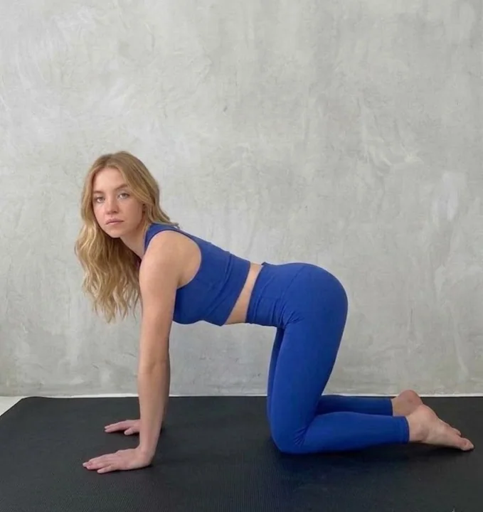
Instructions de photographie d’un mannequin blonde de fitness haut de gamme en bleu cobalt
{ "nano_banana_pro_framework": { "version": "v4.2_améliorée", "global_specifications": { "output_quality": "4K Ultra HD, réaliste et fidèle à la réalité, post-traitement 8K", "aesthetic": "Éditorial fitness haut de gam