Case 24977
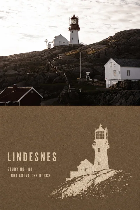
牛皮纸负形地标漏印对比海报
Prompt
Please turn every travel photo I upload into an individual high-end contrast poster. Do not use multi-image splicing; output each photo separately.

Style Name: KRAFT NEGATIVE-STENCIL LANDMARK | Kraft Paper Negative-Stencil Landmark Printing

## Applicable Objects

Suitable for travel landmarks with clear individual silhouettes, such as:

Lighthouses, towers, churches, temples, gate towers, statues, monuments, windmills, solitary boats, pavilions, bridge towers, or architecture with distinct outlines.

The subject should be clearly separated from the sky, water, square, or relatively simple environment.

Do not process all photos into fixed icons like lighthouses, churches, or the same type of travel icon. Do not add birds, boats, trees, people, railings, or decorative landscapes that do not exist in the original photo.

## Overall Layout

Adopt a 3:4 vertical top-bottom contrast composition:

- The upper part (approximately 45%—52%) preserves the high-fidelity original photo
- The lower part (approximately 48%—55%) undergoes a kraft paper negative-stencil conversion
- Use a straight, clear, and restrained horizontal boundary between the two areas
- No feathering, no mutual penetration, and no thick division lines
- Do not generate picture frames, walls, handheld displays, or Mockups

The finished product must retain a substantial and clearly identifiable original photo contrast area. Do not shrink the original image into a small corner icon, nor make the entire poster a stencil print.

## Upper Original Photo

Faithfully preserve the original photo's:

- Landmark identity
- Number of subjects
- Subject orientation
- Proportions of architecture or objects
- Top, base, and key outlines
- Positions of doors, windows, and major structures
- Observation angle
- Number and position of people
- Relationships between sky, ground, water, and space
- Real materials, light and shadow, and original color atmosphere

Apply only slight color grading suitable for high-end travel magazines, architectural publications, or photography exhibitions, and add a very thin film grain.

Do not illustrate the original photo; do not move the subject, reshape the building, replace the sky, add or remove people, stretch, mirror, or duplicate the landmark.

## Lower Kraft Paper

The lower part is a continuous blank field of coarse fiber paper.

Choose a dark color for the paper base based on the temperament of the original photo:

- Natural kraft brown
- Dark taupe
- Cold brown
- Deep indigo
- Dark green
- A single dark color extracted from the shadows of the original photo

Express real natural paper fibers, tiny scraps of paper, slight creases, local color variations, and a matte rough surface.

The paper can look slightly old, but it should not be heavily charred, tattered, covered in stains, or made into a cheap retro background.

## Negative Stencil Mechanism

Remake the subject in the photo as a handmade negative-stencil, coarse-mesh silk screen, or old template print.

First lay down a complete dark coarse paper base, then use only one light-colored opaque ink to "leak" the subject out as if from the paper surface.

Light-colored inks can use:

- Warm ivory
- Off-white
- Light sand
- An extremely light corresponding color extracted from the photo's subject

The entire conversion is strictly limited to two colors or nearly two colors:

Paper base color + light stencil ink.

Do not add a third accent color, and do not use multicolor overprinting, gradients, translucent colors, realistic shadows, or glowing effects.

## Semantic Extraction

Do not copy the full scene of the photo.

Keep only:

- Complete outer silhouette of the subject
- Subject orientation
- Shape of the top and base
- 2—6 internal holes that determine identity
- Connection of the subject with the ground, shoreline, rocks, or water
- Very few subsidiary structures that actually exist in the original photo and help with identification

Remove:

- Complex window panes
- Brick joints and wall textures
- Decorative carvings
- Dense vegetation
- Cloud details
- Reflections
- Realistic light and shadow
- Repetitive figures
- Irrelevant environment
- Photographic noise

The subject must be recognizable at a glance, but internal information should be compressed to a minimum.

Recognition comes primarily from a single continuous block of light-colored negative space, rather than thin lines, cross-hatching, or photo light and dark.

## Composition Method

Adopt a full-frame impactful secondary composition.

The subject occupies the lower area:

- Height approximately 55%—85%
- Width approximately 28%—68%

The subject can be centered or slightly offset according to the center of gravity of the original photo. Allow the base or partial outlines to slightly bleed out of the frame.

Do not perform a two-color redraw at the same scale and complete framing as the photo above. The lower part should significantly enlarge the subject, remove the background, and change the information density.

Keep a continuous, quiet blank field of coarse paper around the subject.

The environment can retain at most one minimalist, intermittent negative space of ground, shoreline, rock mass, or water surface. Do not create a complete landscape background.

## Stencil Texture

The light-colored subject's outer outline should be solid and clear, while carrying slight paper fiber burrs formed by real template printing.

Inside the ink, the following are allowed:

- Uneven coverage
- Random ink missing
- A small number of pinholes
- Local scraping
- Friction wear
- Kraft paper fibers showing through the bottom
- Slight ink leakage or breaks at the template edges

These marks must appear naturally, randomly, and locally.

Do not use uniform grain filters, regular noise, regular grids, or photo threshold effects.

The upper part of the subject, the top outline, and structures determining identity should be relatively complete.

The closer to the bottom of the subject, the more obviously the ink can break, fall off, and gradually be swallowed by paper fibers, creating a feeling that memory is fading.

The bottom fading must be formed by ink loss, wear, and the paper base showing through.

Do not use:

- Smoke feathering
- Soft focus fading
- Regular halftone gradients
- Pixel dissipation
- Rectangular mosaics
- Digital airbrush effects

The print as a whole remains matte, flat, and almost without thickness.

Do not make it into a paper carving, relief, impasto, resin, or 3D model.

## Text

No text is generated by default to let the negative subject maintain maximum graphic impact.

If text is absolutely necessary, only allow:

- One reliable, extremely short location word
- One simple number

The text must use the same light-colored ink and be placed in the edge blank space as a small-area ink-missing stencil print.

Prohibit long paragraphs, author names, signatures, accounts, brands, logos, URLs, QR codes, watermarks, fake Chinese, or gibberish.

## Overall Mood

The overall feel should be like an old landmark stencil print hand-brushed on coarse kraft paper:

Restrained, coarse, quiet, isolated, flat, modern, while having the imperfections left by real paper and manual plate making.

It is not an ordinary silhouette, nor a photo with a two-color filter applied.

The most important visual mechanisms are:

Large blocks of light-colored negative space
+
Minimal internal structural holes
+
Random ink missing showing the base
+
Bottom gradually breaking and fading

## Mandatory Avoidance

Avoid:

ordinary silhouette, vector icon, travel logo, photo threshold filter, automatic tracing, monochrome photo filter, detailed etching, copperplate hatching, dense woodcut lines, halftone gradient, regular noise texture, pixel dissolve, airbrush fade, transparent watercolor, paper relief, paper sculpture, impasto, realistic shadows, plastic 3D, multicolor overprint, complete background coverage, same-crop same-scale redraw, invented landmark, added birds, added trees, added boats, excessive typography, author name, logo, watermark, QR code, gibberish text.

Both the clear original photo and the kraft paper negative-stencil conversion must appear simultaneously; otherwise, it is not considered complete.

请将我上传的每一张旅行照片分别制作成一张独立的高级对比海报。不要多图拼接,每张照片单独输出。

风格名称:

KRAFT NEGATIVE-STENCIL LANDMARK|牛皮纸负形地标漏印

## 适用对象

适合拥有明确单体轮廓的旅行地标,例如:

灯塔、塔楼、教堂、寺庙、门楼、雕像、纪念碑、风车、孤船、亭子、桥塔或轮廓鲜明的建筑。

主体应与天空、水面、广场或相对简洁的环境形成清楚分离。

不要把所有照片固定处理成灯塔、教堂或同一种旅游图标。不得添加原照片中不存在的飞鸟、船只、树木、人物、栏杆或装饰景观。

## 整体版式

采用3:4竖版上下对比构图:

- 上方约45%—52%保留高保真原始照片
- 下方约48%—55%进行牛皮纸负形漏印转绘
- 两个区域使用笔直、清楚、克制的水平边界
- 不羽化、不相互渗透、不生成粗重分割线
- 不生成相框、墙面、手持展示或Mockup

成品必须保留具有实质面积、清楚可辨的原始照片对比区。不得将原图缩成一个小角标,也不得把整张海报全部做成漏印。

## 上方原始照片

忠实保留原始照片中的:

- 地标身份
- 主体数量
- 主体朝向
- 建筑或物体比例
- 顶部、底座和关键轮廓
- 门窗及主要结构位置
- 观察角度
- 人物数量与位置
- 天空、地面、水面及空间关系
- 真实材质、光影与原有色彩氛围

仅进行轻微高级旅行杂志、建筑出版物或摄影展调色,并加入极薄胶片颗粒。

不得插画化原照片,不得移动主体、重塑建筑、替换天空、增删人物、拉伸、镜像或复制地标。

## 下方牛皮纸

下方是一整面连续的粗纤维纸张空场。

纸底根据原照片气质选择一种暗色:

- 天然牛皮棕
- 深灰褐
- 冷棕色
- 深靛蓝
- 墨绿色
- 从原照片暗部提取的单一深色

表现真实的天然纸纤维、细小纸屑、轻微折痕、局部色差和哑光粗糙表面。

纸张可以略显旧,但不能重度烧焦、破烂、布满污渍或做成廉价复古背景。

## 负形漏印机制

将照片中的主体重新制作成一张手工负形模板漏印、粗网丝印或旧模板印刷。

先铺设完整的深色粗纸底,再只使用一种浅色不透明油墨,将主体像从纸面中“漏印”出来。

浅色油墨可以使用:

- 暖象牙色
- 灰白色
- 浅沙色
- 从照片主体提取的极浅对应色

整张转绘严格限制为两色或近两色:

纸底色+浅色漏印油墨。

不得添加第三种强调色,不得使用多色套印、渐变、半透明颜色、写实阴影或发光效果。

## 语义提炼

不要复制照片的完整场景。

只保留:

- 主体完整外轮廓
- 主体朝向
- 顶部和底座形状
- 决定身份的2—6个内部孔洞
- 主体与地面、岸线、岩石或水面的连接方式
- 原照片中确实存在且有助于辨认的极少附属结构

删除:

- 复杂窗格
- 砖缝和墙面纹理
- 装饰雕刻
- 密集植被
- 云层细节
- 反光
- 写实光影
- 重复人物
- 无关环境
- 摄影噪声

主体必须一眼可辨,但内部信息应被压缩到最低限度。

识别主要来自一整块连续的浅色负形,而不是细线、排线或照片明暗。

## 构图方式

采用满版冲击式二次构图。

主体占下方区域:

- 高度约55%—85%
- 宽度约28%—68%

主体可以居中,也可以根据原照片重心略微偏移。允许底座或局部轮廓轻微出画。

不得按上方照片的相同尺度和完整取景进行双色重画。下方应明显放大主体、删除背景并改变信息密度。

主体四周保留连续、安静的粗纸空场。

环境最多保留一条极简、断续的地面、岸线、岩体或水面负形。不要制作完整风景背景。

## 漏印质感

浅色主体外轮廓应坚实、清楚,同时带有真实模板印刷形成的轻微纸纤维毛边。

油墨内部允许出现:

- 不均匀覆盖
- 随机缺墨
- 少量针孔
- 局部刮落
- 摩擦磨损
- 牛皮纸纤维露底
- 模板边缘的轻微漏墨或断口

这些痕迹必须自然、随机、局部出现。

不能使用均匀颗粒滤镜、规则噪点、规则网格或照片阈值效果。

主体上半部分、顶部轮廓和决定身份的结构应相对完整。

越靠近主体底部,油墨可以越明显地破碎、脱落并逐渐被纸纤维吞没,形成记忆正在消失的感觉。

底部消隐必须由缺墨、磨损和纸底露出形成。

不得使用:

- 烟雾羽化
- 柔焦渐隐
- 规则网点渐变
- 像素消散
- 矩形马赛克
- 数字喷枪效果

印刷整体保持哑光、扁平、近乎没有厚度。

不要制作成纸雕、浮雕、厚涂、树脂或立体模型。

## 文字

默认不生成文字,让负形主体保持最大的图形冲击力。

如果确实需要文字,只允许:

- 一个可靠的极短地点词
- 一个简单编号

文字必须使用同一种浅色油墨,以小面积缺墨漏印的方式放在边缘空白中。

禁止长段落、作者名、签名、账号、品牌、Logo、网址、二维码、水印、假中文或乱码。

## 整体气质

整体应像一张在粗牛皮纸上手工刷制的旧地标模板印刷:

克制、粗粝、安静、孤立、平面、现代,同时具有真实纸张和手工制版留下的不完美。

不是普通剪影,也不是照片套上双色滤镜。

最重要的视觉机制是:

大块浅色负形
+
极少内部结构孔洞
+
随机缺墨露底
+
底部逐渐破碎消隐

## 强制避免

Avoid:

ordinary silhouette, vector icon, travel logo, photo threshold filter, automatic tracing, monochrome photo filter, detailed etching, copperplate hatching, dense woodcut lines, halftone gradient, regular noise texture, pixel dissolve, airbrush fade, transparent watercolor, paper relief, paper sculpture, impasto, realistic shadows, plastic 3D, multicolor overprint, complete background coverage, same-crop same-scale redraw, invented landmark, added birds, added trees, added boats, excessive typography, author name, logo, watermark, QR code, gibberish text.

必须同时出现清楚的原始照片与牛皮纸负形转绘,否则不算完成。
Autres prompts
Case 8226
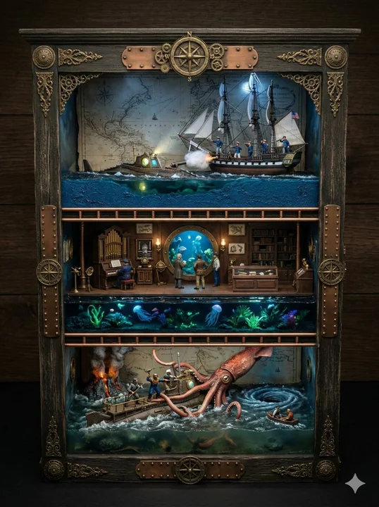
Miniature boîte de paysage 3D de vingt mille lieues sous les mers
Guide des variables 1. OVERALL_DIORAMA_THEME = Scènes tirées du livre Vingt mille lieues sous les mers de Jules Verne, dans l'ordre dans lequel elles sont présentées dans le livre 2. CUPBOARD_BASE_MATERIAL = 3. CUPBOARD_LINING_MATERIAL = 4.
超写实微缩模型海底两万立体景箱奇幻场景
Case 28167
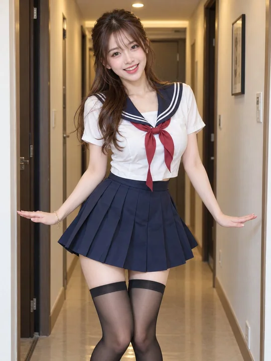
公寓走廊跳舞的日系JK制服少女
Medium full shot, eye-level dynamic freeze-frame portrait of a lively early-20s East Asian young woman dancing inside a modern apartment hallway. Razor-sharp focus throughout with completely zero motion blur, capturing a crisp, frozen momen