Case 13397
Guide to Designing a Local Handmade Graphic and Text Logo
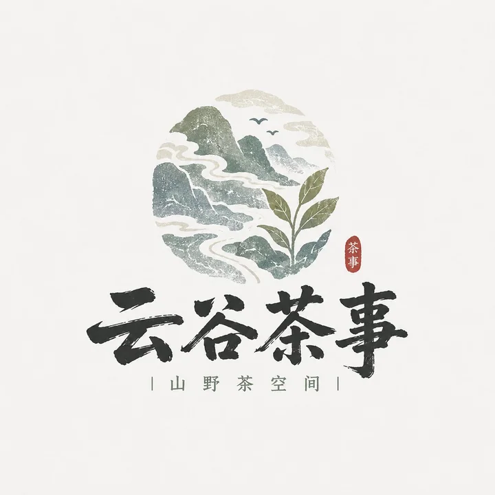
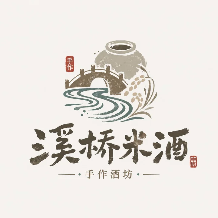
Prompt
Please design a high-completion "Local Craft Illustrated Wordmark Logo" based on the user's input for [Brand Name / Project Name] [Subtitle / Product Name] [Type / Industry] [Brand Positioning] [Core Keywords] [Core Graphics] [Terroir Info] [Emotional Vibe] [Main Color] [Accent Color] [Aspect Ratio].

[User Input]
Brand Name / Project Name: []
Subtitle / Product Name: []
Type / Industry: []
Brand Positioning: []
Core Keywords: []
Core Graphics: []
Terroir Info: []
Emotional Vibe: []
Main Color: []
Accent Color: []
Aspect Ratio: []

[Core Goal]
The design objective is a "Local Craft Illustrated Wordmark Logo" that genuinely conveys a sense of place and handmade texture.

[Design Essence]
The focus of this type of logo is not to be "flashy," but to be "flavorful," "local," and "handmade."
Please integrate the following:
1. Use the Chinese brand name as the primary identifier;
2. Supplement terroir information with small graphic elements;
3. Build a mountain/food/craft atmosphere with low-saturation natural colors;
4. Enhance brand warmth with light woodcut, light printmaking, and light handmade texture;
5. Form an illustrated wordmark suitable for small shops, local brands, and cultural/creative brands.

[Most Important Principles]
1. The Chinese brand name must be the protagonist: clear, recognizable, and with a handwritten or small-shop signage feel;
2. Graphics should be small and precise, used to express local information, food attributes, or craft characteristics;
3. Do not make it into a large commercial badge or a heavy "guochao" catering trademark;
4. Do not make it a high-saturation trendy cartoon;
5. Do not use only text, and do not use only images; it must be a fusion of "text + image";
6. It must have a handmade and rustic feel, but cannot be rough or uncontrolled;
7. It must retain a natural, quiet, and authentic brand temperament;
8. Avoid directly copying any specific mountain shapes, compositions, figures, borders, or symbol combinations from existing brands or reference images; only borrow stylistic approaches, not specific patterns.

[Font / Wordmark Requirements]
1. The Chinese brand name should be the main body;
2. The wordmark should have a handwritten feel, brushstroke feel, folk-signage feel, small-shop writing feel, or light woodcut feel;
3. It may be slightly naive, rustic, or folk-art in style, but must remain clearly legible;
4. Do not make it a modern corporate sans-serif font, nor overly geometric;
5. Do not make it explosive or wildly cursive calligraphy;
6. It should feel like "a name that grew naturally from this local brand itself," rather than a stiff applied typeface.

[Graphic System Requirements]
Please design small illustrated elements around [Core Graphics] and [Terroir Info]. Graphics may include but are not limited to:
- Mountains, water, clouds, bridges, fields, ancient roads, villages, doors and windows, framed views;
- Tea leaves, rice grains, wine jars, stone mills, tofu, bowls, chopsticks, steam, noodles;
- Birds, branches, foliage, small beasts, rural animals;
- Craftsmen, handmade scenes, printmaking-style small figures;
- Local patterns, seals, small labels.

Graphic requirements:
1. Graphics should support brand recognition, not overpower it;
2. Graphics should be simple, informative, and locally grounded;
3. Graphics may lean toward hand-drawn, woodcut, printmaking, or printed aesthetics;
4. Do not make them complex realistic illustrations;
5. Graphics must have a clear relationship with the industry and brand temperament;
6. Do not make them identical to any specific patterns, mountain shapes, figure poses, or door/window styles in reference images; clearly reorganize and innovate in element selection and composition.

[Composition Requirements]
Choose a suitable composition method according to the brand type:
1. Mountain & Terroir Type: Chinese wordmark + small landscape graphic + white space;
2. Handmade Food Type: Chinese wordmark + food/utensil graphic + small subtitle;
3. Printmaking Craft Type: Chinese wordmark + craftsman/woodcut-frame vignette + vertical small text;
4. Terroir Artifact Type: Chinese wordmark + symbolic object such as wine jar/stone mill/tea ware/door view.

[Color Requirements]
The overall color palette should be low-saturation, natural, and rustic.
Requirements:
1. Do not use too many colors; 2–5 main colors are recommended;
2. Colors should resemble natural objects, old prints, ingredients, or handmade materials;
3. Do not use overly fluorescent, glamorous, or trendy high-saturation colors;
4. Red may only be used as a small accent and must not be overused.

[Texture Requirements]
Please moderately express:
1. Light woodcut feel;
2. Light printmaking feel;
3. Light printing grain;
4. Light paper texture;
5. Hand-drawn edge feel;
6. Handmade warmth.

[Auxiliary Element Requirements]
A small amount of supporting information may be added:
- Small subtitle
- Small seal
- Small dots
- Small slogan
- Origin / handmade / craftsmanship note
- Minimal pinyin or English support

But it must be restrained; the focus should remain on the main logo body.

[Visual Presentation Requirements]
1. This is a standalone logo presentation image, not a poster;
2. The background should be clean; light gray-white, beige, or paper white is recommended;
3. The logo body should be clear, complete, and centered;
4. Overall, it should look like the mature main mark of a small brand;
5. It should be suitable for packaging, storefronts, cup stickers, labels, social media avatars, and brand key visuals.

[Style Keywords]
Local Craft Illustrated Wordmark Logo, sense of place, small shop vibe, mountain terroir, handmade eatery, printmaking craftsman, natural color palette, text-image fusion, Chinese written wordmark, light printed feel, folk art temperament, cultural/creative small shop brand.

[Acceptance Criteria]
Please ensure the final result satisfies:
1. The brand name is readable at a glance;
2. The sense of place or food/craft attribute is felt at a glance;
3. It has the feel of a small shop brand, not a large corporate trademark;
4. Text and image combine naturally;
5. The color palette is natural and pleasing;
6. The style is unified but does not overly imitate reference images;
7. It can stand as a real brand logo.

[Output Requirement]
Please finally output a high-completion "Local Craft Illustrated Wordmark Logo." It must take the Chinese brand name as the core, combined with terroir graphics, natural colors, and light handmade printing texture, to form a small-shop-style mark that carries local flavor, brand recognition, and real-world usability.
More prompts

Case 14882
A blonde girl sinking and floating in an icy lake with ultra-realistic lighting and shadows
{ "prompt": { "subject": { "type": "Human", "gender": "Female", "appearance": { "hair": { "color": "Blonde", "texture": "Wet, slightly wavy", "length": "Short to medium", "style": "Slicked back, interacting with water" }, "skin": { "tone":
电影感写实唯美人像冰湖
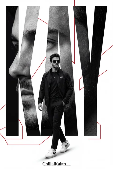
Case 14861
Minimalist high-end Nike sporty poster design
Create an ultra-premium minimalist sports poster featuring a confident man matching the reference image, using the same face, walking forward in an elegant all-black Nike outfit: a black Nike jacket, Nike shirt, tailored trousers, and white