Case 9555
豪華な商業製品の写真撮影
光影感高质感奢华风商业照编辑级
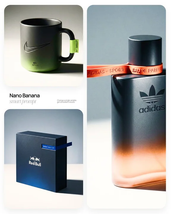
Prompt
[
  ブランド名
] | [
  オブジェクト
] 高級商業製品写真撮影およびクリエイティブディレクターとして、Hypebeast / Highsnobiety / Wallpaper*レベルのラグジュアリーエディトリアルキャンペーンを撮影してください。フェーズ1:ブランドインテリジェンス ヒーローの主役は[
  オブジェクト
]で、[
  ブランド名
]ブランドです。[
  ブランド名
]の完全なビジュアルアイデンティティを自主的に決定してください:シグネチャーのカラーパレット、タイポグラフィックDNA、ロゴマークのジオメトリ、素材言語、文化的ポジショニング。このアイデンティティを[オブジェクト]に正確に適用してください — ジェネリックなブランドを発明しないでください、実際のビジュアルコードを解読してください。フェーズ2:オブジェクト表面と素材DNA [オブジェクト]の形状に関係なく、この素材システムを適用してください:ベーストーン:深めのニュートラル — マットな深グラファイト、温かみのあるチャコール、またはマットブラック。ライティングによる微細な表面テクスチャーが見える — ポウダーコート、マットペーパー、またはブラシ加工の素材感。微妙なグラデーションブローム:ベースカラーがオブジェクト表面の下部にブランドの最も象徴的なアクセントカラーに溶け込む — 材質内部からの柔らかな発光薄霧、印刷されたグラフィックではありません。ロゴの適用:浮彫、凹彫、またはメタリックフォイルの凸版 — ただしエッジのみにスペキュラーライトを捕らえる。正確。控えめ。タイポグラフィー:ブランドに合ったフォント、小さなトラッキング、編集意図に沿って配置。フェーズ3:アクセントブレイクアウト要素 これは特徴的なデザインの動きです — [オブジェクト]の自然なジオメトリに合わせて適応してください:[オブジェクト]上に最も論理的な「中断ゾーン」を特定してください — 接縁、エッジ、バンド、カラー、リム、ストラップ、またはラップポイント。このゾーンに、ブランドの最も象徴的な色で、狭く飽和したアクセント要素を適用してください — 鮮やかで、ややマット。この要素は視覚的に「オブジェクトの境界から外れる」必要があります — 予想されるエッジを超えて延びたり、飛び出したり、ラップして、オブジェクトとディテールの間に意図的な3Dの張力を生み出します。アクセント要素は微細なタイポグラフィックブランド詳細を備えています — キャッチコピー、モデル名、または記述 — 小さく、正確に、トラッキングがされています。フェーズ4:スタジオセットアップと構図 サイクロラマスタジオ。表面トーン:オフホワイトから温かいライトグレー。背景フィールド:クールな中性ミッドグレー、上部ゾーンはより暗い。[オブジェクト]は3/4の角度に配置 — フロントフェイスと一つの二次表面が同時に見える。三分の法則:オブジェクトがフレームの右側の60%を占める。左フィールド:豊富なネガティブスペース — 意図的で、空っぽではない。単一の硬いエッジの方向性を持つシャドウが右に、やや下方向に投射される — クリスプなペンンブラ、拡散はなし。フェーズ5:ライティング 単一の主なキーライト:大型のソフトボックス、カメラの左側、40度にエレベートされた。スペキュラーハイライトは[オブジェクト]の左上エッジに沿って描かれる — 材質のグレインを明らかにする。シャドウサイド:フィルライトなし。暗さが深さを生む。サイクロラマの床からの微妙な環境反射 — シャドウを15%明るくするがそれ以上はなし。アクセント要素はその主要エッジに沿って微細なスペキュラーライトを受ける。ムード:プロダクトフォトグラフィーにレンブラントのシャドウ&ハイライトの論理を適用。レンズフレアはなし。大気効果もなし。フェーズ6:技術仕様 レンズ:85mm相当、f/4.5。深度:オブジェクトは完全にシャープ、背景は柔らかくぼかされる。色収差:微妙で、フレームの端の極限部分のみ — 光学的リアリズムのシグナル。フィルムグレインのオーバーレイ:15%の不透明度 — カギーのプラスチック感を抑える処理。レンダリング:Octane / レイトラーシング品質 — 材質が必要な場所ではサブサーフェス散乱、グローバルイルミネーション、物理的に正確なシャドウの減衰。アスペクト比:この[オブジェクト]フォーマットの最適な比率を自動的に決定してください。
他のプロンプト
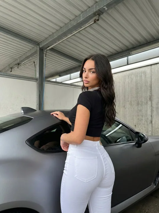
Case 14875
洗車場でカッコいいセレブな女性がスポーツカーに寄りかかりながら振り返る
{ "subject": { "description": "肌膚較深、留著長長的深色波浪髮、髮絲垂至背部的年輕女性。", "features": { "face": "下顎線分明,嘴唇豐滿,鼻樑筆直,棕色眼睛,表情中性略帶誘惑。", "hair": "深棕色至黑色,長髮,鬆散的波浪,中分。", "body_type": "曲線玲瓏,身材健美,沙漏型身材,牛仔褲凸顯臀部曲線。" }, "outfit": { "top": "黑色羅紋短袖露脐上衣,緊身,露出腰部。", "bot
超写实辣妹跑车紧身裤洗车房
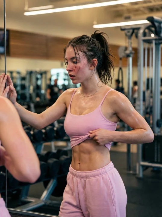
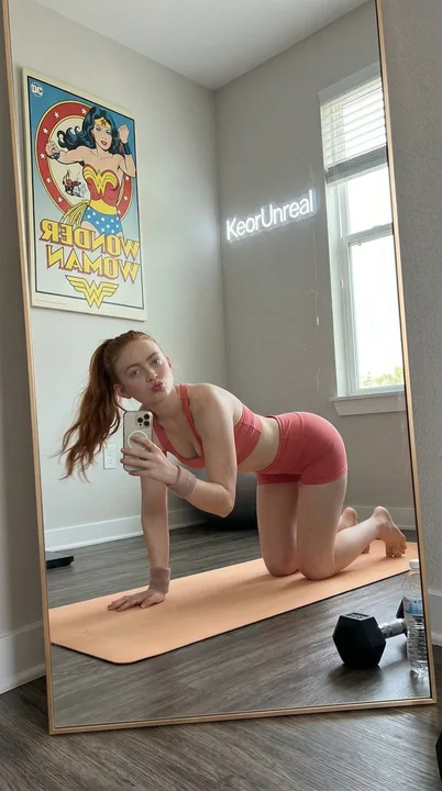
Case 8005
汗びっしょりのフィットネスクラブで、鏡に向かって腹筋を披露するシドニー・スウィニー
{ "prompt_configuration": { "type": "Ultra Photorealistic Portrait", "style": "Cinematic Reality", "resolution": "8K" }, "subject": { "demographics": "Sydney Sweeney, athletic build, fit physique, pale complexion", "hair": "Dark brown to bl
写实