Case 25627
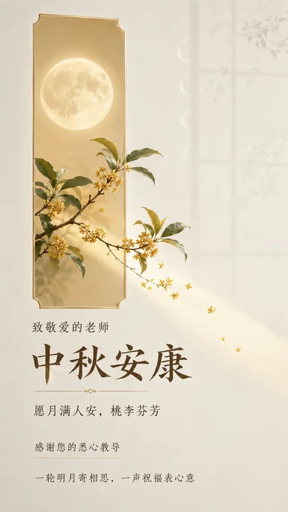
Постер в вертикальном формате с пожеланиями учителям на Праздник середины осени, луной, окном и цветущим османтусом
Prompt
Разработайте вертикальный постер с поздравлением к Празднику середины осени для учителей, предназначенный для чатов WeChat и пересылки на мобильных устройствах. Целевая аудитория — уважаемые учителя; время просмотра короткое, но текст должен быть полностью понятен, а плотность информации находится между «минимум текста» и «стандартной».

Языком визуала является «реальные объекты, проходящие через геометрическое эмоциональное окно»: в качестве основных элементов выступают реалистичная полная луна, ветви османтуса и небольшое количество цветов османтуса, что выражает единственное визуальное событие — «лунный свет и благословения проходят через окно и приходят к учителю».

В кадре размещен узкий, вытянутый геометрический цветной блок в цвете светлого шампанского золота с низкой насыщенностью, выступающий визуальным якорем и пространственным контейнером. Этот блок подобен тихому эмоциональному окну, освещенному лунным светом, с четкими, контролирующимися границами и легкой полупрозрачностью.

Полная луна расположена внутри окна, а ветви османтуса естественно выходят за пределы окна с одного конца. Ветви, листья, цветы и небольшой участок лунного света пересекают границу и простираются в большое внешнее белое пространство, создавая ощущение реального пространственного проникновения. Главный объект не должен быть полностью заключен в цветной блок, но и не должен превращаться в декоративный иконку.

Фон — это «атмосфера класса под лунным светом», связанная с темой: теплая слоновая кость переходит в очень светло-дымчатый серый цвет пустого пространства, подобно воздуху, освещенному лунным светом у окна класса ночью. Вдали сохраняются лишь очень бледные, почти прозрачные контуры оконных переплетов и успокаивающие дуги фаз луны, позволяя главному объекту проявиться из тихой дали и сохраняя по-настоящему чистую «дыхательную зону» для текста.

Добавьте лишь небольшое количество тонких линий фаз луны и теней ветвей османтуса, имеющих причинно-следственную связь с Праздником середины осени и эмоциями между учителем и учеником. Поверхность должна быть целостной, чистой и матовой, с лишь незначительными контролируемыми изменениями яркости. Избегайте нерелевантных пейзажей, тесных декораций или драматичных темных сцен.

Текст должен точно отображать следующие китайские иероглифы, без псевдотекста, искажений, лишнего английского или несанкционированного содержания, сохраняя естественные и четкие формы упрощенного китайского шрифта:

1. «中秋安康» — основной заголовок, первая точка входа в чтение, мягкий, но торжественный заголовок с высокой узнаваемостью.
2. «致敬爱的老师» — обращение к получателю, короткий лид (kicker), формирующий с основным заголовком интимное подтверждение идентичности.
3. «愿月满人安,桃李芬芳» — пожелание к празднику, авторское выражение, выступающее эмоциональным обещанием после основного заголовка.
4. «感谢您的悉心教导» — описание эмоциональной связи учителя и ученика, авторское выражение, появляющееся в виде короткого предложения или легкого выноса (callout), выполняющего функцию благодарности.
5. «一轮明月寄相思,一声祝福表心意» — заключительный текст, авторское выражение, выступающий тихой нижней/краевой пояснительной строкой, завершающей цикл чтения от праздника к доброте учителя.

Порядок чтения: Обращение к получателю → Основной заголовок → Пожелание к празднику → Описание благодарности → Заключительный текст.

Текст образует 4 читаемых блока: лид расположен рядом с основным заголовком, но с четкой иерархией; пожелание представляет собой самостоятельное мягкое короткое предложение; описание благодарности и заключительный текст образуют легкое завершение. Большая часть пустого пространства остается без текста, обеспечивая достаточно места для лунного окна и главного объекта, пересекающего границы.

Даты, названия школ, имена, организации, контактные данные, места проведения мероприятий или подписи отсутствуют, так как они не были предоставлены пользователем и не должны выдумываться.

Композиция использует целостный редакционный стиль постера с поздравлением: геометрическое окно и реалистичный объект «луна-османтус» образуют единственную визуальную точку фокуса. Текст естественно организуется вдоль отношения лунного света, переливающегося из окна, формируя успокаивающий путь чтения от обращения вверху до заголовка рядом с объектом, а затем к благословенному завершению внизу. Текст не парит над нерелевантными изображениями, а перекликается с краями окна, лунным светом и пустым пространством.

Сохраняйте восточное пустое пространство, современный порядок, естественную жизненную силу, качество «легкой роскоши» и сдержанный редакционный темперамент, избегая шаблонного нагромождения.

Цветовая схема использует план теплого лунного света с низкой насыщенностью: слоновая кость и очень светло-дымчатый серый цвет занимают большие площади пространства; окно цвета светлого шампанского золота и мягкий лунный свет отвечают за праздничное тепло. Поверхность луны — естественный теплый белый цвет; цветы и ветви османтуса используют реалистичные, но сдержанные бледно-золотой, оливково-зеленый и немного темно-тауповый цвета в качестве визуальных якорей. Текст использует мягкий темно-тауповый цвет, а не чистый черный.

Поддерживайте высокую яркость, низкую или средне-низкую насыщенность и мягкий контраст, чтобы зритель чувствовал покой, близость, уважение и нежное внимание. Главный объект и пустое пространство четко разделены, но общий вид не должен быть тяжелым или шумным; не используйте высоконасыщенные праздничные красный и золотой цвета.

Типографика adopts современный гуманитарный редакционный темперамент, подходящий для чтения китайского текста на мобильных устройствах: основной заголовок выполнен четким, слегка книжным и стабильным китайским шрифтом для дисплея, с чертами, имеющими теплое рукописное ощущение, но с точными и полными краями. Вспомогательный текст создает ритм с помощью легкого, регулярного и растянутого китайского расположения, различая обращение, пожелание, благодарность и заключение с помощью веса шрифта, плотности, пустого пространства и длины строки, не размещая весь текст в одном размере по центру.

Текст входит в кадр, как лунный свет, получая акцент вблизи краев окна и умеренно отступая в пустом пространстве; сохраняйте естественную читаемость упрощенного китайского языка, все глифы должны быть полными и четкими.

Главный объект имеет текстуру тонкой реалистичной фотографии: поверхность луны имеет сдержанные реальные свет и тени кратеров и мягкое гало; тонкие ветви, пучки мелких цветов и листья османтуса имеют узнаваемые естественные формы и тонкие слои. Завершение достигается с помощью мягкого рассеянного лунного света, чистых матовых поверхностей, точно контролируемых краев и естественной пространственной глубины. Избегайте тяжелых теней, карикатурности, 3D-иконок, водяных знаков, элементов интерфейса, псевдотекста, символов без причинно-следственной связи или ощущения дешевого шаблона.

THEORY_LOGIC = SET[Композиция пустого пространства::Визуальная метафора::Редакционная иерархия] || SYNTHESIS[Использование окна как границы отношений, позволяя луне и османтусу пересечь границу и войти в тихое пустое пространство; использование основного заголовка, пожеланий, благодарности и заключения для формирования прогрессивного ритма от узнавания к эмоциональному отклику, сохраняя тему доброты учителя ясной, мягкой и уважительной при быстром чтении на мобильном устройстве]

METAPHOR_LOGIC = Лунный свет проходит через эмоциональное окно, перенося единение Праздника середины осени и аромат османтуса за пределы границы к учителю, а пустое пространство становится тихим местом, где благодарность слышна.
Другие промпты

Case 23
Плоский дизайн, равносторонний стиль
Плоская изометрическая цифровая иллюстрация [опишите объект: например, современное рабочее место, квартал города, группа значков приложений, спортивный магазин], чистые линии и геометрические формы, яркие пастельные цвета, упрощенная перспе
illustrationminimalistUI设计infographic

Case 25632
Селфи в спальне глубокой ночью с прямой вспышкой на компактную камеру CCD, в корейском стиле
9:16, прямой вспышка с компактной камеры CCD, ночной селфи в спальне с точки зрения корейской девушки, заметное зерно при слабом освещении, легкое сжатие с низким разрешением, темно-серый фон. Одна молодая взрослая женщина, мягкие круглые г