Case 15146
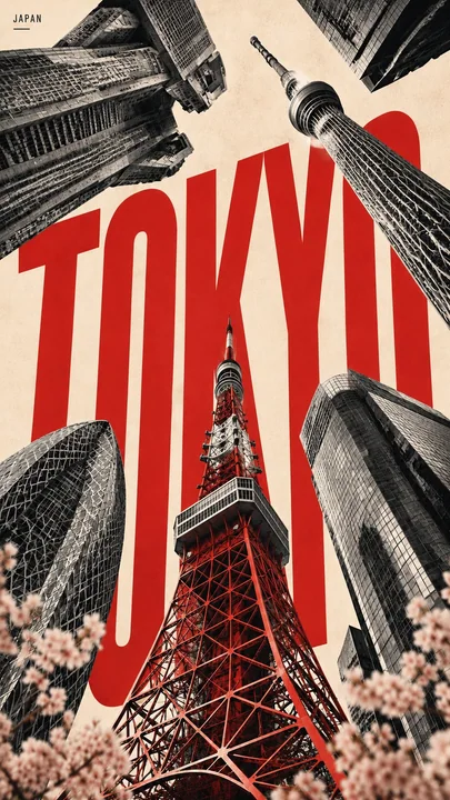
ミニマリズムな都市ランドマークのコラージュ縦型ポスター
Prompt
CITY: [TOKYO / NEW YORK / PARIS / DUBAI / YOUR CITY]
MAIN LANDMARK: [most iconic landmark]
OTHER LANDMARKS: [4–5 recognizable landmarks]
TYPE COLOR: [accent color]
FOREGROUND DETAIL: [cherry blossoms / taxi / leaves / palm leaves]
COUNTRY: [country name]

Create a 9:16 vertical city poster using iconic landmarks from the same city.

Treat each landmark as an independent architectural collage element rather than a realistic street scene. Place the landmarks around the edges of the frame using an extreme worm’s-eye perspective, with their forms rising and converging toward the center of the sky.

Use the MAIN LANDMARK as the central vertical anchor. Keep it the most complete and recognizable structure in the composition.

Arrange the other landmarks from the upper-left, upper-right, lower-left and lower-right edges. Make them large near the frame edges and gradually narrower toward the center, creating a strong radial, upward-moving composition.

Do not follow real geographic positions. The goal is to reconstruct the visual identity of the city through its landmarks.

Behind the architecture, place the city name in huge ultra-tall condensed sans-serif typography. The letters should occupy around 45–60% of the image, partially hidden behind the landmarks while remaining clearly readable.

Keep the city-name typography clean, solid and sharp. No distressed texture, cracks or worn lettering.

Use a limited three-color system: warm off-white paper background, charcoal / grayscale architecture, one strong accent color for the city name.

Render the landmarks with realistic architectural photography, then add subtle vintage editorial print texture, fine grain, halftone and paper texture.

Add a small blurred foreground detail connected to the city, occupying only around 5–10% of the lower edge, to create depth and local atmosphere.

Core visual formula:
iconic landmarks + extreme low-angle perspective + radial convergence + giant city typography + limited colors + subtle foreground depth.

城市:[东京 / 纽约 / 巴黎 / 迪拜 / 你的城市]
主要地标:[最标志性的地标]
其他地标:[4–5 个可辨认的地标]
字体颜色:[强调色]
前景细节:[樱花 / 出租车 / 落叶 / 棕榈叶]
国家:[国家名称]

创作一张 9:16 的垂直城市海报,使用来自同一城市的标志性地标。

将每个地标视为独立的建筑拼贴元素,而不是真实的街道场景。使用极端的虫眼视角将地标放置在框架边缘,它们的形态向天空中心升起并汇聚。

以“主要地标”作为中心垂直锚点。使其成为构图中完整且最具辨识度的结构。

将其他地标布置在左上、右上、左下和右下边缘。使它们在靠近框架边缘处变大,并向中心逐渐变窄,创造出强烈的放射状向上移动的构图。

不要遵循真实的地理位置。目标是通过地标重建城市的视觉身份。

在建筑背后,以巨大的超高、压缩的无衬线字体放置城市名称。字母应占据图像的 45–60% 左右,部分隐藏在地标背后,同时保持清晰可读。

保持城市名称字体的整洁、稳实和锋利。不要有磨损纹理、裂纹或破旧字体。

使用受限的三色系统:暖米白色纸张背景、木炭色/灰色调建筑、城市名称使用一种强烈的强调色。

使用真实的建筑摄影效果渲染地标,然后添加微妙的复古社论印刷纹理、细颗粒、半色调和纸张纹理。

添加与城市相关的细小模糊前景细节,仅占据底边的 5–10% 左右,以营造深度感和当地氛围。

核心视觉公式:
标志性地标 + 极端低角度视角 + 放射状汇聚 + 巨大城市字体 + 有限颜色 + 微妙前景深度。
他のプロンプト

Case 12848
金色の光を浴びる“テニスの女神”アナ・デ・アルマスのグラビア写真
{ "generation_parameters": { "quality_preset": "超高精細", "aspect_ratio": "9:16", "resolution": "8k", "style_model": "フォトリアリスティック" }, "subject": { "description": "アナ・デ・アルマス(Ana de Armas)、引き締まったアスリート体型と日焼けした肌。", "hair": "ダークブラウンのストレート、肩までのボブヘア、
真人写实运动穿搭网球少女阳光运动甜美治愈

Case 21229
高端幼儿渴望视角商业摄影广告海报
{ "REFERENCE_IMAGE": "<Upload Reference Advertisement>", "PRODUCT_NAME": "<Enter Product Name>", "PRODUCT_VARIANT": "<Enter Flavor/Variant>", "BRAND_NAME": "<Enter Brand Name>", "HEADLINE": "<Enter Main Headline>", "SUBHEADLINE