Case 25926
极简拼贴艺术杂志质感海报生成
Prompt
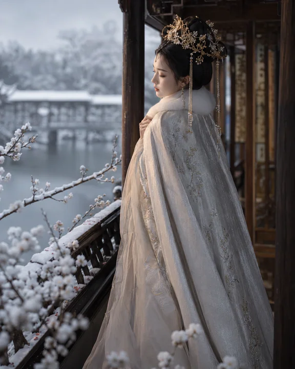
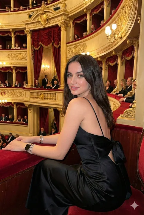
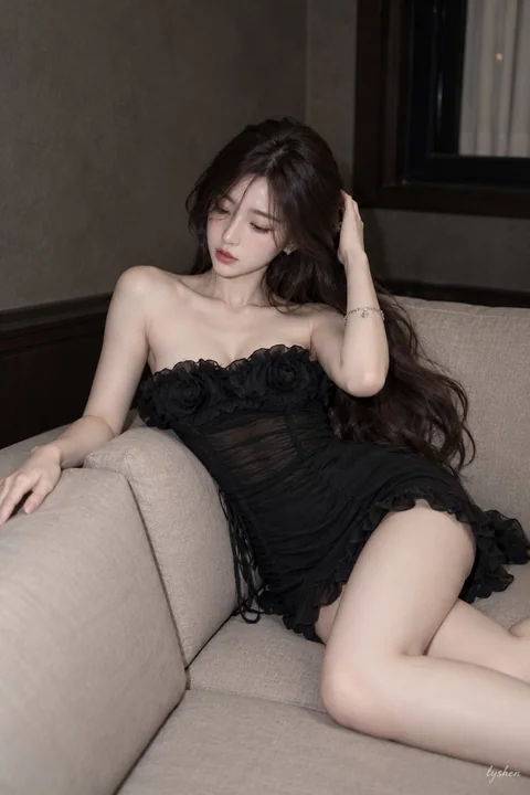
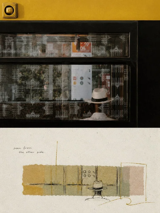
Please create an individual high-end design poster for each photo I upload, not a multi-photo collage; each photo should be output separately. Use a 3:4 vertical composition overall, with the top and bottom sections strictly 1:1 in height, each occupying 50% of the frame.

The upper half retains the original photo, maintaining the subject's identity, structure, posture, realistic texture, natural lighting, and original color atmosphere, with only slight high-end color grading to give it the texture of an art magazine, independent publication, or exhibition image. To fit the aspect ratio, the environmental background may be extended naturally, but the subject must not be stretched, distorted, or changed.

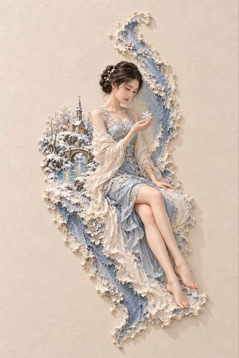
The lower half adopts a **dual-layer paper and material collage texture**: the outer layer is an off-white, rough, handmade paper texture with coarse fibers. A **horizontal narrow rectangular collage color block area** is set in the middle of the frame, with casual, irregular edges, and the color is automatically matched to the photo above as a low-saturation but vibrant composite color. Do not copy the photo completely; instead, first understand the **structure, movement, visual memory points, and temperament** most worth remembering from the original image, delete irrelevant details, and retain only the core form and relationship that best represent the original object. Then re-summarize it through paper collage, layered color blocks, and hand-drawn lines, so that people can recognize its correspondence with the photo above at a glance.

The subject falls within the middle color block area with a **small-scale stamp feel**, and its position can be freely arranged according to its own direction, proportion, and visual focus, allowing for off-centering, edge-clinging, suspension, or partial cropping, without pursuing a complete representation. The composition must retain **a large amount of intentional white space**: leave ample blank space above and below the color blocks, letting the white space itself become part of the picture, creating a sense of breathing, space, and quiet editorial order together with the subject, the edges of the color blocks, and a small number of elements. Better to subtract than to fill.

The expression method is mainly **dark matte wax crayon / pastel-style hand-drawn lines**, with minimalist, loose, naive, casual, and irregular lines, with slightly rough brushstrokes and natural handmade errors; it can be supplemented with a small amount of etched lines, silhouettes, simple color blocks, and slight layering, without realistic redrawing or adding complex details. **Some key outlines, etched lines, or local details can be added with thin gold thread / gold powder lines**, like faint gold leaf powder attached to the edges of the lines, forming a restrained and exquisite sense of flash, just enough without being gaudy.

**Some subjects or key forms in the picture can naturally cross the boundary of the middle collage color block area**, breaking through the original area boundaries and extending into the white space, forming foreground and background layers, spatial pauses, and a more atmospheric visual relationship; this crossing should be restrained and designed, making the picture appear more agile rather than being neatly framed.

A small amount of text intervenes, with **casual, scribbled, soft handwritten English short phrases** dotted in the large areas of white space, like casual notes in personal diaries or independent publications. The text should be small and light, forming a natural rhythm with the subject and white space, without overshadowing the main theme.

Overall atmosphere should be **quiet, retro, healing, minimalist, and artistic**, like an artistically reconstructed paper card. The paper surface can have a slight aging texture, with **faint fine grain noise like Risograph printing** superimposed to enhance the paper and printing texture. Overall avoid heavy shadows, realistic rendering, strong three-dimensionality, complex decorations, filling the screen, and templated effects.

请将我上传的每一张照片分别制作成一张独立的高级设计海报,不多图拼接,每张照片单独输出。整体采用3:4竖版构图,上下两个区域高度严格1:1,各占画面50%。

上半部分保留原始照片,保持主体身份、结构、姿态、真实质感、自然光影和原有色彩氛围,仅进行轻微高级调色,使其具有艺术杂志、独立出版物与展览图像质感。为适配画幅,可自然扩展环境背景,但不得拉伸、扭曲或改变主体。

下半部分采用**双层纸张与材料拼贴质感**:外层为米白色、粗糙、带粗纤维感的手工纸底纹,画面中部设置一块**横向窄矩形的拼贴色块区域**,边缘随性、不规整,颜色根据上方照片自动匹配为低饱和但有生命力的综合色。不要完整复制照片,而是先理解原图最值得被记住的**结构、走势、视觉记忆点与气质**,删去无关细节,只保留最能代表原物的核心形态与关系,再通过纸面拼贴、层叠色块与手绘线条重新概括,使人能够一眼识别它与上方照片之间的对应关系。

主体以**小尺度章印感**落在中部色块区域内,可根据自身方向、比例和视觉重心自由安排位置,允许偏心、贴边、悬置或局部裁切,不追求完整交代。构图必须保留**大量有意识的留白**:色块上方与下方留出充足空白,让留白本身成为画面的一部分,与主体、色块边缘和少量元素共同形成呼吸感、空间感与安静的编辑秩序。宁可删减,也不要填满。

表现方式以**深色哑光蜡粉笔 / 粉蜡笔式手绘线条**为主,线条极简、松弛、稚拙、随性、不规整,带轻微粗糙笔触与自然手作误差;可辅以少量刻线、剪影、简洁色块和轻微层叠,不做写实转绘,不增加繁杂细节。**部分关键轮廓、刻线或局部细节可加入纤细的金线 / 金粉线条**,像淡淡金箔粉末附着在线路边缘,形成克制而精致的闪光感,点到为止,不可俗艳。

画面中的**部分主体或关键形态可以自然越界出中部拼贴色块区域**,突破原有区域边界,延伸到留白之中,形成前后层次、空间停顿与更有意境的视觉关系;这种越界应克制而有设计感,让画面显得更灵动,而不是被整齐框死。

文字少量介入,在大面积留白中点缀**随性、潦草、柔软的手写英文短句**,像私人笔记或独立出版物中的随手标注。文字应小而轻,与主体和留白形成自然节奏,不喧宾夺主。

整体氛围应**安静、复古、治愈、简约、文艺**,像一张经过艺术重构的纸本卡片。纸面可带浅浅旧化肌理,并叠加 **Risograph 孔印般淡淡的细碎颗粒噪点**,增强纸本与印刷质感。整体避免厚重阴影、写实渲染、强烈立体感、复杂装饰、画面填满和模板化效果。
More prompts
Case 28625
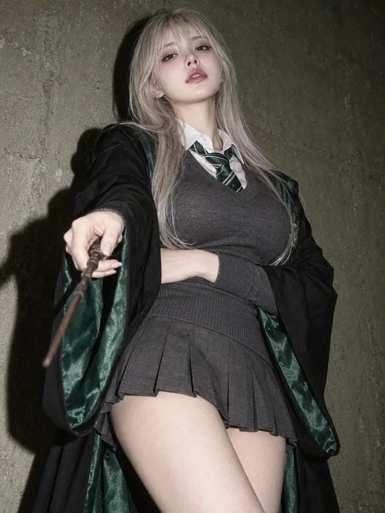
Slytherin lightning-themed East Asian girl cinematic flash portrait
Medium shot, slightly low-angle cinematic flash portrait of an early-20s East Asian girl portraying an alluring Slytherin witch. Standing against a textured wall, she tilts her head slightly back, gazing down at the camera with a haughty ye
Case 10207
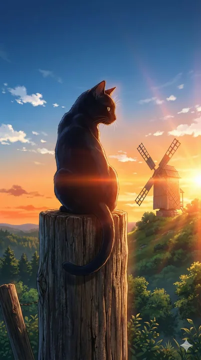
落日逆光下的黑猫回眸
The back view of a black cat sitting on an old wooden post, twisting its body to look back. The cat's fur is smooth, and the texture of the post is realistic. The background is lush with green trees and plants, and a distinctively shap
逆光黑猫落日风车绿野