Case 10938
ミニマリストスタイルの教育用インフォグラフィックデザイン
UI素材极简风信息图教育类知识科普
Prompt
A clean educational infographic poster explaining "{Knowledge Topic}",

[Overall Style]
Modern minimalist UI style,
Background uses soft light colors (such as cream #FAF7F2 / light grayish blue),
Restrained and comfortable color scheme, suitable for long-time reading,

[Core Requirements (Key)]
Naturally organize content modules according to the information structure of the "Knowledge Topic",
Do not force a fixed number or order of modules,
Prioritize clear information logic rather than formal symmetry,

[Layout (Adaptive)]
- Use grid layout (automatically choose 2 columns / 3 columns / irregular distribution)
- Number of cards automatically adjusts according to content (usually 5–9)
- Modules with high information density can be appropriately enlarged (higher visual weight)
- Simple content modules can be shrunk or merged

[Card Design]
- White cards (#FFFFFF)
- Rounded corners + slight shadow (soft hierarchy)
- Maintain consistent spacing and alignment

[Each Information Module Contains]
- Concise illustrations (unified style)
- Clear titles (strong hierarchy)
- 1–3 sentences of core explanation (avoid verbosity)
- Provide examples / comparisons / summaries when necessary

[Content Organization Principles (Key Point)]
Automatically select the appropriate structure based on the topic, for example:
- Concept type → Definition + Principle + Characteristics + Example
- Comparison type → A vs B (contrast structure)
- Process type → Steps / Flowchart
- System type → Components + Relationships
- Skill type → Methods + Tips + Common misconceptions

[Visual Hierarchy]
- Title > Module title > Body text > Auxiliary information
- Important information can be emphasized with color or icons

[Color Suggestions]
- Primary color: Choose based on topic (Technology=Blue, Learning=Green, Warning=Orange)
- Secondary colors: 1–2 types are enough
- Avoid high saturation, avoid flashy

[Style Requirements]
- Plenty of white space, strong sense of breathing
- Unified icons (linear or flat)
- High readability priority
- Clear teaching orientation

[Extra Optimization (Optional)]
- Can add: Comparison blocks / Flow arrows / Structure diagrams
- Can have a "Core Summary" module as a visual ending他のプロンプト
Case 14
クリエイティブ広告
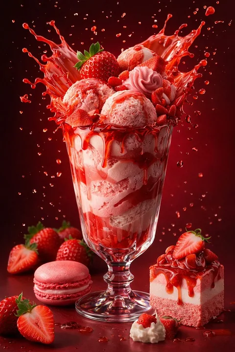
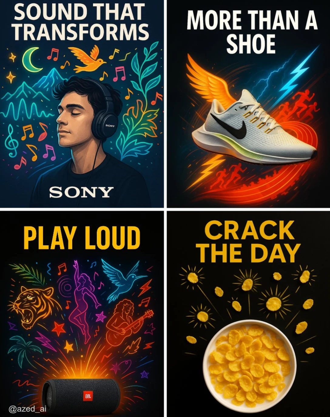
高衝撃の広告で、清潔なダークまたはハイコントラストの背景に配置されています。[製品]は中央に位置し、シャープに照明され、詳細が際立っています。その周りには、現実離れしたスタイリッシュな視覚的な[要素]のイラストが外に向かって爆発的に広がり(例:ミュージシャン、ランナー、カール、太陽放射)、鮮やかなカラーパレットとネオンが使われています。上部には太字の大文字で「[テキスト]」という広告コピーがあり、下部にはブランドロゴが配置されています。現代的な広告スタイルです。
illustrationproductneonbranding
Case 24
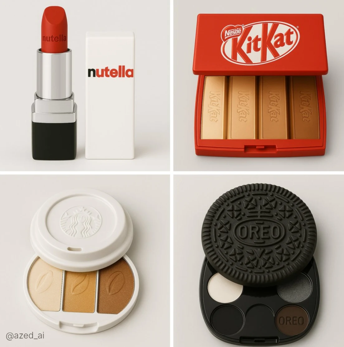
新市場における美容ブランド
[PRODUCT]の製品写真。この写真は[FOOD BRAND]をインスピレーション源としており、柔らかなライトグレーの背景に配置されています。製品はシャープにピントが合い、スタジオの柔らかい照明によって照らされています。パッケージデザインには公式な[FOOD BRAND]ロゴが入り、ブランドの色とスタイルを反映しています。製品はスリムでツヤやかで現実的であり、高精細かつエレガントなプレゼンテーションとなっています。食品アイテムは含まれず、メイクアップ製品のみを写真に含めます
photographyproductfoodbranding