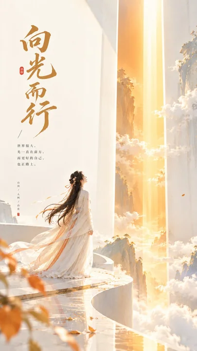
Case 16023
极简清新优雅都市旅行海报
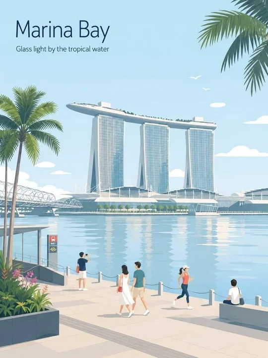
Prompt
Create a fresh, airy, elegant city travel poster that feels uniquely designed for [CITY_NAME], not reused from another city.

IMPORTANT COMPOSITION RULE:
Before drawing, identify the unique “city DNA” of [CITY_NAME]:
1. one primary landmark or skyline feature,
2. one local movement or transport cue,
3. one everyday lifestyle moment,
4. one native plant / local environmental detail,
5. one spatial composition that fits this city specifically.

Do NOT reuse the same layout formula across cities.
Avoid defaulting to:
- a shop always on the right,
- a signboard always on the left,
- people always sitting at a café table,
- the same foreground flower bed,
- the same lamppost position,
- the same waterfront promenade composition.

Each city must have a different scene structure, chosen from its real atmosphere:
harbour lookout, laneway street, riverside park, beach walk, hilltop viewpoint, market corner, tram street, ferry quay, botanical garden, old town street, coastal boardwalk, cultural square, or skyline overlook.

Typography:
Place “[CITY_NAME]” in the upper-left with generous typography-safe negative space.
Add one short refined English caption that matches the city mood.
Keep the typography elegant, minimal, and premium.

Scene adaptation:
Automatically adapt the scene to [CITY_NAME].
Use one iconic primary landmark as the main visual anchor.
Add only 2–4 supporting local details that truly belong to the city.
Do not create a landmark collage.
Do not overfill the background.

People:
Use only 3–6 small figures.
Each person should perform a city-specific everyday action:
walking, sketching, cycling, waiting for a tram, boarding a ferry, carrying a surfboard, taking a quiet photo, reading in a park, jogging by the water, browsing a small market.
Avoid crowd scenes.
Avoid one dominant hero character.
People should feel naturally placed within the city, not copied from previous posters.

Local details:
Use local transport, signage, street furniture, plants, food, architecture, and leisure details only when they fit the city.
Transport signs must not always appear as a large vertical signboard.
They may appear subtly as a tram stop marker, ferry route board, station clock, bike lane symbol, beach patrol flag, small metro icon, or painted pavement mark.

Style:
Japanese stationery aesthetic,
luxury sticker illustration,
premium commercial flat-vector travel poster,
clean thin outlines,
consistent line weight,
flat colors only,
soft minimal shapes,
calm editorial composition.

Palette:
Use pale powder blue, soft sky blue, and mist blue as the atmospheric base.
Use warm cream, soft beige, sage green, and muted gray-green for architecture and nature.
Use dusty rose or blush pink only as tiny accents on flowers, signs, awnings, clothing, or small decorative details.
Keep the palette refined, toned-down, and high-end.

Mood:
fresh, minimal, elegant, calm, refined,
high-end travel postcard,
quiet lifestyle branding,
open space, breathing room, relaxed local rhythm.

Negative prompt:
No realism.
No watercolor.
No painterly effects.
No photorealism.
No heavy shading.
No gradients.
No paper texture.
No dense background.
No repeated café-on-right layout.
No repeated signboard-on-left layout.
No generic tourist poster collage.
No crowded street.
No oversized people.
No dramatic lighting.

为 [CITY_NAME] 创建一个清新、通透、优雅的城市旅行海报,感觉是为该城市量身定制的,而不是套用其他城市的模板。

重要构图规则:
在绘图之前,识别 [CITY_NAME] 独特的“城市 DNA”:
1. 一个主要地标或天际线特征,
2. 一个当地的交通或移动线索,
3. 一个日常生活的瞬间,
4. 一种原生植物/当地环境细节,
5. 一个专门适合这座城市的空间构图。

不要在不同城市之间重复使用相同的布局公式。
避免默认使用:
- 商店总是在右边,
- 招牌总是在左边,
- 人们总是坐在咖啡馆桌旁,
- 相同的前景花坛,
- 相同的路灯位置,
- 相同的滨水长廊构图。

每个城市必须有不同的场景结构,从其实际氛围中选择:
港口观景台、小巷街道、河滨公园、海滩步道、山顶视角、市场角落、电车街道、渡轮码头、植物园、旧城区街道、海岸木栈道、文化广场或天际线俯瞰。

排版:
将“[CITY_NAME]”放置在左上角,留出充裕的排版安全负空间。
添加一条与城市氛围相匹配的简短精炼的英文说明。
保持排版优雅、极简且高端。

场景适配:
自动将场景适配到 [CITY_NAME]。
使用一个标志性的主要地标作为主要视觉锚点。
仅添加 2–4 个真正属于该城市的辅助本地细节。
不要创建地标拼贴画。
不要过度填充背景。

人物:
仅使用 3–6 个小人物。
每个人应执行城市特有的日常动作:
行走、写生、骑行、等电车、登上渡轮、携带冲浪板、安静地拍照、在公园阅读、在水边慢跑、逛小市场。
避免拥挤的场景。
避免出现一个占主导地位的主角。
人物应自然地置于城市中,而不是从之前的海报中复制。

本地细节:
使用当地交通、标牌、街道设施、植物、食物、建筑和休闲细节只有在它们适合城市时才使用。
交通标志不能总是以大型垂直招牌的形式出现。
它们可以微妙地表现为电车站标记、渡轮航线牌、车站时钟、自行车道符号、海滩巡逻旗、小型地铁图标或路面涂鸦标记。

风格:
日系文具美学,
奢华贴纸插画,
高端商业平铺矢量旅行海报,
干净的细轮廓,
一致的线条粗细,
仅限平涂色彩,
柔和的极简形状,
冷静的社论构图。

调色板:
使用淡粉蓝色、柔和的天蓝色和薄雾蓝作为氛围基调。
使用暖奶油色、柔和的米色、鼠尾草绿和柔和的灰绿色用于建筑和自然。
仅在花卉、标志、雨篷、服装或小型装饰细节上使用灰粉色或淡粉色作为微小点缀。
保持色调精致、柔和且高端。

情绪:
清新、极简、优雅、冷静、精致,
高端旅行明信片,
安静的生活方式品牌,
开放空间,呼吸感,轻松的当地节奏。

负面提示词:
无写实。
无水彩。
无绘画效果。
无照片写实。
无重阴影。
无渐变。
无纸张纹理。
无密集背景。
无重复的右侧咖啡馆布局。
无重复的左侧招牌布局。
无通用的旅游海报拼贴。
无拥挤的街道。
无体型过大的人物。
无戏剧性光效。
更多提示词
Case 12885
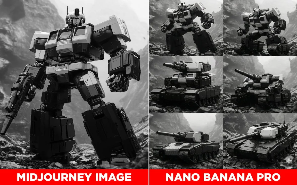
钢铁巨兽的演变:机器人变形为坦克的六个步骤详解
展示这个变形金刚机器人变形为坦克的过渡过程,共 6 步(3 x 2)分步展示。使用相同风格,无轮廓。
科幻机甲变形坦克演变

Case 13102
蕾丝光影下的绝美蓝眼黑发少女特写
“100% 同款面容,高质量、亲密的特写镜头,超写实肖像,描绘了一位眼神迷人、气质柔美的年轻女性。她头部微倾,右肩微露,暗示着她穿着露肩或斜肩的服饰。画面左侧,柔软的白色蕾丝窗帘或布料部分地衬托着她。她拥有一头乌黑的长直发,发梢轻盈,略显凌乱的刘海(齐刘海)修饰着她的脸庞。她那令人惊艳的亮蓝色眼睛是视觉焦点,配以精致的深色眼线和根根分明的睫毛。她的脸颊泛着柔和自然的粉色红晕,双唇饱满,呈现出自然的浅粉色。她的右耳佩戴着一只珍珠水滴耳环。光线柔和而飘渺,突出了她的五官和蕾丝的质
电影感超写实蕾丝