Case 27364
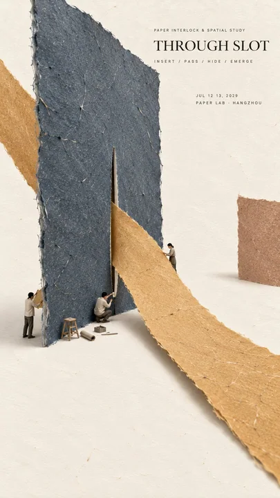
极简手工纸艺社论海报设计
Prompt
Theme:
Main palette:
Spatial idea:
Micro scene:
Title:
Event details:
Aspect ratio: 9:16

Create a refined vertical editorial poster using tactile handmade paper, large color fields, generous negative space, and a tiny micro scene.

Keep the composition minimal, but do not make it empty or simplistic. Build the entire poster around one clear visual idea or physical paper interaction. The concept should be immediately readable from a distance, while smaller material and spatial details become visible only when viewed closely.

Use only one or two dominant handmade paper forms. Let them interact through one deliberate spatial mechanism such as passing through a slot, being pulled under tension, forming one sweeping curve, creating a deep perspective, lifting from the surface, or defining a large negative space.

The paper must feel physical and handmade. Show visible natural fibers, pulp texture, subtle pigment absorption, small embedded flecks, soft pressure marks, slightly irregular edges, and a matte dry surface. Keep the material clean, refined, and contemporary.

Use perspective, overlap, scale, paper thickness, soft natural shadows, subtle curvature, or suspension only when they help explain the physical construction. Avoid decorative effects that do not have a structural purpose.

Add one very small micro scene related to the main concept. Include two or three adult figures naturally interacting with the paper structure, such as holding, measuring, pulling, aligning, inspecting, lifting, or assembling it. The figures and tools should occupy only about 2% to 4% of the composition.

Keep the figures modern, understated, and secondary. Add only a few necessary tools or objects that help explain how the paper structure works.

Use generous warm ivory negative space so the poster feels calm and editorial. Large empty areas should be intentional and balanced against the main paper form.

Typography should remain restrained. Use a refined editorial serif for the title and small uppercase sans serif for supporting information. Keep the title relatively small and place it in a quiet area of negative space.

The visual reading order should be:

large paper form first, spatial interaction second, material texture third, micro scene fourth, title and event details last.

The final image should feel minimal, tactile, intelligent, spatial, refined, and carefully constructed.

From a distance, it should read as a simple arrangement of large paper forms.

Up close, it should reveal fibers, depth, tension, overlap, shadows, tiny figures, tools, and the physical logic behind the composition.

主题:
主色调:
空间创意:
微缩场景:
标题:
活动详情:
纵横比:9:16

创建一个精致的垂直社论海报,使用触感手工纸、大面积色域、充裕的留白以及一个微小的微缩场景。

保持构图极简,但不要使其显得空洞或过于简单。围绕一个清晰的视觉构思或物理纸张互动来构建整个海报。这个概念应该在远处就能立即辨认,而较小的材质和空间细节仅在近距离观察时才变得可见。

仅使用一个或两个主要的手工纸张形状。让它们通过一个精心设计的空间机制进行互动,例如穿过一个槽口、在张力下被拉动、形成一个大幅度的曲线、创造深远的透视感、从表面抬起,或定义一个巨大的负空间。

纸张必须具有物理感和手工感。展示可见的天然纤维、纸浆纹理、细微的颜料吸收、嵌入的小斑点、柔和的压力痕迹、略微不规则的边缘以及哑光干燥的表面。保持材质干净、精致且具有现代感。

仅在有助于解释物理结构时使用透视、重叠、比例、纸张厚度、柔和的自然阴影、细微的曲率或悬浮。避免没有结构目的的装饰效果。

添加一个与主要概念相关的非常小的微缩场景。包括两到三个成年人,他们自然地与纸张结构互动,例如握住、测量、拉动、对齐、检查、抬起或组装它。人物和工具应仅占构图的 2% 到 4% 左右。

保持人物现代、低调且居于次要地位。仅添加少量必要的工具或物体,以帮助解释纸张结构的工作方式。

使用充裕的暖象牙色留白,使海报感觉平静且具有社论感。大面积的空白区域应该是刻意留出的,并与主要的纸张形状保持平衡。

排版应保持克制。标题使用精致的社论衬线体,辅助信息使用小号大写无衬线体。标题保持相对较小,并将其放置在留白的安静区域。

视觉阅读顺序应为:

首先是大面积纸张形状,其次是空间互动,第三是材质纹理,第四是微缩场景,最后是标题和活动详情。

最终图像应给人以极简、触感、智能、空间感、精致且精心构建的感觉。

从远处看,它应该被解读为大面积纸张形状的简单排列。

近距离看,它应展示出纤维、深度、张力、重叠、阴影、微小的人物、工具以及构图背后的物理逻辑。
更多提示词
Case 27363
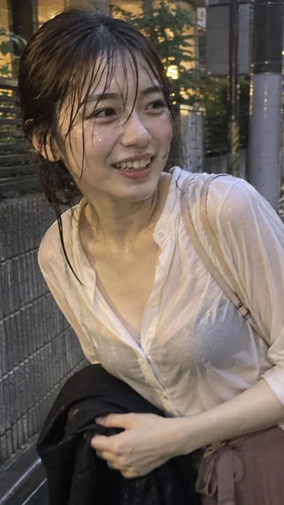
雨中街头抱衣侧笑的成年女性
Subject: A single fictional adult female smiling sideways while holding a black jacket on a street in the rain. White shirt and calm-toned bottoms, wet bangs falling onto the forehead. Taking a daily moment of sudden rain as the theme, natu
Case 14300
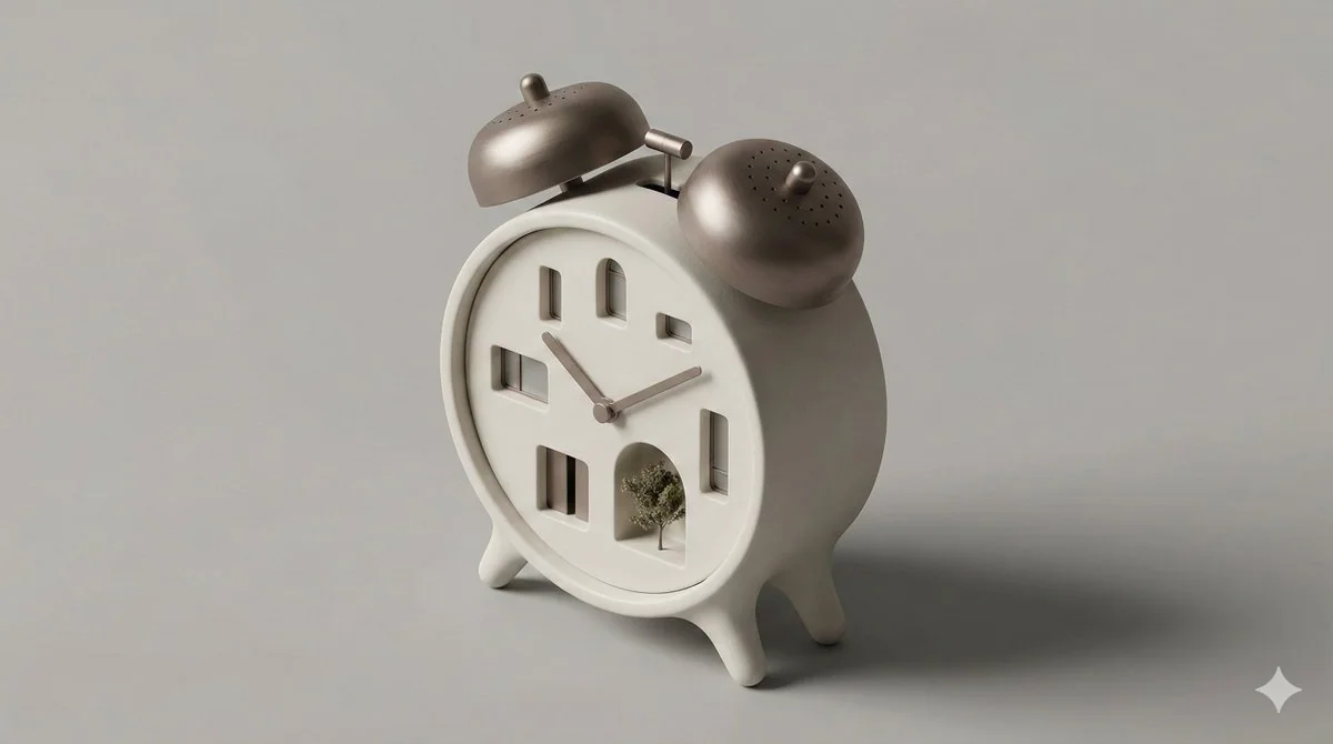
创意家居变身微缩等距建筑模型
一个干净、简约的 3D 等距透视微缩场景,将一个家用物品转化为小型建筑结构。功能元素被抽象为门、窗和体块,采用真实材质、柔和影棚灯光、圆润边缘,呈微缩建筑模型风格,中性背景。
极简风等距图建筑感居家风微缩风