Case 24383
极简人文抽象艺术海报设计
Prompt
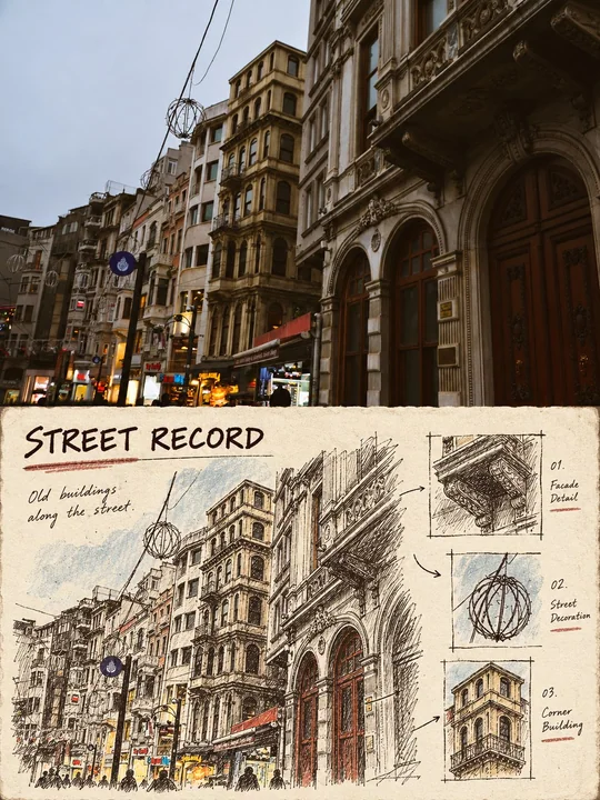
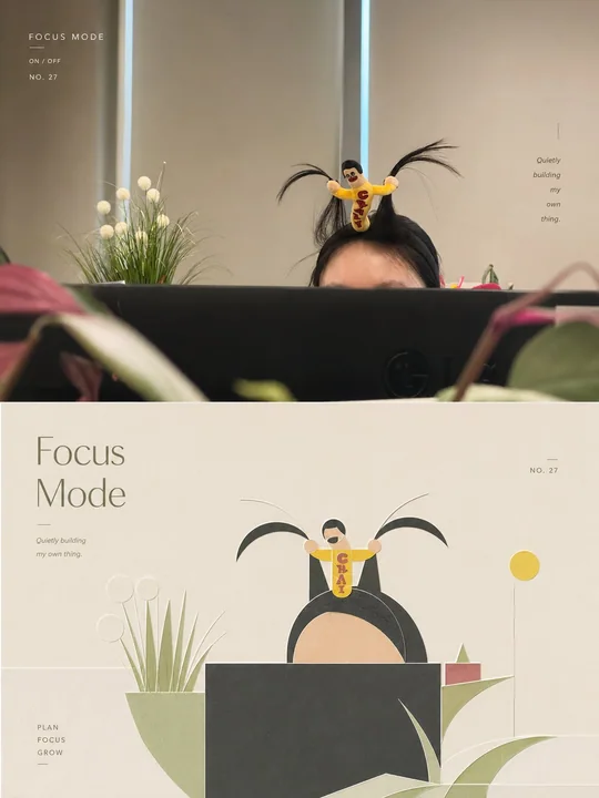
Please turn each photo I upload into an independent high-end design poster, no multi-image stitching, each photo output individually. The overall composition uses a 3:4 vertical format, with the top and bottom areas strictly 1:1 in height, each occupying 50% of the screen. The upper half retains the original photo, maintaining the subject structure, real texture, natural light and shadow, and original color atmosphere, with only slight high-end photographic color grading to give it a magazine photography and art exhibition quality. To adapt to the frame, the sky, ground, or environmental background can be naturally extended, but the subject must not be stretched, distorted, or changed. The lower half extracts the most recognizable subject, outline, posture, and narrative relationship from the photo, reconstructing them into a minimalist abstract geometric visual expression. Use simple geometric shapes, flat color blocks, fine lines, structural lines, and negative space to re-summarize the subject. Do not make realistic illustrations or pile up complex details, but clear features must be retained so that the original object can be recognized at a glance. A small number of horizontal lines, outlines, spatial division lines, or abstract environmental elements can be added based on the original image's relationships, allowing the image to maintain order and a sense of breath within restraint. The composition emphasizes balance, rhythm, and humanistic temperament. With the subject in the lower half as the sole visual core, the overall layout is centered but not stiffly symmetrical, establishing a quiet and professional layout order through proportion control, positive and negative space relationships, density changes, slight layer shifts, and large areas of white space. The image should be concise, stable, and restrained, while carrying a bit of gentle spatial undulation and a shallow embossed feel, making the geometric shapes appear as if slightly imprinted or subtly raised from the paper surface, forming a delicate and subtle three-dimensional layering rather than an obvious 3D effect. The color scheme is extracted from the photo above, but not mechanically copied; instead, it is transformed into a softer color palette with more humanistic temperament. Use low-stimulation, warm, and restrained colors such as off-white, warm white, light gray, sand, dusty pink, light ochre, misty blue, and sage green as the base. Retain the most atmospheric primary and secondary colors from the original image to form a harmonious, quiet, and enduring relationship through a limited palette. The overall colors should be gentle, clear, and full of cultural and life sense, avoiding cheap high saturation, dirty gray distortion, cold high-tech feel, and common commercial color schemes. Keep the text minimal and high-end, not just place names, but concise English titles extracted from the photo's theme, identity, emotion, action, time, or metaphor, accompanied by a small number of numbers, status words, or tiny annotations. The text can be naturally arranged along the subject's outline, structural lines, edges of white space, or the image axis, composing with the graphics in a restrained high-end editorial manner to form a low-key but designed layout relationship. Overall refer to international design studios, architectural posters, art exhibition posters, and high-end brand visual systems, presenting a high-end, modern, quiet, humanistic, artistic, restrained, and gentle visual temperament. Avoid common filters, cheap vector feel, excessive 3D, cartoonish feel, e-commerce feel, and template feel.

请将我上传的每一张照片分别制作成一张独立的高级设计海报,不多图拼接,每张照片单独输出。整体采用3:4竖版构图,上下两个区域高度严格1:1,各占画面50%。

上半部分保留原始照片,保持主体结构、真实质感、自然光影和原有色彩氛围,仅进行轻微高级摄影调色,使其具有杂志摄影和艺术展览质感。为适配画幅,可自然扩展天空、地面或环境背景,但不得拉伸、扭曲或改变主体。

下半部分提取照片中最具识别性的**主体、轮廓、姿态与叙事关系**,重构为极简抽象的几何视觉表达。使用简洁几何形状、扁平色块、细线条、结构线与留白重新概括主体,不做写实插画,不堆砌复杂细节,但必须保留清晰特征,使人能够一眼识别原物。可根据原图关系加入少量水平线、轮廓线、空间分割线或抽象环境元素,让画面在克制中保有秩序与呼吸感。

构图强调**平衡、节奏与人文气质**。以下半部分主体为唯一视觉核心,整体偏居中但不僵硬对称,通过比例控制、正负形关系、疏密变化、轻微层次错动和大面积留白建立安静而专业的版面秩序。画面应简洁、稳定、克制,同时带有一点温和的空间起伏与浅浅的浮雕感,让几何形体仿佛轻微压印或微微隆起于纸面之上,形成细腻、含蓄的立体层次,而不是明显3D效果。

配色从上方照片中提取,但不机械照搬,而是转化为更具**人文主义气质**的柔和色组。以米白、暖白、浅灰、沙色、灰粉、浅赭、雾蓝、鼠尾草绿等低刺激、温润、克制的颜色为基调,从原图中保留最有气质的主色与辅助色,通过有限色盘形成和谐、安静、耐看的关系。整体色彩应温和、清透、富有文化感与生活感,避免廉价高饱和、脏灰失真、冰冷科技感和普通商业配色。

文字保持少量且高级,不只是地点名,而应从照片的**主题、身份、情绪、动作、时间或隐喻**中提炼简洁英文标题,并搭配少量编号、状态词或微型注释。文字可沿主体轮廓、结构线、留白边缘或画面轴线自然排布,以克制的高级编辑方式与图形共同构图,形成低调但有设计感的版式关系。

整体参考国际设计工作室、建筑海报、艺术展览海报与高级品牌视觉系统,呈现**高级、现代、安静、人文、艺术化、克制而温柔**的视觉气质。避免普通滤镜、廉价矢量感、过强3D、卡通感、电商感和模板感。
他のプロンプト
Case 16908
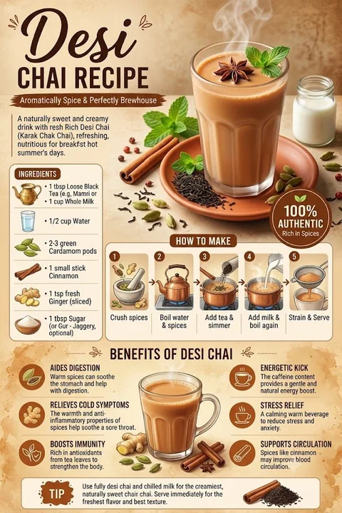
高端质感美食食谱信息图海报
Create a premium vertical digital infographic poster for a [Recipe Name] using a warm, rustic color palette with earthy beige, soft browns, terracotta, and subtle botanical accents. Feature a bold, elegant title combining script and modern
Case 28080
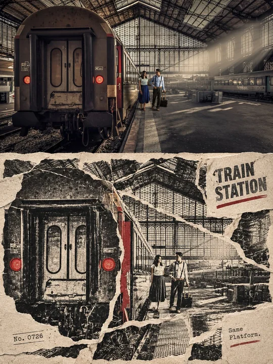
竖版上下对比撕纸轨道版画拼贴海报
Create a vertical 3:4 top-and-bottom comparison editing poster from the input photo. The upper half should completely preserve the real photographic texture, subject identity, and original composition of the input photo, without turning the
Case 28099