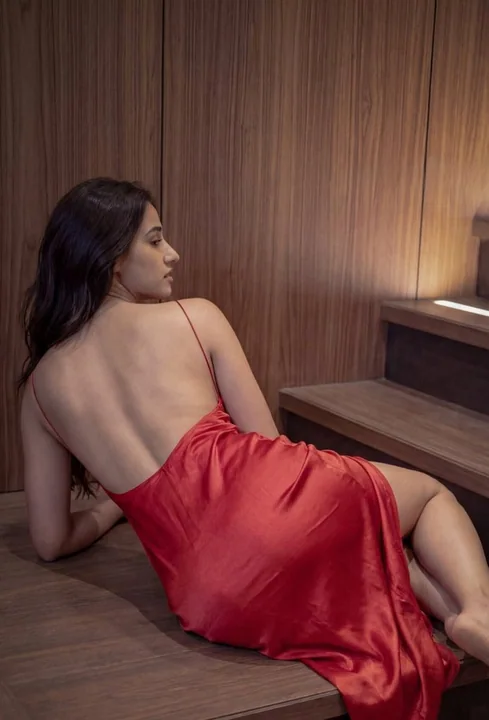
Case 26127
Постер-сравнение: минималистичные пейзажные открытки с чернильными линиями
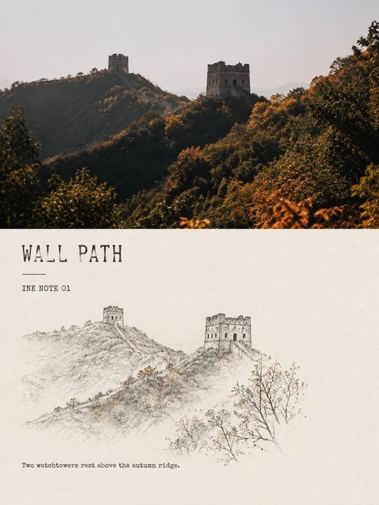
Prompt
Создайте для каждого из моих загруженных фотографий путешествий отдельный сравнительный постер в стиле «Минималистичная чернильная линия пейзажного записки», не объединяя несколько изображений в один коллаж, а выводя каждую фотографию отдельно.

В целом используйте вертикальную композицию 3:4, четко сохраняя визуальный контраст «оригинальное фото сверху, стилизованная перерисовка снизу». Пропорции верхней и нижней областей могут быть естественно скорректированы в зависимости от содержания исходного изображения, а не разделены механически поровну, но обе части должны иметь четкие границы и ясную читательскую связь, совместно образуя законченное редакционное дизайнерское произведение.

Верхняя часть сохраняет исходное фото с высокой степенью точности: сохраняйте местоположение, главный объект, архитектурную структуру, позу персонажа, естественный свет и тени, пространственные слои и исходную цветовую атмосферу; не заменяйте сцены, не изменяйте ключевые объекты, не растягивайте объекты и не выдумывайте достопримечательности, отсутствующие в исходном изображении. Выполняйте лишь легкую и сдержанную цветокоррекцию в стиле журнальной фотографии; при необходимости подгонки под формат естественно расширяйте небо, поверхность воды, землю или фоновую среду.

Нижняя часть использует в качестве полной основы теплый рисовый белый или естественный бумажный белый цвет, превращая фотографию в уменьшенный минималистичный эскиз пейзажа чернильными линиями. Не копируйте исходное изображение полностью и не рисуйте всю рамку линиями; активно отбирайте наиболее узнаваемую и поэтичную информацию из кадра, например: архитектурный или топографический структурный якорь, гребень горы или береговую линию, растение с определенной позой, маленькую фигуру или предмет путешествия, а также одну-две подсказки о погоде и пространстве.

Удаляйте нерелевантных людей, запутанную растительность, повторяющиеся здания и тривиальный фон. Перерисованный объект должен занимать только около 38%–62% ширины нижней области, сохраняя около 55%–72% непрерывного, целостного и ощутимого бумажного белого цвета.

Линии должны использовать черные или темно-серо-черные тонкие стальные перья, сухие чернила и легкую текстуру «летящего белого» кисти: допускаются вариации толщины, паузы, прерывистость, фактура бумаги, растекание чернил и незакрытые контуры, чтобы это выглядело как быстрый, но точный наблюдательный эскиз, сделанный во время путешествия.

Архитектура опирается на несколько структурных линий для демонстрации пропорций; пики и дальние виды сохраняют только разреженные контуры; поверхности воды, туман, небо и расстояние в основном завершаются через пустое пространство; растения не изображаются лист за листом, а их поза передается через направление ветвей и очень небольшое количество чернильных точек. Избегайте больших участков серых чернильных отмывок, а также рисования в виде полных традиционных пейзажных картин или точных архитектурных чертежей.

Цветовая схема в основном чернильная, допускается максимум две небольшие области акцентных цветов, извлеченных из исходного фото, например: киноварный красный, осенний охристый, бледно-розовый лотос, моховой серо-зеленый или теплый желтый рыболовных сетей. Общая площадь акцентных цветов не должна превышать 8% нижней рамки, падая только на одну наиболее запоминающуюся деталь, без акварельного заполнения, цветных контуров или высоконасыщенной декорации.

Текст должен быть похож на заголовки и подписи небольших изданий о путешествиях, немногочисленный, но четкий и читаемый. Сгенерируйте короткий английский заголовок на основе содержания фотографии, в сочетании с полем нумерации «INK NOTE 01» и очень коротким английским наблюдательным предложением.

Заголовок может использовать сдержанный шрифт с засечками, машинописный шрифт или слегка неровный ручной печатный шрифт; текст размещается в основных областях белого пространства, сохраняя дистанцию «дыхания» от иллюстрации, не прижимаясь к главному объекту, без использования пышного каллиграфического письма, без генерации китайских печатей, подписей автора, названий брендов или водяных знаков. Для разных изображений меняются только заголовок, номер и наблюдательное предложение, сохраняя общую компоновку и характер шрифта неизменными.

Финальное изображение должно демонстрировать четкий контраст между реальной фотографией путешествия и легким эскизом наблюдений чернильными линиями; тихое, сдержанное и воздушное, как страница, взятая из независимого журнала о путешествиях, альбома архитектурных наблюдений или личного скетчбука. Акцент не на демонстрации техники, а на том, чтобы через вычитание, остановку пера и бумажный белый цвет заново увидеть место, тип погоды или краткое движение из исходного фото.

Избегайте: прямой фильтрации всего фото в линейный рисунок, полного повторения контента сверху и снизу, заполнения нижней рамки целиком, непрерывных серых отмывок, полных композиций традиционной китайской живописи, сложных листьев, точной штриховки, комиксной архитектуры, мультяшных персонажей, акварельного заполнения, высоконасыщенных цветовых столкновений, псевдокитайских иероглифов, копирования текста вывесок с фотографий, имен авторов, водяных знаков, ощущения шаблона электронной коммерции и дешевых винтажных фильтров.
Другие промпты
Case 28724
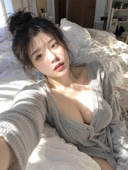
Гиперреалистичный женский портрет с селфи на смартфон в спальне
Гиперреалистичная фотография селфи на телефон в спальне, вертикальная композиция 3:4. Молодая восточноазиатская женщина, явно взрослая, примерно 23–28 лет, светлая кожа, маленькое и изящное лицо, мягкий овальный овал лица, яркие глаза, прям
Case 11508
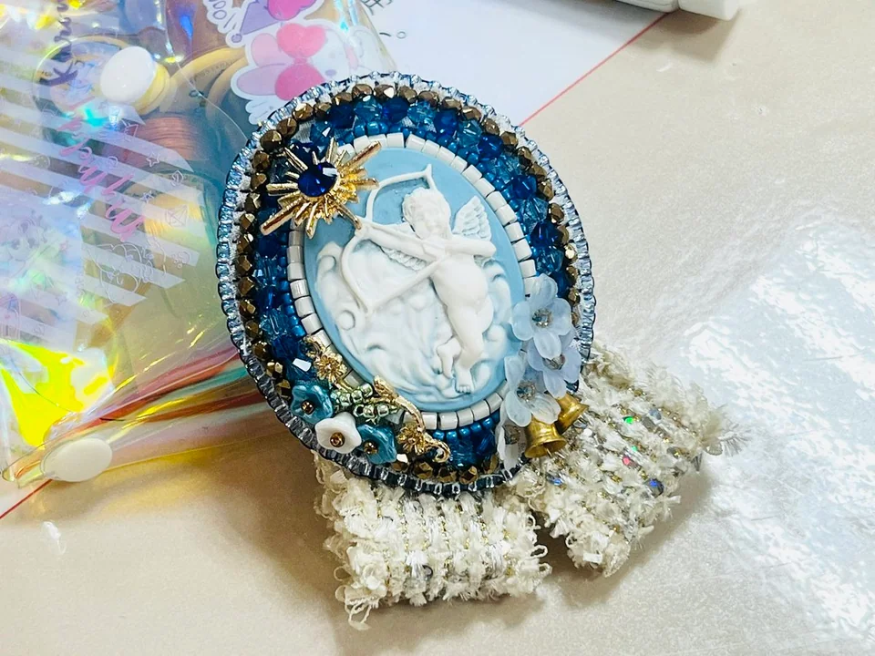
Фантастическая замена: бусы-застежка на фоне нано-бананов
Я попробовал заменить и настроить фон бусинного брошевого украшения с помощью нанобананы.
纳米风换背景珠饰胸针微观感