Case 12341
Minimalist Tokyo urban life monochrome line poster
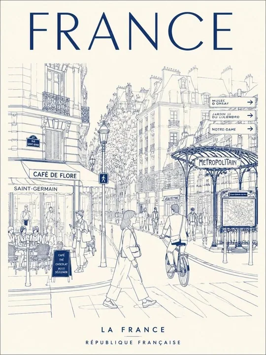
Prompt
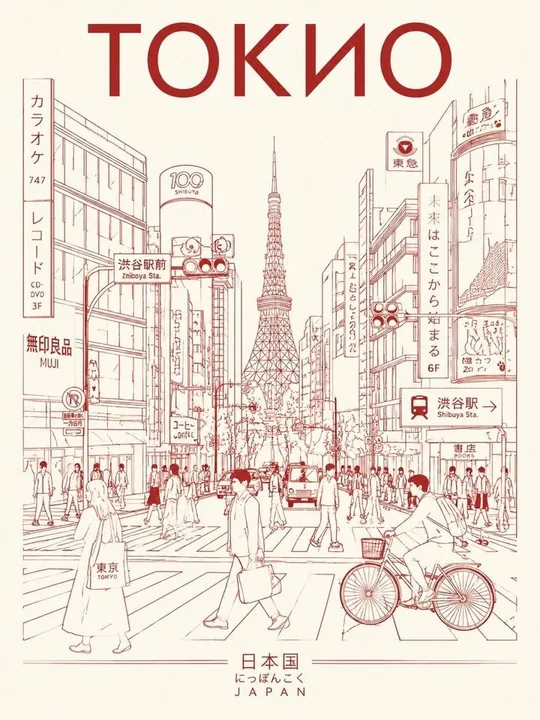
Create a minimalist, ultra-high-resolution line art travel poster about [TOKYO], depicting the city as a stylish, everyday urban scene, not a tourist postcard.

MAIN COMPOSITION:
- The central composition features the city's most iconic street, intersection, alley, tramway, or pedestrian alley.
- Foreground: Locals, commuters, cyclists, travelers, shoppers, students, and cafe patrons.
- People should naturally reflect the local lifestyle and trendy culture of the city.
- Background: filled with realistic local signage, cafes, restaurants, transit signs, shop windows, and architectural details.
- Attractions should seamlessly integrate into everyday life, rather than be exaggerated.
- Use authentic typography in the local language and culturally recognizable visual elements.
- Large font at top center:
"TOKYO"
- Subheading at bottom:
Examples of country or place names in the local language.

Style:
Ultra clean vector illustration, Swiss Art Nouveau travel poster, minimalist line art, monoline art, mid-century editorial aesthetic, architectural illustration, Japanese graphic poster style, clear geometric perspective, extremely clean negative space, premium tourism brand aesthetic.

LINEAR STYLE:
- Only monochrome line illustrations.
- Thin and precise lines.
- Minimal fill areas.
- Intricate detailing, like a city map.
- Rhythmic arrangement of signs, buildings, windows, and street objects.
- Visually dense yet highly organized composition.

COLOR SYSTEM - VERY IMPORTANT:
- Use only ONE primary color + ONE background color.
- Automatically select the color that best conveys the atmosphere of the city.
- Monochrome silkscreen poster aesthetics.
- No rainbow palettes.
- No excessive neon.
- Color should reflect the architecture, climate, nightlife, and cultural identity of the city.

Examples:
Tokyo → bright red on warm ivory
Paris → navy blue on cream
New York → charcoal on light gray
Kyoto → muted burgundy on warm cream
Hong Kong → turquoise on pale ivory
Santorini → Mediterranean blue on white
Cairo → desert sepia on sandy beige

Composition:
- Vertical poster layout.
- Frontal perspective at street level.
- Pedestrians crossing streets or moving naturally.
- Balanced urban rhythm and visual flow.
- Should resemble a premium urban brand advertising poster.

Mood:
Stylish city life,
calm yet vibrant,
travel magazine cover,
timeless city identity,
visual imagery for a premium tourism campaign,
minimalist, yet highly detailed.

TEXT QUALITY IS CRUCIAL:
- All fonts must be legible and neat.
- No stray characters.
- No broken or distorted letters.
- Local signage must look authentic and natural.
- Professional typography.

Output:
- Vertical poster composition.
- Ultra-detailed 8K format.
- Print-ready.
- Ultra-precise vector quality.

Create a minimalist, ultra-high-resolution line art travel poster of Tokyo, portraying the city as a stylish everyday urban scene rather than a tourist postcard.

Main composition:
- The central composition should show the city’s most representative street, intersection, alley, tram tracks, or pedestrian lane.
- Foreground: local residents, commuters, cyclists, travelers, shoppers, students, and cafe customers.
- The people should naturally reflect the city’s local lifestyle and trend culture.
- Background: filled with realistic local signs, cafes, restaurants, traffic signs, shop windows, and architectural details.
- Attractions should blend seamlessly into everyday life rather than being deliberately exaggerated.
- Use authentic typography in the local language and culturally recognizable visual elements.
- Large text at the top center:
"TOKYO"
- Bottom subtitle:
Example country/place names labeled in the local language.

Style:
Ultra-clean vector illustration, Swiss Art Nouveau travel poster, minimalist line art, monoline art, mid-century editorial aesthetic, architectural illustration, Japanese graphic poster style, clear geometric perspective, minimalist negative space, premium travel brand aesthetic.

Line style:
- Monochrome line illustration only.
- Delicate and precise lines.
- Very limited filled areas.
- Dense and detailed like a city map.
- Rhythmic arrangement of signs, buildings, windows, and street objects.
- Visually dense but highly ordered composition.

Color system - very important:
- Use only one primary color + one background color.
- Automatically choose the color that best conveys the atmosphere of the city.
- Monochrome silkscreen poster aesthetic.
- No rainbow palettes.
- No excessive neon.
- The color should reflect the city’s architecture, climate, nightlife, and cultural identity.

Examples:
Tokyo → bright red on a warm ivory background
Paris → navy blue on a cream background
New York → charcoal black on a light gray background
Kyoto → dark burgundy on a warm cream background
Hong Kong → turquoise on a pale ivory background
Santorini → Mediterranean blue on a white background
Cairo → deep desert brown on a sandy beige background

Composition:
- Vertical poster layout.
- Frontal street-level perspective.
- Pedestrians crossing the street or walking naturally.
- Balanced urban rhythm and visual flow.
- Should present the texture of a premium urban brand advertising poster.

Mood:
Stylish city life, calm yet vibrant, travel magazine cover feel, timeless city identity, visual imagery for tourism promotion, premium feeling, minimalist yet richly detailed.

Text quality is crucial:
- All fonts must be clear and tidy.
- No stray characters.
- No broken or distorted letters.
- Local signage must look authentic and natural.
- Professional typography.

Output:
- Vertical poster composition.
- Ultra-detailed 8K format.
- Print-ready.
- Ultra-precise vector quality.
More prompts

Case 8918
Exhausted and collapsed: Fitness girl after a deadlift
{ "title": "Gym Exhaustion After Heavy Lifting", "description": "A woman lies face down on a gym platform floor after an intense workout session. She is wearing a dark long-sleeve athletic top, black shorts, and fingerless workout gloves. N
运动风健身健身房力竭举重
Case 14866
Cinematic summer coastal road Japanese woman lifestyle portrait
Ultra-realistic cinematic vertical portrait, 4:5 aspect ratio, of an extraordinarily beautiful 28-year-old Japanese woman on a coastal road trip during a bright summer morning. She is the clear main subject, shown in a full-body to medium-f