Case 26819
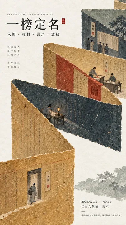
现代东方编辑美学历史文化海报
Prompt
【Subject / Exhibition Name】{Fill in, e.g.: Imperial Examination System / Urban Night Patrol / Ancient Water Conservancy / Mortise and Tenon Structure}
【Main Title】{Fill in}
【Core System / Cultural Logic】{Fill in, e.g.: Entering the Arena → Sealing → Releasing the Results / Evening Drum → Night Patrol → Morning Opening / Diverting Water → Measuring Water → Irrigation}
【Main Color Gamut】{Fill in 3–5 colors, e.g.: Old Wheat Gold + Ink Green + Cinnabar / Deep Indigo + Gray Blue + Warm Ochre}
【Micro-scene Nodes】{Fill in 2–4 consecutive scenes}
【Exhibition Information】{Date / Location / Exhibition Type, optional}
【Aspect Ratio】9:16 vertical

Design a historical and cultural poster with modern Eastern editorial aesthetics, using "paper fiber + large color gamut + micro-scenes" as the core visual language. Do not understand traditional culture as stacking ancient buildings, calligraphy, auspicious clouds, or artifacts; instead, first extract the 【Core System / Cultural Logic】, and then let large areas of handmade paper color fields directly bear the structure, space, time, flow, order, or procedural relationships, so that the audience first sees a strong and clear large shape from a distance, and only upon closer inspection gradually discovers the cultural narrative hidden within.

Use the 【Main Color Gamut】 to establish 2–5 main paper color blocks with significantly different areas, maintaining low saturation but complete color concentration. All color blocks have the texture of real and rich handmade paper, pulp, watercolor, or mineral pigments, with visible natural long and short fibers, pigment deposits, slight indentations, large-scale natural color differences, and irregular torn paper edges; the overall effect is matte, clean, and complete, without being dirty, old, yellow-spotted, randomly mottled, cheap retro, or digital gradients. According to the theme, let the color gamut express the institutional operation logic through folding, branching, interleaving, interlocking, staggered layers, supporting, segmenting, enclosing, or negative space relationships, rather than simply serving as background decoration.

Embed 【Micro-scene Nodes】 within the large color gamut structure, keeping figures and props at a very small scale, totaling about 3%–6% of the frame. Each scene must show a clear action, and there should be a causal or temporal relationship between them, such as "Enter → Execute → Record → Complete," letting the miniature figures truly carry the narrative rather than just posing. The clothing of the characters and the artifacts should conform to the theme's era and identity but remain restrained, not like a film or television ancient costume blockbuster; the scenes retain only the key props that can explain the institutional relationship, without being piled with decorations and irrelevant cultural symbols.

Typography uses the editorial language of modern Eastern cultural institutions, museums, or archival exhibitions. The main title 【Main Title】 uses exquisite Songti, Ming-style, or Chinese fonts with a sense of publication, keeping the font size at a small to medium scale so the text does not overwhelm the large color gamut; auxiliary English, dates, locations, and explanatory information use smaller font sizes to form a clear hierarchy. Minimal cinnabar marks, paper slips, archival labels, or node text can be added, but they must have a real relationship with the theme's logic and cannot be just random decorations for a "National Style feel."

The overall reading order should be: large color gamut structure and color relationships → institutional or spatial logic → miniature figure continuous narrative → main title and exhibition information. The final image should achieve a strong large shape and visual impact from afar, and have paper fibers, character actions, and historical details up close, combining a sense of design, narrative, and cultural completeness. Avoid book cover feelings, traditional ancient style illustrations, full-screen ancient buildings, huge titles, PPT-style regular layouts, modern infographic arrows, meaningless English placeholders, stacking of elements, commercial advertising feelings, 3D CGI, glass materials, neon colors, logos, watermarks, numbering, and starburst decorations.

【主题 / 展览名称】{填写,例如:科举制度 / 城市夜巡 / 古代水利 / 榫卯结构}
【主标题】{填写}
【核心制度 / 文化逻辑】{填写,例如:入闱→弥封→放榜 / 暮鼓→夜巡→晨启 / 分水→量水→灌溉}
【主色域】{填写 3–5 个颜色,例如:旧麦金 + 墨青 + 朱砂 / 深靛蓝 + 灰蓝 + 暖赭}
【微场景节点】{填写 2–4 个连续场景}
【展览信息】{日期 / 地点 / 展览类型,可选}
【画幅比例】9:16 竖版

设计一张具有现代东方编辑美学的历史文化海报,以「纸纤维 + 大色域 + 微场景」作为核心视觉语言。不要把传统文化理解成堆叠古建筑、书法、祥云或器物,而是先提炼【核心制度 / 文化逻辑】,再让大面积手工纸色域直接承担结构、空间、时间、流向、秩序或流程关系,使观众远看首先看到强烈而清晰的大形,近看才逐渐发现隐藏在其中的文化叙事。

使用【主色域】建立 2–5 个面积明显不同的主纸色块,保持低饱和但色彩浓度完整。所有色块具有真实丰富的手工纸、纸浆、水彩或矿物颜料质感,可见天然长短纤维、颜料沉积、轻微压痕、大尺度自然色差与不规则撕纸边缘,整体哑光、干净、完整,不做脏旧、黄斑、随机斑驳、廉价复古或数字渐变。根据主题让色域通过折叠、分叉、穿插、咬合、错层、承托、分段、围合或负空间关系表现制度运行逻辑,而不是简单作为背景装饰。

在大色域结构中嵌入【微场景节点】,人物与道具保持非常小的尺度,总体约占画面 3%–6%。每个场景都要表现一个明确动作,并且彼此存在因果或时间关系,例如“进入→执行→记录→完成”,让微型人物真正承担叙事,而不是站立摆拍。人物服装和器物符合主题时代与身份,但保持克制,不做影视古装大片;场景只保留能说明制度关系的关键道具,不堆满装饰和无关文化符号。

排版使用现代东方文化机构、博物馆或档案展览的编辑语言。主标题【主标题】使用精致宋体、明朝体或具有出版感的中文字体,字号保持中小尺度,不让文字压过大色域;辅助英文、日期、地点和说明信息使用更小字号,形成明确层级。可以加入极少朱砂印记、纸签、档案标签或节点文字,但必须与主题逻辑发生真实关系,不能只是为了“国风感”随机装饰。

整体阅读顺序应为:大色域结构与色彩关系 → 制度或空间逻辑 → 微型人物连续叙事 → 主标题与展览信息。最终画面要做到远看有强烈大形和视觉冲击,近看有纸纤维、人物动作和历史细节,兼具设计感、叙事感与文化完成度。避免书籍封面感、传统古风插画、满屏古建筑、巨大标题、PPT式规则排版、现代信息图箭头、无意义英文占位、元素堆砌、商业广告感、3D CGI、玻璃材质、霓虹色、Logo、水印、编号和星芒装饰。مطالب أخرى

Case 26810
盛夏海滩日本女性自然抓拍写实摄影
A photorealistic candid photograph taken at a Japanese beach on a summer day, vertical 9:16 composition. Two adult Japanese women, approximately 25–27 years old, are sitting on a beach towel spread over the sand, resting and chatting toget

Case 23575
日本少女与倒挂猫咪低角度手机自拍
The identity reference for a young Japanese woman, preserving her facial structure, skin tone, hairstyle characteristics, expression vibe, and recognizable appearance. Create a realistic vertical smartphone selfie taken indoors from a very
Case 26811