Case 15133
处暑主题现代纸印编辑视觉
Prompt
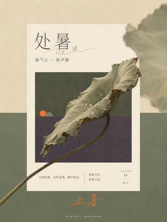
Generate an extremely narrow and long vertical editorial visual around a specific theme, creating three clear planar spaces consisting of an outer large color field, a central warm white paper page, and an indented theme window within the page. First, derive two structural colors from the thematic state contrast and emotional temperature, covering the majority of the image with a hard horizontal boundary; repeat this division in the embedded window with the same direction and similar proportions; the outer field is brighter and emptier, while the window is deeper and denser, with the paper white acting as the highest brightness interlayer of the entire painting. The weight of the image is concentrated in the middle, leaving a wide title area at the top and a relaxed emotional landing point at the bottom; the edges of the paper are straight, without heavy floating shadows, and a wide annotation strip is reserved below the window.

Extract a continuous and identifiable core form from the theme's direction, process, structural connections, and temporal changes, organizing it into a single diagonal axis running through the middle, making it cross at least two boundaries from inside the window, pressing over the window frame, entering the paper white space, and extending to the outer color field. The cross-boundary form remains complete and continuous, with the endpoints crossing the edges retaining the clearest recognition outlines, while internal details are moderately compressed; local forms go from dense to sparse along the diagonal axis, and other auxiliary objects are reduced to quiet small geometric focal points, stably remaining inside the window and near the color field boundary. Maintain a strict orthogonal order for the horizontal color boundary, vertical frame, rectangular paper, and inner window; only the core theme has the right to break the rules, establishing space through accurate occlusion relationships rather than relying on perspective or dramatic shadows.

Place a few homologous echoes on one side of the theme's momentum: enlarge, crop, and reduce the transparency and contrast of the core form, blurring it strongly until only soft color blocks remain, partially extending out of the canvas; the central subject remains clear, while the other side remains clean, giving the planar color field a sense of shallow air and memory. The colors maintain a clear area order, with the two structural colors together occupying about 80% of the image; the thematic intermediate color spans the two fields and stitches together cold and warm or state differences, while a small-area accent color appears twice at a long distance only at the visual focus within the window and the text gesture outside the paper. The specific hues change with the theme, but the brightness relationship—where paper white is the highest, a few deep outlines press the structure, and the accent color wins by saturation rather than area—remains stable.

The text system continues the order and boundary-crossing relationship of the image. The main title uses an elongated, sharp editorial serif skeleton with obvious stroke contrast and exquisite endpoints; the Chinese characters use a slender font with a bookish temperament and relaxed letter spacing. Transform a keyword into a continuous freehand thin line, lightly passing through or adjacent to the printed title, forming a private handwriting that echoes the theme's diagonal axis. Explanatory information is indented at the bottom of the paper, divided into two groups of medium-thin small characters and date-style micro-text; the area outside the bottom of the paper can use a group of handwritten text with long closing strokes to carry the second accent color, with only minimal metadata at the very bottom. Let the title, image, annotations, and footer decrease in density in sequence, ensuring the text does not suppress the core identifiable edges.

Treat objects with directionless soft daylight and low shadows, allowing the theme to retain limited realistic textures while still submitting to planar color blocks. The entire image is covered with extremely light art paper fibers, fine printing dots, and low-contrast scanning grain; textures in the paper and window are slightly more obvious, while the outer solid color field is more restrained; object edges allow for slight printing softening and color bleeding, while key outlines and glyphs remain clean. The final image first presents a white paper window in a two-color long format and a theme form growing continuously from inside the window to the outside, followed by the revelation of out-of-focus side shadows, exquisite headers, handwritten interventions, and micro-annotations, forming a modern paper-print visual where strict editorial order and a vivid sense of time coexist.
Theme: Chushu (End of Heat) of the Twenty-four Solar Terms.
Ratio 3:4

围绕具体主题内容生成一张极窄长的竖版编辑视觉,让外部大色场、中央暖白纸页与纸页内缩的主题画窗构成三层清楚的平面空间。先从主题的状态对照与情绪温度中推导两种结构色,以一条硬水平分界覆盖画面绝大面积;在内嵌画窗中用相同方向和相近比例缩小复述这组分区,外场更明、更空,窗内更深、更密,纸白作为全画最高明度的隔层。画面重量集中在中段,上部保留宽阔标题区,下部留出舒展的情绪落点;纸页边缘平直,不使用厚重悬浮阴影,画窗下方保留宽阔注释带。

从主题的方向、过程、结构连接与时间变化中提取一条连续可识别的核心形态,把它组织成贯穿中段的单一斜轴,使其从画窗内部跨过至少两道边界,压住窗框、进入纸面留白并延伸到外部色场。跨界形态保持完整连续,越过边缘的端点保留最清楚的识别轮廓,内部细节适度压缩;局部形态沿斜轴由密到疏,其余辅助对象缩成安静的小型几何焦点,稳定留在画窗内部并靠近色场分界。让水平色界、竖向画幅、矩形纸页和内窗维持严格正交秩序,只有核心主题获得破格权,以准确遮挡关系建立空间,而不是依靠透视或戏剧投影。

在主题动势的一侧边缘布置少量同源回声:将核心形态放大、裁切、降低透明与对比,强烈失焦到只剩柔软色块,局部越出画布;中心主体保持清楚,另一侧保持干净,使平面色场获得浅层空气和记忆感。色彩保持清晰的面积秩序,两个结构色共同占据约八成画面,主题中介色跨越两场并缝合冷暖或状态差异,一个小面积强调色只在窗内视觉焦点与纸页外文字手势处远距离出现两次。具体色相随主题改变,但纸白最高、少量深轮廓压住结构、强调色以饱和度而非面积取胜的明度关系保持稳定。

文字系统延续图像的秩序与越界关系。主标题使用瘦长、细锐、笔画反差明显、端点精致的编辑衬线骨架,中文采用纤细而有书刊气质的字形,字距舒展;将一个关键词转化为连续自由的手写细线,轻轻穿过或邻接印刷标题,形成与主题斜轴呼应的私人笔迹。解释性信息缩进纸页下部,以两组中细小字和日期型微字分列;纸页外下方可用一组带长收笔的手写文字承接第二个强调色,最底边只保留极小元数据。让标题、图像、注释和页脚依次降低密度,不让文字压住核心识别边缘。

以无方向的柔和日光和低阴影处理对象,使主题保留有限的真实材质,却仍服从平面色块。全图覆盖极轻的艺术纸纤维、细印刷网点与低对比扫描颗粒,纸页和画窗中的纹理略明显,外部纯色场更克制;对象边缘允许微小印刷柔化与溢色,关键轮廓和字形仍保持清洁。最终画面第一眼呈现双色长幅中的白色纸窗与从窗内连续生长到窗外的主题形态,随后才显露失焦边影、精细题头、手写干预和微型注释,形成严格编辑秩序与鲜活时间感并存的现代纸印视觉。
主题:二十四节气之处暑

比例3:4
更多提示词
Case 9473
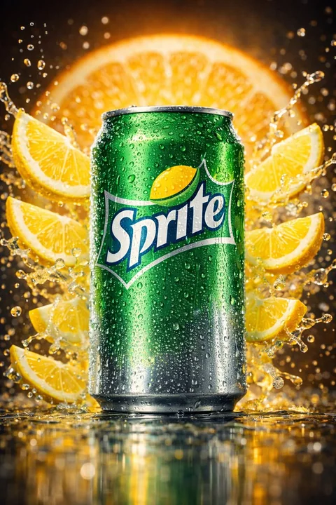
冰爽雪碧与青柠爆裂飞溅
{ "image_request": { "metadata": { "product": "Sprite", "flavor_profile": "Lemon-Lime", "quality": "Advertising-Grade" }, "subject": { "primary": "Classic green Sprite aluminum can", "positioning": "Upright, 5-degree forward tilt", "brandin
微距广告风冰镇飞溅青柠
Case 28072
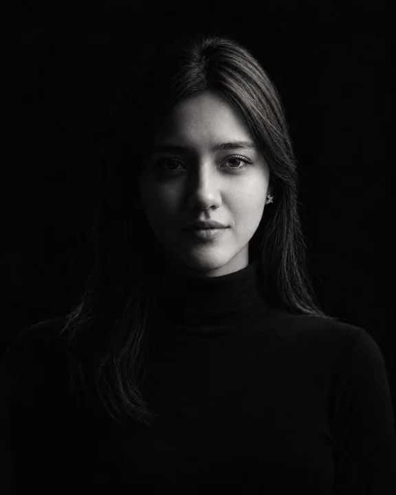
极简主义黑白美术肖像摄影
{ "task": "image_generation", "reference_image": { "role": "identity_reference_only", "instruction": "Use the uploaded reference image only to preserve the person's identity. Do not copy the reference image's original pose, clothing, light