Case 25189
تصميم ملصقات لصفحات الرأي في المجلات الغذائية الحديثة
Prompt
أنشئ ملصقًا تحريريًا للأطعمة بنسبة 9:16 بناءً على المدخلات التالية:

العلامة التجارية: {اسم العلامة التجارية}
الطعام / المشروب: {المنتج الرئيسي}
العنوان الرئيسي: {العبارة الترويجية الرئيسية}
النص الداعم: {اسم المنتج / المكونات / السعر / ساعات العمل}
لون الخلفية: {لون محايد فاتح أو لون علامة تجارية ناعم}
ألوان التمييز: {1–2 لون تمييز مقيد}
كلمة الخط: {كلمة قصيرة واحدة مرتبطة بالمنتج}
اتجاه التكوين: {عمودي / قطري / دائري / متقاطع / أفقي}

ابنِ الملصق بأكمله حول الشكل الطبيعي واتجاه الطعام نفسه.

استخدم منتجًا رئيسيًا واحدًا واضحًا مع تصوير فوتوغرافي واقعي للغاية للأطعمة: قوامات شهية، إضاءات طبيعية، ظلال، رطوبة، فتات، طلاء لامع، جبن ذائب، انعكاسات زجاجية، مكونات طازجة، أو تفاصيل أخرى مناسبة للمنتج. تجنب CGI، القوام البلاستيكي، المبالغة في المعالجة، أو التصوير التجاري العام.

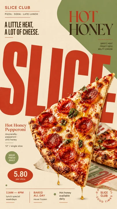
دع شكل المنتج يحدد حركة التخطيط. يمكن لمشروب طويل أن يقود تكوينًا عموديًا، ويمكن لقطعة بيتزا أن تخلق قطرية قوية، ويمكن لعاء دائري أن يوجه خطًا دائريًا، ويمكن للمنتجات المتقاطعة أن تشكل بنية على شكل X.

استخدم خطًا تحريريًا ضخمًا كجزء نشط من التكوين. يجب أن تكون الكلمة الرئيسية كبيرة جدًا، مقصوصة بواسطة اللوحة، مخفية جزئيًا خلف الطعام، مقسمة عبر مناطق مختلفة، أو مدورة، أو منحنية، أو ممتدة خارج الإطار وفقًا لهندسة المنتج.

يجب أن يتداخل الطعام والخط ويتفاعل معًا. لا تكتفِ بوضع النص بجانب المنتج. دع المنتج يغطي أجزاء من الحروف، يعبر حدود الخط، يخترق كتل الألوان، أو يكسر الشبكة، بحيث يبدو التصوير الفوتوغرافي والتصميم الجرافيكي متكاملين.

استخدم تسلسلًا هرميًا واضحًا:
خط عرض ضخم،
تصوير فوتوغرافي رئيسي للطعام،
العنوان الرئيسي،
معلومات المنتج،
السعر / الوقت / تفاصيل داعمة قصيرة.

حافظ على جميع النصوص الداعمة ذات معنى ومختصرة. لا تستخدم Lorem Ipsum أو نصوص حشو عشوائية.

استخدم نظام ألوان مقيدًا مع خلفية فاتحة، ألوان طعام واقعية، و1–2 لون تمييز للعلامة التجارية. أضف فقط عناصر جرافيك قليلة مثل خطوط رفيعة، نقاط، إطارات مفتوحة، كتل هندسية، أشكال عضوية ناعمة، أو ملصقات معلومات صغيرة.

يجب أن يبدو التكوين ديناميكيًا وغير متماثل، مع الحفاظ على إشراف فني دقيق، مع مساحة سلبية كافية للحفاظ على قابلية قراءة الملصق.

الأسلوب النهائي: تصميم تحريري حديث للأطعمة، خط جريء، تكوين ديناميكي، تصوير فوتوغرافي واقعي للأطعمة، هوية علامة تجارية عصرية كلاسيكية، تباعد نظيف، مرح لكن احترافي.