Case 26760
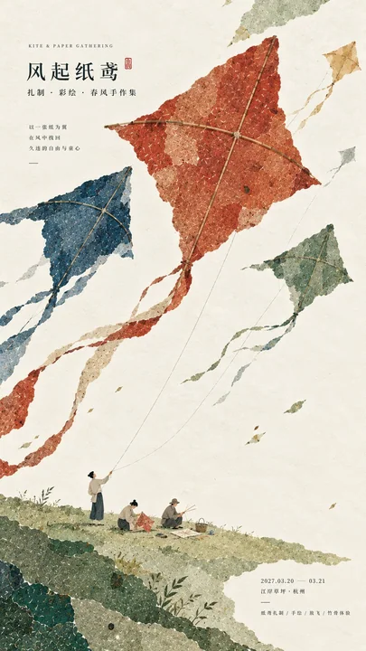
现代东方编辑美学文化活动海报
Prompt
【Theme / Event Name】
【Main Color Gamut】
【Micro Scene】
【Cultural Elements】
【Title Text】
【Auxiliary Information】
【Aspect Ratio】

Design a cultural event poster with modern Oriental editorial aesthetics. The core visual adopts a composition of "Large Color Gamut + Micro Scene" and incorporates obvious but restrained paper collage and watercolor material language.

The image uses large areas of low-saturation color blocks as the primary visual subject, using 【Main Color Gamut】 to establish a strong and complete large-scale relationship. Color blocks can constitute abstract spaces such as mountain ranges, waterfronts, courtyards, workshops, kites, or dyed cloth through tearing paper, layering, blocking, enclosing, interleaving, hanging, diagonal extension, or white negative space, but do not draw them directly as ordinary realistic scenes. From a distance, a clear large-color-gamut composition is seen first, and it still has obvious recognition in thumbnail status.

All color blocks have rich and realistic textures of handmade paper, watercolor pulp, and mineral pigments, with visible natural paper fibers, pigment deposition, slight indentations, rubbings, natural shade variations, and irregular torn paper edges. The material is delicate and rich but remains clean and complete, without being dirty, old, having yellow spots, severe damage, strong grain, or cheap retro filters. The overall presentation is matte, natural, and has a breathable paper-like tactile feel.

Between the large areas of color gamut, add a 【Micro Scene】 that is very small in scale but complete in content. Characters and props overall account for only about 2%–5% of the screen. Characters are truly doing something, rather than posing for a photo. Tell a small story through actions, objects, and spatial relationships, such as flying, playing the qin, drinking tea, rubbing, drying books, dyeing cloth, or making pottery. Character clothing is natural and restrained, unified with the overall cultural theme, and does not grab the primary vision of the large color gamut.

The micro scene can include a small amount of 【Cultural Elements】, but control the quantity and information density. Props are naturally scattered or participate in character actions, not product displays, and do not crowd the screen. A very small area of warm-colored nodes, vermillion marks, lights, the moon, or object colors can be set as the finishing touch, usually controlled at 1%–3% of the screen.

The typography adopts restrained Oriental editorial design language. The main title 【Title Text】 uses exquisite Chinese Songti, Mingti, or modern fonts with a sense of publication. The font size should not be too large, maintaining sufficient white space, making the text the second visual level rather than overpowering the screen with huge Typography. Auxiliary English, dates, locations, and event information use smaller font sizes to form a clear information hierarchy. All text must have real meaning, do not use meaningless placeholders such as RANDOM, DESIGN, ART, STUDIO, etc.

The composition avoids mechanical centering and regular PPT grids, prioritizing asymmetrical layouts, large areas of white space, color block misalignment, front-and-back blocking, and density contrast. Let the image form a reading experience of "simple from a distance with large shapes; material, scenes, and stories upon close inspection".

The overall style should present a visual effect of merging modern Oriental cultural posters, paper collage, watercolor textures, editorial design, and micro-narratives, which is high-end, natural, restrained, and has a cultural temperament, while possessing the completeness of a real professional poster.

Avoid: book cover déjà vu, huge titles, traditional ink painting, ordinary national style illustrations, realistic photography backgrounds, PPT-style layout, commercial advertising feel, stacking of elements, over-decoration, dirty and old paper, random noise, plastic feel, 3D CGI, glass materials, neon colors, logos, watermarks, numbering, starlight decorations.

【主题 / 活动名称】
【主色域】
【微场景】
【文化元素】
【标题文字】
【辅助信息】
【画幅比例】

设计一张具有现代东方编辑美学的文化活动海报,核心视觉采用「大色域 + 微场景」的构成方式,并加入明显但克制的纸本拼贴与水彩材质语言。

画面以大面积低饱和色块作为第一视觉主体,使用【主色域】建立强烈、完整的大形关系。色块可以通过撕纸、叠层、遮挡、围合、穿插、悬挂、斜向延伸或留白负空间构成山势、水岸、庭院、工坊、纸鸢、染布等抽象空间,但不要直接画成普通写实场景。远看首先看到清晰的大色域构图,缩略图状态下仍具有明显识别度。

所有色块具有丰富真实的手工纸、水彩纸浆和矿物颜料质感,可见天然纸纤维、颜料沉积、轻微压痕、擦印、自然浓淡变化与不规则撕纸边缘。材质细腻丰富但保持干净完整,不做脏旧、黄斑、严重破损、强颗粒或廉价复古滤镜。整体呈现哑光、自然、有呼吸感的纸本触觉。

在大片色域之间加入一个尺度非常小但内容完整的【微场景】。人物与道具整体只占画面约 2%–5%,人物正在真实地做一件事情,而不是站立摆拍。通过动作、器物和空间关系讲清一个小故事,例如放飞、弹琴、饮茶、拓印、晒书、染布、制陶等。人物服装自然克制,与整体文化主题统一,不抢夺大色域的第一视觉。

微场景可以加入少量【文化元素】,但控制数量和信息密度。道具自然散落或参与人物动作,不做商品陈列,不堆满画面。可以设置一个面积很小的暖色节点、朱红印记、灯火、月亮或器物色彩作为点睛,通常控制在画面 1%–3%。

排版采用克制的东方编辑设计语言。主标题【标题文字】使用精致的中文宋体、明朝体或具有出版感的现代字体,字号不要过大,保持充足留白,让文字成为第二视觉层级,而不是用巨大 Typography 压住画面。辅助英文、日期、地点和活动信息采用更小字号,形成清楚的信息层级。所有文字必须有真实意义,不使用 RANDOM、DESIGN、ART、STUDIO 等无意义占位词。

构图避免机械居中和规则 PPT 网格,优先使用不对称布局、大面积留白、色块错位、前后遮挡和疏密反差。让画面形成“远看简洁、有大形;近看有材质、有场景、有故事”的阅读体验。

整体风格应呈现现代东方文化海报、纸本拼贴、水彩材质、编辑设计与微型叙事融合的视觉效果,高级、自然、克制、有文化气质,同时具备真实专业海报的完成度。

避免:书籍封面既视感、巨大标题、传统水墨画、普通国风插画、写实摄影背景、PPT式排版、商业广告感、元素堆砌、过度装饰、脏旧纸张、随机噪点、塑料感、3D CGI、玻璃材质、霓虹色、Logo、水印、编号、星芒装饰。
他のプロンプト
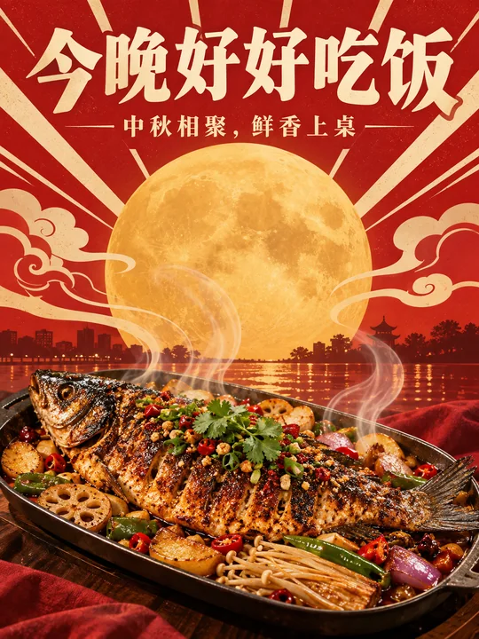
Case 26787
复古未来主义风格中秋烤鱼美食海报
复古海报美食中秋烤鱼
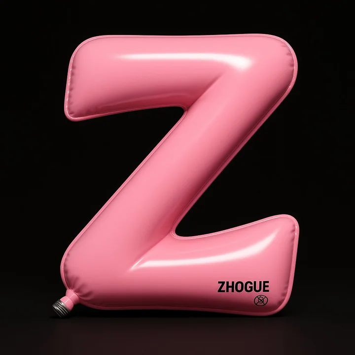
Case 22
カスタムバルーン
非常に高精細な3Dインスタレーションアート:アルファベットの「Z」は、インフレータブルなボール状にデザインされており、全体の形状は滑らかに曲がった「Z」字の経路のように見え、2本の斜め線と1つの折れ角から構成されている。縁はわずかに巻き上がっているように見え、柔らかい空気圧感を表現している。 視点は正面からやや上向き(約10°)の正射影で、主体は画面中央に配置されており、ほぼ全体を占めている。背景は純黒であり、劇場のスポットライトのような集中的な舞台効果を作り出している。
minimalisttypographytoy3D打印