Case 26960
现代东方纸纤维美学历史文化海报
Prompt
[Theme / Exhibition Name] {Fill in, e.g.: Urban Fire Prevention / Ice Storage System / Maritime Trade Clearance / Voucher Verification}
[Main Title] {Fill in}
[Core Institutional Logic] {Fill in, e.g.: Alarm → Fetch water → Block fire / Storage → Preservation → Retrieve ice / Check records → Seal goods → Release / Combined verification → Passage}
[Main Space Mechanism] {Fill in, e.g.: Gamut cutting / Shallow outside deep inside / Diagonal sails / Left-right complementarity}
[Main Color Gamut] {Fill in 3–5 colors, e.g.: Brick Ocher + Charcoal Black + Gray-Blue / Ice Gray-Blue + Deep Indigo + Warm Ocher / Ink Sea Blue + Sea Pine Green + Old Sail Yellow}
[Microscopic Scenes] {Fill in 2–4 real actions related to the institution}
[Key Visual Nodes] {Fill in, e.g.: Firebreak cut / Hot and cold boundary / Continuous rope / Cross-seam mark}
[Exhibition Information] {Date / Venue, optional}
[Aspect Ratio] 9:16 Vertical

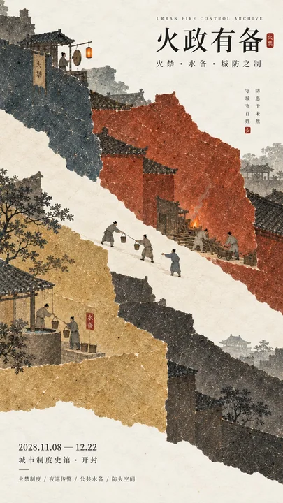
Design a historical and cultural exhibition poster with modern Oriental editorial aesthetics, using "paper fiber + large color gamut + micro scenes" as the core visual language. Do not paint ordinary ancient style scenes first, but first extract the [Core Institutional Logic], and then directly transform the [Main Space Mechanism] into the first visual of the entire screen, letting large areas of paper color gamut bear abstract relationships such as "blocking, deepening, connecting, verifying, passing, and storing."

Use the [Main Color Gamut] to establish 3–5 large handmade paper color blocks with significantly different areas. All color blocks have real and rich natural long and short fibers, pulp particles, mineral or plant pigment deposits, large-scale natural color differences, slight indentations, and irregular torn paper edges, keeping the overall matte, clean, complete, and weighty. When viewed from a distance, the clear large shapes, colors, and spatial relationships are seen first; only when viewed closely are the paper fibers and character details discovered. Avoid dirt, yellow spots, random mottling, strong noise, digital gradients, plastic feel, and CG texture.

Choose the most appropriate spatial mechanism according to the theme, do not mechanically apply templates. You can use a clear negative space cut to express "isolation," use layers of paper fields from shallow to deep to express "storage and depth," use large diagonal paper fields and thin ropes to express "navigation and customs clearance," and use two complementary paper color gamuts on the left and right to express "joint inspection and certification." Large color gamuts are not backgrounds, but visualized expressions of the theme itself.

Embed [Microscopic Scenes] into the large paper color gamut, with figures, artifacts, and tools generally controlled at about 3%–6% of the frame. Figures must perform real actions directly related to the institution, such as sounding alarms, fetching water, clearing obstacles, carrying, checking records, sealing goods, submitting vouchers, verifying, releasing, etc., rather than standing for poses. If the theme has a process, 2–4 small nodes with causal relationships can be set up, but do not make them into flowcharts, step cards, or storyboard frames; scenes should be naturally hidden in the large color gamuts and spatial nodes, letting the audience discover the complete story after approaching.

Add a clear but restrained [Key Visual Node], such as a fireproof negative space, a hot and cold boundary, a continuous hemp rope, a cross-seam vermilion seal, a sealing tag, or a small point of warm light. This node must have a real relationship with the institutional logic, rather than being a random decoration for "Oriental feeling." Accent colors like cinnabar red, warm orange, and old gold are usually controlled at 1%–5% of the total area.

Keep figure clothing and environment restrained, retaining only necessary elements to help understand the theme. Do not stack ancient buildings, auspicious clouds, flowers and birds, lanterns, landscapes, scrolls, seals, or large amounts of calligraphy. The scale of the figures should be small, the actions real, and the clothing low in saturation, avoiding the feel of film and television costume blockbusters. Concrete content always serves the large color gamut and institutional narrative, and does not grab the main visual.

Typography uses the Oriental editorial language of modern museums, historical archive exhibitions, and institutional history exhibitions. The main title [Main Title] uses slender, upright Chinese Songti, Mingti, or modern fonts with a sense of publication, maintaining a medium-small font size. English sub-headings, dates, and venue information use smaller font sizes. The entire poster should try to keep only three sets of core text: "English sub-heading + Chinese main title + date/venue," without adding long subtitles, poems, side vertical text, classification lists, and meaningless English placeholders.

The overall reading order should be: large paper color gamut and spatial mechanism → core institutional relationship → microscopic character continuous narrative → title and exhibition information. The final image should achieve a strong large shape, spatial tension, and color memory points when viewed from afar, and only reveal paper fibers, character actions, vouchers, ropes, transport, storage, or city defense details when viewed closely, combining material feel, design sense, and narrative sense.

【主题 / 展览名称】{填写,例如:城市防火 / 藏冰制度 / 海贸通关 / 凭证验证}
【主标题】{填写}
【核心制度逻辑】{填写,例如:传警→取水→隔火 / 入藏→储存→取冰 / 验册→封货→放行 / 合验→通行}
【主空间机制】{填写,例如:色域切割 / 外浅内深 / 斜向帆面 / 左右互补}
【主色域】{填写 3–5 个颜色,例如:砖赭 + 炭黑 + 灰青 / 冰灰蓝 + 深靛 + 暖赭 / 墨海蓝 + 海松绿 + 旧帆黄}
【微型场景】{填写 2–4 个与制度相关的真实动作}
【关键视觉节点】{填写,例如:防火切口 / 冷暖边界 / 连续绳索 / 跨缝印记}
【展览信息】{日期 / 场馆,可选}
【画幅比例】9:16 竖版

设计一张具有现代东方编辑美学的历史文化展览海报,以「纸纤维 + 大色域 + 微场景」作为核心视觉语言。不要先画普通古风场景,而是先提炼【核心制度逻辑】,再把【主空间机制】直接转化成整个画面的第一视觉,让大面积纸色域承担“阻断、深入、连接、验证、通行、储藏”等抽象关系。

使用【主色域】建立 3–5 个面积明显不同的大型手工纸色块。所有色块具有真实丰富的天然长短纤维、纸浆颗粒、矿物或植物颜料沉积、大尺度自然色差、轻微压痕和不规则撕纸边缘,整体保持哑光、干净、完整、有重量。远看时首先看到清楚的大形、色彩和空间关系,近看才发现纸纤维与人物细节。避免脏旧、黄斑、随机斑驳、强噪点、数字渐变、塑料感和CG质感。

根据主题选择最合适的空间机制,不要机械套模板。可以利用一道明显负空间切口表现“隔离”,利用由浅入深的层层纸域表现“储藏与纵深”,利用大型斜向纸域和细绳表现“航行与通关”,利用左右两块能够互补的纸色域表现“合验与认证”。大色域不是背景,而是主题本身的视觉化表达。

在大型纸色域中嵌入【微型场景】,人物、器物和工具总体控制在画面约3%–6%。人物必须执行与制度直接相关的真实动作,例如传警、取水、清障、搬运、验册、封货、递交凭证、核验、放行等,而不是站立摆拍。若主题存在流程,可设置2–4个彼此有因果关系的小节点,但不要做成流程图、步骤卡或分镜框;场景应该自然藏在大色域与空间节点中,让观众靠近后才发现完整故事。

加入一个明确但克制的【关键视觉节点】,例如一道防火负空间、一条冷暖边界、一根连续麻绳、一个跨缝朱印、一张封签或一小点暖光。这个节点必须与制度逻辑发生真实关系,而不是为了“东方感”随机装饰。朱砂红、暖橙、旧金等点睛色通常控制在整体面积1%–5%。

人物服装与环境保持克制,只保留能帮助理解主题的必要元素。不要堆叠古建筑、祥云、花鸟、灯笼、山水、卷轴、印章或大量书法。人物尺度要小、动作真实、服装低饱和,避免影视古装大片感。具象内容永远服务于大色域和制度叙事,不抢主视觉。

文字排版采用现代博物馆、历史档案展、制度史展览的东方编辑语言。主标题【主标题】使用纤细、端正的中文宋体、明朝体或具有出版感的现代字体,保持中小字号。英文小标、日期和场馆信息使用更小字号。整张海报尽量只保留「英文小标 + 中文主标题 + 日期场馆」三组核心文字,不加入长副标题、诗句、侧边竖文、分类列表和无意义英文占位。

整体阅读顺序应为:大型纸色域与空间机制 → 核心制度关系 → 微型人物连续叙事 → 标题与展览信息。最终画面要做到远看有强烈大形、空间张力和色彩记忆点,近看才出现纸纤维、人物动作、凭证、绳索、运输、储藏或城防细节,兼具材料感、设计感与叙事感。More prompts
Case 5
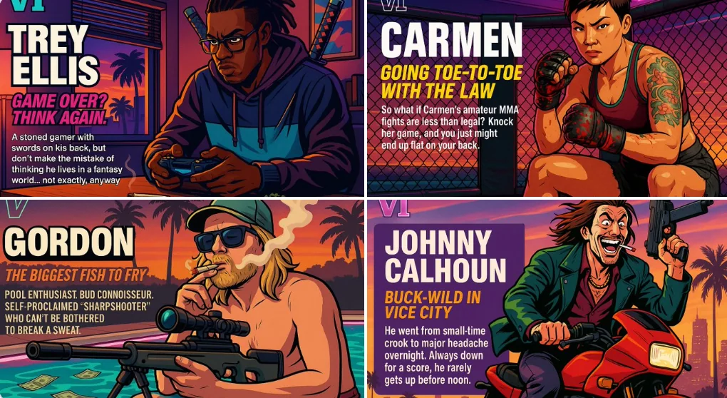
Create your own GTA character
**VI** **LUCIAN "THE SHADOW" VARGAS** *“In the city of vice, I cast no shadow — only fear.”* Lucian Vargas is a smooth-talking con artist with a heart of gold and a mind full of schemes. He's the kind of guy who can talk his way out of
characterlandscapeneongaming
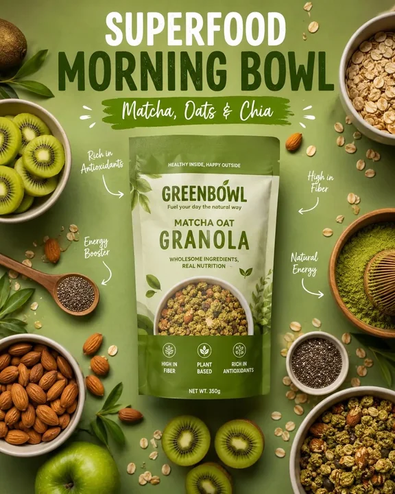
Case 12696
Minimalist high-end healthy breakfast cereal advertising poster
Ultra-realistic high-end healthy breakfast cereal brand advertisement poster, featuring centered matte pouch packaging labeled “Matcha Oat Granola,” green monochrome aesthetics, flat lay composition, soft studio lighting, a vibrant matcha g