Case 24435
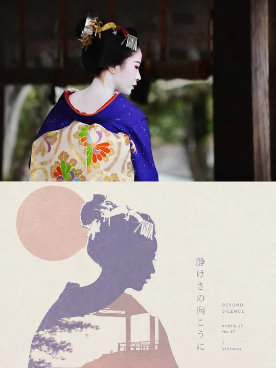
莫兰迪色系极简格式塔丝网版画海报
Prompt
Please make each photo I upload into an independent high-end design poster, no multi-photo stitching, each photo output individually. The overall composition uses a 3:4 vertical layout, with the upper and lower regions strictly 1:1 in height, each occupying 50% of the screen.

The upper part retains the original photo, maintaining the main structure, realistic texture, natural light and shadow, and original color atmosphere, with only slight high-end photography color grading to give it an art magazine, independent publication, and exhibition photography texture. To fit the frame, the sky, ground, or environmental background can be naturally extended, but the subject must not be stretched, distorted, or changed.

The lower part extracts the most recognizable subject, outline, posture, and narrative relationship from the photo, reconstructing it into a minimalist Gestalt positive and negative space screen print. Retain the most recognizable outer contour of the subject, while extracting an environment, structure, object, or symbolic image most closely related to it from the original photo, allowing the two to merge into a complete graphic through contour interlocking, negative space hollowing, boundary sharing, and figure-ground reversal: seeing the subject first from a distance, and discovering another layer of scene or image hidden within upon closer inspection. Do not simply stack two objects; let the edge of one shape naturally become the boundary of another.

The composition maintains a single visual anchor, clear silhouette, and large areas of white space, with positioning determined by the subject's own posture, orientation, center of gravity, and contour trend, using eccentricity, partial cropping, upper and lower nesting, or edge alignment to create a clever visual transition between positive and negative shapes. Auxiliary elements must be minimal, letting visual interest mainly come from the momentary switch between 'seeing what' and 'seeing what again,' rather than complex decoration.

The color scheme uses a healing, soft, and high-end Morandi pastel system, referring to the low-saturation color logic in dreamlike architectural spaces: misty pink, soft apricot, grey-green, sage, light terracotta, cream yellow, misty blue, grey-purple, etc., coordinating with each other, with a light-colored paper surface as the base, selecting the most spirited color relationships from the original photo for softening and recombination. Control the overall to 2–4 colors, establishing layers through a combination of color temperature, brightness difference, and area ratio. Colors are clean, soft, and airy, avoiding dirty grey, heavy aging, neon colors, and high-contrast commercial color schemes.

Retain slight paper fibers, screen printing particles, ink coverage, and registration deviations, giving the graphics a real printmaking touch, but keeping edges sharp and color blocks flat, without using gradients, 3D volume, realistic shadows, or smooth CG textures.

Text also participates in the positive and negative space composition. Extract a short English title from the photo's identity, location, action, emotion, state, or symbolic meaning, paired with a very small amount of location, number, status words, or micro-annotations. Text can be arranged along the subject's contour, negative space boundary, horizontal baseline, or white space axis, or partially embedded in graphics, cut by contours, or blocked by color blocks, making the text like a part of the print structure rather than a title pasted on later. The overall look remains small, restrained, clever, and with a high-end editorial feel.

The overall presentation combines minimalist geometry, Gestalt optical illusion, soft Morandi colors, screen printing, and poetic narrative visual temperament. Whether the subject is a person, animal, plant, building, object, vehicle, or natural landscape, it should maintain the dual reading experience of 'recognizing the subject at first glance and discovering the hidden image at second glance,' avoiding multiple parallel focal points, direct collage, complex illustrations, cartoonish feel, commercial promotional feel, and template feel.

Text preference: english

请将我上传的每一张照片分别制作成一张独立的高级设计海报,不多图拼接,每张照片单独输出。整体采用3:4竖版构图,上下两个区域高度严格1:1,各占画面50%。

上半部分保留原始照片,保持主体结构、真实质感、自然光影和原有色彩氛围,仅进行轻微高级摄影调色,使其具有艺术杂志、独立出版物和展览摄影质感。为适配画幅,可自然扩展天空、地面或环境背景,但不得拉伸、扭曲或改变主体。

下半部分提取照片中最具识别性的**主体、轮廓、姿态与叙事关系**,重构为极简的格式塔正负形丝网版画。保留主体最具有辨识度的外轮廓,同时从原图中提炼一个与其关系最紧密的环境、结构、物件或象征性意象,让二者通过**轮廓咬合、负形镂空、边界共用和图底反转**融为一个完整图形:远看首先识别主体,近看才发现另一层场景或意象隐藏其中。不要把两个对象简单叠放,而要让一个形状的边缘自然成为另一个形状的边界。

构图保持**单一视觉锚点、清晰剪影和大面积留白**,根据主体自身姿态、朝向、重心和轮廓走势决定位置,可采用偏心、局部裁切、上下嵌套或边缘对齐,使正形与负形之间形成巧妙视觉转换。辅助元素必须极少,让视觉趣味主要来自“看见什么”与“再次看见什么”的瞬间切换,而不是复杂装饰。

配色采用治愈、柔和而高级的**莫兰迪粉彩体系**,参考梦境般建筑空间中的低饱和配色逻辑:雾粉、柔杏、灰绿、鼠尾草、淡陶土、奶油黄、雾蓝、灰紫等相互协调,以浅色纸面为底,从原照片中选择最有精神的色彩关系进行柔化与重组。整体控制在2–4种颜色,通过综合色温、明度差和面积比例建立层次,颜色干净、柔和、有空气感,避免脏灰、沉重做旧、荧光色和高反差商业配色。

保留轻微纸张纤维、丝网印刷颗粒、油墨覆盖与套色偏差,使图形具有真实版画触感,但保持边缘清晰、色块平整,不使用渐变、3D体积、写实阴影或光滑CG质感。

文字同样参与正负形构图。从照片的**身份、地点、动作、情绪、状态或象征意义**中提炼一个简短英文标题,并搭配极少量地点、编号、状态词或微型注释。文字可沿主体轮廓、负形边界、水平基线或留白轴线排布,也可局部嵌入图形、被轮廓切断或与色块形成遮挡,使文字像版画结构的一部分,而不是后期贴上的标题。整体保持细小、克制、聪明而具有高级编辑感。

整体呈现**极简几何、格式塔错视、柔和莫兰迪色、丝网版画与诗意叙事**结合的视觉气质。无论主体是人物、动物、植物、建筑、器物、交通工具或自然景观,都应保持“一眼识别主体,第二眼发现隐藏意象”的双重阅读体验,避免多个并列焦点、直接拼贴、复杂插画、卡通感、商业宣传感和模板感。

文字偏好:english
More prompts
Case 28084
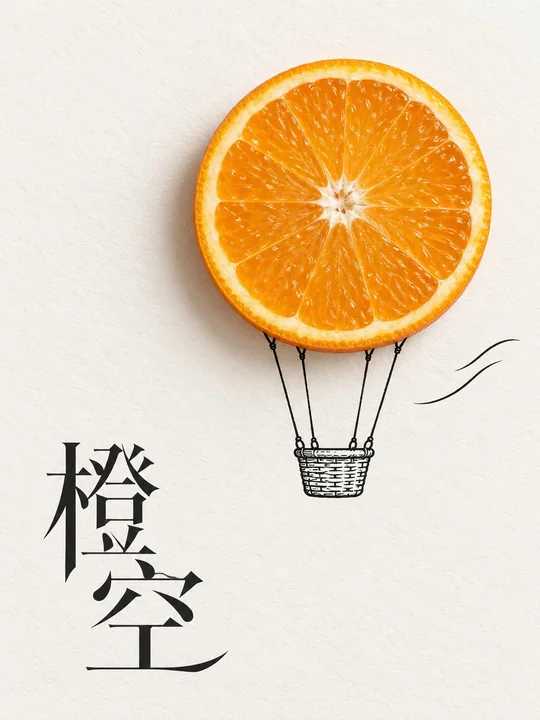
静物摄影结合手绘视觉海报
Generate a standalone 3:4 vertical creative poster, using a visual language that combines real still life photography and minimalist hand-drawing. The only realistic object is the [Object] from the uploaded photo, retaining its real outline
Case 24304
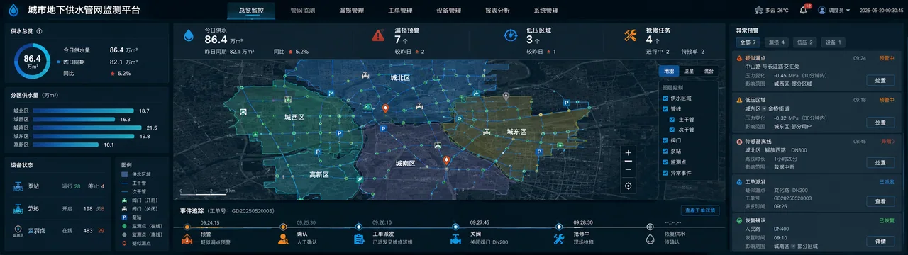
智慧城市供水管网数字孪生监测大屏
UI设计界面设计数据看板智慧水务供水管理