Case 15486
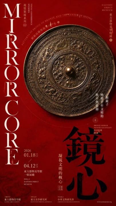
博物馆视觉聚核艺术展海报提示词
Prompt
Prompt:

【Subject】: ____
【Chinese Title】: ____
【English Title】: ____
【Core Object / Key Subject】: ____
【Convergence Method】: Concentric Embrace / Top-Down Sandwiched / Dual-Side Compression / Array Surrounding Core
【Main Color】: ____
【Auxiliary Color】: ____
【Date / Institution】: ____
【Ratio】: 9:16

Generate a "Visual Convergence" poster with high-end Museum Editorial / Exhibition Poster temperament.

First determine an absolute visual core, then organize objects, text, color blocks, and white space around it. The focus is not simply placing the subject in the center of the frame, but letting all other visual forces push the gaze toward the same core.

Choose a convergence structure based on the theme:

- Concentric Embrace: Use circular subjects, text, arcs, or information to form a centripetal relationship around the core.
- Top-Down Sandwiched: Use large color planes, titles, or white space at the top and bottom to exert pressure toward the center, locking the focus on the subject.
- Dual-Side Compression: Left and right Typography, color blocks, or information areas collectively converge toward the middle; the subject itself can also use framed outlines to form secondary focusing.
- Array Surrounding Core: Set one obviously largest main object, with multiple smaller elements surrounding it in an asymmetrical enclosure; must maintain clear size, density, and primary-secondary relationships.

The subject bears the main visual weight, and other elements can only "surround, point to, hold up, or balance" the core, without establishing a second visual center.

Typography participates in composition: Large Chinese titles are responsible for visual weight, while small English, date, and institution information are concentrated in 1–2 areas. Avoid scattering information evenly across the layout.

Control colors within 2–4 primary colors, establishing hierarchy through large color blocks, object textures, and white space; preserve enough negative space, do not stack decorations for the sake of richness.

Objects or subjects use real, exquisite museum collection photography / high-quality object photography texture, with natural and credible materials, textures, lighting, and shadows.

Final reading order:
First glance at the visual core → Second glance feeling the surrounding elements converging toward the core → Third glance reading the title and auxiliary information.

Overall requirements: Clear focus, distinct primary and secondary levels, strong editorial feel, restrained but tense, with the visual quality of mature art institutions, museum exhibitions, or high-end cultural posters.

Avoid: Subject simply centered, elements evenly distributed, multiple visual centers, sticker-style scattering, excessive information, decorations overshadowing the subject, e-commerce detail page feel, tourist cultural souvenir feel.

提示词:

【主题】:____
【中文标题】:____
【英文标题】:____
【主体器物 / 核心对象】:____
【聚核方式】:同心环抱 / 上下夹逼 / 双侧压缩 / 阵列围核
【主色调】:____
【辅助色】:____
【日期 / 机构】:____
【比例】:9:16

生成一张具有高级 Museum Editorial / Exhibition Poster 气质的「视觉聚核」海报。

先确定一个绝对视觉核心,再围绕它组织器物、文字、色块和留白。重点不是简单把主体放在画面中央,而是让其他视觉力量都把视线推向同一个核心。

根据主题选择一种聚核结构:

 同心环抱:利用圆形主体、文字、弧线或信息围绕核心形成向心关系。
 上下夹逼:用上下大色面、标题或留白向中部施压,把焦点锁定在主体。
 双侧压缩:左右 Typography、色块或信息区共同向中间收束,主体自身还可以利用框形轮廓形成二次聚焦。
 阵列围核:设置一个明显最大的主器,周围多个较小元素形成非对称围合;必须保持清楚的大小、疏密和主次关系。

主体承担主要视觉重量,其他元素只能“围绕、指向、托住或平衡”核心,不建立第二视觉中心。

Typography 参与构图:大中文标题负责视觉重量,小型英文、日期和机构信息集中在 1–2 个区域。避免把信息平均撒满版面。

色彩控制在 2–4 个主要颜色,通过大色块、器物材质和留白建立层级;保留足够负空间,不要为了丰富而堆叠装饰。

器物或主体使用真实、精致的博物馆藏品摄影 / 高质量对象摄影质感,材质、纹理、光影和阴影自然可信。

最终阅读顺序:
第一眼看到视觉核心 → 第二眼感受到周围元素向核心汇聚 → 第三眼阅读标题与辅助信息。

整体要求:聚焦明确、主次清晰、编辑感强、克制但有张力,具有成熟艺术机构、博物馆展览或高端文化海报的视觉品质。

避免:主体只是简单居中、元素平均分布、多个视觉中心、贴纸式散落、信息过量、装饰抢主体、电商详情页感、旅游文创感。
More prompts
Case 11189
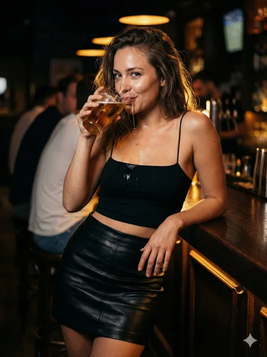
夜吧微醺女郎酒液滑落锁骨
{ "meta": { "aspect_ratio": "3:4", "style": "ultra-photorealistic nightlife portrait, cinematic bar realism", "quality": "high-end editorial photography with raw textures", "orientation": "vertical", "depth_of_field": "shallow background bl
人像性感微醺质感酒吧
Case 11199
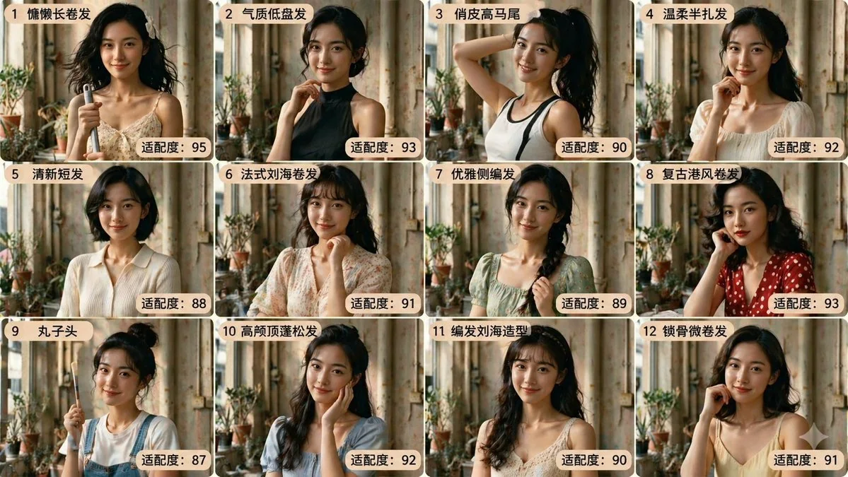
Twelve Grid Character Hairstyle Design Award
Design twelve different hairstyles for the character in the image, matching with different clothing and hairstyles, poses, displayed in a twelve-grid layout. And give a fitness score for each image.
角色图宫格图