Case 24946
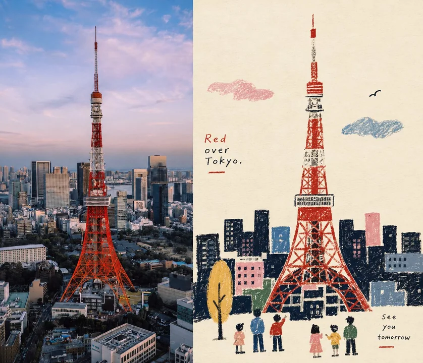
稚拙民艺感左右分屏叙事海报设计
Prompt
Please turn each photo I upload into an individual high-end design poster, no multi-photo collages, output each photo separately. Use a 7:6 aspect ratio with a side-by-side layout (not top-bottom), where the two areas are strictly 1:1 in width, each occupying 50% of the frame.

One half preserves the original photo, maintaining the subject's identity, structure, posture, authentic texture, natural light and shadow, and the original color atmosphere, with only slight high-end color grading to give it the texture of an art magazine, independent publication, or exhibition image. To fit the frame, the environment background can be naturally extended, but the subject must not be stretched, distorted, or altered.

The other half extracts the most recognizable subject, silhouette, posture, and narrative relationship from the photo, reconstructing it into a Naïve folk-inspired narrative illustration / Naïve folk-style textured flat narrative illustration. Do not fully trace the photo; instead, actively subtract details, retelling the original scene with silhouettes, primitive forms, a few color blocks, and iconographic elements, keeping only the visual clues that best maintain the subject's identity and story relationship, making the original object instantly recognizable while having a sense of clumsiness, humor, and life.

The subject's modeling centers on simplified silhouettes and large primitive forms. People, animals, buildings, plants, objects, or vehicles can have their proportions moderately compressed, structures summarized, and features exaggerated, without pursuing strict perspective and anatomy. The space uses flattened perspective, establishing narrative through height, overlapping, size, and color block relationships; auxiliary objects are distributed rhythmically like visual symbols, and complex backgrounds are actively deleted, letting a core action, relationship, or scene carry the main story.

The image uses grainy textures like crayons, oil pastels, thick pencils, and dry materials. Black or dark areas should not be filled uniformly but should retain traces of wiping, friction, layering, breakage, and the paper showing through; silhouettes have slight manual errors and a sense of clumsiness, and edges do not need to be absolutely neat. The overall look remains flat, without using realistic light and shadow, metallic materials, complex volumes, or smooth digital vectors.

The color scheme is reorganized by selecting the most vivid, memorable colors that best represent the subject's spirit from the photo, forming a concise and bright limited color palette. Overall, increase the cleanliness and vitality of colors, using warm white paper and dark silhouettes as a stable base, then naturally extracting a few spot-color accents like blue, red, yellow, green, pink, or orange from the original image for clothing, plants, food, architectural parts, or narrative focuses. Colors are distinct but not over-saturated, forming rhythm through large-area light-dark contrast and small-area pop colors, avoiding gray, muddy, Morandi-style, fluorescent colors, and cheap candy-like effects.

Composition emphasizes narrative center, visual weight, positive/negative shapes, size rhythm, and white space relationships. The subject does not need to be centered; it can be offset, partially cropped, or form a loose triangular relationship with auxiliary elements; leave enough blank space so that the rough silhouettes and small colored elements have room to breathe. From a distance, the structure is clear; up close, manual grains and slightly naive stylistic fun are visible, rather than filling all elements evenly.

A small amount of text is involved, without presetting fixed titles, locations, numbers, or languages, freely extracting a small amount of meaningful text based on the photo's subject, action, life state, emotion, or cultural context. Use lightweight, simple folk-art editorial fonts with slight manual printing deviations and irregular character spacing, which can be paired with a small amount of handwriting, making the text naturally exist like signs, menus, notes, or publication annotations in the scene. Text can be arranged staggered along the subject, desktop, wall, white space, or scene structure, participating in the narrative together with graphics, but do not form a regular commercial title bar.

The overall presentation is a visual temperament composed of naïve silhouettes, flat space, crayon grains, limited colors, folk art symbols, and editorial narrative: intimate, humorous, simple, smart, with a sense of life, while maintaining mature composition and design awareness. Avoid children's cartoons, cute stickers, realistic illustrations, smooth vectors, complex perspective, fine facial features, excessive details, 3D rendering, e-commerce illustration style, and templated effects.
——————
We changed it to a side-by-side layout, not top-bottom. Ratio 7:6.

请将我上传的每一张照片分别制作成一张独立的高级设计海报,不多图拼接,每张照片单独输出。整体采用3:4竖版构图,上下两个区域高度严格1:1,各占画面50%。

上半部分保留原始照片,保持主体身份、结构、姿态、真实质感、自然光影和原有色彩氛围,仅进行轻微高级调色,使其具有艺术杂志、独立出版物与展览图像质感。为适配画幅,可自然扩展环境背景,但不得拉伸、扭曲或改变主体。

下半部分提取照片中最具识别性的**主体、轮廓、姿态与叙事关系**,重构为 **Naïve folk-inspired narrative illustration / 稚拙民艺感质感型扁平叙事插画**。不要完整描摹照片,而是主动删减细节,以剪影、原始化形体、少量色块和图符化元素重新讲述原画面,只保留最能维持主体身份与故事关系的视觉线索,让人一眼认出原物,同时具有朴拙、幽默和生活感。

主体造型以**简化剪影与大块 primitive forms** 为核心,人物、动物、建筑、植物、器物或交通工具都可适度压缩比例、概括结构和夸张特征,不追求严格透视与解剖。空间采用 flattened perspective,以高低、遮挡、大小和色块关系建立叙事;辅助物件像视觉符号一样有节奏地分布,复杂背景主动删除,让一个核心动作、关系或场景承担主要故事。

画面使用**蜡笔、油画棒、粗铅笔与干性材料般的颗粒肌理**。黑色或深色区域不要均匀填满,而应保留擦拭、摩擦、叠涂、断裂和纸张透底的痕迹;轮廓略带手工误差和笨拙感,边缘不必绝对整齐。整体保持平面,不使用写实光影、金属材质、复杂体积或光滑数字矢量。

配色从上方照片中挑选**最鲜活、最有记忆点、最能代表主体精气神的颜色重新组织**,形成简洁而明快的 limited color palette。整体提高颜色的清洁度与生命力,以暖白纸面、深色剪影为稳定基底,再从原图自然提炼蓝、红、黄、绿、粉、橙等少量 spot-color accents,用于服饰、植物、食物、建筑局部或叙事焦点。颜色鲜明但不过度饱和,通过大面积深浅对比与小面积跳色形成节奏,避免灰脏、暗沉、莫兰迪化、荧光色和廉价糖果感。

构图重视**叙事中心、视觉重心、正负形、大小节奏和留白关系**。主体不必居中,可以偏置、局部裁切或与辅助元素形成松散的三角关系;保留足够空白,使粗粝的剪影与彩色小元素具有呼吸感。画面远看结构清楚,近看能看到手工颗粒和略带天真的造型趣味,而不是把所有元素平均铺满。

文字少量介入,不预设固定标题、地点、编号或语种,根据照片的主体、动作、生活状态、情绪或文化语境自由提炼少量有意义的文字。**使用轻巧、朴素、略带手工印刷偏差与不规则字距的民艺编辑字体**,可搭配少量手写字,让文字像画面中的招牌、菜单、便笺或出版物注释一样自然存在。文字可沿主体、桌面、墙面、留白或场景结构错落排布,与图形共同参与叙事,但不要形成规整商业标题栏。

整体呈现**稚拙剪影、平面空间、蜡笔颗粒、限制性色彩、民艺符号与编辑叙事**共同构成的视觉气质:亲切、幽默、朴素、聪明、有生活感,同时保持成熟的构图与设计意识。避免儿童卡通、可爱贴纸、写实插画、光滑矢量、复杂透视、精细五官、过度细节、3D渲染、电商插画感和模板化效果。
——————

我们改成左右布局,sidebyside 不要上下布局
比例7:6
Autres prompts
Case 18911
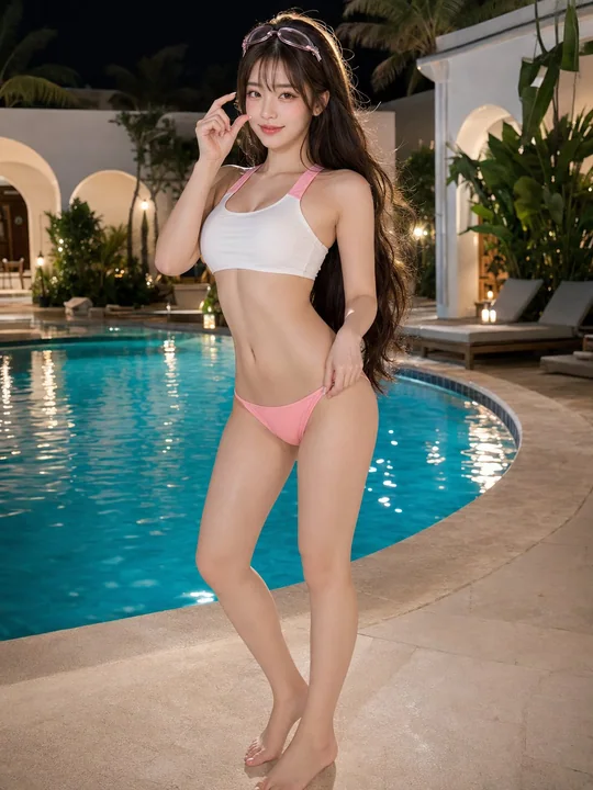
奢华度假村泳池畔东亚美女夜景人像
Create a photorealistic 3:4 full-body poolside portrait of an exceptionally beautiful adult East Asian woman standing beside a luxurious private resort swimming pool at night. She has long, thick dark-brown hair reaching her lower back, sof
Case 18907
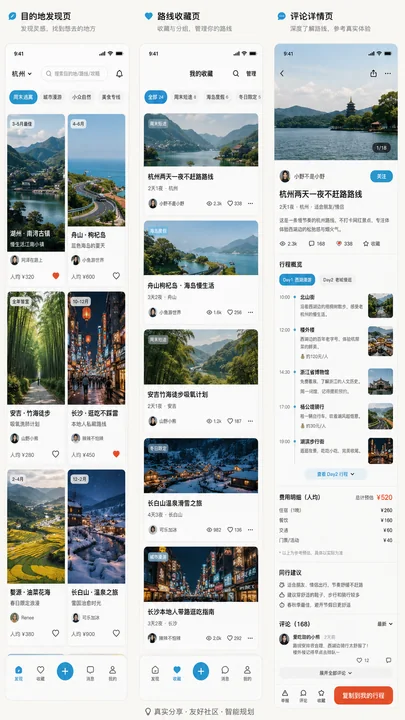
Z世代审美社区感旅行规划APP界面
UI设计高保真Z世代旅行APP社区感