Case 24591
稚拙油画棒旅行线描对照构图
Prompt
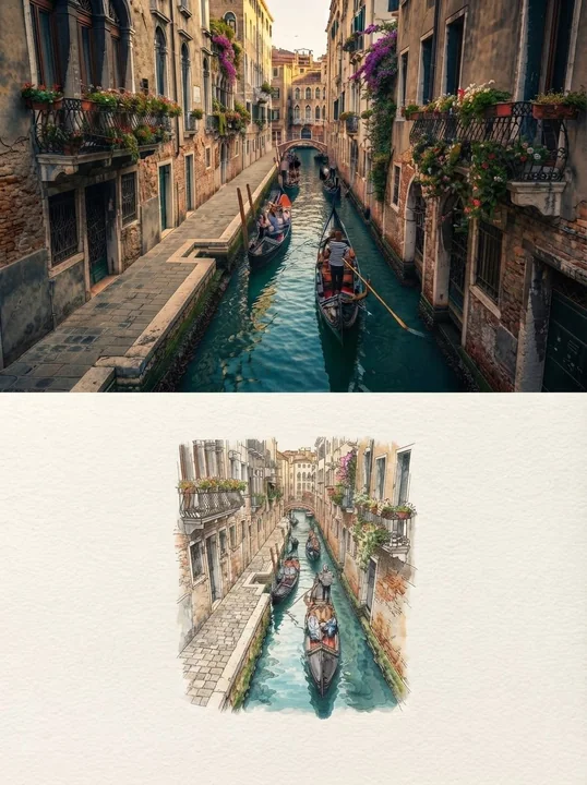
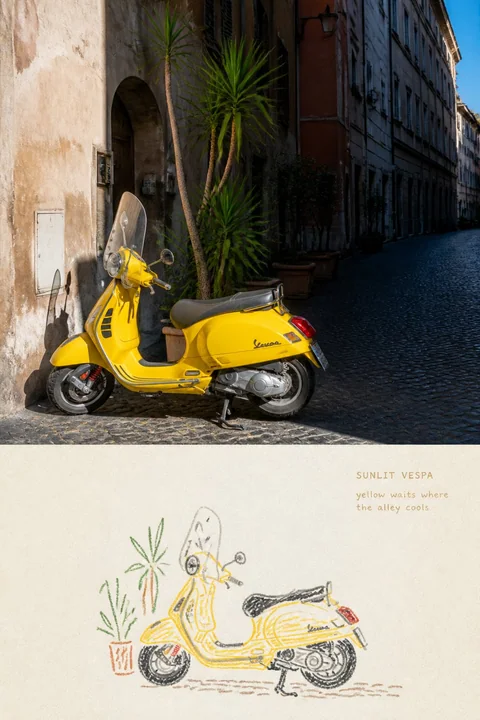
Please convert each travel photo I upload into an independent 「NAIVE OIL-PASTEL TRAVEL LINE|稚拙油画棒旅行线描」.

Output each photo separately, without multi-image stitching. The overall layout uses a 3:4 vertical top-and-bottom comparison composition.

The upper part occupies about 48%–50% of the frame, retaining the clear original photo with substantial area; the lower part occupies about 50%–52%, refining the same scene into a minimalist, naive yet aesthetically controlled oil-pastel travel line drawing.

Use clear, straight horizontal boundaries between the upper and lower areas; do not use gradients, feathering, or mutual penetration.

The upper part must faithfully retain the original photo.

Accurately maintain the subject identity, number of subjects, orientation, posture, action, key architectural structures, vehicle proportions, boat direction, ridge morphology, spatial relationship between figures and environment, natural textures, real light and shadow, and original color atmosphere.

Apply only slight color grading for travel magazines, independent publications, or photography exhibitions, and add an extremely thin film grain.

Do not redraw the photo, do not stretch, mirror, move, replace, or add subjects; do not change vehicle direction, figure posture, building outlines, mountain peak morphology, or number of boats. The upper part must still clearly be a real photographic work.

The lower part should not redraw the complete composition of the photo.

First understand the photo, then select the most memorable subject from it, for example:

- A single boat
- A lighthouse or tower
- A pavilion, hut, or independent building
- A roadside vehicle
- An isolated mountain peak
- One to two figures
- An animal or travel object with a clear outline

Keep only the minimum visual facts that make the subject instantly recognizable:

- Number of subjects
- Overall outer silhouette
- Orientation or direction of travel
- Posture
- Most important proportional relationships
- One to three key structures
- One clue explaining the environment

For boats, keep the bow, stern, hull curve, cabin, or motor; for vehicles, keep the wheel distance, body direction, seats, and front structure; for buildings, keep the roofline, main entrance, and support relationships; for mountain peaks, keep the unique ridge and one necessary horizon line; for figures, keep the number, posture, orientation, hairstyle, or main clothing color, without depicting facial features, clothing folds, or fine human structures.

Delete dense vegetation, repeated window panes, tourist shadows, advertising signs, complex water ripples, cloud details, rock textures, and photographic-level light and shadow.

The background should retain at most one to three broken path lines, shorelines, water surface lines, horizons, ridges, or ground hints. Do not form a complete background, and do not shrink the entire original scene to fit it all onto the paper.

The lower part uses warm off-white or light ivory matte drawing paper; the paper surface has natural fibers, small particles, and obvious paper texture resistance.

The subject usually occupies only 22%–42% of the width and 20%–38% of the height of the conversion area, placed in the lower-middle, left-leaning, or right-leaning, following the direction of the subject in the original photo.

Retain at least 65%–80% of completely unpainted continuous paper white. The paper must become the largest color block in the lower half.

Use childlike, direct, but aesthetically maturely controlled oil pastels, thick crayons, or waxy chalk lines to redraw the subject.

Lines must show:

- Obvious thickness
- Uneven pressure
- Waxy particles
- Paper texture resistance
- Natural breaks
- Partial white gaps
- Occasional buildup
- Hesitation and back-folding
- Slight double lines
- Partial misalignment
- Unclosed outlines
- Active stopping at secondary structures

Do not use a uniform black outer outline.

Extract 3–6 colors from the original photo, using mutually separate colored lines to distinguish structures.

For example:

- The subject's signature color for the main outer outline
- Gray-blue or charcoal gray for tires, shadows, or ridges
- Ocher, sienna, or taupe for buildings and ground
- Gray-green or olive green for a small number of plant hints
- Light blue or gray-blue for one or two water surface or sky direction lines

Almost no full coloring.

Only add a small amount of loose, transparent short cross-hatching, thick scratches, or waxy color blocks at the most critical positions of the subject. Allow colors to be slightly darker where crayons overlap, but do not create realistic volume.

Do not draw complete shadows, do not use smooth gradients, and do not pursue correct and smooth perspective. It should be like an experienced illustrator deliberately retaining a somewhat clumsy hand-feel.

The lower half adds a small amount of small text by default.

Small text includes:

1. A small title of 1–3 English words;
2. A very short observation of 5–10 English words.

Before generating, please clearly replace:

TITLE: “[English Title]”
OBSERVATION: “[Short sentence based on the real content of the photo]”

Observation sentences should not introduce scenic knowledge or write vague travel quotes. It should describe actions, colors, positions, or feelings truly visible in the photo, such as:

- “yellow waits where the alley cools”
- “the boat rests below the pale cliff”
- “one figure stands beneath the peaks”
- “a small door beneath stacked stone”

Text should be placed in the continuous paper white away from the subject, and the total area must not exceed 3%–5% of the lower area.

Text should use:

- Slightly slanted blunt pencil handwriting
- Small oil pastel signatures
- Simple handwritten sans-serif with slight breaks
- Typefaces with paper teeth, white gaps, and waxy particles

Text color is extracted from the subject's outline color, gray-blue, taupe, or ocher. Do not use smooth, neat, floating digital fonts.

Do not add author names, accounts, signatures, brands, logos, QR codes, URLs, fictional locations, fictional dates, fake Chinese, or garbled text.

The overall style should be: simple, quiet, relaxed, slightly clumsy, like a small sketch casually drawn in a paper notebook during a trip. It can be naive but not childish; simple but not sloppy; inaccurate, but the subject's identity, direction, and posture must be accurate.

Avoid: children’s classroom drawing, kindergarten cartoon, cute sticker aesthetics, flower-vase template, colored-pencil detailed rendering, adult coloring book, uniform black outline, automatic edge tracing, clean vector icon, smooth pen line, full oil-pastel filling, heavy oil painting, realistic crayon portrait, complete background, individual leaves, repeated water waves, photographic lighting, gradient shadows, full-page illustration, decorative typography, fake text, author signature, logo, watermark, blurry split boundary.

The most important rule: First strip the photo down to just a few of the most recognizable lines of the subject, then let the crayon particles, breaks, hesitant outlines, and small text signatures work together with the large areas of untouched paper to complete the memory.

请将我上传的每一张旅行照片分别制作成一张独立的
「NAIVE OIL-PASTEL TRAVEL LINE|稚拙油画棒旅行线描」。

每张照片单独输出,不进行多图拼接。
整体采用3:4竖版上下对照构图。

上方约占画面48%–50%,保留清楚、具有实质面积的原始照片;
下方约占50%–52%,将同一场景提炼成一幅极简、
稚拙而具有成熟审美控制的油画棒旅行线描。

上下区域使用清晰、平直的水平边界,
不得渐变、羽化或相互渗透。

上半部分必须忠实保留原始照片。

准确保持主体身份、主体数量、朝向、姿态、动作、
关键建筑结构、车辆比例、船只方向、山脊形态、
人物与环境的空间关系、自然材质、真实光影和原有色彩氛围。

仅进行轻微的旅行杂志、独立出版物或摄影展调色,
并加入极薄的胶片颗粒。

不得重绘照片,不得拉伸、镜像、移动、替换或增加主体,
不得改变车辆方向、人物姿势、建筑轮廓、山峰形态或船只数量。
上半部分仍须明确是一张真实摄影作品。

下半部分不要按照照片的完整构图重新画一遍。

先理解照片,从中选择一个最值得记住的主体,例如:

- 单一船只
- 灯塔或塔楼
- 亭子、小屋或独立建筑
- 路边车辆
- 孤立山峰
- 一至两个人物
- 动物或轮廓清楚的旅行物件

只保留让主体一眼可辨的最少视觉事实:

- 主体数量
- 整体外轮廓
- 朝向或行进方向
- 姿态
- 最重要的比例关系
- 一至三处关键结构
- 一条解释环境的线索

船只保留船头、船尾、船舷弧线、船舱或马达;
车辆保留车轮距离、车身方向、座椅和车头结构;
建筑保留屋顶走势、主要入口和支撑关系;
山峰保留独特山脊与一条必要的地平线;
人物保留数量、姿态、朝向、发型或服装主色,
不描绘五官、衣褶和精细人体结构。

删除密集植被、重复窗格、游客杂影、广告招牌、
复杂水纹、云层细节、岩石肌理和摄影级明暗。

背景最多只保留一至三条断开的路径线、岸线、
水面线、地平线、山脊或地面提示。
不得形成完整背景,也不得把原始场景缩小后全部塞进纸面。

下半部分使用温暖米白或浅象牙色哑光画纸,
纸面具有天然纤维、细小颗粒和明显的纸纹阻力。

主体通常只占转绘区域宽度的22%–42%、
高度的20%–38%,放置在中下部、偏左或偏右,
并顺应原照片主体的方向。

至少保留65%–80%完全未经绘制的连续纸白。
纸张必须成为下半部分最大的色块。

使用儿童般直接、但经过成熟审美控制的油画棒、
粗蜡笔或蜡质粉笔线条重新描绘主体。

线条必须呈现:

- 明显偏粗
- 压力不均
- 蜡质颗粒
- 纸纹阻力
- 自然断裂
- 局部漏白
- 偶尔堆积
- 迟疑与回折
- 轻微双线
- 局部错位
- 未闭合轮廓
- 次要结构主动停笔

不要使用统一的黑色外轮廓。

从原照片中提取3–6种颜色,
使用彼此分离的彩色线条区分结构。

例如:

- 主体标志色负责主要外轮廓
- 灰蓝或炭灰负责轮胎、阴影或山脊
- 土黄、赭石或灰褐负责建筑与地面
- 灰绿或橄榄绿负责少量植物提示
- 浅蓝或灰蓝负责一两条水面或天空方向线

几乎不要完整填色。

只在主体最关键的位置加入少量松散、透底的短排线、
粗擦痕或蜡质色块。
允许蜡笔重叠处颜色略深,但不能塑造写实体积。

不要绘制完整阴影,不要使用平滑渐变,
不要追求正确而圆滑的透视。
它应像一位经验丰富的插画者,
刻意保留有点笨拙的手感。

下半部分默认加入少量小字。

小字包括:

1. 一个1–3个英文单词的小标题;
2. 一句5–10个英文单词的极短观察。

生成前请明确替换:

TITLE: “[英文标题]”
OBSERVATION: “[根据照片真实内容写成的短句]”

观察句不要介绍景点知识,
也不要写空泛的旅行鸡汤。

它应描述照片中真实可见的动作、颜色、位置或感受,例如:

- “yellow waits where the alley cools”
- “the boat rests below the pale cliff”
- “one figure stands beneath the peaks”
- “a small door beneath stacked stone”

文字放在远离主体的连续纸白中,
总面积不得超过下半区域的3%–5%。

文字使用:

- 略歪的钝铅笔手写体
- 细小的油画棒题签
- 轻微断裂的朴素手写无衬线
- 带纸齿、漏白与蜡质颗粒的字形

文字颜色从主体轮廓色、灰蓝、灰褐或赭石中提取。
不得使用光滑、工整、悬浮的数字字体。

不要添加作者名、账号、签名、品牌、Logo、
二维码、网址、虚构地点、虚构日期、假中文或乱码。

整体应具有:

简单、安静、松弛、略带笨拙,
像旅行途中翻开纸本随手画下的小稿。

它可以稚拙,但不能幼稚;
可以简单,但不能潦草;
可以不准确,但主体身份、方向与姿态必须准确。

Avoid: children’s classroom drawing, kindergarten cartoon,
cute sticker aesthetics, flower-vase template,
colored-pencil detailed rendering, adult coloring book,
uniform black outline, automatic edge tracing,
clean vector icon, smooth pen line, full oil-pastel filling,
heavy oil painting, realistic crayon portrait,
complete background, individual leaves, repeated water waves,
photographic lighting, gradient shadows, full-page illustration,
decorative typography, fake text, author signature,
logo, watermark, blurry split boundary.

最重要的规则:

先把照片删到只剩主体最有辨识度的几根线,
再让蜡笔的颗粒、断口、迟疑轮廓、小字题签
与大片没有触碰过的纸面共同完成记忆。
More prompts
Case 28074
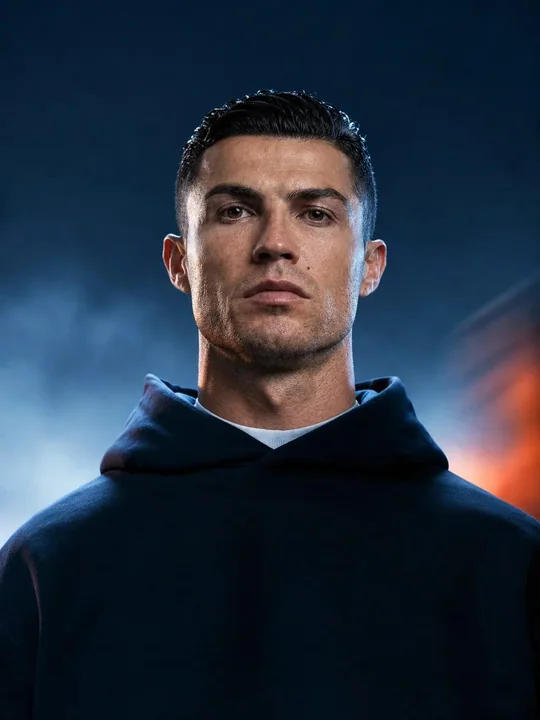
电影感写实人物肖像工作室灯光
Create a highly photorealistic cinematic portrait of a person standing centered and facing the camera with a calm, serious expression. Natural facial proportions, realistic skin texture, detailed eyes, subtle skin imperfections, and natural
Case 9
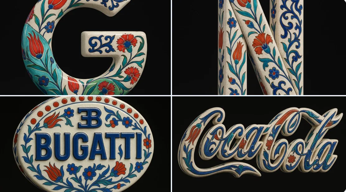
Blue and white porcelain style
Using the uploaded image as the exact visual base, transform it into a hyper-realistic 3D object that retains the original shape and proportions of the logo only. Apply traditional Ottoman Iznik ceramic textures—featuring a warm white glaze
natureproductvehiclesculpturebranding