Case 20757
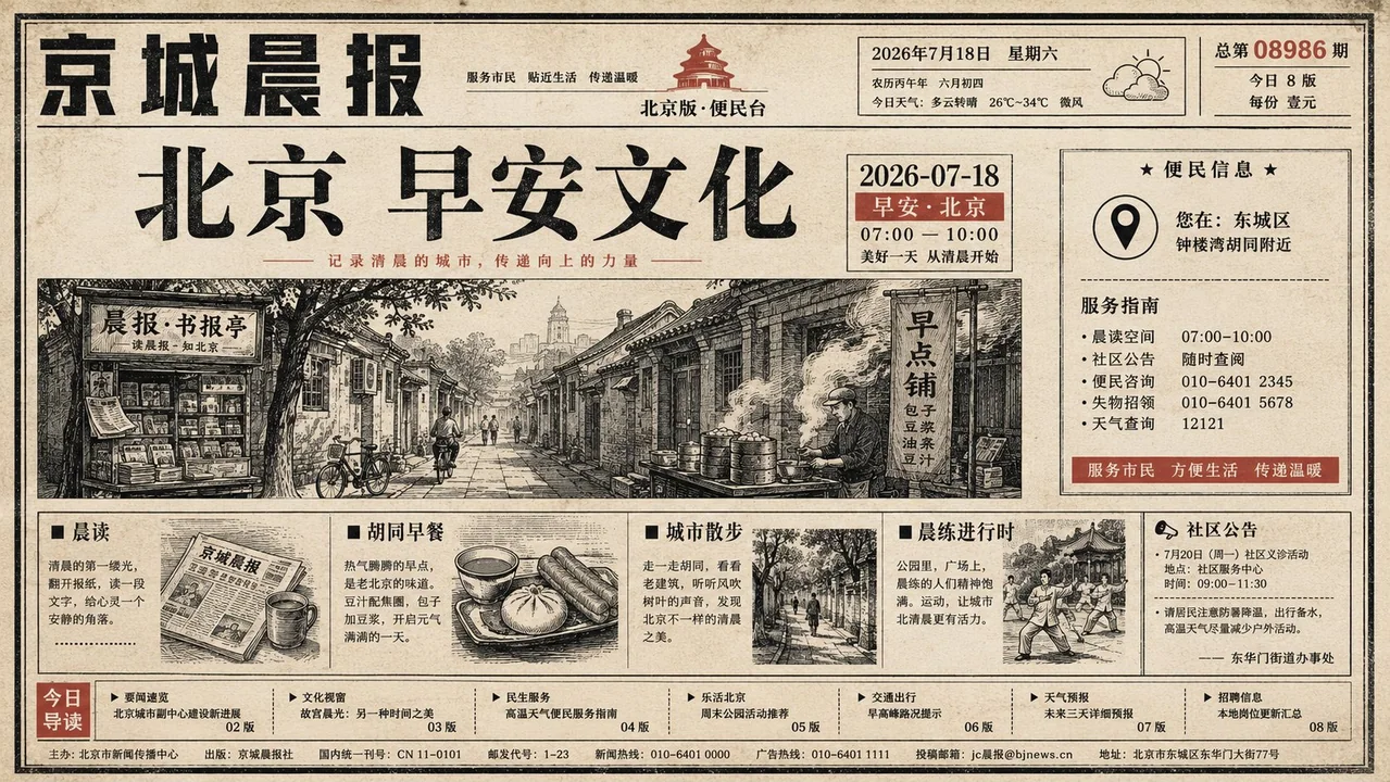
城市早安文化旧报纸插画排版
Prompt
Generate a set of old newspaper front-page visuals around any theme: the overall look starts like a full-page report from a local newspaper, with light warm white newsprint dominating; fine black frames, narrow text columns, a top masthead, dense vertical or horizontal columns on the left and right, and a strip of small grid advertisements at the bottom establish the reading order; subsequently, huge flat illustrations derived from the theme suddenly break into the layout and between columns, with several irregular circular, rectangular, or leaf-shaped outlines pressing over the text at a naive scale, edges showing slight overprint offset and paper ink absorption, simplified to only clear shapes, a few lines, and pairs of small round eyes, turning the serious newspaper into an approachable public notice. The core headline uses heavy black Mincho-style font, tight character spacing, and steady line spacing, placed below or beside the illustration to create a strong pause; subheadlines and body text maintain the high-density gray-black text blocks of a real newspaper, with small documentary photos and thin-bordered Q&A columns embedded locally, but do not let the photos take away the layout center. Colors are derived from the theme itself, controlled to the newsprint base color, black and gray text, two to three high-saturation spot color large illustration blocks, and a small amount of low-saturation auxiliary colors: large color blocks are bright and clean but with printing grain, locally revealing paper fibers, slight stains, creases, scanning yellowing, and uneven ink; aging mainly occurs on the paper, black text edges, and inside solid color blocks, without uniform brown dirtying. The layout allows for crowding, staggering, and slight misalignment, retaining child-painting-like round-eye humor, the simple credibility of local news, and the reading interruption caused by illustrations interspersed with text; avoid modern magazine whitespace, smooth vectors, commercial studio textures, and overly refined typography. Theme: City + Good Morning Culture + 2026-07-18

围绕任意主题对象生成一套旧报纸头版式视觉:整体先像地方报刊的整页报道,浅暖白新闻纸占主导,细黑线框、窄栏正文、顶部报头、左右密集竖排或横排栏目、底部小格广告带共同建立阅读秩序;随后由主题派生的巨大扁平插画突然闯入版心和栏间,几枚不规则圆形、长条形或叶片状轮廓以天真尺度压过文字,边缘略有套印偏移和纸面吸墨,简化到只有清楚外形、少量线条和成对小圆眼,让严肃报纸变成亲近的公共告示。核心标题使用厚重黑色明朝感字形,字距紧、行距稳,放在插画下方或旁侧形成强烈停顿;小标题和正文保持真实报刊的高密度灰黑文本块,局部嵌入小幅纪实照片和细边框问答栏,但不要让照片夺走版心。色彩由主题自身派生,控制为新闻纸底色、黑灰文字、两到三种高饱和专色大块插画和少量低饱和辅助色:大色块明亮、干净但带印刷颗粒,局部露出纸纤维、轻微污点、折痕、扫描泛黄和墨色不均,旧化主要发生在纸张、黑字边缘和实色块内部,不做统一褐色脏化。版面允许拥挤、错落和轻微不对齐,保留儿童画般的圆眼幽默、地方新闻的朴素可信感、插画穿插文字造成的阅读中断;避免现代杂志留白、光滑矢量、商业摄影棚质感和过度精致排版。


主题:城市+早安文化+2026-07-18
更多提示词
Case 28081
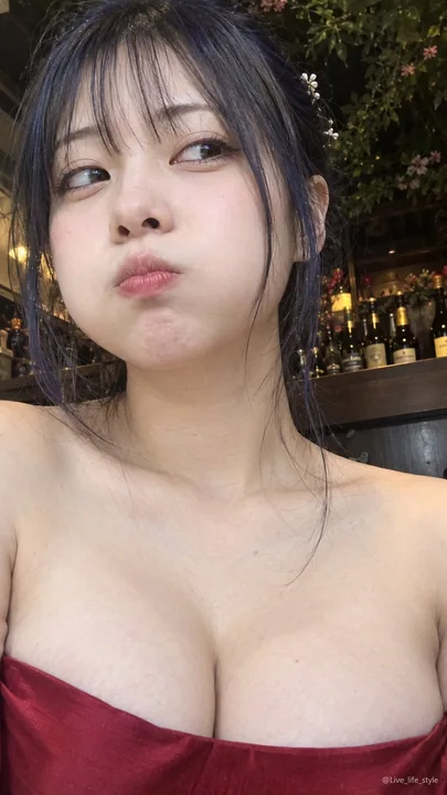
昏暗咖啡馆鼓起腮帮的日本女性手机自拍
{ "direction": "Not an advertising photo, but the kind of ultra-close-up vertical selfie taken by a friend holding a phone to their face in a dim cafe. An adult Japanese woman in her 20s. The character occupies about 85-90% of the screen,
Case 11
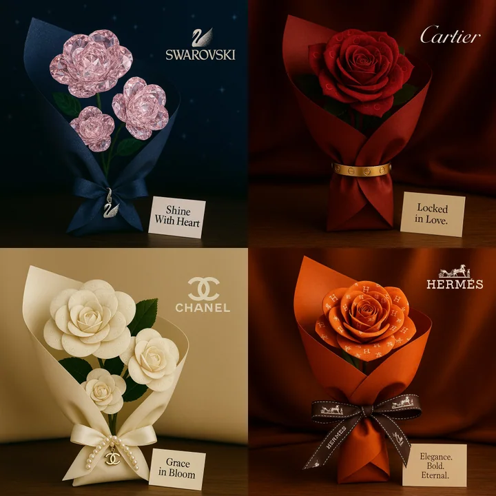
品牌之爱的话术
灵感来自[品牌名称]的浪漫方形花束。玫瑰由视觉图案或纹理制成,反映出品牌的形象。花束用奢华材质包裹,呼应品牌的标志性风格(如丝绸、天鹅绒、皮革),并以品牌的一款标志性产品优雅地系住,取代传统的丝带。将其放置在与品牌形象相匹配的表面上。在花束旁边放一张信息卡,上面印有代表品牌精神的简短情感三字标语。在场景中微妙地加入[品牌名称]的标志。电影般的照明效果,超精细细节,优雅的景深,高端编辑品质。
natureproductvehiclebranding