Case 26499
东方文化展海报视觉指南
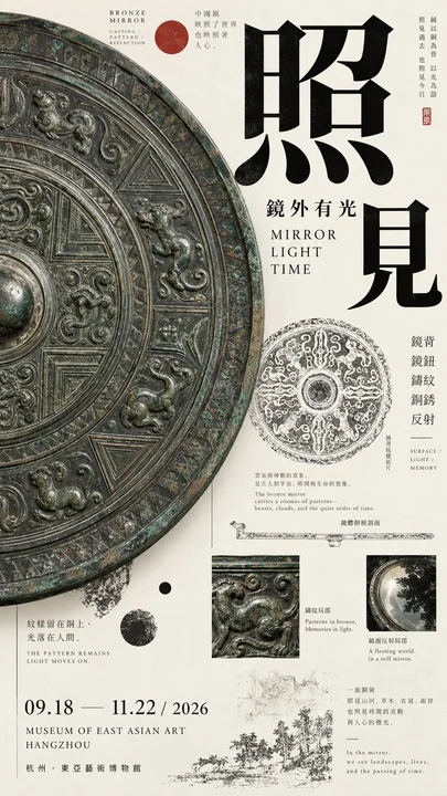
Prompt
[Theme]:
[Chinese Title]:
[English Title]:
[Core Subject]:
[Left-Right Relationship]: Giant object dominating / Image narrow band × Wide text field / Subject × Archive / Image crossing boundaries / Dense × White space / Other
[Left Content]:
[Right Content]:
[Crossover Elements]: Object silhouette / Branches and leaves / Large characters / Line drawings / Patterns / Other
[Main Color Tone]:
[Accent Color]:
[Date / Venue]:
[Aspect Ratio]: 9:16

Generate a high-aesthetic, high-information-density Oriental culture exhibition poster using a "Left-Right Composition / Asymmetrical Dual-Zone Composition."

Do not split the left and right 50/50 equally. Use ratios like 35/65, 40/60, 45/55 flexibly based on the volume of the subject, text density, and white space relationships. The focus is not equal area on both sides, but achieving visual balance among image weight, typography, and information density.

Flexibly choose different methods based on the theme:

Giant Object Dominating: Enlarge a scale object, cultural relic, or art object on one side, allowing bold cropping to occupy the primary visual weight; establish reading hierarchy on the other side through titles, English text, small print, structural line drawings, and exhibition info.

Image Narrow Band × Wide Text Field: Use a slender ancient painting, photography, or pattern slice on one side, while keeping a larger area of paper and typography on the other. Branches, birds, clouds, or subject silhouettes in the image can actively cross out of the core area into the text zone.

Subject × Archive: Maintain a single strong subject on one side, while combining object line drawings, material macros, rubbings, pattern studies, dimensions, era, and a small amount of explanatory text on the other to create an art catalog feel.

Dense × White Space: Form a high-density visual on one side through images, archive fragments, and research content, while maintaining a large area of controlled white space on the other, using only a few large characters and key exhibition info. White space must not just be "no content"; it must be precisely designed through kerning, fine lines, position, and proportion.

Left and right boundaries should not be too mechanical. Allow object edges, large characters, flower branches, patterns, or research lines to cross the boundary by about 3%–10% to reconnect the two sides, while avoiding random collage.

Typography must be redesigned based on the subject of each image. Use oversized single characters, two-character offsets, full horizontal titles, medium-scale titles, multi-column text, or partial color inversion. Adhere to the scale contrast of "large characters are very large, small characters are very small," reducing meaningless medium-sized fonts. Do not fixate on four-character vertical arrangements, and do not repeat templates like "two-character horizontal + two-character vertical."

Information density should refer to mature museum posters, Japanese Editorial Design, and Art Catalogues. Include English subtitles, eras, materials, techniques, venues, dates, curatorial phrases, and 1–3 research nodes directly related to the theme, such as object line drawings, glaze macros, ancient painting materials, pattern rubbings, stone texture studies, or partial enlargements.

These auxiliary pieces of information must serve the theme; do not pile up random small text just to "look professional."

Control colors within 3–5 main colors. Prioritize restrained colors such as bone white, ink black, celadon green, mineral blue/green, deep gray, and ochre, then add a clear but very small area of cinnabar red or another accent color. Paper surface should remain clean without using dirty yellow antique filters.

First glance should see the large subject and the left-right weight relationship; second glance sees the title and main color blocks; third glance discovers how objects, ancient paintings, or branches break through the left-right boundaries; finally, read the materials, structures, eras, and exhibition archives.

Core principle: One side is responsible for anchoring the vision, the other for carrying the reading; white space is weight, and information density is also weight; left and right are not equal, but the whole must be balanced.

Overall requirements: 9:16, high-definition, clear, clean paper surface, realistic subject texture, sharp typography, fine lines and small text as clear as possible, rich information but not messy, with the completion level of mature museum posters and art publications.

Avoid: Mechanical 50/50 split, simple left-image-right-text, placing a similar subject on both sides, subjects being too small, information areas looking like manuals, fixed title templates, PPT info boxes, complex UI, random English, heavy aging, mottled noise, image numbering, copyright logos, four-pointed stars, sparkles, and low-completion AI poster vibes.

【主题】:
【中文标题】:
【英文标题】:
【核心主体】:
【左右关系】:巨物压场 / 图像窄带 × 宽文字场 / 主体 × 档案 / 图像越界 / 密集 × 留白 / 其他
【左侧内容】:
【右侧内容】:
【跨界元素】:器物轮廓 / 枝叶 / 大字 / 线稿 / 纹样 / 其他
【主色调】:
【强调色】:
【日期 / 场馆】:
【画面比例】:9:16

生成一张高审美、高信息密度的东方文化展览海报,采用「左右构图 / 非对称双区构图」。

左右不要 50 / 50 平均切开,根据主体体量、文字密度和留白关系灵活使用 35 / 65、40 / 60、45 / 55 等比例。重点不是两侧面积相等,而是让图像重量、Typography 和信息密度达到视觉平衡。

根据主题灵活选择不同方式:

巨物压场:一侧放大尺度器物、文物或艺术对象,允许大胆裁切,占据主要视觉重量;另一侧通过标题、英文、小字、结构线稿和展讯建立阅读层级。

图像窄带 × 宽文字场:一侧使用修长古画、摄影或纹样切片,另一侧保留更大的纸面与 Typography。图像中的枝叶、飞鸟、云气或主体轮廓可主动越出画芯进入文字区。

主体 × 档案:一侧保持单一强主体,另一侧组合器型线稿、材质微距、拓片、纹样研究、尺寸、年代和少量说明文字,形成艺术图录感。

密集 × 留白:一侧通过图像、档案碎片和研究内容形成高密度视觉,另一侧保持大面积控制过的留白,只使用少量大字和关键展讯。留白不能只是“没有内容”,要通过字距、细线、位置和比例被精确设计。

左右边界不要过于机械。可以让器物边缘、大字、花枝、纹样或研究线条跨过分界约 3%–10%,把两侧重新连接起来,但避免随意拼贴。

Typography 必须根据每张画面的主体重新设计。可以使用超大单字、两字错位、完整横排标题、中等尺度标题、跨栏文字或局部反色。坚持“大字很大、小字很小”的尺度反差,减少无意义的中号字。不要固定使用四字纵排,也不要重复“两字横排 + 两字竖排”的模板。

信息密度参考成熟博物馆海报、Japanese Editorial Design 和 Art Catalogue。可加入英文副标题、年代、材质、工艺、场馆、日期、策展短句,以及 1–3 个与主题直接相关的研究节点,例如器型线稿、釉面微距、古画材料、纹样拓片、石纹研究或局部放大。

这些辅助信息必须服务主题,不要为了“显得专业”而堆随机小字。

色彩控制在 3–5 个主要颜色。优先使用骨白、墨黑、青瓷绿、石青石绿、深灰、赭色等克制色彩,再加入一个明确但面积很小的朱砂红或其他强调色。纸面保持干净,不使用脏黄仿古滤镜。

第一眼看到大型主体与左右重量关系;第二眼看到标题和主要色块;第三眼发现器物、古画或枝叶如何突破左右边界;最后再阅读材质、结构、年代与展览档案。

核心原则:一边负责压住视觉,一边负责承接阅读;留白也是重量,信息密度也是重量;左右不相等,但整体必须平衡。

整体要求:9:16,高清、清晰、纸面干净、主体质感真实、Typography 锐利、细线与小字尽可能清楚,信息丰富但不乱,具有成熟博物馆海报和艺术出版物完成度。

避免:机械五五分、简单左图右字、左右各放一个相似主体、主体过小、信息区像说明书、固定标题模板、PPT 信息框、复杂 UI、随机英文、严重做旧、斑驳噪点、画面编号、版权标识、四角星芒、sparkle 和低完成度 AI 海报感。
Другие промпты
Case 26520
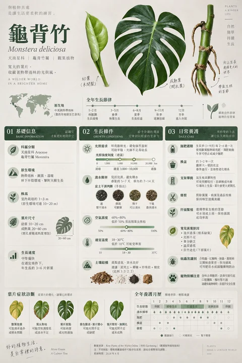
极简日系侘寂风龟背竹科学养护百科
信息图极简主义龟背竹侘寂风绿植养护

Case 22002
市政蜡像现实主义人像摄影
You are an image generation director. Style name: Civic Wax Realism Style definition: Create one photorealistic image of an original adult woman who looks like a real person, a wax figure, and a public statue at the same time. The subject