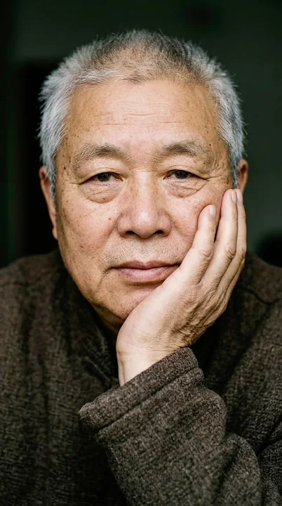
Case 24648
东方传统色现代社论风格配色研究海报
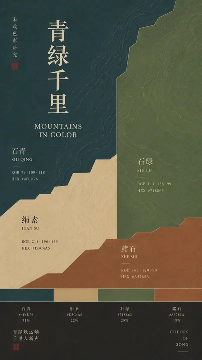
Prompt
[Subject]: { }
[Chinese Title]: { }
[English Title]: { }
[Color 1]: {Color Name}|{HEX}
[Color 2]: {Color Name}|{HEX}
[Color 3]: {Color Name}|{HEX}
[Color 4]: {Color Name}|{HEX}
[Cultural Pattern]: { }
[Aspect Ratio]: 9:16

Generate a color research poster in the style of Oriental Traditional Color × Modern Editorial Design.

First, conduct a color review: using the filled HEX as the sole benchmark, accurately convert to corresponding RGB, and ensure that the color names, HEX, and RGB in the image correspond one-to-one, prohibiting numerical mismatches or self-modifying colors. By default, only show RGB + HEX, do not use CMYK. Core large color blocks should strive to maintain the pure flat color of the specified HEX, avoiding obvious color shifts caused by strong gradients, lighting, filters, or textures.

Use 3–4 large color gamuts of unequal proportions for asymmetric modular composition, avoiding an even four-grid layout. Make color the primary visual subject and include a prominent spectrum band approximately 4–6% of the image height, using the locked primary colors directly.

Use clear, slightly thick fonts with ancient book or Songti temperament for Chinese titles and color names; use modern Serif / Sans Serif for English and numbers. Text must be complete, sharp, and easy to read.

Extract only partial structures from the [Cultural Pattern], enlarge them, and hide them with low contrast within the color gamuts; they can span across different color blocks and be partially obscured. Do not directly draw complete artifacts or ancient paintings.

Overall maintain large amounts of white space, clear hierarchy, and a high-end sense of color research. Avoid all colors being too light, cluttering of Guochao materials, a PPT feel, meaningless English, incorrect Chinese characters, HEX/RGB mismatches, numbering, logos, and four-pointed stars.

Check all HEX and RGB again before generating, and confirm they are correct before producing the image.

【主题】:{ }
【中文标题】:{ }
【英文标题】:{ }
【色 1】:{色名}|{HEX}
【色 2】:{色名}|{HEX}
【色 3】:{色名}|{HEX}
【色 4】:{色名}|{HEX}
【文化纹样】:{ }
【比例】:9:16

生成一张东方传统色彩 × Modern Editorial Design 风格的配色研究海报。

先进行颜色审查:以填写的 HEX 为唯一基准,准确换算对应 RGB,并确保画面中的色名、HEX、RGB 一一对应,禁止数字错配或自行改色。默认只展示 RGB + HEX,不使用 CMYK。核心大色块尽量保持指定 HEX 的纯净平面颜色,避免强渐变、光影、滤镜和材质造成明显偏色。

使用 3–4 个不等比例的大色域进行非对称模块化构图,避免平均四宫格。让颜色成为第一视觉主体,并加入高度约占画面 4–6% 的明显色谱带,直接使用锁定的主色。

中文标题与色名使用清晰、略厚、有古籍或宋体气质的字体;英文和数字采用现代 Serif / Sans Serif。文字必须完整、锐利、易读。

从【文化纹样】中只提取局部结构,将其放大并低对比度地隐藏在色域中,可跨越不同色块并局部被遮挡。不要直接画完整器物或古画。

整体保持大量留白、明确层级和高级的色彩研究感。避免颜色全部过浅、国潮素材堆砌、PPT 感、无意义英文、错误中文字、HEX/RGB 不匹配、编号、Logo 和四角星芒。

生成前再次核对全部 HEX、RGB,确认无误后再出图。