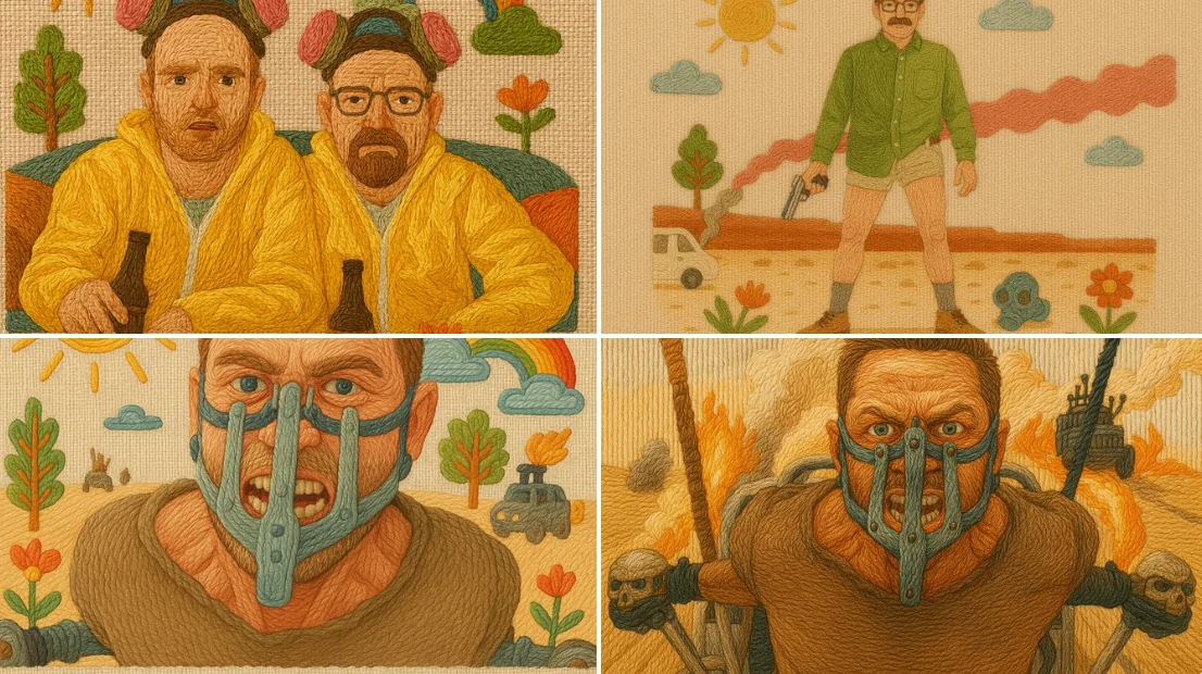
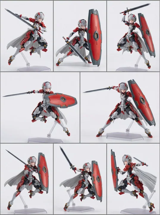
Case 13268
Original IP Merchandise Visualization Proposal

Prompt
Please generate a set of high-completion, visually unified 'Original IP Commercialization Proposal / 4-Board Original IP Commercialization Proposal' based on the brand information provided by the user.

Note: This is not a four-grid collage, nor a master image combining 4 contents into one screen, but a set of 4 independent images that must be 'generated sequentially'. You need to complete these 4 images continuously under the same brand visual system. The 4 images must obviously belong to the same brand, but each image has different responsibilities and cannot just be 4 repetitive variants.

This is not a regular poster design, general e-commerce detail page, or a single packaging rendering, but a complete visual proposal possessing: branding, IP sense, product sense, packaging sense, scene sense, commercial realization sense, business proposal sense, exhibition sense, and portfolio quality.

[User Input]
Brand Name, English Auxiliary Name, Brand Type/Industry, One-sentence Brand Positioning, Core Keywords (3–8), Target Audience, Overall Style Direction, Brand Slogan, Main Product/Core Service, Product Line/SKU Info, Brand Story/Regional Characteristics/Cultural Background, Main Color Preference, Secondary Color Preference, Accent Color Preference, Cultural Elements/Graphic Elements to Incorporate, IP Image Requirement (Yes/No/Weakened IP), IP Direction Preference, Preferred Application Direction (Packaging/Gift Box/Store/E-commerce/Social Media/Merchandise/Cold Chain/Shelf/Other), Style to Avoid, Aspect Ratio (Default Portrait 3:4, customizable), Other Supplementary Explanations.

[Overall Task]
Please extract and unify the brand's visual DNA internally based on the above information, and then generate 4 independent images sequentially based on the same brand DNA.

Before formally generating the 4 images, please unify the following content and keep it consistent in the subsequent 4 images: 1. Brand core temperament, 2. Brand visual keywords, 3. Main/Secondary/Accent colors, 4. Font tendency and glyph temperament, 5. Graphic language/Auxiliary pattern language, 6. Visual presentation of products or services, 7. IP image setting method, 8. Unified rules for packaging/application materials/merchandise/scenes, 9. Overall screen temperament: brand sense, proposal sense, commercial sense, exhibition sense, series sense, 10. 4 images with unified style but clear information division, not repetitive variants.

[Special Requirements regarding IP]
1. This proposal cannot only have a Logo without IP sense. Even if the overall route is high-end, restrained, and realistic, it should possess an 'IP recognition role' or 'symbolic IP image'. 2. The IP does not necessarily have to be an exaggerated cartoon character, but can be a more high-end and restrained 'cultural symbol IP / brand totem IP / mascot IP / emblem IP / seal IP / charm IP / micro-sculpture IP'. 3. If the brand is suitable for a light IP route, please understand IP as 'brand recognition role', which can appear in emblems, seals, tags, pendants, charms, seals, packaging details, and social media symbols, not necessarily occupying the whole screen as a protagonist. 4. If the brand is more suitable for a strong IP route, the role can be clearer, but it must still be unified with the brand system and cannot appear cheap, childish, or like stock material. 5. If the user explicitly requests 'not too cartoonish', please treat the IP as: more high-end, more realistic, more designed, and more like a brand recognition symbol rather than a childish Q-version character.

[Overall Uniformity Requirements]
1. The four images must obviously belong to the same brand system (Brand name, color system, font temperament, graphic language, brand symbol, IP image, product logic must be unified). 2. The four images are not 4 repetitive posters, but 4 brand commercialization proposal images with different duties. 3. All 4 images should have high completion, brand proposal sense, commercial sense, exhibition sense, and portfolio quality. 4. Layouts can differ, but the overall aesthetics, design language, and visual system must be highly unified. 5. Automatically match the most suitable content according to different brand types. 6. If text appears in the image, ensure the brand name, title, module name, slogan, and key product names are concise and clear, trying to be accurate without stacking long text. 7. Each image should be suitable for independent display, and when placed together, it should be obvious that they are a whole set of proposals. 8. Do not merge four images into one, do not make a four-grid, do not make a one-page overview collage. 9. Please generate in order: 1st -> 2nd -> 3rd -> 4th. 10. Generate only the current independent image each time, and automatically continue the brand system already established, until all 4 are completed. 11. If the user requests 'high-end realism', the screen must have a sense of real commercial photography, real material, real light and shadow, and real product texture, rather than illustration collage, low-quality material sense, or cheap e-commerce images. 12. If the user requests 'cultural elements', modernize, design, and brand the cultural elements. Do not simply stack traditional decorative symbols. 13. If the user requests 'not too cartoonish', handle it as light IP, heavy brand, and strong product sense.

[Structure of the 4 Boards]
1. Brand Hero Board: Sets the tone, first visual memory point, shows brand name, English name, slogan, core temperament, visual elements, color system, core symbols.
2. Identity & IP System Board: Explains the 'visual system', shows wordmark, colors, font, auxiliary graphics, packaging pattern logic, IP image system (roles, charms, seals, tags, etc.), small application system.
3. Product & Packaging System Board: Shows how the brand lands on 'products/packaging/service carriers', demonstrates commercial implementation, relevant to brand type.
4. Campaign & Sales Scenario Board: Shows visual effects after entering real communication scenes, demonstrating brand recognition, communication power, and scenario extension capabilities.

[Execution Method]
1. Understand and unify brand visual DNA. 2. Generate 1st image. 3. Generate 2nd image. 4. Generate 3rd image. 5. Generate 4th image. Do not merge, do not repeat, do not make grids. Generate only one at a time, remember the established system.

[Image and Quality Requirements]
Default aspect ratio 3:4, high definition, detailed, brand proposal/commercial sense, realistic, main Chinese text with English support, text clear and accurate.

[Negative Constraints]
No 'Logo only without IP', no poster collages, no low-quality e-commerce details, no cheap stock material, no traditional element stacking, no childishness unless requested, no repetitive variants, no grids, no fake-looking packaging, no copying existing brands.

请根据用户输入的品牌信息,创作一套高完成度、具有统一视觉系统的「原创 IP 商品化提案 / 4-Board Original IP Commercialization Proposal」。

注意:
这不是一张四宫格拼图,也不是把4张内容合并在同一个画面里的总图,而是一套需要“依次分别生成”的4张独立图片。你需要在同一个品牌视觉系统下,连续完成这4张图的生成。4张图必须明显属于同一个品牌,但每一张图承担不同职责,不能只是4张重复变体。

这也不是普通海报设计、普通电商详情图或单一包装效果图,而是一套兼具:
品牌感、IP感、产品感、包装感、场景感、商品化落地感、商业提案感、展示感、作品集质量
的完整视觉提案。

【用户输入】
品牌名:【品牌名】
英文辅助名:【英文辅助名】
品牌类型 / 行业:【品牌类型 / 行业】
一句话品牌定位:【一句话品牌定位】
核心关键词(3–8个):【核心关键词】
目标人群:【目标人群】
整体风格方向:【整体风格方向】
品牌口号 / Slogan:【Slogan】
主打产品 / 核心服务:【主打产品 / 核心服务】
产品线 / SKU 信息:【产品线 / SKU 信息】
品牌故事 / 地域特色 / 文化背景:【品牌故事 / 地域特色 / 文化背景】
主色调倾向:【主色调倾向】
辅助色倾向:【辅助色倾向】
点缀色倾向:【点缀色倾向】
希望融入的文化元素 / 图形元素:【希望融入的文化元素 / 图形元素】
是否需要IP形象:【是 / 否 / 弱化IP】
IP方向偏好:【IP方向偏好】
希望偏重的应用方向:【包装 / 礼盒 / 门店 / 电商 / 社媒 / 周边 / 冷链 / 货架 / 其他】
希望避免的风格:【希望避免的风格】
画幅比例:【默认竖版 3:4,可修改】
其他补充说明:【其他补充说明】

【总任务】
请先基于以上信息,在内部提炼并统一这个品牌的视觉 DNA,再基于同一个品牌 DNA,依次分别生成4张独立图片。

在正式生成4张图之前,请先统一以下内容,并在后续4张图中始终保持一致:
1. 品牌核心气质
2. 品牌视觉关键词
3. 主色 / 辅色 / 点缀色
4. 字体倾向与字形气质
5. 图形语言 / 辅助图案语言
6. 产品或服务的视觉呈现方式
7. IP形象设定方式
8. 包装 / 应用物料 / 周边 / 场景的统一规则
9. 整体画面气质:品牌感、提案感、商业感、展示感、系列感
10. 4张图风格统一,但信息分工明确,不做成4张内容重复的变体

【关于IP的特别要求】
1. 这套提案不能只有 Logo,没有IP感。即使整体走高端、克制、写实路线,也应具备“IP识别角色”或“符号化IP形象”。
2. IP不一定是夸张卡通人物,也可以是更高级、更克制的“文化符号型IP / 品牌图腾型IP / 吉祥物型IP / 徽章型IP / 印章型IP / 吊饰型IP / 微雕塑型IP”。
3. 如果品牌适合轻IP路线,请将IP理解为“品牌识别角色”,可以出现在徽章、封签、吊牌、挂件、印章、标签、包装细节、社媒符号中,而不一定作为主角占据整个画面。
4. 如果品牌更适合强IP路线,可以让角色更明确,但依然要与品牌系统统一,不能显得廉价、幼稚或素材感过强。
5. 如果用户明确要求“不要太卡通”,请将IP处理为:更高级、更写实、更有设计感、更像品牌识别符号,而不是儿童化Q版角色。

【整体统一要求】
1. 四张图必须明显属于同一个品牌系统,品牌名、色彩系统、字体气质、图形语言、品牌符号、IP形象(如有)、产品逻辑必须统一。
2. 四张图不是4张重复海报,而是4张不同职责的品牌商品化提案图。
3. 四张图都要具有高完成度、品牌提案感、商业感、展示感和作品集质量。
4. 版式可以有差异,但整体审美、设计语言和视觉系统必须高度统一。
5. 根据不同品牌类型自动匹配最合适的内容:
   - 节令食品 / 地方特产 / 礼盒食品:礼盒、单颗装 / 单品装、标签、手提袋、外箱、礼赠卡、封签、陈列、社媒传播等
   - 餐饮 / 饮品:杯子、瓶身、杯套、纸袋、外卖袋、包装盒、标签、门店、广告海报、电商图等
   - 美妆 / 快消:瓶器、盒装、礼盒、系列包装、陈列、广告KV等
   - 文创 / IP / 零售:周边、徽章、贴纸、吊牌、礼盒、手提袋、海报、门店等
   - 科技 / 数字品牌:官网首屏、APP界面、卡片、数字场景、传播物料等
6. 如果画面中出现文字,请保证品牌名、标题、模块名、口号、关键产品名简洁清晰,尽量准确,不要堆砌过多冗长文案。
7. 每张图都应适合独立展示,同时4张图放在一起时要明显看出是一整套提案。
8. 不要把四张图拼在一张图里,不要做四宫格,不要做一页总览拼贴。
9. 请按顺序依次生成:第1张 → 第2张 → 第3张 → 第4张。
10. 每次只生成当前这一张独立图片,并自动延续前面已经建立好的品牌系统,直到4张全部完成。
11. 如果用户要求“高级写实”,则画面必须具有真实商品摄影感、真实材质感、真实光影和真实产品质感,而不是插画拼贴、低质素材感或廉价电商图。
12. 如果用户要求“有文化元素”,请将文化元素现代化、设计化、品牌化,不要简单堆砌传统装饰符号,不要满屏祥云、龙纹、红金边框等模板化国潮元素。
13. 如果用户要求“不要太卡通”,则整体以轻IP、重品牌、强商品感的方式处理。

【四张图的固定结构与职责】

第1张:品牌主视觉封面图 / Brand Hero Board
这张图负责“定调”,是整套提案的封面图和第一视觉记忆点。
需要重点展示:
- 品牌名
- 英文辅助名(如有)
- Slogan(如有)
- 品牌核心气质
- 品牌关键词的视觉转译
- 核心主视觉元素
- 主色系统
- 能代表该品牌的核心符号:产品、材质、图形、角色、IP识别物、视觉装置、氛围元素等
要求:
- 更偏封面图 / Hero Image,而不是说明书
- 画面有视觉冲击力和高级感
- 品牌感要强
- 信息不要太满,突出“第一眼记忆点”
- 如果品牌适合IP,可以出现IP,但应服务整体品牌主视觉
- 如果用户偏好写实路线,必须有高质感商品摄影感 / 产品渲染感
目标:
让人一眼看出这个品牌是谁、气质是什么、第一印象是什么。

第2张:品牌识别与IP系统图 / Identity & IP System Board
这张图负责解释这个品牌的“视觉系统如何构成”,并清楚说明这个品牌不只是Logo,还有完整的IP识别语言。
需要重点展示:
- 品牌名 / 字标 / Logo感呈现
- 主色、辅色、点缀色
- 字体气质与字形风格
- 辅助图形 / 图案 / icon / sticker / label 语言
- 包装图案逻辑或品牌识别元素
- IP形象系统:如角色设定、IP徽章、IP挂件、IP印章、IP标签、IP符号演变、三视图、不同动作 / 表情 / 应用方式(根据风格决定)
- 小型应用系统:贴纸、吊牌、封签、标签、印章、徽章、卡片、腰封、挂件等
要求:
- 比第1张更有结构感和提案感
- 更像品牌系统提案板,但不要僵硬得像传统VI手册
- 模块清晰,逻辑明确
- 审美要保持高级,不要做成信息堆砌
- 如果品牌走高端写实路线,IP应偏克制、设计化、符号化,而非幼稚卡通
目标:
让人清楚理解这个品牌的视觉识别语言和IP语言是如何建立起来的。

第3张:商品与包装系统图 / Product & Packaging System Board
这张图负责展示品牌如何真正落到“产品 / 包装 / 服务载体”上,体现商业落地能力。
需要根据品牌类型自动匹配最合适的应用形式,例如:
- 节令食品 / 地方特产 / 礼盒食品:单品装、礼盒装、手提袋、礼赠卡、口味标签、封签、运输外箱、陈列装、冷链外箱等
- 餐饮 / 饮品:杯子、瓶身、杯套、纸袋、吸管套、包装盒、外卖袋、贴纸、标签等
- 美妆 / 快消:瓶器、罐装、盒装、礼盒、系列包装、货架陈列等
- 文创 / IP / 零售:周边、徽章、贴纸、文具、礼盒、标签、包装延展等
- 科技 / 数字品牌:官网首页、APP界面、数字产品界面、卡片、服务展示等
要求:
- 重点体现“产品化 / 包装化 / 可售卖 / 可使用 / 可落地”
- 至少有一种主力应用载体,也可以有若干延展应用,但必须有主次
- 画面应具有真实商业摄影感、产品展示感或提案板陈列感
- 不要只是摆一堆东西,要看得出统一的品牌系统已经落地
- 如果品牌有SKU,要清楚区分系列、规格、口味、型号、层级
- 如果品牌有IP,要让IP自然融入包装系统,而不是仅仅单独悬浮存在
目标:
让人看到这个品牌不仅有概念,也能真正变成可售卖、可使用、可执行的产品系统。

第4张:传播与销售场景应用图 / Campaign & Sales Scenario Board
这张图负责展示品牌进入真实传播场景后的视觉效果,体现品牌辨识度、传播力与场景延展能力。
需要根据品牌类型自动匹配最合适的场景,例如:
- 门店外立面 / 店招 / 柜台 / 导视系统
- 海报KV / 社交媒体广告 / 立牌 / 灯箱 / 户外广告
- 快闪店 / 展台 / 品牌活动空间 / 节日陈列空间
- 电商首页 / 手机端首屏 / 社媒 feed / 数字传播界面
- 开箱体验 / 礼赠场景 / 货架陈列 / 配送场景
要求:
- 场景感要比第3张更强,要体现品牌进入真实世界后的传播效果
- 可以偏广告感、空间感、展示感,但仍要保留提案气质
- 不要与第3张重复成单纯包装展示图
- 品牌系统仍需保持统一:品牌名、色彩、字体、图形、IP形象(如有)、产品调性都要一致
- 如果用户要求真实感,要像真实商业摄影和真实使用场景,而不是拼贴素材
目标:
让人看到这个品牌在真实传播、真实销售和真实应用场景中具有鲜明辨识度和商业表现力。

【执行方式】
请严格按照以下流程执行:
1. 先内部理解并统一品牌视觉 DNA。
2. 然后开始生成第1张图:品牌主视觉封面图。
3. 在保持同一品牌系统的前提下,继续生成第2张图:品牌识别与IP系统图。
4. 在保持同一品牌系统的前提下,继续生成第3张图:商品与包装系统图。
5. 在保持同一品牌系统的前提下,继续生成第4张图:传播与销售场景应用图。
6. 整个过程中,不要把4张图合并成一张,不要变成四宫格,不要让4张图内容重复。
7. 每次只生成当前这一张独立图片,并自动记住前面已经建立好的品牌系统,直到4张全部完成。

【画面与质量要求】
- 默认画幅比例:竖版 3:4
- 图片质量:高清、精致、细节丰富
- 画面气质:品牌提案感、商业感、作品集质量、真实商品感、设计感
- 文字语言:以中文为主,英文为辅助
- 文本要求:品牌名、标题、Slogan、关键产品名、模块名尽量清晰准确,不要乱码,不要大段无意义文字

【负面要求】
不要只做Logo,没有IP识别感。
不要做成普通海报拼贴。
不要做成低质电商详情页。
不要做成廉价素材堆砌。
不要大面积出现网络素材感。
不要把传统元素堆满画面。
不要幼稚化、儿童化,除非用户明确要求。
不要把IP做得过于卡通、低龄、夸张,除非用户明确要求。
不要让4张图变成同一内容的重复变体。
不要把4张图拼成一张图。
不要让包装、产品或场景显得虚假和不可信。
不要照搬任何现成品牌、真实商标或已有IP。

【最终目标】
输出一套4张独立但高度统一的原创 IP 商品化提案图:
- 第1张负责定调
- 第2张负责解释识别系统与IP系统
- 第3张负责产品与包装落地
- 第4张负责传播与销售场景落地

整套结果应具备:
统一的品牌视觉 DNA、清晰的页面分工、高完成度的审美、IP识别度、商品化能力、商业提案感、展示感、作品集质量,以及可直接用于品牌概念展示和内容发布的效果。
More prompts
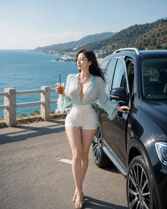
Case 14866
Cinematic summer coastal road Japanese woman lifestyle portrait
Ultra-realistic cinematic vertical portrait, 4:5 aspect ratio, of an extraordinarily beautiful 28-year-old Japanese woman on a coastal road trip during a bright summer morning. She is the clear main subject, shown in a full-body to medium-f
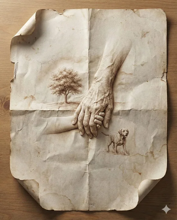
Case 14883
Hyper-realistic three-dimensional memories emerging among the creases of old paper
Nano Banana Pro || 8K Ultra-Realistic Promotional Film: Design a hyper-realistic close-up image of a folded sheet of aged paper. Within the paper’s creases and surfaces, depict a [SCENE OR MEMORY] emerging naturally from the folds, like scu
超写实故事感纸纹理微浮雕极细节