Case 14971
Conception d'affiche éditoriale de portfolio de style système d'exploitation
Prompt
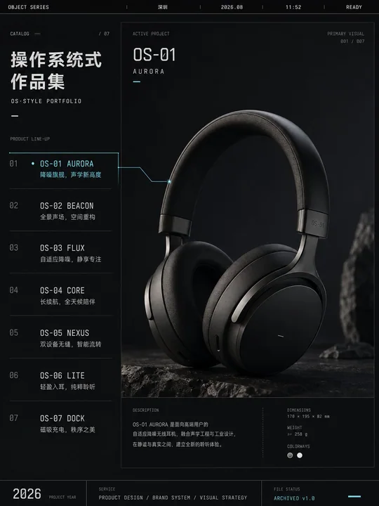
Design a 3:4 vertical "OS-style portfolio" editorial poster for [Personal Portfolio / Design Agency / Brand Project / Creative Team]. Use a deep graphite black background overall to establish a professional workstation-like interface order, but do not copy any specific brand's OS interface. Set a very narrow status bar at the top, sequentially placing: Brand Name / Current City / Date / Time / Online Status. Set a project directory area on the left, occupying about 30%—35% of the frame, with 6—8 project names listed consecutively. Each project includes: a short title and a one-sentence achievement description of no more than 12 words. Present the only activated core project on the right, occupying about 50%—55% of the frame. Use a single high-impact full visual image as the main visual, which can be a person, product, space, brand result, or key project visual. Do not split it into a thumbnail grid. The currently activated project should be highlighted in the left directory using reverse color, underline, or a single accent color, and establish a clear correspondence with the right main visual through a thin path, fine line, or positioning relationship. Add third-level auxiliary information at the bottom: Project Year, Service Type, File Status. Typography system: Use compact geometric sans-serif for main titles; neutral sans-serif for directory descriptions; monospaced fonts for time, numbers, and status. Color palette limited to: Charcoal Black, Warm White, Cold Gray, and one project accent color [Signal Orange / Cobalt Blue / Acid Green / Cold Purple]. The accent color area should not exceed 6%. Overall vibe like: Creative studio backend, digital archive, cultural magazine cover, mature proposal system. Avoid: Mimicking computer screenshots, stacked windows, complex icons, neon code rain, uniform card arrays, multiple images of equal size, cheap tech aesthetics.

为【个人作品集 / 设计机构 / 品牌项目 / 创意团队】设计一张3:4竖版“操作系统式作品集”编辑海报。

整体采用深石墨黑背景,建立类似专业工作站的界面秩序,但不要复制任何具体品牌操作系统界面。

顶部设置一条极窄状态栏,依次放置:
品牌名称 / 当前城市 / 日期 / 时间 / 在线状态。

左侧设置占画面约30%—35%的项目目录区,连续排列6—8个项目名称。
每个项目包含:
短标题
一句不超过12字的成果说明

右侧呈现唯一被激活的核心项目,占画面约50%—55%。
使用一张高冲击力的完整视觉图像作为主视觉,可以是人物、产品、空间、品牌成果或关键项目画面。
不要拆成缩略图网格。

当前被激活的项目,在左侧目录中使用反白、下划线或单一强调色高亮,并通过一条纤细路径、细线或定位关系,与右侧主视觉建立清晰对应。

底部加入三级辅助信息:
项目年份
服务类型
文件状态

字体系统:
主标题使用紧凑几何无衬线字体
目录说明使用中性无衬线字体
时间、编号、状态使用等宽字体

配色限定为:
炭黑
暖白
冷灰
一种项目强调色【信号橙 / 钴蓝 / 酸性绿 / 冷紫】
强调色面积不超过6%。

整体气质像:
创意工作室后台
数字档案馆
文化杂志封面
成熟提案系统

避免:
仿制电脑截图
堆叠窗口
复杂图标
霓虹代码雨
均匀卡片阵列
多张同等大小的图片
廉价科技感
Autres prompts
Case 28058
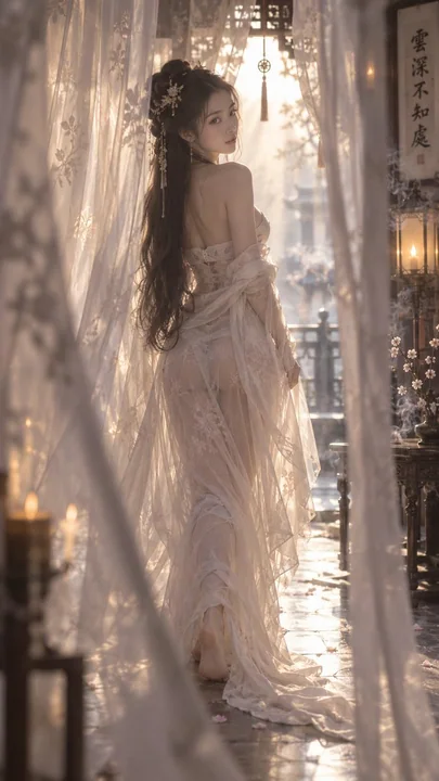
雾感轻纱抹胸裙摆曳地逆光勾边
Misty light gauze tube top; loose clothing edges; chest lines softly revealed; half-hidden by layers of gauze curtains; walking slowly barefoot; skirt hem trailing on the ground; backlit rim lighting; a fleeting glimpse 雾感轻纱抹胸;衣缘松散;胸口线条柔和显
Case 12171
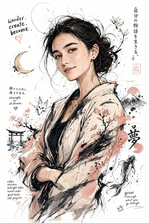
Portrait à mi-corps de « moi » en style graffiti japonais
Générez une illustration de « moi » telle que vous l’imaginez. Les caractéristiques incluent un style d’illustration japonais, des traits de personnage distincts, des expressions émotionnelles naturelles, une composition en demi-corps, des

Case 28077