Case 21506
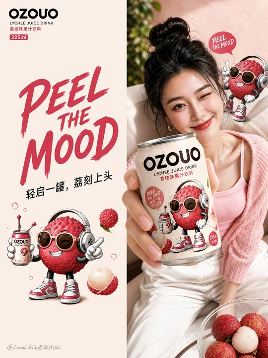
OZOUO果饮品牌零售视觉应用板
Prompt
Create the fourth image of the unified brand visual system for “OZOUO” fruit drinks, keeping exactly the same brand identity, mascot illustration style, typography system, 225ml can proportion, lychee flavor hero design, and overall color DNA as the established OZOUO visual system. This image must serve a new responsibility: a retail touchpoint and brand-extension application board, not a packaging sheet, not a flavor lineup poster, and not a broad campaign collage.

Core role:
This image should show how the OZOUO brand system extends into real consumer touchpoints, including point-of-sale materials, retail-ready packaging extensions, fridge display, branded lifestyle accessories, and human interaction moments. It should feel like a polished brand application board for a modern beverage launch.

Overall composition:
Use a clean multi-panel layout on a soft warm beige or creamy neutral background, with 5 or 6 sections arranged in a tidy brand-presentation collage. Each panel should feel visually distinct but clearly belong to the same OZOUO world. The whole image must remain calm, premium, playful, and highly coherent.

Brand consistency:
Keep exactly the same OZOUO identity system:
same “OZOUO” wordmark,
same lychee hero flavor,
same adult-oriented cartoon lychee mascot,
same 225ml compact can design,
same creamy base + lychee pink + deep brown typography,
same “PEEL THE MOOD” tone of voice,
same balance between cute and grown-up.
Everything must clearly feel like one brand.

Suggested panel structure:

Panel 1:
Branded print materials such as postcards, flyers, mini posters, or brand cards laid flat in a neat presentation. Use the same OZOUO logo, lychee mascot, and creamy-pink color system. The style should feel simple, graphic, and collectible.

Panel 2:
A compact retail multipack or gift carton designed for the OZOUO 225ml cans. Show a realistic branded paper carrier or small boxed set using the same mascot and typography system. It should feel commercially believable and shelf-ready.

Panel 3:
A refrigerated retail shelf display with multiple OZOUO lychee cans lined up neatly inside a cooler. The cans should look cold, fresh, slightly condensed, and highly recognizable. This panel demonstrates shelf impact and retail visibility.

Panel 4:
A stylish young adult holding or presenting an OZOUO can in a natural lifestyle moment. Keep the person fashionable, modern, and brand-appropriate, with the can clearly visible. The mood should feel social, confident, and urban, not like a generic stock photo.

Panel 5:
A branded tote bag, shopping bag, or soft lifestyle accessory using the OZOUO visual system. The bag should feel trendy, useful, and premium, extending the brand into daily life. Use the logo and mascot in a more graphic, simplified way.

Optional Panel 6:
A small point-of-sale or countertop display, sticker sheet, shelf wobblers, or branded cooler decal system, proving the OZOUO design language works across retail details.

Visual tone:
The board should feel more practical and retail-facing than the previous campaign image. It must communicate how OZOUO appears in real purchase environments and branded consumer touchpoints. Each panel should be simple, strong, and brand-consistent.

Typography:
Typography should stay concise and highly recognizable, using the same OZOUO system:
“OZOUO”
“LYCHEE JUICE DRINK”
“PEEL THE MOOD”
“轻启一罐,荔刻上头”
“成人向果味灵感”
Use text sparingly and strategically. Avoid cluttered copy.

Color palette:
Use the established OZOUO lychee palette:
creamy warm beige,
soft blush pink,
lychee rose,
berry-pink accents,
deep espresso-brown typography,
small fresh green leaf accents.
All applications should clearly feel part of the same family.

Styling:
Adult playful, stylish, retail-ready, social-media friendly, clean, modern, premium FMCG branding, cute but not childish, polished and commercially believable.

Rendering:
hyper-detailed 225ml can mockups, realistic packaging materials, premium print finishes, clean collage composition, realistic fridge display, lifestyle application realism, soft studio shadows, 8k, brand presentation quality.

Negative prompt:
repeated technical packaging board, barcode-heavy design, random flavor changes, inconsistent mascot style, childish kids drink branding, messy collage, unrelated products, weak retail realism, low detail, inconsistent can proportions, generic supermarket branding, cluttered layout

Create the fourth image of the unified brand visual system for “OZOUO” fruit drinks, keeping exactly the same brand identity, mascot illustration style, typography system, 225ml can proportion, lychee flavor hero design, and overall color DNA as the established OZOUO visual system. This image must serve a new responsibility: a retail touchpoint and brand-extension application board, not a packaging sheet, not a flavor lineup poster, and not a broad campaign collage.

Core role:
This image should show how the OZOUO brand system extends into real consumer touchpoints, including point-of-sale materials, retail-ready packaging extensions, fridge display, branded lifestyle accessories, and human interaction moments. It should feel like a polished brand application board for a modern beverage launch.

Overall composition:
Use a clean multi-panel layout on a soft warm beige or creamy neutral background, with 5 or 6 sections arranged in a tidy brand-presentation collage. Each panel should feel visually distinct but clearly belong to the same OZOUO world. The whole image must remain calm, premium, playful, and highly coherent.

Brand consistency:
Keep exactly the same OZOUO identity system:
same “OZOUO” wordmark,
same lychee hero flavor,
same adult-oriented cartoon lychee mascot,
same 225ml compact can design,
same creamy base + lychee pink + deep brown typography,
same “PEEL THE MOOD” tone of voice,
same balance between cute and grown-up.
Everything must clearly feel like one brand.

Suggested panel structure:

Panel 1:
Branded print materials such as postcards, flyers, mini posters, or brand cards laid flat in a neat presentation. Use the same OZOUO logo, lychee mascot, and creamy-pink color system. The style should feel simple, graphic, and collectible.

Panel 2:
A compact retail multipack or gift carton designed for the OZOUO 225ml cans. Show a realistic branded paper carrier or small boxed set using the same mascot and typography system. It should feel commercially believable and shelf-ready.

Panel 3:
A refrigerated retail shelf display with multiple OZOUO lychee cans lined up neatly inside a cooler. The cans should look cold, fresh, slightly condensed, and highly recognizable. This panel demonstrates shelf impact and retail visibility.

Panel 4:
A stylish young adult holding or presenting an OZOUO can in a natural lifestyle moment. Keep the person fashionable, modern, and brand-appropriate, with the can clearly visible. The mood should feel social, confident, and urban, not like a generic stock photo.

Panel 5:
A branded tote bag, shopping bag, or soft lifestyle accessory using the OZOUO visual system. The bag should feel trendy, useful, and premium, extending the brand into daily life. Use the logo and mascot in a more graphic, simplified way.

Optional Panel 6:
A small point-of-sale or countertop display, sticker sheet, shelf wobblers, or branded cooler decal system, proving the OZOUO design language works across retail details.

Visual tone:
The board should feel more practical and retail-facing than the previous campaign image. It must communicate how OZOUO appears in real purchase environments and branded consumer touchpoints. Each panel should be simple, strong, and brand-consistent.

Typography:
Typography should stay concise and highly recognizable, using the same OZOUO system:
“OZOUO”
“LYCHEE JUICE DRINK”
“PEEL THE MOOD”
“轻启一罐,荔刻上头”
“成人向果味灵感”
Use text sparingly and strategically. Avoid cluttered copy.

Color palette:
Use the established OZOUO lychee palette:
creamy warm beige,
soft blush pink,
lychee rose,
berry-pink accents,
deep espresso-brown typography,
small fresh green leaf accents.
All applications should clearly feel part of the same family.

Styling:
Adult playful, stylish, retail-ready, social-media friendly, clean, modern, premium FMCG branding, cute but not childish, polished and commercially believable.

Rendering:
hyper-detailed 225ml can mockups, realistic packaging materials, premium print finishes, clean collage composition, realistic fridge display, lifestyle application realism, soft studio shadows, 8k, brand presentation quality.

Negative prompt:
repeated technical packaging board, barcode-heavy design, random flavor changes, inconsistent mascot style, childish kids drink branding, messy collage, unrelated products, weak retail realism, low detail, inconsistent can proportions, generic supermarket branding, cluttered layout
更多提示词
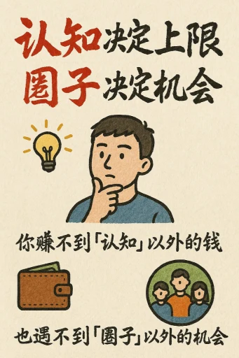
Case 1
手绘风格的信息图表卡片
创作一张手绘风格的信息图卡片,比例为9:16竖版。卡片主题鲜明,背景为带有纸质肌理的米色或米白色,整体设计体现质朴、亲切的手绘美感。 卡片上方以红黑相间、对比鲜明的大号毛笔草书字体突出标题,吸引视觉焦点。文字内容均采用中文草书,整体布局分为2至4个清晰的小节,每节以简短、精炼的中文短语表达核心要点。字体保持草书流畅的韵律感,既清晰可读又富有艺术气息。 卡片中点缀简单、有趣的手绘插画或图标,例如人物或象征符号,以增强视觉吸引力,引发读者思考与共鸣。 整体布局注意视觉平衡,预留足
illustrationtypographyportraitpaper-craftinfographic
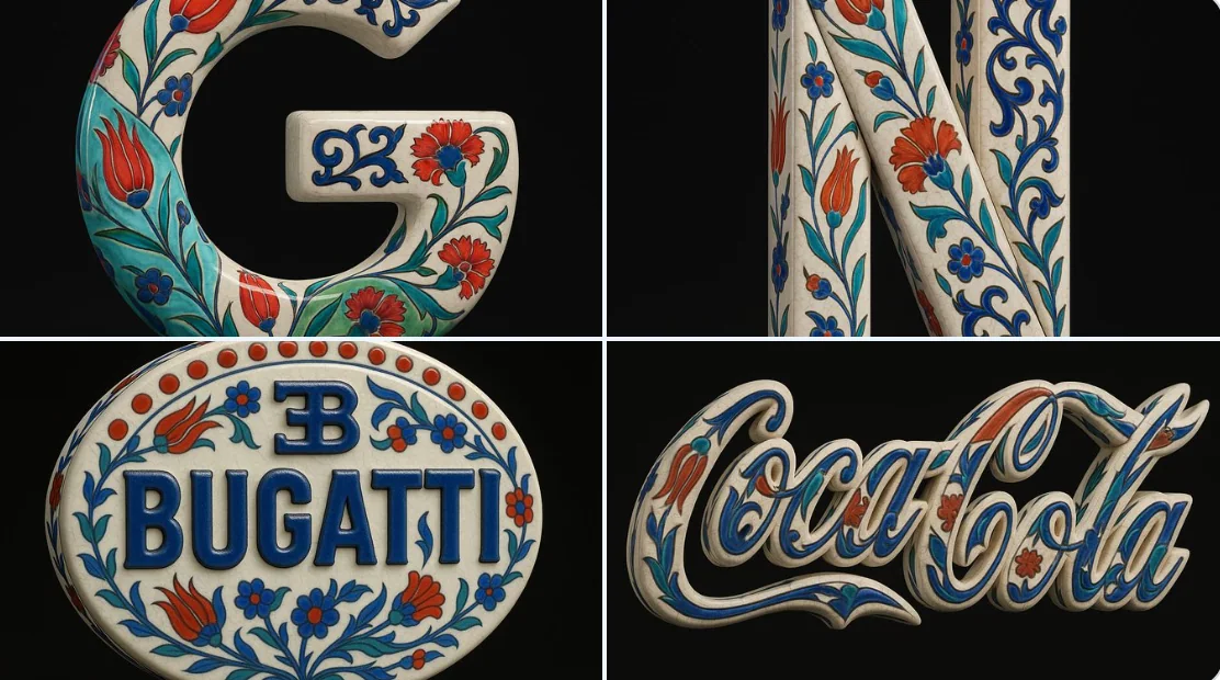
Case 9
青花瓷风格
以上传的图像作为精确的视觉基础,将其转化为一个超现实主义的3D对象,仅保留原始标志的形状和比例。应用传统的奥斯曼伊兹尼克陶瓷纹理——具有温暖的白色釉面基底,带有细腻的裂纹线条,并叠加鲜艳的钴蓝色、青绿色和大胆的红色花卉图案,如郁金香、康乃馨和阿拉伯藤蔓。整个标志应被处理为一个独立的瓷器雕塑,具有凸起的手绘细节,不带任何背景板或瓷砖结构。确保装饰图案优雅地沿着布加迪标志的轮廓延伸,而不改变其形态。以纯黑色背景呈现该对象,并采用类似Cinema 4D风格的产品照明——突出真实的陶
natureproductvehiclesculpture