Case 27593
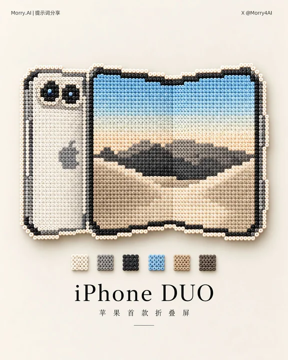
极简拼豆艺术手工海报设计
Prompt
Refer to the uploaded image, automatically identify the core subject, and convert the subject into a real handmade Fuse Bead / Perler Bead artwork.

【Subject Restoration】
Strictly preserve the outline, proportions, posture, perspective, iconic structure, and main color scheme of the subject in the reference image, only pixelating and simplifying overly detailed structures to ensure the original subject is still recognizable at a glance after conversion. Do not simply add a pixel filter, but completely reconstruct the subject as a real fuse bead piece.

【Fuse Bead Material】
The subject is composed of hundreds of identically sized, regularly arranged cylindrical plastic fuse beads, bead by bead. Each bead must be clearly visible: central round hole, cylindrical structure, regular grid, and subtle gaps between particles. Use a limited color palette to express the subject's structure, shadows, and highlights through different colored fuse beads; use a ring of off-white or white fuse beads around the periphery of the subject to form a complete outline.

【Background and Photography】
The background is replaced with a clean, warm cream-white matte surface, the overall tone is soft and low-saturation, without obvious paper fibers, wood grain, or coarse particles, only an extremely delicate and uniform matte texture. Adopt real still-life photography texture. Soft natural light shines from the top left, the fuse beads appear as a delicate matte plastic material, and form a slight, soft floating projection on the cream-white background surface.

【Color Display】
Analyze the reference image and the converted fuse bead subject, extract the 3–5 most representative key colors from the subject to form a set of minimalist color cards. The color cards are located between the fuse bead subject and the text title, arranged horizontally and centered. Each color block is small in size, uniform in proportion, evenly spaced, and uses solid color blocks without adding gradients, 3D effects, or complex borders. The color card colors must truly come from the subject, including: main colors, auxiliary colors, dark colors, light colors, or recognizable accent colors. Automatically decide to use 3, 4, or 5 color blocks based on the actual color scheme of the subject, without adding meaningless colors just to make up the number. The color card is only an auxiliary visual element, its overall width is significantly smaller than the subject, and it does not grab the visual focus of the subject.

【Typography】
Generate a concise Chinese main title and a very short Chinese subtitle below the color card based on the image content. The Chinese main title uses modern high-contrast Songti / Mincho style: thin font weight, slender and sharp serifs, stretched character shapes, appropriately increased letter spacing, and centered arrangement. The subtitle font size is significantly smaller and thinner, with wider letter spacing. The overall feel is that of high-end Chinese magazines, art publications, and boutique brand advertisements.

【Composition】
The image adopts a 4:5 vertical minimalist editorial poster layout. Regardless of the original aspect ratio of the reference image, the final image is always re-adapted to a 4:5 vertical format and does not follow the original image's aspect ratio.

【Layout Structure】
Large white space at the top
↓
Fuse bead subject
↓
3–5 theme color blocks
↓
Chinese main title
↓
Small Chinese subtitle
↓
Large white space at the bottom

The fuse bead subject is located in the upper-middle of the frame, occupying about 35%–50% of the frame. Automatically adjust the size of the subject based on its own horizontal, vertical, or irregular outline, showing it completely while maintaining the original proportions, without stretching, compressing, or cropping. All elements are aligned along the central axis, maintaining sufficient spacing and a large amount of negative space. The subject, color cards, title, and subtitle are all located within the safety area, not close to the edges of the frame, and the overall layout is not damaged by the different proportions of the reference image. The final frame size is fixed at 4:5 vertical.

【Overall Style】
Fuse Bead Craft × Pixel Art × Color Palette × Minimal Editorial Poster × Product Photography. The image is restrained, quiet, exquisite, and high-end, like a color research page in an independent design magazine or a boutique brand visual archive.

【Avoid】
Ordinary pixel art, mosaics, Lego, glass beads, cross-stitch, knitting effects, complex backgrounds, huge color blocks, rainbow color schemes, gradient color cards, thick bold fonts, cartoon fonts, calligraphy fonts, complex text effects, and excessive 3D.

参考上传图片,自动识别其中的核心主体,并将主体转换成真实手工 Fuse Bead / Perler Bead 拼豆作品。

【主体还原】

严格保留参考图中主体的轮廓、比例、姿态、视角、标志性结构和主要配色,只对过于细碎的结构进行像素化简化,确保转换后仍能一眼识别原主体。

不要简单添加像素滤镜,而是将主体完全重新构建为真实拼豆作品。

【拼豆材质】

主体由数百颗大小一致、规则排列的圆柱形塑料拼豆逐颗组成。

每颗拼豆必须清晰可见:
中央圆孔、圆柱结构、规则网格、颗粒间的细微间隙。

采用有限配色,通过不同颜色拼豆表现主体的结构、阴影和高光;主体外围使用一圈米白色或白色拼豆形成完整描边。

【背景与摄影】

背景替换为干净、温暖的奶油白哑光表面,整体色调柔和、低饱和,不带明显纸张纤维、木纹或粗糙颗粒,只有极其细腻、均匀的哑光质感。

采用真实静物摄影质感。
柔和自然光从左上方照射,拼豆呈细腻的哑光塑料材质,并在奶油白背景表面形成轻微、柔软的悬浮投影。

【色彩展示】

分析参考图片以及转换后的拼豆主体,从主体中提取最具代表性的 3–5 个重点颜色,形成一组极简色卡。

色卡位于拼豆主体与文字标题之间,水平居中排列。

每个色块尺寸小巧、比例统一、间距均匀,使用纯色色块,不添加渐变、立体效果或复杂边框。

色卡颜色必须真实来源于主体,包括:
主色、辅助色、深色、浅色或具有识别度的强调色。

根据主体实际配色自动决定使用 3、4 或 5 个色块,不为了凑数量加入无意义颜色。

色卡只是辅助视觉元素,整体宽度明显小于主体,不抢夺主体视觉焦点。

【文字排版】

色卡下方根据图片内容生成简洁的中文主标题和一句极短中文副标题。

中文主标题采用现代高对比宋体 / 明朝体:
细字重、纤细锐利衬线、字形舒展、适当增加字距、居中排列。

副标题字号明显更小、更细,字距更宽。

整体具有高级中文杂志、艺术出版物和精品品牌广告的编辑感。

【构图】

画面采用 4:5 竖版极简编辑海报布局,无论参考图片原始比例如何,最终画面始终重新适配为 4:5 竖版,不跟随原图比例。

【版式结构】

上方大面积留白
↓
拼豆主体
↓
3–5 个主题色块
↓
中文主标题
↓
小号中文副标题
↓
底部大面积留白

拼豆主体位于画面中央偏上,占画面约 35%–50%。

根据主体本身的横向、纵向或不规则轮廓,自适应调整主体大小,在保持原始比例的前提下完整展示,不拉伸、不压缩、不裁切。

所有元素沿中央轴线排列,保持充足间距和大量负空间。

主体、色卡、标题、副标题全部位于安全区域内,不贴近画面边缘,不因参考图比例不同而破坏整体版式。

最终画幅固定为 4:5 竖版。

【整体风格】

Fuse Bead Craft × Pixel Art × Color Palette × Minimal Editorial Poster × Product Photography。

画面克制、安静、精致、高级,像独立设计杂志中的色彩研究页面或精品品牌视觉档案。

【避免】

普通像素画、马赛克、乐高、玻璃珠、十字绣、针织效果、复杂背景、巨大色块、彩虹配色、渐变色卡、粗黑体、卡通字体、书法字体、复杂文字特效和过度3D。
他のプロンプト

Case 12461
活気と遊び心に満ちた商業写真大作
このプロンプトを使って、楽しい商業写真を作成してください このプロンプトを使って、楽しい商業写真を作成してください
时尚趣味创意商业风大片
Case 27598
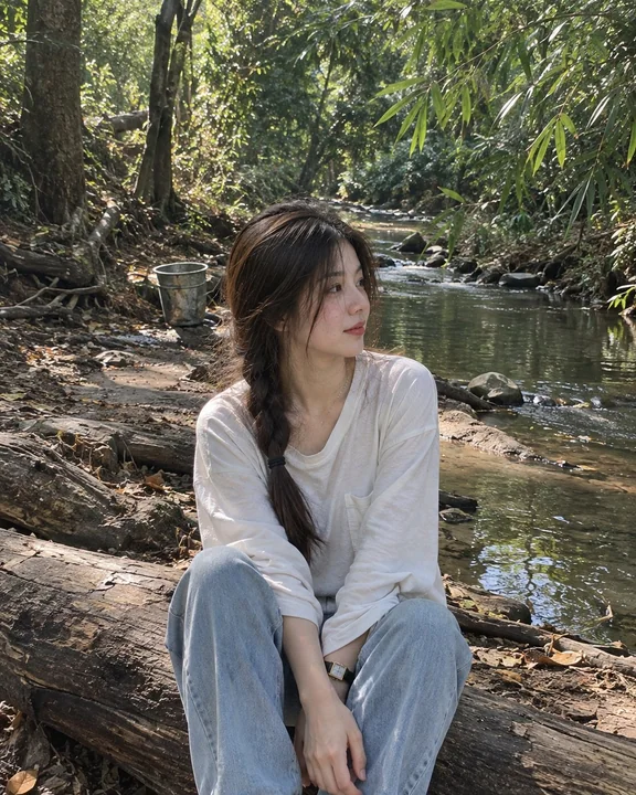
森林溪边独坐的年轻女性写实人像
A photorealistic candid portrait of a young woman sitting peacefully on a fallen tree beside a calm, narrow forest stream. She has long dark brown hair styled in a loose side braid, with soft strands naturally framing her face. She gazes th