空間的透視による建築ボリュームのタイポグラフィポスター
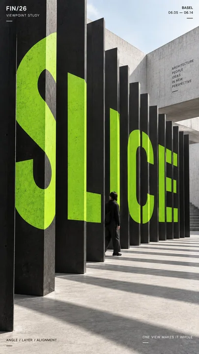
Prompt
タイトル:[メインワード]
プロジェクト名:[ブランド / 展示 / キャンペーン]
建築構造:[垂直フィン / 分離された建物 / 段差のあるプラットフォーム / 折り畳み平面 / その他]
タイポグラフィメカニズム:[スライス / スパン / オフセット / フォールド / カスタム]
被写体:[小さな人物 / なし]
アクセントカラー:[1つの強い単色]
補助テキスト:[場所 / 日付 / 短いキャッチコピー]
フォーマット:9:16 縦型ポスター

巨大なタイポグラフィが建築に物理的に統合され、意図された1つのカメラ視点からのみ視覚的に完全になる、高インパクトなパースペクティブタイポグラフィポスターを作成してください。

まず建築構造を構築し、その後、タイポグラフィがその実在する奥行き、表面、角度、隙間、折り目、および遮蔽に厳密に従うようにします。

選択されたメカニズムに応じて、単語は複数の垂直面にわたってスライスされたり、構造間の物理的な隙間をスパンしたり、段差のあるプラットフォームで途切れたり、折り畳まれた建築表面上で連続したりすることができます。

メインワードは構図の約35〜55%を占めるべきです。個々の断片は別々の表面上では抽象的または不完全に見えますが、意図された視点からは、視覚的に整列して1つの明確で読みやすい単語になるべきです。

コンクリート、黒、白、またはニュートラルな石材などの抑制された建築素材に対して、1つの強い単色のアクセントカラーを用い、ボールドな幾何学的サンセリフタイポグラフィを使用してください。

人物が含まれる場合は、小さく保ち、主にスケール基準として使用してください。建築が自然に人物の一部を隠したり重なり合わせたりすることで、タイポグラフィ空間の物理的な内部にいるような感覚を与えてください。

プロジェクト名、場所、日付、短いテーマラインなどの編集情報は少量のみ追加してください。

全体的なスタイル:パースペクティブタイポグラフィ、空間グラフィックデザイン、現代建築、エディトリアルポスター、アナモルフィックインスタレーション、強い奥行き感とクリーンな階層構造。

浮遊するテキスト、ランダムな歪み、弱いアライメント、装飾的な3Dエクストルージョン、ネオンのSF効果、過剰な埋め込みコピー、雑多な背景、ウォーターマーク、番号付けを避けてください。
他のプロンプト
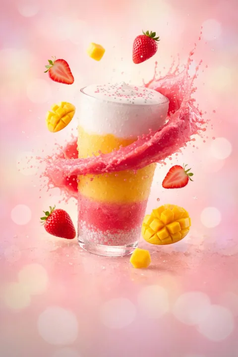
グラスの中の夏のさわやかなストーム
グラスに閉じ込めた夏。イチゴ、マンゴー、そして純粋なさわやかさが一口で爆発!
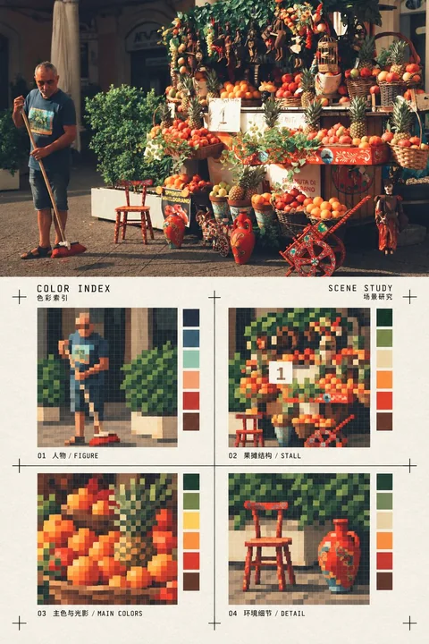
実写写真とピクセルカラーインデックスの比較ポスター
単一の実際の写真を唯一のコンテンツソースとして使用し、縦型の上下比較エディトリアルポスターを作成する。上半分は、入力写真の実際の写真テクスチャ、被写体のアイデンティティ、数量、ポーズ、空間関係、ライティング、構図を完全に保持し、写真をイラストに変換しない。下半分は、同じ写真のスタイル化された再レンダリング領域である:暖かい白色の紙面上で、画像を4つの等しい正方形のピクセルカラーブロックインデックスに精錬し、それぞれが写真の中で最も認識しやすい被写体の輪郭、建築または物体の構造
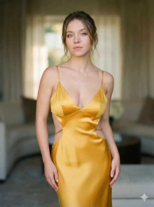
絶美的なゴールドのチェーンと赤いリボンのハイファッションの写真
[ { "image_id": "20260214_221316", "subject_details": { "name": "Sydney Sweeney", "expression": "宁静而中性", "hair_style": "松散发髻,留有修饰脸型的发丝", "makeup": "柔和魅力妆,裸色唇" }, "outfit_analysis": { "material": "高光泽丝绸缎面", "color": "芥末金", "silhouette": "紧身剪
フラッシュライトの下でキラキラと輝くミレニアル派对のギャル
スタイリッシュな若い女性が家庭パーティーで撮られたカジュアルな一瞬の写真。彼女は黒いサテン素材のボンバージャケットを着用し、その下には黒いクロップトップを着ている。長いストレートの黒髪に、ナチュラルメイクが施され、肌には柔らかな光沢が。直接的なカメラフラッシュで撮影され、強いシャドウが生まれ、明るい前景の被写体が、暗く混雑した背景と対照をなしている。背景には飲み物を持ったゲストたちがぼかされており、部屋の雰囲気はカジュアルで、環境照明は控えめ。一つの写真では彼女が肩を後ろに向
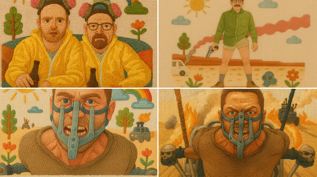
刺繡イラストスタイル
伝統的な刺繍をシミュレートした、手作業で制作されたイラストレーション。綿麻生地にカラフルな糸を使っており、すべての要素はサテンステッチ、バックステッチ、フレンチノットなどの技術を使用して、「縫い付けた」ように見える糸の質感が表現されています。盛り上がった輪郭と方向性のある糸の流れにより、触感があり温かみを感じる印象を与えています。背景は織られた綿麻生地で、優しいパステルカラーまたは民俗的なインスピレーションを受けた色調が使われています。構図はフレンドリーで魔法のような雰囲気を
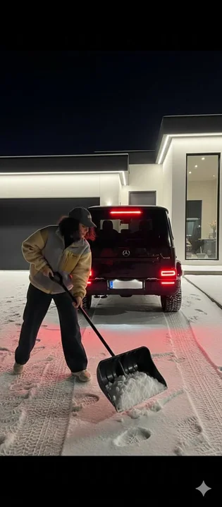
雪の夜、豪邸の前に停まっているベンツと、雪かきをする少女
ハイパーリアリスティックな夜間撮影、カジュアルなライフスタイル風の写真。若い女性が、豪華な現代ミニマリズムスタイルの家のドライブウェイから雪をかいている。彼女は前景の左側に位置し、前傾姿勢で、雪でいっぱいになった大きな黒い雪かきのスコップを押し進めている。彼女はヴィンテージのフリースジャケット(グレーのボディに肩と袖にベージュ/黄色っぽいパッチがついている)を着用し、ダークなゆったりとしたズボン、ベースボールキャップ、そして明るい色のスニーカーを着ている。黒い、濡れた、襟元ま
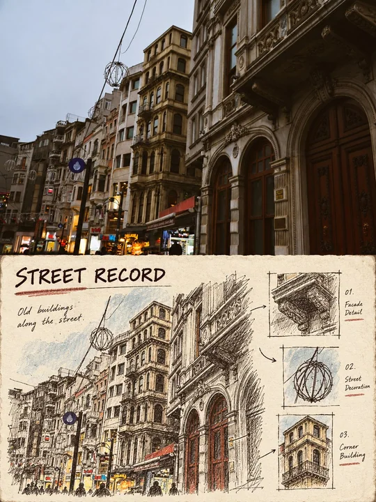
档案カードの現場手描き記録風、上下比較図
ユースケース:スタイル転写 アセットタイプ:縦型上下比較スタイル転写ポスター 主なリクエスト:入力された任意の実写写真を、「フィールド手描きアーカイブカード記録スタイル」の上下比較転写画像に変換する。 入力画像:入力写真は唯一の事実の源泉であり、写真内の被写体、ポーズ、数量、構造、空間関係、および確認可能な色のみを使用する。 シーン/背景:画像は縦型で、比率は約3:4。上半分は、入力写真のリアルな写真質感、元の構図、自然光を完全に保持し、明確な写真記録エリアとして機能する。下
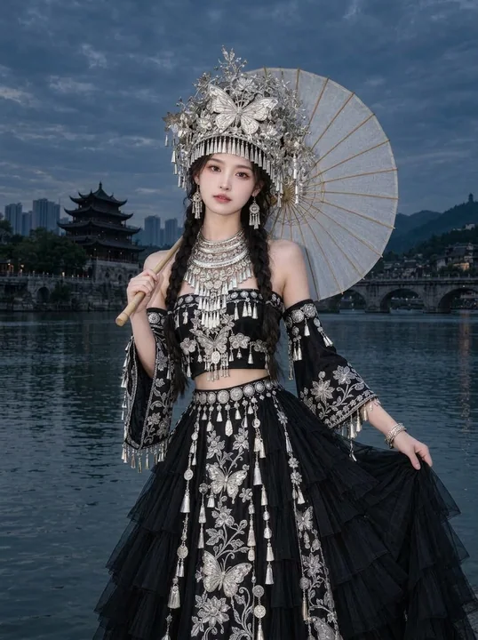
水辺で撮影された、銀の冠と黒いドレスを身につけた民族風ポートレート
縦型 585:883、2:3 に近い比率、写実的な写真スタイルの水辺の民族衣装ポートレート。東アジアの女性がフレームの中央に位置し、体は正面を向いてわずかに自然な角度をとり、顔はカメラに向かい、頭部はわずかに傾いている。構図は高い銀色の冠からロングスカートの下部までを捉え、スカートの裾はフレームの下端でカットされ、脚と足は完全にスカートの生地によって覆われている。人物の上部には広い曇天の空が確保され、周囲には水面と遠景が保たれており、人物を半身のクローズアップに拡大していない
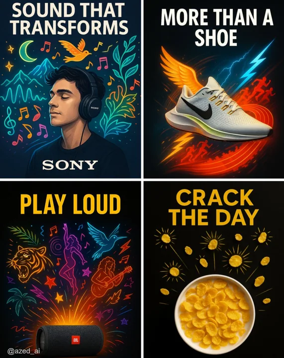
クリエイティブ広告
高衝撃の広告で、清潔なダークまたはハイコントラストの背景に配置されています。[製品]は中央に位置し、シャープに照明され、詳細が際立っています。その周りには、現実離れしたスタイリッシュな視覚的な[要素]のイラストが外に向かって爆発的に広がり(例:ミュージシャン、ランナー、カール、太陽放射)、鮮やかなカラーパレットとネオンが使われています。上部には太字の大文字で「[テキスト]」という広告コピーがあり、下部にはブランドロゴが配置されています。現代的な広告スタイルです。