Case 24920
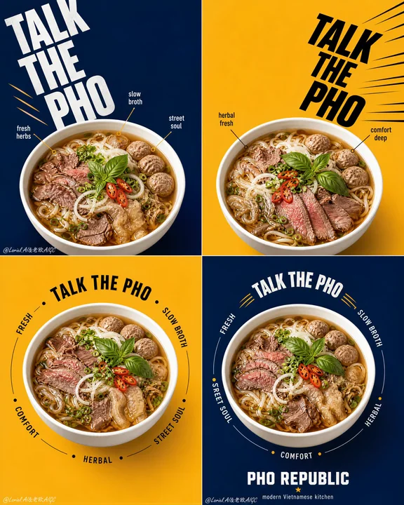
PHO REPUBLIC 越南粉 2x2 旗舰平面广告系列
Prompt
Create a flagship 2x2 campaign poster series for an original Vietnamese noodle brand named "PHO REPUBLIC", merging Orbit energy with Transit restraint. Use ultra-realistic commercial food photography, not illustration, not 3D render. The final artwork must present four coordinated square posters arranged in a strict 2x2 grid, each panel built from the same structural system with disciplined variation. The pho bowl must remain the absolute visual hero in every panel.

Style lock: high-end graphic food advertising, bold editorial poster layout, product-first hierarchy, clean color-block backgrounds, oversized kinetic typography, youthful premium Asian street-dining branding, Cannes-level print campaign execution.

Core campaign structure: four square panels with alternating deep navy blue and warm mustard yellow backgrounds. Each panel contains one large white pho bowl shown from the exact same slightly top-down camera angle. Bowl size, bowl height, bowl perspective, rim thickness, bowl diameter, and visual weight must be perfectly consistent across all four posters. The container must sit at an equal visual scale in every panel, acting as the fixed campaign anchor. Variation is allowed only in typography rhythm, circular text paths, callout placement, and directional movement around the bowl.

Transit logic: simplify every panel so the layout feels flagship and globally polished. Reduce small labels, reduce decorative callouts, shorten copy, preserve more clean negative space, and let the bowl, background block, and primary typography do most of the work. Avoid flyer-like density. Each square should feel graphic, premium, and instantly readable.

Orbit logic: create a coordinated movement system across the full 2x2 set. Panel one uses a strong descending diagonal text flow, panel two uses a mirrored inward-driving diagonal, panel three uses a controlled circular orbit around the bowl, and panel four uses a tighter circular return path that visually resolves the campaign. The four panels should feel like one connected visual sequence: launch, counter, orbit, resolve. Motion must feel crisp and graphic, not noisy.

Food design: create a premium beef pho hero dish with richly detailed ingredients: glowing amber broth, thin rice noodles, sliced beef, beef balls, tendon or tripe accents, basil leaves, scallions, red chili slices, onion, fresh herbs, and subtle broth sheen. Ingredient styling may shift slightly between panels, but the bowl size and bowl dominance must never change. The dish must feel abundant, fragrant, hot, and highly craveable.

Panel logic:
1. Top-left panel: deep navy background, oversized stacked headline moving diagonally from upper-left toward center, bowl anchored in the lower-middle zone, a few restrained callout markers near the rim.
2. Top-right panel: mustard background, mirrored bold typography driving inward from upper-right toward center seam, bowl anchored at the same scale and height as panel one, minimal graphic accents only.
3. Bottom-left panel: mustard background, centered bowl with a clean circular text orbit around it, fewer callouts than the top row, stronger negative space.
4. Bottom-right panel: deep navy background, centered bowl matching panel three exactly in scale and placement, tighter orbit text and a compact brand footer block to conclude the campaign.

Typography and branding: use original English text only, never copy any existing wording. Use a bold master phrase such as "TALK THE PHO" as the campaign anchor across the series, varied in scale and rhythm but always consistent in brand voice. Add only a few short descriptors such as "fresh", "slow broth", "street soul", "herbal", and "comfort". Include a compact brand block reading "PHO REPUBLIC" with a subtitle such as "modern Vietnamese kitchen". Typography should feel oversized, architectural, witty, and kinetic, but always secondary to the bowls.

Lighting: bright controlled studio food lighting with soft frontal illumination and subtle side shaping. The broth must glow warmly, herbs must feel crisp and fresh, meat textures must remain moist and realistic, and the white ceramic bowls must look clean, glossy, and dimensional. Keep shadows soft and controlled, with no muddy contrast.

Materials and realism: realistic white ceramic bowls with identical shape and scale across all four posters, hot glossy broth, tender beef textures, springy noodles, fresh basil, crisp chili slices, subtle oil shimmer, clean matte background fields, premium print-ready sharpness, and integrated graphic elements that feel designed rather than pasted.

Color system: strict alternating navy blue and mustard yellow fields, with restrained accents of red, white, black, and herb green. Keep the palette disciplined, high-contrast, and premium. Food colors must remain natural and appetizing.

Quality and physical rules: all four panels must feel like one unified flagship campaign. Equal bowl size across every panel is mandatory. Equal bowl camera angle, equal bowl scale, equal bowl visual weight, and equal product dominance must be preserved. Keep the campaign clean, graphic, premium, and highly legible. No clutter, no warped rims, no type collisions, no weak food detail, no dead black patches, no oversaturated broth.

Negative prompt: copied branding, copied text, inconsistent bowl sizes, inconsistent bowl height, inconsistent bowl perspective, different container scale between panels, warped bowl rims, blurry food, fake broth texture, messy layout, chaotic typography, cheap flyer look, low-resolution print feel, oversaturated food colors, excessive labels, cluttered callouts, cartoon rendering, CGI look, illustration style, product losing dominance, muddy shadows, dirty background.

为名为“PHO REPUBLIC”的原创越南河粉品牌创作一系列 2x2 旗舰活动海报,融合 Orbit 的能量与 Transit 的克制。使用超写实商业美食摄影,非插画,非 3D 渲染。最终的作品必须呈现四个协调的正方形海报,排列在严格的 2x2 网格中,每个面板都由相同的结构系统构建,并具有克制的变量。在每个面板中,河粉碗必须保持绝对的视觉主角地位。

风格锁定:高端平面美食广告,大胆的社论海报布局,产品优先的层级结构,干净的色块背景,超大动态排版,年轻的高端亚洲街头餐饮品牌,戛纳级别的平面广告执行。

核心活动结构:四个正方形面板,交替使用深海军蓝和温暖的芥末黄背景。每个面板包含一个大型白色河粉碗,以完全相同的略微俯视的相机角度展示。碗的大小、高度、透视、边缘厚度、直径和视觉重量在所有四张海报中必须完全一致。容器在每个面板中必须处于相等的视觉比例,作为固定的广告支柱。仅允许在排版节奏、圆形文字路径、标注放置和围绕碗的定向运动方面进行变化。

Transit 逻辑:简化每个面板,使布局具有旗舰感和全球化的精致感。减少小标签,减少装饰性标注,缩短文案,保留更多干净的负空间,让碗、背景色块和主要排版完成大部分工作。避免传单式的密度。每个方格都应该具有图形感、高端感并易于即时阅读。

Orbit 逻辑:在整个 2x2 组合中创建一个协调的运动系统。第一面板使用强烈的下降对角线文字流,第二面板使用镜像的向内驱动对角线,第三面板使用受控的围绕碗的圆形轨道,第四面板使用更紧凑的圆形返回路径,在视觉上解决整个活动。这四个面板应该感觉像一个连贯的视觉序列:启动、对抗、轨道、解决。动作必须感觉干脆利落且具图形感,而不是嘈杂。

食物设计:制作一道具有丰富细节配料的高端牛肉河粉主角菜肴:晶莹剔透的琥珀色肉汤、细米粉、牛肉片、牛肉丸、牛筋或牛肚点缀、罗勒叶、葱花、红辣椒片、洋葱、新鲜香草和微妙的肉汤光泽。面板之间的配料造型可能会略有变化,但碗的大小和碗的主导地位绝不能改变。菜肴必须让人感觉丰盛、芬芳、热气腾腾且极具诱惑力。

面板逻辑:
1. 左上角面板:深海军蓝背景,超大的堆叠标题从左上角向中心对角移动,碗固定在下部中间区域,靠近边缘处有少量克制的标注标记。
2. 右上角面板:芥末黄背景,镜像的大胆排版从右上角向中心接缝向内驱动,碗固定在与第一面板相同比例和高度的位置,仅有极简的图形装饰。
3. 左下角面板:芥末黄背景,居中的碗,周围有干净的圆形文字轨道,标注比顶行少,负空间更强。
4. 右下角面板:深海军蓝背景,居中的碗在比例和放置上与第三面板完全一致,更紧凑的轨道文字和紧凑的品牌页脚块,以此结束活动。

排版与品牌:仅使用原始英文文本,切勿复制任何现有字词。使用一个大胆的主导短语,如“TALK THE PHO”,作为整个系列中的活动支柱,在规模和节奏上有所变化,但在品牌基调上始终保持一致。仅添加少量简短的描述词,如“fresh”、“slow broth”、“street soul”、“herbal”和“comfort”。包含一个简洁的品牌块,写着“PHO REPUBLIC”,并带有副标题,如“modern Vietnamese kitchen”。排版应该是超大的、建筑感的、风趣的和动态的,但始终次于碗。

光照:明亮且受控的影棚美食照明,具有柔和的前部照明和微妙的侧面塑形。肉汤必须散发出温暖的光芒,香草必须感觉清爽新鲜,肉的质地必须保持湿润写实,白色陶瓷碗必须看起来干净、光滑且具有立体感。保持阴影柔和受控,没有模糊的对比。

材料与写实:写实的白色陶瓷碗,在所有四张海报中具有相同的形状和比例,滚烫光滑的肉汤,鲜嫩的牛肉质地,劲道的面条,新鲜的罗勒,清脆的辣椒片,微妙的油脂闪烁,干净的哑光背景场,高端的印刷级清晰度,以及感觉是设计出来的而非粘贴上去的集成图形元素。

颜色系统:严格交替的海军蓝和芥末黄场,辅以红色、白色、黑色和草绿色的克制点缀。保持色调严谨、高对比度且高端。食物颜色必须保持自然诱人。

质量与物理规则:所有四个面板必须感觉像一个统一的旗舰活动。每个面板中碗的大小相等是强制性的。必须保持相等的碗相机角度、相等的碗比例、相等的碗视觉重量和相等的产品主导地位。保持活动简洁、具图形感、高端且极易辨识。没有混乱,没有变形的碗边,没有排版冲突,没有单薄的食物细节,没有死黑区域,没有过饱和的肉汤。

负向提示:抄袭的品牌,抄袭的文本,不一致的碗大小,不一致的碗高度,不一致的碗透视,面板之间不同的容器比例,变形的碗边,模糊的食物,假的肉汤质地,凌乱的布局,混乱的排版,廉价的传单感,低分辨率的印刷感,过饱和的食物颜色,过多的标签,拥挤的标注,卡通渲染,CGI 感,插画风格,产品失去主导地位,模糊的阴影,肮脏的背景。
Autres prompts
Case 11429
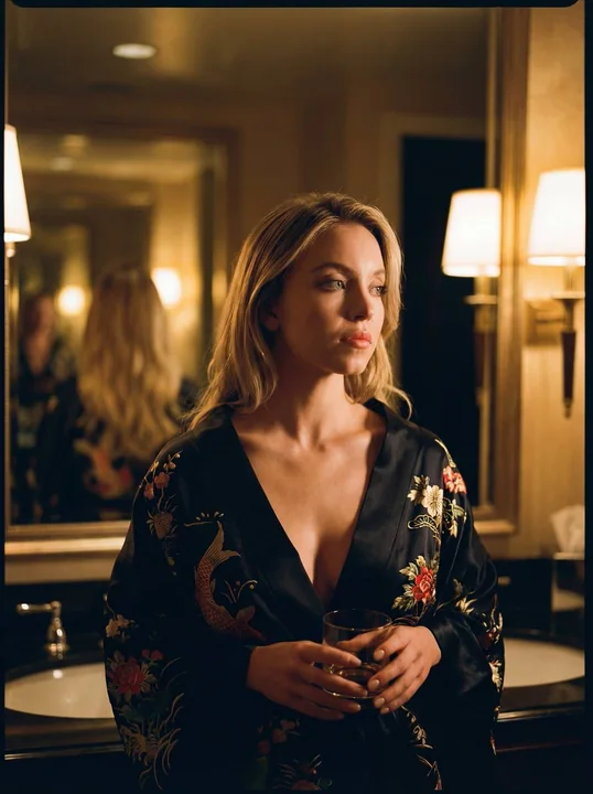
La belle carpe or du bain de nuit
{ "album_ka_unwan": "Série Kimoto Celebrity en Éclairage Cinématographique", "tasaveer_ki_tafseel": [ { "file_name": "20260202_202438.jpg", "shakhsiyat": "Sadie Sink", "chehre_ke_tassurat": "Sanjeeda aur khoya hua (pensive)", "libas_ki_khus
电影感奢华风暖光影锦鲤纹黑浴袍
Case 1
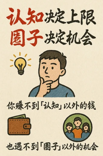
Cartes d'information au style dessiné à la main
Créez une carte d'information au style dessin à la main, avec un format vertical de 9:16. Le thème de la carte est clair et distinctif, le fond est en couleur miel ou crème avec une texture papier, tout le design reflète une beauté rustique
illustrationtypography