Case 25572
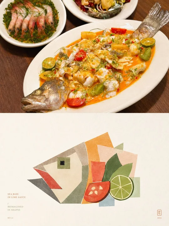
Дизайн модульного арт-постера с геометрической деконструкцией в фотосъемке
Prompt
Пожалуйста, превратите каждое загруженное мной фото в отдельный постер высокого дизайнерского уровня, без склейки нескольких фото, каждое фото выводится отдельно. Общая композиция — вертикальный формат 3:4, верхняя и нижняя области строго равны по высоте (1:1), каждая занимает 50% кадра.

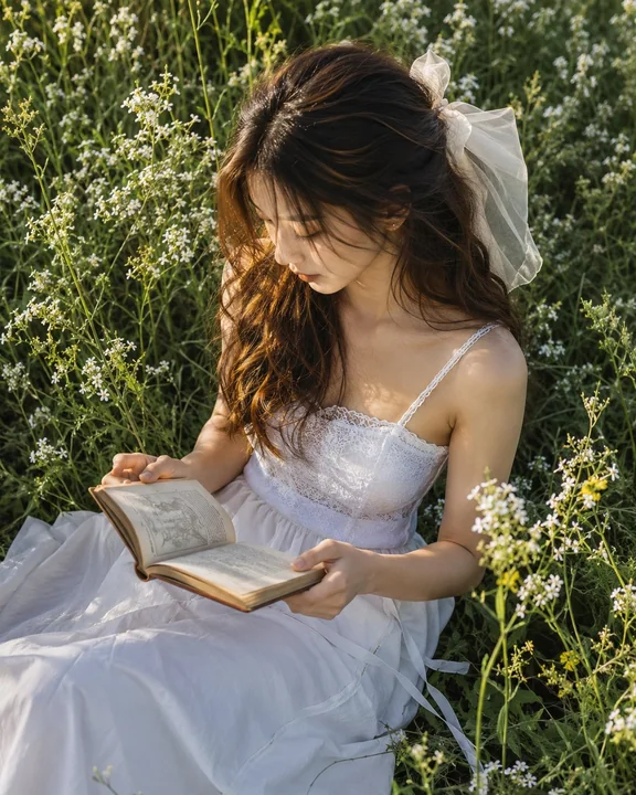
Верхняя половина сохраняет исходное фото, сохраняя идентичность, структуру, позу, реалистичную текстуру, естественное освещение и исходную цветовую атмосферу объекта, с лишь незначительной премиальной цветокоррекцией, придающей качество журналов об искусстве, независимых изданий и выставочных изображений. Для соответствия формату фоновая среда может быть естественно расширена, но объект не должен быть растянут, искажён или изменён.

Нижняя половина извлекает наиболее узнаваемые объект, контур, структуру, позу и нарративные связи фото и перестраивает их в блочные, модульные геометрические деконструктивные иллюстрации. Не копируйте фото полностью и не рисуйте реалистично; вместо этого удалите нерелевантные детали, оставив только визуальные точки памяти, которые лучше всего представляют идентичность и характер исходного объекта. Переосновите образ через геометрическую обобщённость, наложение форм и коллажную реорганизацию, чтобы люди могли сразу распознать связь с фото выше.

Общий стиль подчёркивает ощущение блоков, модулей, геометрического разделения и крупных цельных плоскостей. Геометрическое дробление не должно быть слишком дробным; не режьте на множество разрозненных мелких кусочков, а организуйте объект с помощью меньшего количества более крупных и цельных прямоугольников, квадратов, скруглённых углов, эллипсов, треугольников и неправильных блоков. Люди могут быть представлены квадратными лицами, чёткими линиями челюсти и блочными чертами лица; здания могут быть преобразованы в квадратные объёмы, фасадные зоны, ритм окон и структурные повороты; животные, растения, предметы и пейзажи также должны быть утончены до геометрических форм с блочным порядком и модульными отношениями. Допускается умеренное преувеличение и деформация, но общий результат должен быть зрелым, сдержанным и лаконичным, избегая дробности, инфантильности и чрезмерной раздробленности.

Общий стиль использует плоские цветовые блоки + коллажную композицию + модернистский геометрический язык. Цветовые блоки пересобираются, как кусочки бумаги, формируя яркий, но упорядоченный коллажный эффект; сложные фоны активно удаляются, оставляя лишь несколько необходимых форм или вспомогательных блоков, не создавая второго визуального центра.

Композиция сохраняет соотношение «малый объект / большие площади белого пространства», свободно располагая позиции в соответствии с собственным направлением, пропорциями, визуальным фокусом и структурным трендом объекта. Допускается смещение от центра, выравнивание по краям или частичное обрезание, но всегда поддерживаются чёткие первичные и вторичные роли, ритм плотности и редакционный баланс. Общий образ подчёркивает позитивные и негативные формы, вес блоков, «дышащее» белое пространство и порядок макета, придавая нижней половине как художественное ощущение, так и характер премиальных изданий.

Материал демонстрирует мягкую бумажную зернистость и лёгкое гравюрное ощущение: на геометрических цветовых блоках сохраняются тонкая бумажная текстура, мягкий шум и лёгкая печатная фактура, приближая изображение к бумажному коллажу или художественным печатным работам. Избегайте гладких векторов, 3D-рендеринга, фотофильтров и чрезмерной обработки.

Цветовая схема извлекает 2–4 наиболее узнаваемых, приятных цвета, которые лучше всего воплощают характер объекта из фото выше, и перестраивает их в более премиальную цветовую систему. Общая палитра может быть умеренно осветлена, очищена и обесцвечена, преобразована в более лёгкие, современные и долговечные цветовые отношения, такие как кремовый белый, абрикосовый, персиково-розовый, кораллово-оранжевый, туманно-голубой, серо-зелёный, шалфейно-зелёный, тёплый коричневый и мягкий фиолетовый. Основные цвета яркие, но не резкие, вспомогательные цвета мягкие и многослойные, общий характер чистый, тёплый, модный и дружелюбный, избегая землистого жёлтого, грязно-серого, тёмно-коричневого, флуоресцентных цветов, дешёвого «конфетного» ощущения и загромождённых цветовых схем.

Небольшое количество текста вмешивается, без ограничений по языку. Короткие заголовки, мелкие пометки, номера или описательные фрагменты могут быть свободно разработаны на основе идентичности, места, настроения, характера или символического значения объекта. Текст должен быть маленьким, лёгким и сдержанным, естественно располагаясь в белых пространствах или углах макета, формируя изысканные графико-текстовые отношения с графическими элементами, без нагромождения коммерческих заголовков.

Общее представление характеризуется геометрической деконструкцией крупных цельных блоков, сдержанным коллажем, мягкой премиальной цветовой схемой, бумажной зернистостью, большими областями белого пространства и редакционным макетом, вместе формирующими визуальный эффект. Независимо от того, является ли объект человеком, зданием, животным, растением, предметом или природным пейзажем, он должен сохранять чёткую идентичность, модульный геометрический порядок и единый художественный язык. Избегайте реалистичного изображения, чрезмерно дробного разрезания, наивного коллажа, сложной перспективы, чрезмерно плотных деталей, мультяшного ощущения, 3D-эффекта, шаблонного постерного ощущения и дешёвого культурно-креативного стиля.
Другие промпты
Case 15519
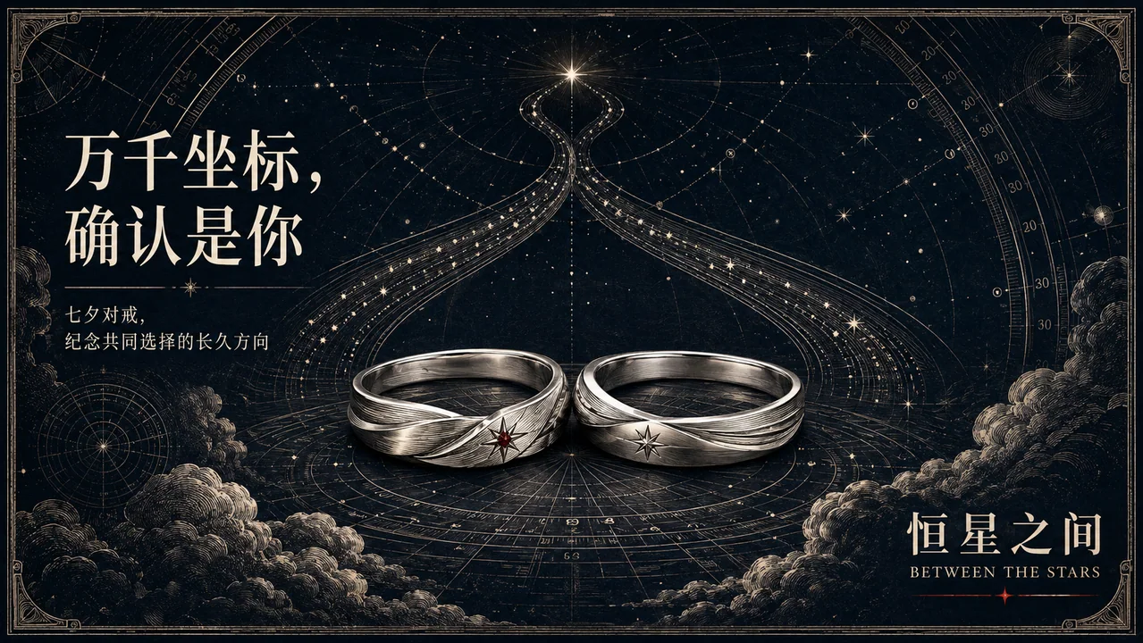
Между звёздами: коммерческая иллюстрация свадебных колец в День всех влюблённых в стиле гравюры на меди
极简铜版画天文七夕婚戒
Case 28468
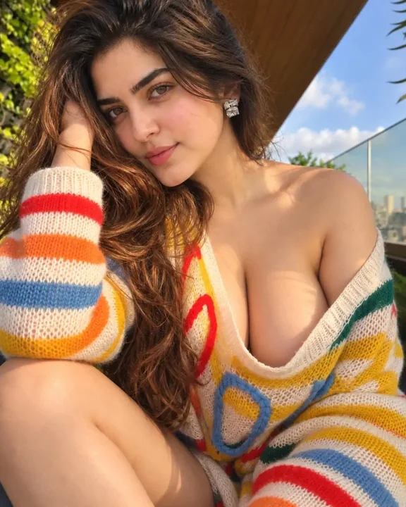
阳光露台彩色毛衣印度美女写实人像
Ultra-realistic 4K portrait of a beautiful young Indian woman with long, voluminous wavy brown hair, expressive brown eyes, soft makeup, and elegant square diamond earrings. She is sitting outdoors on a sunny terrace, gently resting her hea