Case 25925
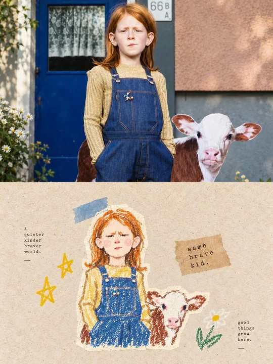
Double poster : collage d’art en pastel et graffiti à partir de photos
Prompt
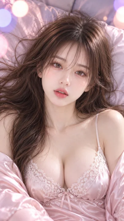
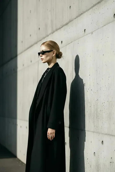
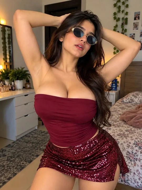
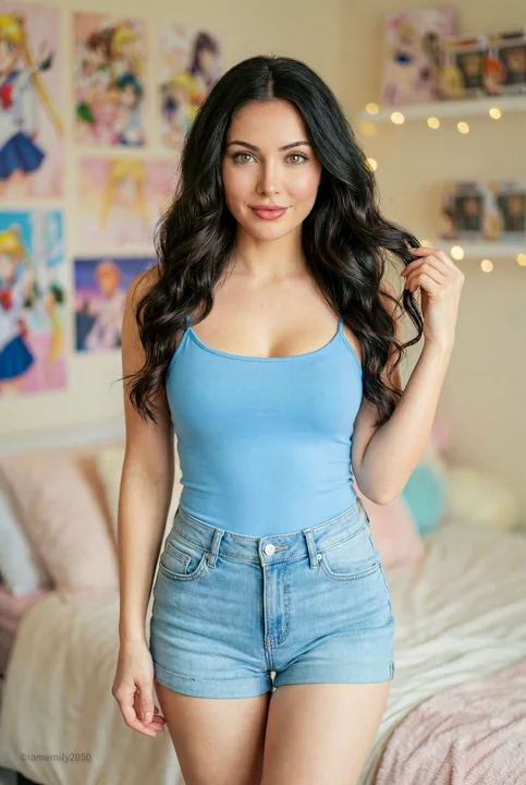
Veuillez transformer chaque photo que je téléverse en un poster de design haut de gamme indépendant, sans collage de plusieurs photos, chaque photo étant sortie séparément. Adoptez une composition verticale globale en 3:4, où les deux zones supérieure et inférieure ont une hauteur strictement de 1:1, chacune occupant 50 % de l'écran.

La partie supérieure conserve la photo d'origine, en préservant l'identité, la structure, la posture, la texture réaliste, la lumière et les ombres naturelles, ainsi que l'atmosphère chromatique d'origine, avec seulement un léger étalonnage de couleurs haut de gamme pour lui conférer la qualité d'une image de magazine d'art, de publication indépendante ou d'exposition. Pour s'adapter au cadre, l'arrière-plan de l'environnement peut être étendu naturellement, mais le sujet ne doit pas être étiré, déformé ou modifié.

La partie inférieure comprend d'abord le thème central, la relation du sujet, la tendance structurelle, l'émotion et la métaphore visuelle les plus mémorables de la photo d'origine, puis les reconstruit sous forme d'illustration de collage de matériaux de graffiti dessiné à la main aux pastels, avec une texture de papier rétro. Ne copiez pas les objets de la photo un par un, ni ne remplissez pas l'écran sur une grande surface ; au contraire, supprimez les détails non pertinents et ne conservez que les structures, les tendances et les points de mémoire visuelle qui représentent le mieux l'original. Grâce au graffiti dessiné à la main, au collage de matériaux, à la texture de crayon pastel et à une petite quantité de réorganisation du papier, effectuez un redessin et une réexpression ingénieux, permettant aux gens de reconnaître d'un coup d'œil la correspondance avec la photo ci-dessus.

La forme du sujet est présentée sous forme de visuel principal de style tampon à petite échelle, ne cherchant pas une reproduction complète, mais accomplissant la reconnaissance par quelques contours, postures, directions et relations les plus critiques. Les lignes du sujet adoptent des lignes de graffiti dessinées à la main de style craie/crayon distinctes : variations légères d'épaisseur, avec des particules sèches, un effritement intermittent, de légers tremblements et des bords non entièrement fermés, comme un croquis de lignes décontracté dessiné directement sur une surface de papier rugueuse. Il peut y avoir de légères inclinaisons, des répétitions, des hésitations et de l'empêchement, mais cela ne doit pas devenir un brouillon désordonné. Localement, des lignes courtes, des hachures croisées, des grilles simples et une petite quantité de brouillage peuvent être utilisés pour exprimer la structure, sans modelage volumétrique réaliste.

La logique générale du collage de matériaux est toujours maintenue. Le sujet et une petite quantité d'éléments auxiliaires peuvent être composés conjointement de chutes de papier, de formes de collage, de blocs de couleurs pastel et de symboles dessinés à la main, en conservant de légères bords découpés, des relations de superposition et une sensation artisanale, mais ne servant qu'à la généralisation et à la reconstruction, pas à la décoration triviale. Une très petite quantité d'étoiles, de fleurs, d'ondulations, de symboles géométriques ou de petits graffiti de vie liés à l'émotion de l'image d'origine peuvent être ajoutés autour comme écho narratif, sans former un second centre visuel.

La composition maintient la relation entre les tampons à petite échelle et les grandes zones de blanc. Les positions sont disposées librement selon la direction, la proportion et le point focal visuel du sujet lui-même, pouvant être excentriques, alignées sur le bord, suspendues ou partiellement rognées. Le blanc doit être un langage compositionnel conscient, et non un arrière-plan vide. Il forme, avec le sujet, les éléments de collage, le texte et quelques symboles, des formes positives et négatives, de la densité, de la dispersion et un équilibre asymétrique, constituant un sens évident de respiration, d'espace et de pause. Mieux vaut supprimer que remplir, faisant en sorte que le sujet ressemble à un tampon visuel soigneusement placé dans une grande surface de papier.

L'arrière-plan doit former un contraste clair mais doux avec le sujet ; la teinte, la luminosité et la texture ne doivent pas se confondre toutes ensemble. Le papier d'arrière-plan peut utiliser du papier kraft brun chaud, du papier recyclé, du papier artisanal clair ou d'autres bases de papier cohérentes avec le tempérament de l'image d'origine, mais il doit être distingué du sujet par la luminosité des lignes, la luminosité des blocs de couleur ou la teinte pour laisser le sujet émerger clairement. L'arrière-plan maintient des fibres et des grains réels, propre et naturel, sans taches sales ou vieilles.

Les couleurs sont extraites de la photo ci-dessus en sélectionnant 2 à 4 des couleurs les plus vives, les plus amicales et les plus représentatives pour être réajustées en un ensemble de couleurs pastel doux et clair. Il peut naturellement former des couleurs claires telles que le rose crème, l'orange pêche, le bleu ciel clair, le vert menthe, le jaune doux, le lavande, etc., et être éclairci avec des lignes blanches ou crème. L'apparence globale doit être lumineuse, chaleureuse, apaisante et avoir un sens de la vie, tout en étant suffisamment distinguée de l'arrière-plan pour éviter l'obscurité, les bruns sales, les tons Morandi ternes, les couleurs fluorescentes et la sensation de bonbons bon marché.

Le texte ne sert que d'intervention éditoriale minimale, sans restriction de langue. Une petite quantité de courtes phrases ou de fragments de texte peut être librement raffinée à partir du sujet, de l'émotion, de l'action, de la mémoire ou de la métaphore de la photo, en utilisant des polices de mise en page de machine à écrire légères, fines, espacées, avec un espacement des lettres légèrement inégal et des erreurs d'impression de style ancien, formant un contraste avec les lignes dessinées à la main détendues. Le texte est dispersé silencieusement dans le blanc, placé près du sujet ou disposé le long de la direction de l'écran, formant conjointement une relation naturelle de mélange image-texte avec l'illustration, sans utiliser de modèles de titre fixes.

La présentation globale est un effet visuel haut de gamme composé de texture de papier, de graffiti au crayon pastel, d'une petite quantité de collage de matériaux, d'un sujet de tampon à petite échelle, de grandes zones de blanc conscient et d'une mise en page détendue de mélange image-texte. L'accent n'est pas de copier la photo, mais de comprendre le langage visuel de l'image d'origine puis de réexprimer le thème original d'une manière plus ingénieuse, plus légère et plus respirante. Évitez le redessin objet par objet, la confusion de l'arrière-plan et du sujet, le remplissage de l'écran, la représentation réaliste, le contour fin, les vecteurs lisses, la décoration excessive, la sensation de modèle pour enfants, la sensation 3D et la sensation de poster commercial.
Autres prompts
Case 9017
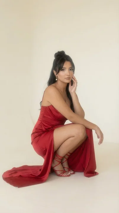
Femme élégante en robe rouge sous les lumières douces et floues
{ "generation_request": { "meta_data": { "tool": "NanoBanana Pro", "task_type": "soft_haze_editorial_studio_portrait", "language": "fr", "priority": "highest", "version": "v1.0_RED_SATIN_DRAPE_SQUAT_SOFT_HAZE_STUDIO" }, "input": { "mode": "
红裙高定胶片风棚拍柔雾
Case 7
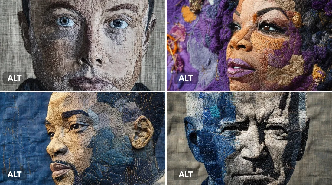
Portrait brodé
Un portrait brodé d'Elon Musk, cousu avec des fils gris acier riche et bleu électrique sur un tissu de lin profond. Le travail de couture visible, les textures superposées et les motifs artisanaux lui donnent une sensation terrestre et sacr
portrait