Case 26095
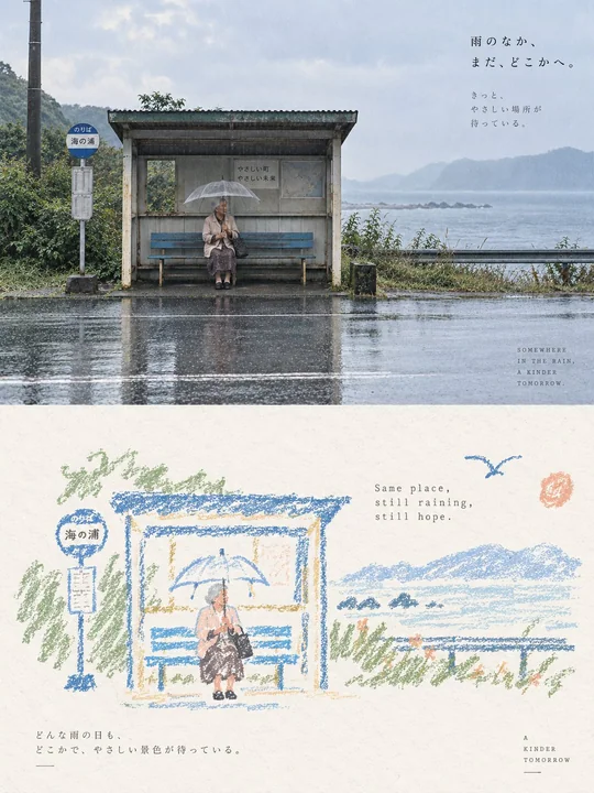
Постер с винтажным стилем восковых мелков и граффити, с обилием свободного пространства
Prompt
Пожалуйста, оформите каждое загруженное мной фото в виде отдельного постера высокого дизайнерского уровня, без склейки нескольких изображений, каждое фото выводится индивидуально. Общая композиция — вертикальный формат 3:4, где верхняя и нижняя области строго равны по высоте (1:1), каждая занимает 50% кадра.

Верхняя часть сохраняет исходное фото, поддерживая идентичность, структуру, позу, реальную текстуру, естественное освещение и тени, а также исходную цветовую атмосферу объекта. Применяется лишь легкая премиальная цветокоррекция, придающая изображению текстуру арт-журнала, независимого издания или выставочного плаката. Для адаптации к формату фрейма фоновая среда может быть естественно расширена, но сам объект не должен быть растянут, искажен или изменен.

Нижняя часть сначала интерпретирует наиболее запоминающиеся аспекты исходного фото — ключевую тему, связь между объектами, структурную динамику, эмоцию и визуальную метафору, — а затем перерабатывает их в пастельную меловую граффити-иллюстрацию с текстурой винтажной бумаги. Не копируйте фото поэлементно и не перерисовывайте полностью весь контент; сохраняйте только контуры, позы, направления и визуальные точки памяти, которые лучше всего представляют исходный объект. За счет упрощения, обобщения, легкого преувеличения и рекомбинации создайте ощущение мгновенного узнавания связи с фото выше.

Объект оформлен толстыми меловыми/восковыми контурами в стиле ручной росписи: линии слегка толстые, свободные, сухие, с частицами порошка, прерывистым выцветанием, легким дрожанием и незакрытыми краями, с естественно тупыми и округлыми окончаниями. Внутри объекта добавляется лишь очень небольшое количество пастельных цветовых пятен, простых сеток, полос, точек или случайных разводов, использующих минимальное количество информации для намечения структуры, без реалистичного объема или полных деталей.

Окружающие мелкие элементы используют тот же языковой стиль линий, что и объект, но еще больше сжаты до граффити-символов, узнаваемых за один или несколько штрихов. Звезды, цветы, растения, предметы, контекстные детали или абстрактные символы должны быть простыми, наивными, открытыми и незакрытыми, преимущественно в виде однолинейных контуров с минимальным количеством заливок. Не превращайте их в изысканные иконки, наклейки или отдельные мини-иллюстрации.

Композиция сохраняет соотношение между мелкомасштабными «штампами» и большими областями белого пространства, свободно располагая элементы в соответствии с собственным направлением, пропорциями и визуальным центром тяжести объекта. Допустимы смещение от центра, прижатие к краю, подвешивание или частичное обрезание. Объект и очень небольшое количество граффити-символов образуют свободное, но четкое визуальное сообщество, а остальное пространство намеренно остается пустым. Белое пространство само по себе является основным композиционным элементом, создавая ощущение дыхания, дистанции и паузы через соотношение пустоты и наполненности, сгущения и рассеивания, контраста размеров и асимметрии; лучше нарисовать меньше, чем заполнить все.

Фон должен использовать исключительно светлый, яркий и чистый цвет бумаги, например, кремовый белый, слоновая кость, светло-бежевый белый, бледно-абрикосовый белый, очень светло-серый белый или почти белый цвет бумаги, интеллектуально подобранный в соответствии с общей цветовой температурой исходного изображения. Бумага сохраняет лишь очень легкие волокна и частицы, не должна быть коричневой, желтоватой, сероватой или выглядеть старой. Яркость фона должна быть значительно выше, чем у линий и цветовых пятен объекта, чтобы все восковые контуры, мелкие символы и текст были четко видны и не сливались с фоном.

Цветовая палитра извлекает 2–4 самых ярких, дружелюбных и репрезентативных цвета из фото выше и перерабатывает их в яркие и мягкие пастельные восковые цвета. Это может естественным образом создавать легкие оттенки, такие как персиковый розовый, абрикосовый оранжевый, кремовый желтый, мятный зеленый, небесно-голубой, светло-фиолетовый и т.д. Линии объекта приоритетно используют коралловый розовый, мягкий синий, бирюзово-зеленый, теплый оранжевый, светло-фиолетовый или темно-кремовые тона, которые четче фона; мелкие элементы лишь эпизодически повторяют эти цвета, создавая отклик. В целом поддерживается контрастная связь «светлый фон + четкие цветные линии + небольшое количество мягких цветовых пятен», что делает изображение ярким, исцеляющим, расслабляющим и жизнерадостным. Избегайте темных, грязно-коричневых, тусклых моранди-тонов, низкого контраста, флуоресцентных цветов и дешевого «конфетного» ощущения.

Текст вмешивается в малом количестве, без ограничений по языку. Короткие фразы или текстовые фрагменты могут свободно извлекаться из объекта, действия, эмоции, памяти или метафоры, используя тонкий, разреженный шрифт печатной машинки с легким неравномерным межбуквенным интервалом и ошибками старой механической печати. Цвет текста — четкий, но не броский серо-коричневый, мягкий черный, темно-сине-серый или темный оттенок, перекликающийся с объектом, обеспечивающий достаточную читаемость на светлой поверхности бумаги. Текст естественно рассеян в области белого пространства, формируя смешанную типографско-иллюстративную композицию с объектом и граффити, без шаблонов фиксированных заголовков.

Общее впечатление — это высококачественное исцеляющее визуальное решение, составленное из исключительно светлой поверхности бумаги, толстых восковых контуров, небольшого количества пастельных заливок, минималистичных граффити-символов, мелкомасштабного объекта и большого количества художественного белого пространства. Акцент сделан на том, чтобы объект и мелкие элементы четко «парили» на светлой поверхности бумаги, сохраняя при этом свободное, наивное, нежное и зрелое редакторское чувство композиции. Избегайте темной крафт-бумаги, темно-коричневых фонов, линий с низким контрастом, слипания фона и объекта, тонких штрихов, реалистичной перерисовки, сложных мелких иконок, заполненных фонов, гладких векторов, 3D-эффекта и ощущения коммерческого шаблона.
Другие промпты
Case 28711
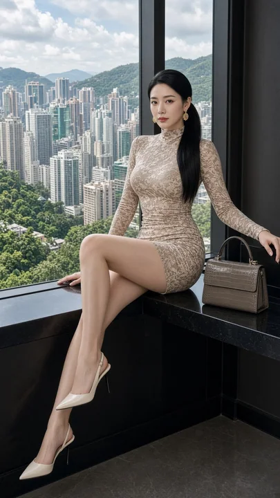
Гламурная модная фотосессия восточноазиатской женщины в городском интерьере у окна
## [Описание объекта] Фотореалистичный портрет в полный рост в стиле роскошного модного глянца: взрослая восточноазиатская женщина с белой, гладкой кожей, естественно пышной грудью, стройной, но соблазнительной фигурой, чётко очерченной тал
Case 22
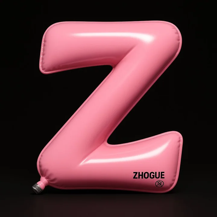
Пользовательские воздушные шары
Высокореалистичная 3D-инсталляция: буква Z выполнена в виде надувного шарика, общий контур напоминает плавно изгибающуюся траекторию "Z", состоящую из двух наклонных линий и одного угла, края слегка завернуты, создавая ощущение мягкого давл
minimalisttypographytoy3D渲染