Case 24423
真实摄影与稚拙扁平插画设计海报
Prompt
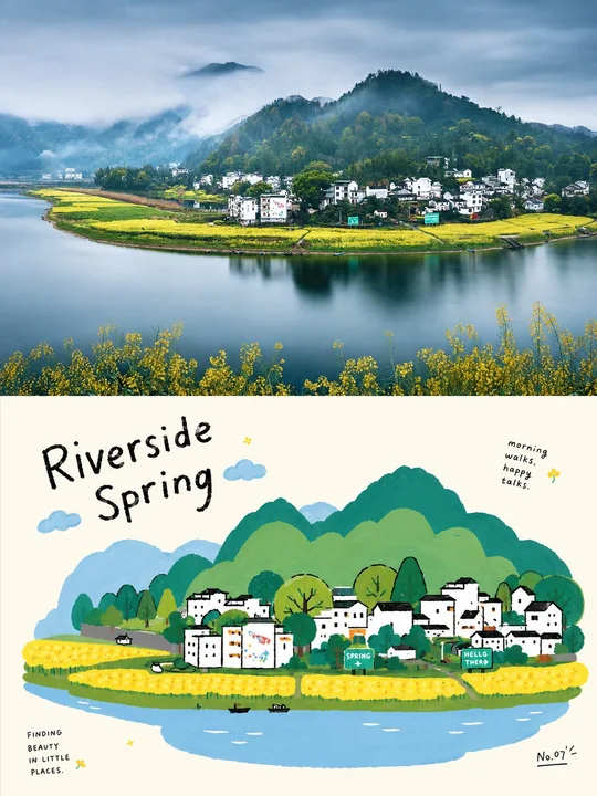
Please turn every photo I upload into an individual high-end design poster, not a multi-image collage; each photo should be output separately. The overall composition adopts a 3:4 vertical format, with the top and bottom sections strictly 1:1 in height, each taking up 50% of the frame.

The upper half preserves the original photo, maintaining the subject structure, realistic texture, natural light and shadow, and the original color atmosphere, with only slight high-end photographic color grading to give it the texture of an art magazine, independent publication, or exhibition photography. To fit the aspect ratio, the environmental background can be naturally extended, but the subject must not be stretched, distorted, or changed.

The lower half extracts the most recognizable subject, outline, posture, and narrative relationship from the photo, reconstructing it into a relaxed, naive Korean-style flat editorial illustration. Retain the general layout, object relationships, and core actions of the original image, but remove realistic light and shadow, perspective, and material details. Generalize the subject into rounded, simple, slightly exaggerated geometric shapes, using rough, shaky, partially broken black hand-drawn outlines paired with flat solid color fills, so the image remains instantly recognizable but not overly realistic.

The composition maintains one clear visual center, with other objects as foils, establishing a light rhythm through size differences, misalignment, occlusion, slight cropping, and incomplete symmetry. The background uses large areas of bright solid colors and white space to support the subject, retaining left/right or partial complete color blocks as breathing space; do not pile up complex scenes, making the image look like a carefully designed children's picture book or an independent editorial illustration, rather than a cartoonized photo.

The color scheme extracts the most vital and recognizable colors from the photo above and transforms them into high-brightness, high-purity, limited-quantity flat color blocks; bright blue, red, yellow, green, white, and other color relationships with childlike tension can be used, but do not mechanically apply fixed color palettes. The background and the subject form a sharp contrast in area, avoiding gradients, shadows, gray/dirty colors, complex color mixing, and a plastic feel.

The text also adopts a naive yet design-oriented editorial logic. Extract a short English title from the subject, action, mood, or story of the photo, and pair it with a small number of extremely small short sentences, object words, location words, numbers, or playful annotations. The main title can use a font that feels slightly handwritten, uneven in thickness, or slightly tilted, while the small text remains clear and restrained; the text can be arranged along the subject's outline, color block edges, white space areas, or the image axis, and can also feature slight rotation, misalignment, splitting, and interlacing, making the text feel like a part of the illustration itself rather than typography pasted on later.

The overall presentation is a visual temperament of real photography × naive flat illustration × relaxed editorial design, which is bright, childlike, intimate, playful, relaxed, and design-oriented. Whether the subject is a person, animal, plant, building, object, vehicle, food, or natural scene, a clear visual echo should be maintained between the original photo's identity and the illustration below, avoiding cheap cartoons, complex depictions, 3D textures, a commercial sticker feel, and templated children's illustrations.

请将我上传的每一张照片分别制作成一张独立的高级设计海报,不多图拼接,每张照片单独输出。整体采用3:4竖版构图,上下两个区域高度严格1:1,各占画面50%。

上半部分保留原始照片,保持主体结构、真实质感、自然光影和原有色彩氛围,仅进行轻微高级摄影调色,使其具有艺术杂志、独立出版物与展览摄影质感。为适配画幅,可自然扩展环境背景,但不得拉伸、扭曲或改变主体。

下半部分提取照片中最具识别性的主体、轮廓、姿态与叙事关系,重构为轻松、稚拙的韩式扁平编辑插画。保留原图的大致布局、物体关系和核心动作,但去除写实光影、透视和材质细节,将主体概括成圆润、简单、略带夸张的几何形状,以粗糙抖动、局部断开的黑色手绘轮廓搭配纯色平涂,让画面保持一眼可辨又不过度写实。

构图保持一个明确视觉中心,其余物体作为陪衬,通过大小差、错位、遮挡、轻微裁切和不完全对称建立轻快节奏。背景使用大面积明亮纯色与留白承托主体,可保留左右或局部完整色块作为呼吸空间,不堆积复杂场景,让画面像经过精心设计的儿童绘本或独立编辑插画,而不是照片卡通化。

配色从上方照片中提取最有生命力和辨识度的颜色,再转化为高明度、高纯度、数量有限的扁平色块;可使用亮蓝、红、黄、绿、白等具有童趣张力的色彩关系,但不机械套用固定色卡。背景与主体形成鲜明面积对比,避免渐变、阴影、灰脏色、复杂混色和塑料感。

文字同样采用稚拙而有设计感的编辑逻辑。从照片的主体、动作、情绪或故事中提炼一个简短英文标题,并搭配少量极小短句、对象词、地点词、编号或俏皮注释。主标题可使用略带手写感、粗细不均或轻微歪斜的字体,小字则保持清晰克制;文字可以沿主体轮廓、色块边缘、留白区域或画面轴线排列,也可出现轻微旋转、错位、拆分和穿插,使文字像插画本身的一部分,而不是后期贴上的排版。

整体呈现真实摄影 × 稚拙扁平插画 × 轻松编辑设计的视觉气质,明快、童趣、亲切、俏皮、松弛又有设计感。无论主体是人物、动物、植物、建筑、器物、交通工具、食物或自然场景,都应保持原图身份与下方插画之间清晰的视觉呼应,避免廉价卡通、复杂描绘、3D质感、商业贴纸感和模板化儿童插画。
Другие промпты
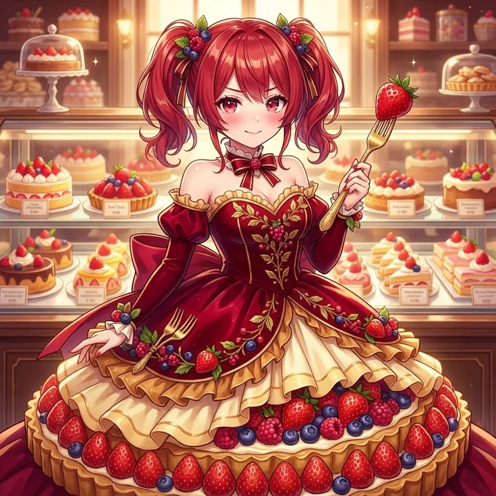
Case 14208
Девушка в роскошном платье из клубники наслаждается кисло-сладкой первой любовью
Вкус любви сладкой и кислой? 💕 Прекрасное платье с изображением клубники! ✨
少女甜美浪漫草莓恋爱
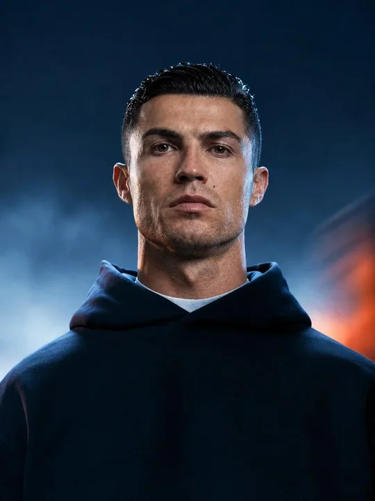
Case 28074
电影感写实人物肖像工作室灯光
Create a highly photorealistic cinematic portrait of a person standing centered and facing the camera with a calm, serious expression. Natural facial proportions, realistic skin texture, detailed eyes, subtle skin imperfections, and natural