Case 28184
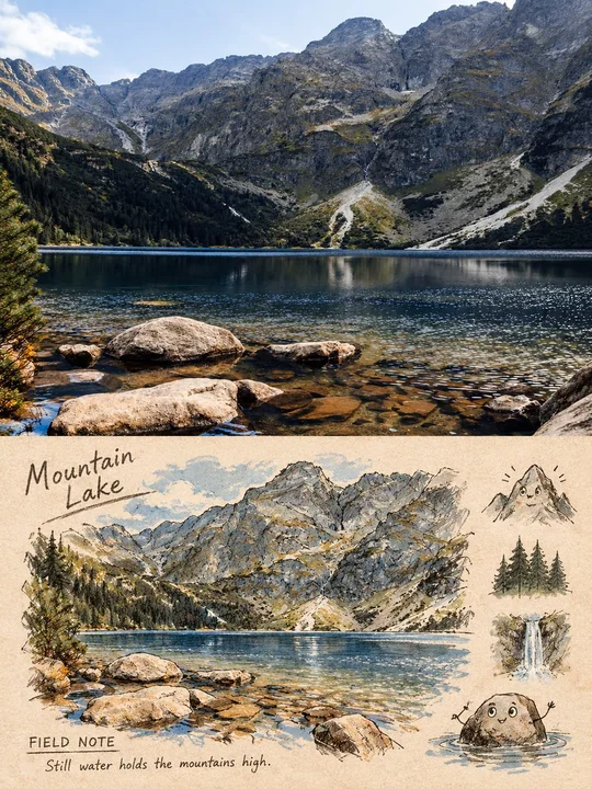
摄影实景转手账风格上下对比海报
Prompt
Usage: Style Transfer
Asset Type: 3:4 vertical editing comparison poster
Input Image: A real photo to be processed, and it is the sole source of truth.
Create a vertical poster with a strict top-bottom comparison.
The upper half must preserve the input photo's clear, recognizable high-fidelity realistic photographic effect: subject identity, quantity, pose, shooting angle, architectural structure, landscape relationships, lighting, and main colors all remain consistent, with only slight print-grade color grading.
The lower half redraws the same scene as a warm beige paper page of a travel field journal; it cannot be just a filter, nor a generic travel illustration.
Use dark brown pencil and ink outlines with a slight jittery feel, uneven hand pressure, dry brush marks, a small amount of low-saturation watercolor and crayon coloring, paper fibers, erasure marks, and slight ink-bleeding effects.
Compress the scene into one main subject or landmark, plus one to two environmental anchors from the original photo's facts; simultaneously change the scale and information density so it is no longer a copy of the same crop and composition.
Allow the key subject or landmark to have a touch of restrained surreal cartoonishness—only when facial features or small hands and feet can naturally grow from their real shapes, add simple eyes, mouths, or small limbs.
Add 2–4 small hand-drawn icons; these icons must correspond to details actually visible in the original photo.
The lower half must maintain about 20%–35% continuous warm-colored paper white space around the edges.
Add a small handwritten title of 1–3 English words, the fixed field "FIELD NOTE", and a short observation sentence of 5–12 English words with a slight sense of rhyme on the paper; this sentence can only be written based on facts visible in the image.
These texts should look like they are written directly into the paper, not floating digital fonts.
Colors are extracted from the input photo and compressed into 2–5 low-saturation colors, plus 1 accent color from the original image; do not apply fixed travel color schemes.
The top-bottom boundary must be clean and horizontal.
Forbidden: Left-right layout, grids, multi-photo collages, "original/AI" labels, watermarks, logos, QR codes, fake Chinese, fictional landmarks, irrelevant people, changing characters' faces or poses, missing the original photo in the top half, making the entire image cartoonized, and redrawing the original photo with the same crop.

用途: 风格转绘
资产类型: 3:4 竖版编辑对比海报
输入图像: 一张需要处理的真实照片,并且它是唯一事实来源。
制作一张严格上下对比的竖版海报。
上半部必须保留输入照片清晰、可辨认的高保真真实摄影效果:主体身份、数量、姿态、拍摄角度、建筑结构、景观关系、光线和主要色彩都保持一致,只做轻微的印刷级调色。
下半部则把同一场景重绘成一页暖米色纸面的旅行现场手账,不能只是滤镜,也不能是泛泛的旅行插画。
使用带轻微抖动感的黑褐色铅笔与墨水轮廓、不均匀的手部力度、干刷痕迹、少量低饱和水彩和蜡笔填色、纸张纤维、擦除痕迹和轻微洇墨效果。
将场景压缩为一个主要主体或地标,再加上一到两个来自原图事实的环境锚点;同时改变尺度与信息密度,使其不再是相同裁切和相同构图的照抄。
可以让关键主体或地标带一点克制的超现实卡通感——只有当五官或小手小脚能自然从其真实形状中长出来时,才加入简单的眼睛、嘴巴或小肢体。
再加入 2–4 个小型手绘图标,这些图标必须对应原照片中真实可见的细节。
下半部四周要保留约 20%–35% 的连续暖色纸面留白。
在纸面上加入一个 1–3 个英文单词的小手写标题、固定字段 “FIELD NOTE”,以及一句 5–12 个英文单词、略带一点押韵感的简短观察句,且这句话只能基于画面中可见事实来写。
这些文字应像是直接写进纸面里的,而不是悬浮的数字字体。
色彩从输入照片中提取,并压缩为 2–5 种低饱和颜色,再加 1 个来自原图的强调色;不要套用固定的旅行配色方案。
上下分界线必须干净、水平。
禁止: 左右布局、网格、多照片拼贴、“original/AI”标签、水印、logo、二维码、假中文、虚构地标、无关人物、改变人物脸部或姿势、缺失上半部分原照片、整张图全部卡通化、以及对原图进行同裁切重绘。
他のプロンプト
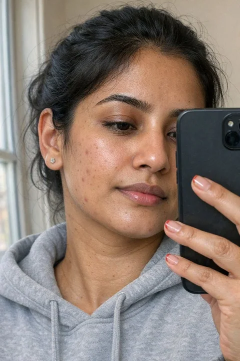
Case 10876
暗黒の街、超現実的なレザージャケットを着た冷たい美少女
若い女性の超現実的で極めて詳細な肖像画。彼女は波打ちながら流れる深みのある茶色の長髪をしており、黒いレザージャケットとシンプルな白いTシャツを着ている。彼女の表情は真剣で、鋭い視線がカメラからわずかに外れている。背景は夜の暗いぼかされた都市の通りで、控えめなネオンの反射が見られる。映画的な輪郭照明が彼女のプロフィールを強調し、陰気で高コントラストな雰囲気を作り出している。写真のようにリアルで8K解像度。高級なDSLRカメラで撮影され、浅い被写体の奥行きと控えめなフィルムの G
电影感超写实霓虹夜冷艳皮衣
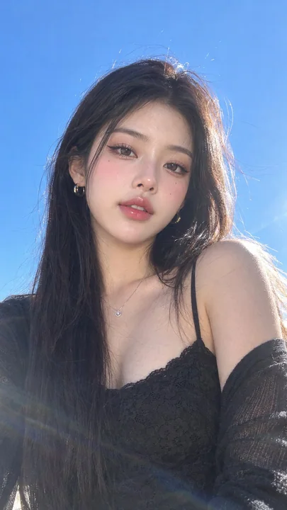
Case 28173
户外蓝天阳光下韩系质感女性人像
Ultra-photorealistic portrait, a young woman outdoors under a clear vivid blue sky, photographed in bright natural sunlight. She has long, straight, dark brown-black hair with a soft natural shine, slightly tousled by a gentle breeze, with