Case 25039
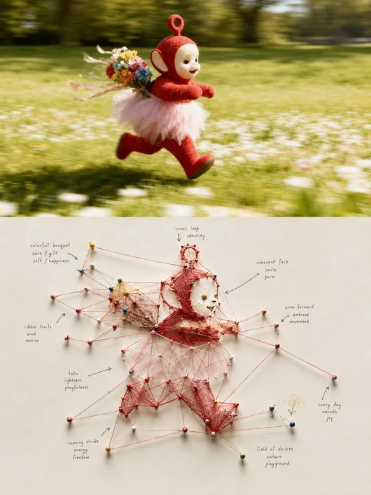
实体红色线绳节点关系映射系统海报
Prompt
Please turn each photo I upload into an independent high-end design poster, no multi-image stitching, each photo output individually. The overall composition uses a 3:4 vertical layout, with the top and bottom areas strictly 1:1 in height, each occupying 50% of the screen.

The top half retains the original photo, maintaining the subject's identity, structure, posture, realistic texture, natural light and shadow, and original color atmosphere, with only slight high-end color grading to give it the texture of an art magazine, independent publication, or exhibition image. To adapt to the frame, the environmental background can be naturally extended, but the subject must not be stretched, distorted, or changed.

The bottom half extracts the most recognizable subject, outline, structure, posture, and narrative relationship from the photo, translating it into a realistic and touchable Physical String-based Systems Map / Tangible Node-link Visualization. Do not directly depict the original object; instead, dismantle the subject into a small number of meaningful nodes and relationships: key outlines, structural transitions, movement directions, spatial positions, or environmental clues become pin-style Nodes, using real string as Edges / Links between each other, so that the visual relationships of the original photo are manifested again as a physical network, while the identity and structure of the original subject remain faintly recognizable.

The composition uses a clear core node or core relationship as the visual hub, with other nodes naturally unfolding around the main structure. The strings are not randomly wound but should establish relationships based on the direction, proportion, distance, connection, and narrative logic of the original image; some nodes form radial, convergent, triangular, polygonal, and cross-regional connections, causing a large number of simple relationships to naturally produce emergent geometry. The whole is both complex and orderly, with denser central relationships and gradually sparser peripheries, retaining sufficient negative space to avoid filling the entire layout.

Materials must have a sense of a real physical installation: use tiny pushpins, stitches, cotton thread or twine, paper labels, handwritten marks, and real cardboard surfaces, preserving slight differences in string tension, node height, cross-occlusion, stitch shadows, and manual errors. The whole looks like an art-directed research wall, system design experiment, or information art installation, rather than a computer-drawn network diagram, and should not have cyber UI, digital glowing lines, or cheap detective board effects.

The string uses a vivid but restrained cinnabar red, coral red, or warm red as the primary relational color, creating visual tension against a large amount of natural white, warm white, light gray, or very light backgrounds coordinated with the comprehensive color temperature of the photo above; pushpins, paper tags, and a small number of marks can extract local characteristic colors from the photo above for low-area correspondence. The overall color is clean, modern, and vibrant, avoiding dark brown, dirty old, blood-red horror, and excessive retro distressing.

Text intervenes freely as Hand-lettered Annotation in the system, without pre-setting fixed titles, locations, years, or menu-style information. Based on the subject, action, position, emotion, relationship, or metaphor in the photo, freely generate a small number of keywords, short phrases, arrows, circled notes, or miniature descriptions, and write them directly near nodes, string intersections, or white space areas. The font uses small, loose, handwritten annotation fonts with a slight sense of research notes and writing deviations, letting the text be like natural traces of thought left during the observation process, while maintaining the restraint and readability of high-end editorial design.

Overall, it presents a high-end experimental visual composed of physical nodes, red strings, relationship mapping, emergent geometry, handwritten annotations, and a large amount of white space. Whether the subject is a person, animal, plant, building, object, vehicle, natural landscape, or complex scene, it should further translate 'what it is' into 'how its parts relate', forming a physical information visualization with a sense of research, art, systematicity, and manual warmth. Avoid random red lines, meaningless nodes, full-page chaos, horror crime boards, digital network UI, cartoon pushpins, templated mind maps, and ordinary flowcharts.

请将我上传的每一张照片分别制作成一张独立的高级设计海报,不多图拼接,每张照片单独输出。整体采用3:4竖版构图,上下两个区域高度严格1:1,各占画面50%。

上半部分保留原始照片,保持主体身份、结构、姿态、真实质感、自然光影和原有色彩氛围,仅进行轻微高级调色,使其具有艺术杂志、独立出版物与展览图像质感。为适配画幅,可自然扩展环境背景,但不得拉伸、扭曲或改变主体。

下半部分提取照片中最具识别性的**主体、轮廓、结构、姿态与叙事关系**,将其转译成一张真实可触摸的 **Physical String-based Systems Map / Tangible Node-link Visualization**。不要直接描绘原物,而是把主体拆解为少量具有意义的节点与关系:关键轮廓、结构转折、动作方向、空间位置或环境线索成为图钉式 Nodes,彼此之间使用真实线绳作为 Edges / Links,使原照片的视觉关系重新以实体网络显形,并仍能隐约辨认出原主体的身份与结构。

构图以一个明确的**核心节点或核心关系**作为视觉枢纽,其余节点围绕主体结构自然展开。线绳不是随机缠绕,而应根据原图的方向、比例、远近、连接与叙事逻辑建立关系;部分节点形成放射、聚合、三角、多边形与跨区域连接,使大量简单关系自然产生 **emergent geometry**。整体既复杂又有秩序,中心关系较密,外围逐渐疏松,保留充足负空间,避免把整个版面铺满。

材质必须具有真实实体装置感:使用细小图钉、针脚、棉线或细绳、纸质标签、手写痕迹和真实纸板表面,保留轻微线绳松紧差异、节点高度、交叉遮挡、针脚阴影与手工误差。整体像一件经过艺术指导的研究墙、系统设计实验或信息艺术装置,而不是电脑绘制的网络图,也不要出现赛博UI、数字发光线或廉价侦探板效果。

线绳以**鲜明但克制的朱红、珊瑚红或暖红色**作为主要关系色,在大量自然白、暖白、浅灰或与上方照片综合色温协调的极浅背景中形成视觉张力;图钉、纸签与少量标记可从上方照片提取局部特征色进行低面积呼应。整体颜色干净、现代、有生命力,避免暗褐、脏旧、血红恐怖感和过度复古做旧。

文字作为系统中的**Hand-lettered Annotation** 自由介入,不预设固定标题、地点、年份或菜单式信息。根据照片中的主体、动作、位置、情绪、关系或隐喻,自由生成少量关键词、短句、箭头、圈注或微型说明,并直接写在节点附近、线绳交汇处或留白区域。字体使用**细小、松弛、略带研究笔记感与书写偏差的手写注释字体**,让文字像观察过程中自然留下的思考痕迹,同时保持高级编辑设计的克制与可读性。

整体呈现**实体节点、红色线绳、关系映射、涌现几何、手写注释与大量留白**共同构成的高级实验视觉。无论主体是人物、动物、植物、建筑、器物、交通工具、自然景观或复杂场景,都应把“它是什么”进一步转译为“它的各部分如何发生关系”,形成具有研究感、艺术感、系统性与手工温度的实体信息可视化。避免随机红线、无意义节点、满版混乱、恐怖犯罪板、数字网络UI、卡通图钉、模板化思维导图和普通流程图。
مطالب أخرى
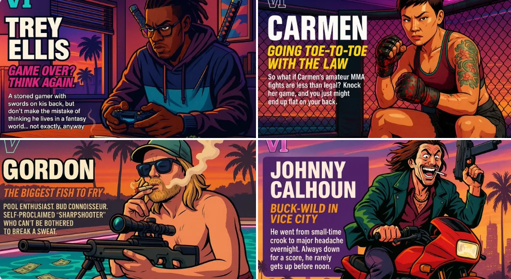
Case 5
أنشئ شخصية جي تي إيه الخاصة بك
[Visual: A horizontal character sheet with a dynamic pose on the right. The character is in a vibrant Vice City aesthetic, with sunset lighting, neon accents, and cel-shaded comic style.] [Left side of the sheet:] [Top left corner: "VI" l
characterlandscapeneongaming
Case 18964
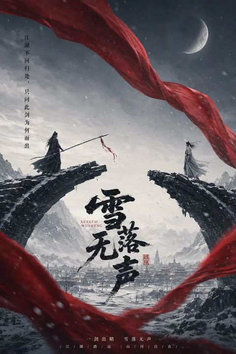
东方武侠史诗海报雪落无声断桥对峙
海报极简武侠水墨电影