Case 27204
高端创意食品排版物理交互海报提示词
Prompt
Brand: [BRAND NAME]
Food: [FOOD / DRINK]
Headline: [1 SHORT WORD]
Physical Interaction: [TWIST / SNAP / DRIP / PEEL / other physical action]
Accent Color: [COLOR]
Product Name: [PRODUCT NAME]
Price: [PRICE]
Aspect Ratio: 9:16

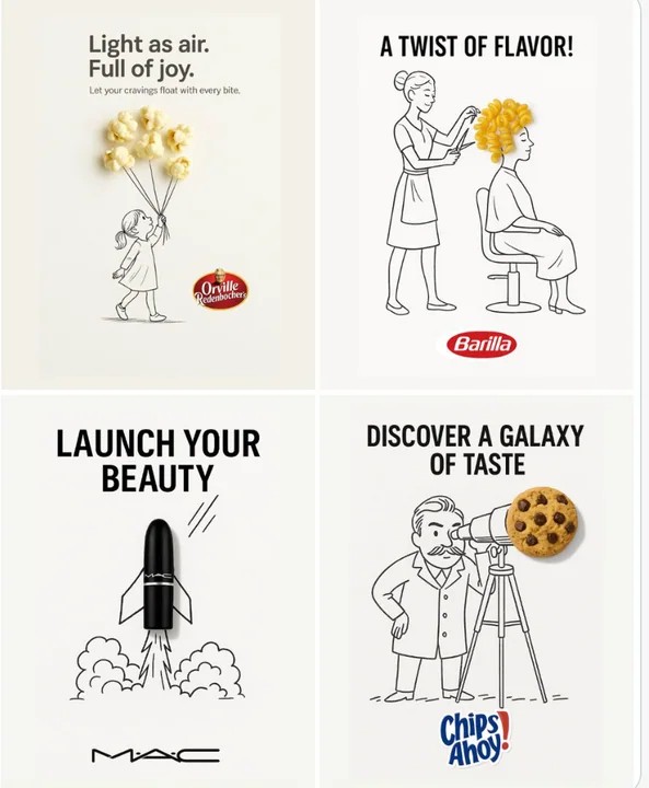
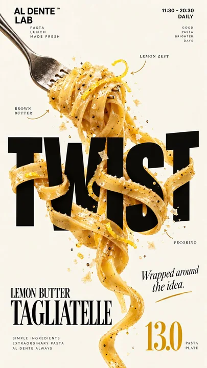
Create a premium editorial food poster where real food physically interacts with and reshapes oversized typography, using a warm cream or ivory background, bold black Heavy Grotesk typography, photorealistic food materials, generous negative space, and a broken editorial grid inspired by high-end European food branding and contemporary magazine design.

The food must not simply overlap or sit beside the letters, treat the food and typography as objects inside the same physical world, the selected interaction should visibly alter the structure, surface, or material behavior of the letterforms through clear and believable physics.

Examples: TWIST, long food elements wrap around, pass in front of and behind, tighten around, and subtly pull selected letter strokes; SNAP, the food fractures along a clear force line and the typography breaks along the same continuous axis with small structural offsets; DRIP, a real liquid or glaze flows over the letters, gradually covering and replacing parts of the geometric type with edible material; PEEL, the surface of a letter is physically removed to reveal a different edible material underneath, with the peeled layer remaining visibly connected and curling away.

Keep the interaction focused on one main physical mechanism, localized deformations should follow real contact, weight, tension, gravity, viscosity, fracture, or material separation, untouched areas of the typography should remain clean, hard, geometric, and readable, avoid random liquify effects, decorative overlap, generic 3D lettering, floating food pieces, or digital-looking distortion.

Use a broken editorial grid with strong scale contrast, asymmetric placement, edge information, large negative space, and small meaningful annotations such as [INGREDIENTS], [OPENING HOURS], and [ADDRESS], avoid traditional menu rows, long horizontal divider lines, boxed prices, rigid bottom information bars, and template-like layouts.

Use bold Grotesk Sans Serif for the main typography, high-contrast Editorial Serif or Italic Serif for product names, quotes, and prices, keep the palette minimal with a cream background, black typography, natural food colors, and one accent color.

The final image should feel clever, physical, premium, contemporary, and immediately understandable at thumbnail size, the first glance should reveal the food and headline, the second glance should reveal how the food has physically changed the typography.

品牌: [BRAND NAME]
食物: [FOOD / DRINK]
标题: [1 SHORT WORD]
物理交互: [TWIST / SNAP / DRIP / PEEL / 其他物理动作]
强调色: [COLOR]
产品名称: [PRODUCT NAME]
价格: [PRICE]
纵横比: 9:16

创建一张高端社论食品海报,其中真实食品与超大号排版产生物理交互并重塑排版,使用温暖的奶油色或象牙色背景,粗体黑色 Heavy Grotesk 排版,写实的食品材质,大量的留白,以及受高端欧洲食品品牌和当代杂志设计启发的打破常规的社论网格。

食品绝不能仅仅是重叠或位于字母旁边,要将食品和排版视为同一个物理世界中的物体,所选择的交互应通过清晰且可信的物理学可见地改变字母形式的结构、表面或材料行为。

示例:TWIST(扭曲),长条状食品元素缠绕、穿过字母的前后、收紧并微妙地拉动选定的字母笔画;SNAP(断裂),食品沿清晰的受力线断裂,且排版沿相同的连续轴线断裂,带有小的结构偏移;DRIP(滴落),真实的液体或釉料流过字母,逐渐覆盖并用可食用材料替换部分几何文字;PEEL(剥离),字母表面被物理移除,露出下面不同的可食用材料,剥离层保持可见的连接并卷曲。

将交互集中在一种主要的物理机制上,局部变形应遵循真实的接触、重量、张力、重力、粘度、断裂或材料分离,排版中未触及的区域应保持干净、坚硬、几何化且易读,避免随机的液化效果、装饰性重叠、通用的 3D 文字、漂浮的食物碎片或具有数码感的扭曲。

使用带有强烈比例对比、不对称放置、边缘信息、大面积留白和诸如 [INGREDIENTS]、[OPENING HOURS] 和 [ADDRESS] 等小型有意义注释的打破常规的社论网格,避免传统的菜单行、长水平分割线、方框价格、僵硬的底部信息栏和模板化的布局。

主排版使用粗体 Grotesk 无衬线体,产品名称、引语和价格使用高对比度的社论衬线体(Editorial Serif)或斜体衬线体,保持配色极简,采用奶油色背景、黑色排版、自然的食品颜色和一种强调色。

最终图像应感觉巧妙、具有物理感、高端、现代且在缩略图尺寸下能立即被理解,第一眼应揭示食品和标题,第二眼应揭示食品如何物理地改变了排版。
他のプロンプト
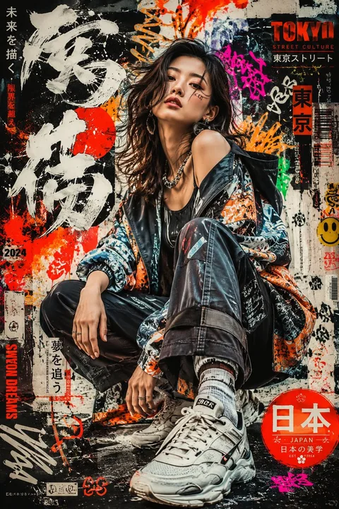
Case 11759
日系グラフィティファッション人物ポスター
高品質なポートレートポスターを制作し、大胆な日本のグラフィティインスピレーションされたアートスタイルを採用します。現代的な都会のストリート美学と表現力豊かな日本の視覚文化を融合させます。ポスターには、ダイナミックなグラフィティタイポグラフィ、レイヤーされたスプレーペイントテクスチャ、手描きのシンボル、抽象的なペイントスプレッディング、ネオンブラシストローク、都会的なステッカー要素、日本書道のアクセント、そしてデザインのエネルギッシュな雰囲気を強調する装飾的なモチーフを含めます
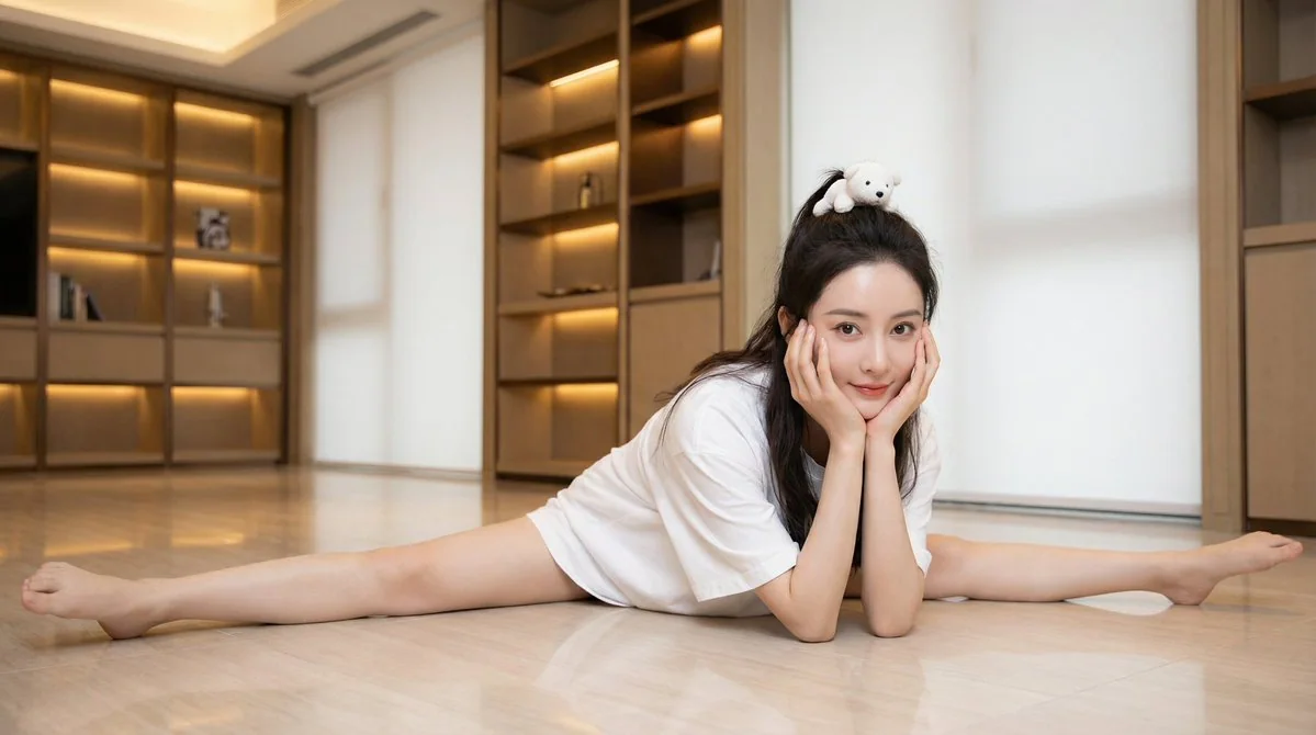
Case 2367
アイドル・女神の純白スプリットの驚きの瞬間
{ "realism_level": "超写実写真級、雑誌表紙肖像", "texture_quality": "8k", "lighting_simulation": "柔らかく、魅力的な室内スタジオ照明、肌の輝きを強調", "global_assets": { "subject_definition": { "archetype": "中国トップアイドル女優、驚くべき美しさ", "hair": { "style
超写实女星劈叉宽松T恤毛绒反差暖光写真