Case 27218
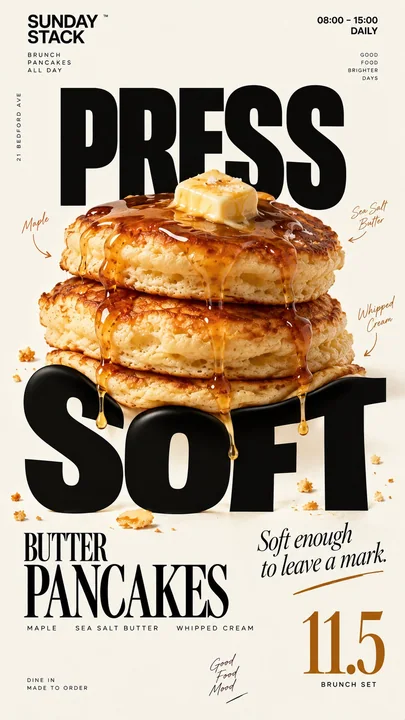
顶级社刊食品文字物理交互海报
Prompt
Brand: [BRAND NAME]
Food: [FOOD / DRINK]
Headline: [1 SHORT WORD]
Physical Interaction: [PRESS / SCOOP / SMEAR / LAYER / other physical action]
Accent Color: [COLOR]
Product Name: [PRODUCT NAME]
Price: [PRICE]
Aspect Ratio: 9:16

Create a premium editorial food poster where real food physically interacts with and reshapes oversized typography, using a warm cream or ivory background, bold black Heavy Grotesk typography, photorealistic food materials, generous negative space, and a broken editorial grid inspired by high-end European café branding and contemporary magazine design.

The food must not simply overlap or sit beside the letters, treat the typography and food as objects inside the same physical world, the selected interaction must visibly change the structure of the letters through believable physics.

Examples: PRESS, food weight compresses and locally deforms the typography; SCOOP, a real scoop removes material directly from a letter, leaving a matching cavity and revealing edible material inside; SMEAR, a knife drags food across the type, causing localized lateral stretching and shear only along the contact zone; LAYER, the typography contains real food layers, and one structural layer is physically pulled out and offset.

Keep the interaction localized, clear, and physically believable, untouched parts of the typography should remain hard, clean, geometric, and readable, use only one main physical mechanism per poster, avoid random liquify effects, decorative overlap, generic 3D lettering, or digital-looking distortion.

Add small editorial information such as [INGREDIENTS], [OPENING HOURS], and [ADDRESS], use strong scale contrast rather than traditional menu rows, avoid long horizontal divider lines, boxed prices, rigid bottom information bars, or template-like layouts.

Use bold Grotesk Sans Serif for the main typography, high-contrast Editorial Serif or Italic Serif for product names, quotes, or prices, keep the color system minimal with a cream background, black typography, natural food colors, and one accent color.

The final poster should feel clever, physical, premium, and instantly understandable at thumbnail size, the key idea is simple: food does not decorate the typography, food physically changes it.

品牌:[BRAND NAME]
食物:[FOOD / DRINK]
标题:[1 SHORT WORD]
物理交互:[PRESS / SCOOP / SMEAR / LAYER / 其他物理动作]
强调色:[COLOR]
产品名称:[PRODUCT NAME]
价格:[PRICE]
宽高比:9:16

创建一张高级社刊风格食品海报,其中真实的食物与超大尺寸的版式产生物理互动并重塑其形状。使用温暖的乳白色或象牙色背景,粗体黑色 Heavy Grotesk 字体,光影写实的食物材质,大量的留白,以及受高端欧洲咖啡馆品牌和当代杂志设计启发的打破常规的编辑网格。

食物不得简单地重叠或靠在字母旁边,应将排版和食物视为同一物理世界中的物体,所选的交互作用必须通过可信的物理效应明显地改变字母的结构。

示例:PRESS(按压),食物的重量压缩并使局部排版变形;SCOOP(舀取),真实的勺子直接从字母中移除材料,留下匹配的空腔并露出内部的可食用材质;SMEAR(涂抹),一把刀将食物拖过字体,仅在接触区引起局部的横向拉伸和剪切;LAYER(分层),排版包含真实的食物层,其中一个结构层被物理地拉出并偏移。

保持交互的局部性、清晰性和物理上的真实感,排版中未被触及的部分应保持坚硬、干净、几何化且易读,每张海报仅使用一种主要的物理机制,避免随机的液化效果、装饰性重叠、通用的3D字体或看起来像数字生成的扭曲。

添加小型编辑信息,如 [INGREDIENTS]、[OPENING HOURS] 和 [ADDRESS],使用强烈的比例对比,而非传统的菜单行,避免长水平分割线、方框标价、僵硬的底部信息栏或模板化的布局。

主体排版使用粗体 Grotesk Sans Serif,产品名称、引言或价格使用高对比度的 Editorial Serif 或斜体 Serif,保持极简的配色方案,包括乳白色背景、黑色字体、天然食物颜色和一种强调色。

最终的海报应该感觉巧妙、具有物理感、高端,并且在缩略图尺寸下也能立即理解。核心理念很简单:食物不是装饰排版,食物在物理上改变排版。
Autres prompts
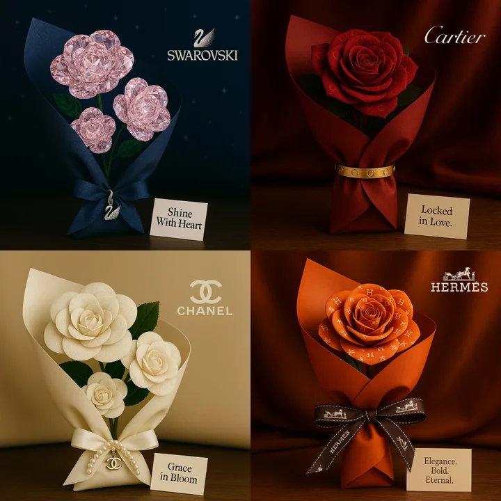
Case 11
Discours sur l'amour pour la marque
Un bouquet au format carré romantique inspiré par [Nom de la marque]. Les roses sont conçues à partir de motifs visuels ou de textures reflétant l'identité de la marque. Le bouquet est enveloppé dans un matériau luxueux évoquant le style em
natureproductvehiclebranding
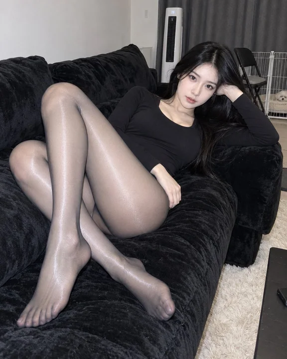
Case 27232
黑色连体衣与高光丝袜居家沙发人像
Hyper-realistic indoor home portrait photography, vertical version approx 4:5. One clearly adult East Asian female, 20+, semi-reclining on a black suede sofa, body extending diagonally along the sofa, the photographer is located directly in