Case 27656
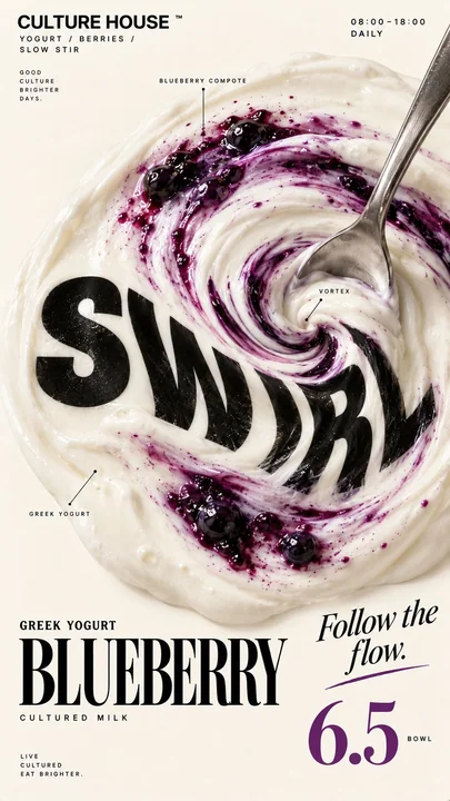
高端社论风食物海报物理排版设计
Prompt
Brand: [BRAND NAME]
Food / Drink: [PRODUCT]
Headline: [1 SHORT WORD]
Physical Interaction: [SWIRL / FILL / PIPE / PULL / other physical action]
Accent Color: [COLOR]
Product Name: [PRODUCT NAME]
Price: [PRICE]
Aspect Ratio: 9:16

Create a premium editorial food poster where real food physically interacts with oversized typography, using a warm cream or ivory background, bold black Heavy Grotesk type, photorealistic food materials, generous negative space, and a broken editorial grid inspired by contemporary food branding and high-end magazine design.

The physical relationship must be the main visual idea, not decoration, food and typography should visibly affect each other through believable material behavior, force, flow, pressure, elasticity, or construction.

Examples: SWIRL, thick food or liquid creates a real vortex and drags nearby typography through the same rotational flow; FILL, liquid physically enters hollow letter structures and settles according to gravity and a shared liquid level; PIPE, edible material is extruded directly into missing typographic strokes and physically constructs the letters; PULL, elastic food is stretched between opposing forces and the typography deforms according to the same real tension.

Use only one physical mechanism per poster, keep cause and effect instantly readable, all deformation must follow real physics rather than random digital distortion, untouched typography should remain clean, geometric, strong, and legible.

Build the composition with asymmetric placement, strong scale contrast, edge information, small meaningful annotations, and large areas of negative space, add details such as [INGREDIENTS], [OPENING HOURS], [ADDRESS], and [PRODUCT NOTES], avoid traditional menu rows, rigid bottom information bars, long horizontal separators, boxed prices, or template-like layouts.

Use bold Grotesk Sans Serif for the main headline, high-contrast Editorial Serif or Italic Serif for product names, quotes, and prices, keep the palette minimal with cream, black, natural food colors, and one accent color.

The final poster should feel clever, physical, premium, contemporary, and immediately readable at thumbnail size, the first glance should reveal the food and headline, the second glance should reveal the physical interaction behind the design.

品牌:[品牌名称]
食物/饮料:[产品]
标题:[1个短单词]
物理交互:[旋转 / 填充 / 挤压 / 拉伸 / 其他物理动作]
强调色:[颜色]
产品名称:[产品名称]
价格:[价格]
宽高比:9:16

创建一个高端的社论食物海报,真实的食物与超大号的排版产生物理交互,使用温暖的奶油色或象牙色背景,粗体黑色 Heavy Grotesk 字体,写实的食物材料,大量的负空间,以及受当代食品品牌和高端杂志设计启发的打破常规的社论网格。

物理关系必须是核心视觉创意,而非装饰,食物和排版应通过真实的材质行为、力、流动、压力、弹性或构造来明显地相互影响。

示例:旋转(SWIRL),粘稠的食物或液体产生真实的漩涡,并以同样的旋转流带动附近的排版;填充(FILL),液体物理性地进入中空的字母结构,并根据重力和共同的液面沉降;挤压(PIPE),可食用材料被直接挤压到缺失的排版笔画中,并物理性地构建字母;拉伸(PULL),有弹性的食物在相反的力之间被拉伸,排版根据同样的真实张力而变形。

每张海报仅使用一种物理机制,保持因果关系即时可读,所有变形必须遵循真实的物理学而非随机的数字扭曲,未触及的排版应保持整洁、几何感、强力且易于辨认。

通过不对称的布局、强烈的比例对比、边缘信息、微小而有意义的注释以及大面积的负空间来构建构图,添加细节如 [配料]、[营业时间]、[地址] 和 [产品说明],避免传统的菜单行、死板的底部信息栏、长的水平分隔线、框起来的价格或模板化的布局。

主标题使用粗体 Grotesk 无衬线字体,产品名称、引言和价格使用高对比度的社论衬线体或斜体衬线体,保持色调极简,使用奶油色、黑色、自然的食物颜色和一种强调色。

最终的海报应该感觉巧妙、具有物理感、高端、现代,并且在缩略图大小下立即可读,第一眼应该揭示食物和标题,第二眼应该揭示设计背后的物理交互。
Autres prompts
Case 14590
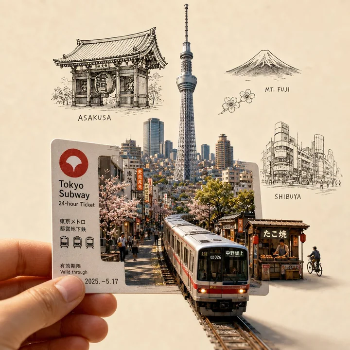
Billet d’entrée urbain, paysage miniature, illustration artistique de voyage
Créez une illustration de voyage artistique hautement détaillée et premium, mettant au premier plan une main tenant un [BILLET/PASS SPÉCIFIQUE À LA VILLE]. Le billet agit comme un portail vers [NOM DE LA VILLE], avec une scène urbaine minia

Case 14599
Prompt de photographie de portrait réaliste en extérieur dans un parc en été
Utilisez le portrait téléchargé comme unique référence d’identité. Préservez les véritables traits du visage de la personne, la forme du visage, le teint, la forme des yeux, le nez, les lèvres, la mâchoire, l’asymétrie naturelle du visage e