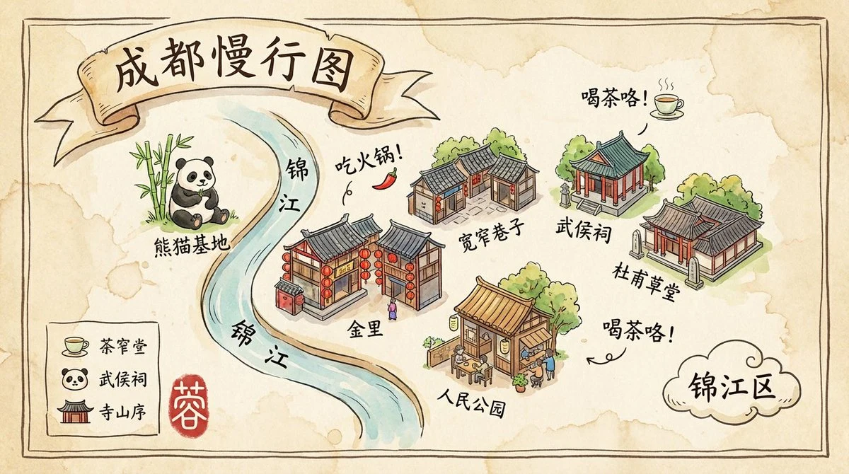
Case 499
Chengdu Tourist Map
illustrationminimalisttypographyarchitecturepaper-craft
Prompt
Aspect ratio 16:9, a charming and refined hand-drawn travel map of Chengdu with the artistic style reminiscent of Studio Ghibli's art concept books. The entire illustration is a watercolor and ink wash drawing on a textured, aged vellum paper. The overall aesthetic is whimsical, vibrant, and full of life.

Map layout and style:
The map presents Chengdu's core landmarks in a stylized isometric perspective, with these landmarks depicted as adorable, detailed miniature buildings and icons (e.g., pandas at the Panda Base, lanterns from Jinli Street, teahouses in People's Park). The layout is organic and fluid rather than based on a rigid grid.

Critical typography challenges (high difficulty section):
All text must be presented in an elegant, slightly imperfect hand-written calligraphy style (running script), appearing as if written with the same pen used for illustration.
1. **Main Title:** The main title "Chengdu Slow Travel Map" is artistically written on a flowing ribbon at the top.
2. **Angled Fun Labels:** Beside each landmark icon, its name is written in a playful, slightly slanted manner (e.g., "Kuanzhai Alley," "Wuhou Temple," "Du Fu Thatched Cottage"). The text should feel organically placed rather than rigid horizontal lines.
3. **Curved Text Along the Path:** A stylized Jinjiang River runs through the map. The name of the river, "Jinjiang," must be elegantly written along the river's curved path. This is a key test point.
4. **Integrated Annotations:** Scattered across the map are small, whimsical annotations that combine text and icons. For example:
    - An annotation saying "Eat hot pot!" with a tiny red chili pepper icon next to it.
    - A label reading "Time for tea!" beside a miniature teacup icon emitting steam.
    - The area name "Jinjiang District" is written inside a hand-drawn cloud shape.
5. **Hand-Drawn Legend:** In one corner, there's a hand-drawn "Legend" box containing small icons (e.g., teacups, panda faces, temple roofs) and their corresponding handwritten labels.
6. **Seal:** A red seal with an artistic hand-carved style, bearing the character "Rong" (a short name for Chengdu), is stamped in a corner with slight overlap on the border.

Aesthetics:
A masterpiece of illustrated cartography. The integration of text and illustration must be seamless. Watercolor effects should be soft with visible water stains and textures, while pen lines should be confident and lively. The overall feeling is warm, enticing, and full of personality.

Negative prompts:
Computer fonts, computer-generated text, straight lines, rigid grids, perfect alignment, only horizontal text, text layers, photographs, 3D, minimalism, generic icons, spelling errors, garbled text, watermarks.More prompts

Case 14872
Hyper-realistic anime fashion outfit collage
Ultra-realistic anime fashion lookbook collage, warm golden-hour sunlight streaming through large windows, cozy luxury apartment interior with soft beige walls, framed artwork, flowers in glass vases, candlelight ambiance, elegant feminine

Case 14168
Close-up portrait of a young woman with a disgusted and disdainful expression
Close-up portrait of a young woman making a strong disdainful “tsk” expression, clicking her tongue in disgust, furrowed brows, narrowed eyes looking sideways with contempt, slightly pursed lips, tongue positioned as if saying “tsk,” wrinkl