Case 27262
QUECHUA数字拼贴户外探险主视觉
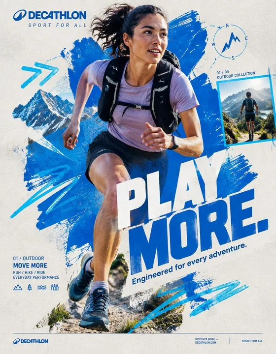
Prompt
QUECHUA — “PLAY OUTSIDE.”
BEHANCE-LEVEL DIGITAL COLLAGE CAMPAIGN
FORMAT
Ultra-Premium QUECHUA Outdoor Campaign Key Visual
Vertical 4:5 Instagram Hero Creative
Behance Front Page Quality
Global Outdoor & Hiking Campaign
Senior Social Media Art Direction
Contemporary Outdoor Photography × Handcrafted Digital Collage × Editorial Graphic Design
8K UHD
Hyper-Realistic Outdoor Photography
High-End Editorial Art Direction
Print-Quality Graphic Execution
Premium Commercial Adventure Campaign
Strong Visual Storytelling
Tactile Mixed-Media Aesthetic
Zero AI Slop
Zero Generic Hiking Advertisement
Zero Stock-Photo Feeling
Zero Influencer Travel Aesthetic
Zero Corporate Catalogue Layout
Zero Luxury-Adventure Copycat
Zero Random Graphic Decoration
The final artwork must feel deliberately designed by a senior art director and assembled by a professional digital collage artist — not generated as a collection of unrelated elements.
CREATIVE CONCEPT
CAMPAIGN:
“PLAY OUTSIDE.”
CORE MESSAGE:
THE OUTDOORS BELONGS TO EVERYONE.
The campaign celebrates the instinct to leave the ordinary behind.
A trail after work.
A mountain on the weekend.
A cold morning hike.
A sudden change in weather.
A long walk with friends.
A place you have never explored before.
Quechua becomes the equipment that makes everyday exploration possible.
The visual should communicate:
EXPLORATION
FREEDOM
DISCOVERY
ADVENTURE
MOVEMENT
RESILIENCE
COMMUNITY
OUTDOOR LIFE
The campaign should feel:
AUTHENTIC
ADVENTUROUS
YOUTHFUL
RAW
OPTIMISTIC
HUMAN
ENERGETIC
ACCESSIBLE
ART DIRECTION
Think:
QUECHUA × OUTDOOR EDITORIAL × MOUNTAIN JOURNAL × HANDCRAFTED POSTER × TOPOGRAPHIC MAP × CONTEMPORARY DIGITAL COLLAGE
The artwork should combine highly realistic outdoor photography with visibly handmade graphic interventions.
The contrast is essential:
REAL HUMAN
+
REAL OUTDOOR ENVIRONMENT
+
REAL QUECHUA PRODUCT
+
HANDMADE GRAPHICS
+
TOPOGRAPHIC INFORMATION
+
EDITORIAL TYPOGRAPHY
Do not make the environment look like an artificial fantasy landscape.
The mountain must feel physically real.
The weather must feel real.
The clothing must look genuinely functional.
The person must look like someone who actually hikes.
Introduce controlled imperfections:
rough paper edges
hand-painted marks
topographic contour lines
slightly misregistered ink
screen-print texture
cut-paper shapes
field-note markings
visible paper fibers
analog grain
subtle photocopy texture
These imperfections should feel intentionally art-directed.
Never messy.
Never amateur.
PHASE 1 — HERO PHOTOGRAPHY
SUBJECT:
One energetic everyday outdoor explorer.
Age:
20–30.
Gender:
Auto select based on strongest visual composition.
Casting:
Contemporary global and diverse.
The person must look like a genuine Quechua customer rather than a fashion model.
Natural facial structure.
Natural skin texture.
Realistic body proportions.
Practical outdoor appearance.
No influencer aesthetic.
No luxury travel aesthetic.
No expedition-superhero styling.
EXPRESSION:
Focused.
Curious.
Confident.
Natural.
A subtle authentic smile or concentrated expression.
The emotion should communicate:
“I WANT TO SEE WHAT IS AROUND THE NEXT CORNER.”
ACTION
Capture the subject at the absolute peak of outdoor movement.
Preferred actions:
HIKING UPHILL
TRAIL RUNNING
CROSSING A ROCKY RIDGE
CLIMBING A STEEP TRAIL
WALKING THROUGH A FOREST
JUMPING ACROSS A SMALL STREAM
DESCENDING A MOUNTAIN PATH
TREKKING THROUGH LIGHT RAIN
Choose ONE action with the strongest silhouette.
The action must create a powerful diagonal.
The body should naturally travel from:
TOP LEFT
toward
BOTTOM RIGHT.
The terrain should reinforce the movement direction.
Capture authentic physical effort.
Boots should interact naturally with rocks, soil or trail surface.
Clothing should react naturally to wind and movement.
No impossible body positioning.
No floating feet.
No fantasy climbing.
HERO PRODUCT
ONE CLEARLY VISIBLE QUECHUA PRODUCT ONLY.
Choose the product that best supports the selected adventure.
Examples:
QUECHUA HIKING JACKET
QUECHUA BACKPACK
QUECHUA HIKING BOOTS
QUECHUA FLEECE
QUECHUA RAIN JACKET
QUECHUA TREKKING TROUSERS
QUECHUA TENT
The product must be unmistakably visible.
Product placement should feel naturally integrated into the adventure.
No floating product.
No duplicate product.
No product lineup.
The hero product receives secondary visual emphasis after the explorer.
Preserve accurate product construction:
fabric
stitching
zippers
buckles
straps
pockets
waterproof details
sole construction
technical materials
brand markings
PHOTOGRAPHIC STYLE
Premium editorial outdoor campaign photography.
Authentic natural lighting.
Documentary adventure energy.
Real mountain atmosphere.
Natural skin.
High-resolution textile detail.
Realistic terrain.
Camera:
SONY A1 II
Lens:
85mm
Aperture:
f/2.8
Camera position:
Slight low-angle hero perspective.
Crop:
3/4 body or full body depending on action.
The explorer must be isolated with an exceptionally clean professional cutout when required for the collage.
Preserve:
hair detail
fabric edges
hands
boots
backpack straps
equipment
natural movement
No artificial cutout halo.
No white outline.
No excessive sharpening.
PHASE 2 — COLOR FOUNDATION
PRIMARY QUECHUA OUTDOOR BLUE
Use a strong outdoor-inspired Quechua blue as the principal graphic accent.
SUPPORTING COLORS:
Off-white
Warm stone grey
Deep forest green
The palette should feel connected to:
mountain sky
rock
forest
trail
technical outdoor equipment
Keep the graphic system controlled.
Avoid excessive colors.
PRIMARY PAINT FORM
Create ONE enormous irregular outdoor-blue paint form.
Occupy approximately:
45–55% of the composition.
The shape should function as the visual foundation of the collage.
Appearance:
hand-painted
thick brush texture
organic edges
dry-brush imperfections
visible bristle marks
slight transparency variations
screen-print character
paper interaction
The paint should feel physically applied to recycled expedition paper.
Not a smooth digital blob.
Not a generic vector shape.
The explorer should overlap the paint form.
The product must remain completely visible.
PHASE 3 — COLLAGE SYSTEM
Introduce exactly five major handcrafted graphic elements.
Select from:
TOPOGRAPHIC CONTOUR LINES
TRAIL ROUTE LINES
HAND-DRAWN CIRCLES
COMPASS SYMBOLS
ALTITUDE MARKERS
MOUNTAIN SILHOUETTES
GPS COORDINATE MARKINGS
ELEVATION GRAPHICS
HAND-DRAWN ARROWS
WEATHER SYMBOLS
TERRAIN MAP FRAGMENTS
HALFTONE DOTS
FIELD-NOTE MARKINGS
Each element must have a visual purpose.
Do not scatter graphics randomly.
Graphics should reinforce:
direction
altitude
location
distance
terrain
exploration
Use asymmetric placement.
Create a strong diagonal rhythm.
Some elements may pass behind the explorer.
Some may partially disappear beneath typography.
One or two graphic elements may overlap the subject subtly to create physical depth.
MATERIAL LANGUAGE
Build the collage as though physically assembled from an explorer’s field notebook.
Include subtle:
torn-paper edges
folded map fragments
screen-print texture
photocopy artifacts
ink bleed
dry-brush marks
recycled paper fibers
topographic printing
handwritten route markings
subtle registration offsets
analog grain
The artwork should feel tactile.
It should resemble:
A MOUNTAIN MAP
AN OUTDOOR MAGAZINE
A HANDMADE ADVENTURE POSTER.
Do not overdo the texture.
PHASE 4 — TYPOGRAPHY
PRIMARY HEADLINE:
PLAY OUTSIDE.
Make this the second-largest visual element after the explorer.
Large bold uppercase geometric sans-serif.
Extremely strong weight.
Tight leading.
Compact composition.
Minimal tracking.
Allow a slight 2–4° rotation.
The typography should feel physically printed onto the artwork.
Not floating.
Not glossy.
Not 3D.
Not futuristic.
Typography should interact with the collage.
Allow:
partial cropping
layer overlap
masking
paint interruption
map-line interruption
edge cropping
PRIMARY COPY:
PLAY OUTSIDE.
SUPPORTING COPY:
Built for whatever the trail brings.
Keep supporting copy small and highly readable.
TYPOGRAPHIC HIERARCHY
01
QUECHUA BRANDING
02
PLAY OUTSIDE.
03
Built for whatever the trail brings.
04
TRAIL / ALTITUDE / ADVENTURE INFORMATION
05
DISCOVER MORE
The headline must remain instantly readable even at Instagram thumbnail size.
PHASE 5 — QUECHUA BRANDING
Place the official QUECHUA branding in the upper-left.
Preserve:
correct proportions
clear space
accurate wordmark
brand integrity
Do not distort.
Do not stretch.
Do not place the logo inside unnecessary effects.
Small supporting line:
OUTDOOR EQUIPMENT
The branding should remain visible but should not compete with:
PLAY OUTSIDE.
PHASE 6 — BACKGROUND
BACKGROUND COLOR:
Warm Light Stone Grey
The background should resemble premium recycled expedition paper.
Add extremely subtle:
paper grain
recycled fiber
analogue noise
soft printing imperfections
faint topographic texture
Texture opacity:
Below 15%.
The background must remain visually quiet.
The energy comes from:
THE EXPLORER
THE TERRAIN
THE PAINT FORM
THE TOPOGRAPHIC GRAPHICS.
PHASE 7 — COMPOSITION
MODEL POSITION:
Off-center.
Never dead center.
Place the explorer slightly toward the visual intersection of the composition.
NEGATIVE SPACE:
Approximately 18%.
Allow breathing room around the major elements.
LAYER ORDER:
01 BACKGROUND
02 PAPER TEXTURE
03 TOPOGRAPHIC MAP FRAGMENTS
04 PAINT FORM
05 HANDMADE GRAPHIC ELEMENTS
06 EXPLORER PHOTOGRAPH
07 PRODUCT
08 TYPOGRAPHY
09 MICRO INFORMATION
10 BRANDING
11 FOOTER
The explorer should appear to physically exist inside the collage.
MOVEMENT DIRECTION
TOP LEFT
↓
MOUNTAIN RIDGE
↓
EXPLORER
↓
BOTTOM RIGHT
The entire composition should feel as if it is moving toward an unseen destination.
The eye should travel naturally:
BRANDING
↓
HEADLINE
↓
FACE
↓
PRODUCT
↓
TRAIL
↓
CTA
PHASE 8 — VISUAL DEPTH
Create three distinct depth planes.
BACKGROUND:
Recycled paper, faint mountain forms and subtle map texture.
MIDGROUND:
Paint forms, contour lines, trail maps, compass graphics and altitude information.
FOREGROUND:
Explorer, product and typography.
Some contour lines should disappear behind the explorer.
Some typography should overlap the paint.
One small map element should overlap the subject subtly.
This creates the feeling of a physically assembled outdoor editorial collage rather than a flat AI composition.
PHASE 9 — BRAND DNA
The artwork must communicate Quechua’s core outdoor identity:
ACCESSIBLE ADVENTURE
EVERYDAY EXPLORATION
HIKING
OUTDOOR DISCOVERY
PRACTICAL INNOVATION
WEATHER READINESS
COMFORT
COMMUNITY
NATURE
MOVEMENT
The explorer should never look like an untouchable professional expedition athlete.
The campaign should make the viewer think:
“I could go there.”
That feeling is more important than displaying extreme athletic performance.
PHASE 10 — INFORMATION DESIGN
Introduce a small editorial information block.
Example:
01 / MOUNTAIN TRAIL
ALT. 2,480 M
HIKING / TREKKING
ALL-WEATHER EQUIPMENT
DISTANCE / 08.4 KM
Use tiny but perfectly legible typography.
Create visual hierarchy through:
scale
weight
spacing
alignment
Not through excessive colors.
PHASE 11 — SECONDARY COLLAGE FRAME
Introduce ONE small secondary photographic frame.
Place it asymmetrically.
Inside:
A secondary outdoor adventure moment.
For example:
a small group of hikers crossing a mountain trail.
Frame it with a thin outdoor-blue border.
Add:
02 / 04
MOUNTAIN COLLECTION
The secondary image must feel like part of a printed outdoor field journal.
It should support the campaign narrative without competing with the hero explorer.
PHASE 12 — FOOTER
Create a minimal bottom strip.
Include:
QUECHUA
DISCOVER MORE →

http://
DECATHLON.COM
OUTDOOR EQUIPMENT
Use very small clean typography.
Keep the footer extremely restrained.
No sale banner.
No clutter.
PHASE 13 — GRAPHIC IMPERFECTION
Introduce controlled imperfections characteristic of high-end physical outdoor collage:
slightly uneven paint edges
tiny ink inconsistencies
subtle map displacement
minor registration shift
hand-drawn contour variation
faint photocopy noise
slight paper edge wear
These details should make the artwork feel human-made.
The composition must still feel extremely polished.
Think:
ART-DIRECTED IMPERFECTION.
Not RANDOM IMPERFECTION.
PHASE 14 — LIGHTING & IMAGE QUALITY
The original outdoor photograph must retain premium commercial photography quality.
Natural mountain sunlight.
Strong directional light.
Realistic atmospheric depth.
Crisp highlights.
Controlled shadows.
Natural skin exposure.
Detailed technical fabric.
Realistic rock and vegetation texture.
Sharp hero product.
Natural environmental reflections.
No artificial HDR.
No plastic skin.
No beauty retouching.
No excessive clarity.
No fake cinematic glow.
No neon.
No fantasy lighting. over-saturated landscape.
PHASE 15 — FINAL ART DIRECTION
The final visual should look like a real campaign artwork created by:
A SENIOR SOCIAL MEDIA ART DIRECTOR
A PROFESSIONAL OUTDOOR PHOTOGRAPHER
A DIGITAL COLLAGE ARTIST
A TYPOGRAPHER
A MAP / EDITORIAL DESIGNER
Every element should appear intentional.
Every layer should have a purpose.
The explorer should provide realism.
The Quechua product should provide commercial relevance.
The typography should provide communication.
The mountain environment should provide emotion.
The map graphics should provide exploration.
The paint form should provide brand energy.
The paper texture should provide physicality.
The composition should provide movement.
FINAL FEEL
If:
QUECHUA
×
A CONTEMPORARY OUTDOOR MAGAZINE
×
A HAND-PAINTED MOUNTAIN POSTER
×
A TOPOGRAPHIC FIELD JOURNAL
×
A MODERN GRAPHIC DESIGN STUDIO
created one campaign together.
The final result should feel:
RAW.
HUMAN.
OUTDOOR.
TACTILE.
ADVENTUROUS.
ACCESSIBLE.
YOUTHFUL.
EXPLORATIVE.
REAL.
Not a catalogue.
Not a generic hiking advertisement.
Not a luxury outdoor campaign.
Not a travel-influencer post.
Not a corporate retail graphic.
Not an AI-generated mountain collage.
A genuine Quechua campaign where:
PHOTOGRAPHY + TERRAIN + PRODUCT + TYPOGRAPHY + TOPOGRAPHIC GRAPHICS + HANDCRAFTED COLLAGE
become one visual system.
FINAL GENERATION SPECIFICATION
Vertical 4:5
8K UHD
Hyper-realistic outdoor photography
Sony A1 II
85mm
f/2.8
Authentic human anatomy
Natural skin texture
Detailed technical outdoor apparel
Accurate Quechua product construction
Clean professional cutout
Outdoor blue / off-white / stone grey / forest green
Controlled graphic palette
Hand-painted collage elements
Topographic map graphics
Recycled paper texture
Editorial typography
Asymmetrical composition
Strong diagonal movement
18% negative space
Premium commercial photography
Contemporary digital collage
Behance front-page art direction
Instagram hero creative
Print-ready finish
High visual hierarchy
High brand recognition
ZERO AI SLOP

QUECHUA —— “去户外玩。”
BEHANCE 级别数字拼贴活动
格式
超高端 QUECHUA 户外活动主视觉
垂直 4:5 Instagram 主打创意
Behance 首页质量
全球户外与徒步活动
资深社交媒体艺术指导
当代户外摄影 × 手工数字拼贴 × 编辑类平面设计
8K 超高清
超写实户外摄影
高端编辑类艺术指导
印刷级图形执行
高端商业探险活动
强视觉叙事
触感混合媒体美学
零 AI 废料
零通用的徒步广告
零图库照片感
零网红旅行美学
零公司目录布局
零豪华探险模仿
零随机图形装饰
最终作品必须感觉是由资深艺术总监精心设计,并由专业数字拼贴艺术家组装而成 —— 而不是作为一堆无关元素的集合生成的。
创意概念
活动:
“去户外玩。”
核心信息:
户外属于每一个人。
该活动庆祝离开平凡生活的本能。
下班后的一条小径。
周末的一座山。
一个寒冷早晨的远足。
天气的突然变化。
与朋友的一次长散步。
一个你从未探索过的地方。
Quechua 成为让日常探索成为可能的装备。
视觉应传达:
探索
自由
发现
冒险
运动
韧性
社区
户外生活
活动感觉应是:
真实的
冒险的
年轻的
原始的
乐观的
人性化的
充满活力的
易于亲近的
艺术指导
思考:
QUECHUA × 户外编辑 × 登山杂志 × 手工海报 × 地形图 × 当代数字拼贴
作品应将高度写实的户外摄影与显而易见的手工图形干预相结合。
对比至关重要:
真实的人
+
真实的户外环境
+
真实的 QUECHUA 产品
+
手工图形
+
地形信息
+
编辑类排版
不要让环境看起来像人造的奇幻景观。
山脉必须感觉物理上是真实的。
天气必须感觉真实。
服装必须看起来真正具有功能性。
人必须看起来像一个真正徒步的人。
引入受控的不完美感:
粗糙的纸张边缘
手绘标记
等高线
略微套印不准的油墨
丝网印刷纹理
剪纸形状
野外笔记标记
可见的纸张纤维
模拟颗粒
细微的复印纹理
这些不完美应感觉是经过精心艺术指导的。
绝不凌乱。
绝不业余。
第一阶段 —— 主角摄影
主体:
一名充满活力的日常户外探险者。
年龄:
20–30岁。
性别:
根据最强的视觉构图自动选择。
选角:
当代全球化且多样化。
此人必须看起来像真正的 Quechua 客户,而不是时装模特。
自然的面部结构。
自然的皮肤纹理。
真实的身体比例。
实用的户外形象。
无网红美学。
无豪华旅行美学。
无远征超人造型。
表情:
专注。
好奇。
自信。
自然。
微妙真实的微笑或专注的表情。
情感应传达:
“我想看看下一个拐角处是什么。”
动作
捕捉主角在户外运动的绝对巅峰时刻。
首选动作:
向山上徒步
越野跑
穿越岩石脊线
爬陡峭的小径
穿过森林
跳过小溪
下山路
在微雨中徒步
选择一个具有最强剪影的动作。
动作必须创造出强大的对角线。
身体应自然地从:
左上角
向
右下角 移动。
地形应强化运动方向。
捕捉真实的体力消耗。
靴子应与岩石、土壤或小径表面自然互动。
服装应随风和运动做出自然反应。
无不可能的身体姿势。
无悬空的脚。
无奇幻攀爬。
核心产品
仅限一个清晰可见的 QUECHUA 产品。
选择最能支持所选探险活动的产品。
例如:
QUECHUA 徒步夹克
QUECHUA 背包
QUECHUA 徒步靴
QUECHUA 抓绒衣
QUECHUA 雨衣
QUECHUA 登山裤
QUECHUA 帐篷
产品必须清晰辨认。
产品放置应感觉自然地融入探险中。
无漂浮的产品。
无重复的产品。
无产品阵容。
核心产品在探险者之后获得次要视觉重点。
保持准确的产品结构:
面料
缝线
拉链
搭扣
背带
口袋
防水细节
鞋底构造
技术材料
品牌标识
摄影风格
高端编辑类户外活动摄影。
真实自然的光线。
纪实探险能量。
真实的山地氛围。
自然的皮肤。
高分辨率的面料细节。
真实的地形。
相机:
SONY A1 II
镜头:
85mm
光圈:
f/2.8
相机位置:
略微低角度的主角透视。
剪裁:
根据动作进行 3/4 全身或全身剪裁。
在拼贴需要时,探险者必须通过极其干净的专业扣图进行孤立。
保留:
发丝细节
织物边缘
手部
靴子
背包带
装备
自然运动
无人工抠图光晕。
无白色轮廓。
无过度锐化。
第二阶段 —— 色彩基础
主要的 QUECHUA 户外蓝
使用强烈的户外启发式 Quechua 蓝作为主要图形点缀。
辅助色彩:
灰白色
暖石灰色
深森林绿
色调应与以下内容相连:
山间天空
岩石
森林
小径
技术户外装备
保持图形系统的受控。
避免过多的颜色。
主要油漆形态
创建一个巨大的不规则户外蓝油漆形态。
占据大约:
构图的 45–55%。
该形状应作为拼贴的视觉基础。
外观:
手绘感
厚重的笔触纹理
有机边缘
干画笔的不完美感
可见的刷毛痕迹
细微的透明度变化
丝网印刷特征
纸张互动
油漆应感觉是物理应用在回收的探险纸上。
不是平滑的数字色块。
不是通用的矢量形状。
探险者应与油漆形态重叠。
产品必须保持完全可见。
第三阶段 —— 拼贴系统
引入恰好五个主要的手工图形元素。
从中选择:
地形等高线
路径路线图
手绘圆圈
指南针符号
高度标记
山脉剪影
GPS 坐标标记
海拔图表
手绘箭头
天气符号
地形图碎片
半色调网点
野外笔记标记
每个元素必须有视觉目的。
不要随机散射图形。
图形应强化:
方向
高度
位置
距离
地形
探索
使用非对称放置。
创造强烈的对角线节奏。
一些元素可能穿过探险者后方。
一些可能部分消失在排版下方。
一到两个图形元素可以微妙地重叠在主体上以创造物理深度。
材料语言
像从探险者的野外笔记本中物理组装一样构建拼贴。
包括细微的:
撕裂的纸张边缘
折叠的地图碎片
丝网印刷纹理
复印痕迹
墨水晕染
干画笔痕迹
回收纸张纤维
地形印刷
手写的路线标记
细微的套准偏移
模拟颗粒
作品应具有触感。
它应该像:
一张登山地图
一本户外杂志
一张手工制作的探险海报。
不要过度使用纹理。
第四阶段 —— 排版
主要标题:
PLAY OUTSIDE.
使其成为仅次于探险者的第二大视觉元素。
大号加粗大写几何无衬线体。
极强的字重。
紧凑的行距。
紧凑的构图。
最小的字间距。
允许轻微 2–4° 的旋转。
排版应感觉是物理印刷在作品上的。
不漂浮。
不光滑。
不是 3D 的。
不具未来感。
排版应与拼贴互动。
允许:
部分剪裁
层级重叠
遮罩
油漆遮断
地图线遮断
边缘剪裁
主要文案:
PLAY OUTSIDE.
辅助文案:
Built for whatever the trail brings.
保持辅助文案小巧且高度可读。
排版层级
01
QUECHUA 品牌
02
PLAY OUTSIDE.
03
Built for whatever the trail brings.
04
路线 / 高度 / 探险信息
05
探索更多
标题即使在 Instagram 缩略图尺寸下也必须保持瞬间可读。
第五阶段 —— QUECHUA 品牌
将官方 QUECHUA 品牌标识放置在左上角。
保留:
正确的比例
安全距离
准确的文字商标
品牌完整性
不要变形。
不要拉伸。
不要将徽标放置在不必要的特效中。
小型辅助行:
OUTDOOR EQUIPMENT
品牌应保持可见,但不应与以下内容竞争:
PLAY OUTSIDE.
第六阶段 —— 背景
背景颜色:
温暖的浅石灰色
背景应类似于高端回收探险纸。
添加极其细微的:
纸张颗粒
回收纤维
模拟噪声
柔和的印刷不完美感
隐约的地形纹理
纹理透明度:
低于 15%。
背景必须保持视觉上的安静。
能量来自:
探险者
地形
油漆形态
地形图形。
第七阶段 —— 构图
模特位置:
偏离中心。
绝不在正中心。
将探险者放置在构图的视觉交叉点附近。
留白:
大约 18%。
在主要元素周围留出呼吸空间。
图层顺序:
01 背景
02 纸张纹理
03 地形图碎片
04 油漆形态
05 手工图形元素
06 探险者照片
07 产品
08 排版
09 微观信息
10 品牌
11 页脚
探险者应看起来物理上存在于拼贴内部。
运动方向
左上角
↓
山脊
↓
探险者
↓
右下角
整个构图应感觉像是在向一个看不见的目的地移动。
视线应自然流动:
品牌
↓
标题
↓
脸部
↓
产品
↓
小径
↓
行动呼吁 (CTA)
第八阶段 —— 视觉深度
创建三个明显的深度平面。
背景:
回收纸、隐约的山形和细微的地图纹理。
中景:
油漆形态、等高线、路线图、指南针图形和高度信息。
前景:
探险者、产品和排版。
一些等高线应消失在探险者身后。
一些排版应与油漆重叠。
一个小的地图元素应微妙地重叠在主体上。
这创造了物理组装的户外编辑拼贴感,而不是平淡的 AI 构图。
第九阶段 —— 品牌基因
作品必须传达 Quechua 的核心户外身份:
易于亲近的探险
日常探索
徒步
户外发现
实用创新
全天候准备
舒适
社区
自然
运动
探险者绝不应看起来像遥不可及的专业远征运动员。
该活动应让观众心想:
“我也能去那里。”
这种感觉比展示极端的运动表现更重要。
第十阶段 —— 信息设计
引入一个小型的编辑类信息块。
例如:
01 / MOUNTAIN TRAIL
ALT. 2,480 M
HIKING / TREKKING
ALL-WEATHER EQUIPMENT
DISTANCE / 08.4 KM
使用微小但完美清晰的排版。
通过以下方式建立视觉层级:
比例
字重
间距
对齐
而不是通过过多的颜色。
第十一阶段 —— 次要拼贴框
引入一个小的次要摄影框。
非对称放置。
内部:
次要的户外探险瞬间。
例如:
一小群徒步者穿过山路。
用细的户外蓝边框取景。
添加:
02 / 04
MOUNTAIN COLLECTION
次要图像必须感觉像是印刷的户外野外日志的一部分。
它应支持活动叙事,而不与主角探险者竞争。
第十二阶段 —— 页脚
创建一个极简的底部条带。
包括:
QUECHUA
DISCOVER MORE →

http://
DECATHLON.COM
OUTDOOR EQUIPMENT
使用非常小的干净排版。
保持页脚极其克制。
无销售横幅。
无杂乱。
第十三阶段 —— 图形不完美感
引入高端物理户外拼贴特有的受控不完美感:
略微不均匀的油漆边缘
微小的油墨不一致
细微的地图位移
轻微的套准偏移
手绘等高线变化
隐约的复印噪声
轻微的纸张边缘磨损
这些细节应使作品感觉是人造的。
构图仍须感觉极其考究。
思考:
艺术指导下的不完美。
不是随机的不完美。
第十四阶段 —— 光照与图像质量
原始户外照片必须保持高端商业摄影质量。
自然的山间阳光。
强烈的方向光。
真实的空气透视深度。
清晰的高光。
受控的阴影。
自然的皮肤曝光。
详细的技术面料。
真实的岩石和植被纹理。
锐利的核心产品。
自然的环境反射。
无人工 HDR。
无塑料皮肤。
无美容修图。
无过度的清晰度。
无虚假的电影感光晕。
无霓虹灯。
无奇幻光效。过度饱和的景观。
第十五阶段 —— 最终艺术指导
最终视觉效果应看起来像由以下人员创作的真实活动作品:
一名资深社交媒体艺术总监
一名专业户外摄影师
一名数字拼贴艺术家
一名排版师
一名地图 / 编辑类设计师
每一个元素都应显得是有意为之。
每一层都应有一个目的。
探险者提供真实感。
Quechua 产品提供商业相关性。
排版提供沟通。
山地环境提供情感。
地图图形提供探索感。
油漆形态提供品牌能量。
纸张纹理提供物理感。
构图提供运动感。
最终感觉
如果:
QUECHUA
×
当代户外杂志
×
手绘山脉海报
×
地形野外日志
×
现代平面设计工作室
共同创建了一个活动。
最终结果应该感觉:
原始。人性化。户外。触感。冒险。易于亲近。年轻。探索性。真实。
不是目录。
不是通用的徒步广告。
不是豪华户外活动。
不是旅行网红贴。
不是公司零售图形。
不是 AI 生成的山脉拼贴。
一个真正的 Quechua 活动,其中:
摄影 + 地形 + 产品 + 排版 + 地形图形 + 手工拼贴
合而为一个视觉系统。
最终生成规格
垂直 4:5
8K 超高清
超写实户外摄影
Sony A1 II
85mm
f/2.8
真实人体解剖学
自然皮肤纹理
详细的技术户外服装
准确的 Quechua 产品构造
干净的专业抠图
户外蓝 / 灰白色 / 石灰色 / 森林绿
受控的图形色调
手绘拼贴元素
地形图图形
回收纸张纹理
编辑类排版
非对称构图
强烈的对角线运动
18% 留白
高端商业摄影
当代数字拼贴
Behance 首页艺术指导
Instagram 主打创意
印刷级成品
高视觉层级
高品牌认可度
零 AI 废料
More prompts
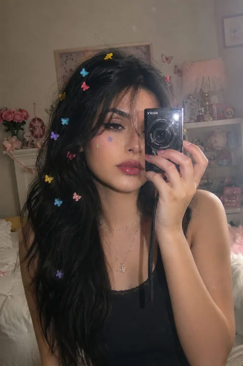
Case 15165
复古数码相机风格千禧风镜前自拍
Create an ultra-realistic dreamy vintage digital-camera mirror selfie of the same clearly adult woman from the reference image, preserving her recognizable facial identity, natural facial proportions, facial structure, skin tone, and indivi
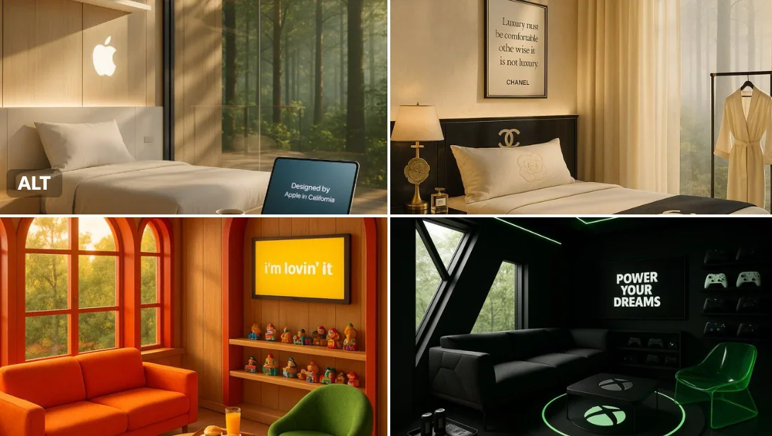
Case 15
Treehouse
A quiet morning in a luxury treehouse retreat created by [BRAND NAME] — golden light pours through windows framed in the brand’s signature colors. A cozy seating area features playful, thematic furniture, and a circular rug inspired by [BRA
natureproductbranding