Case 25041
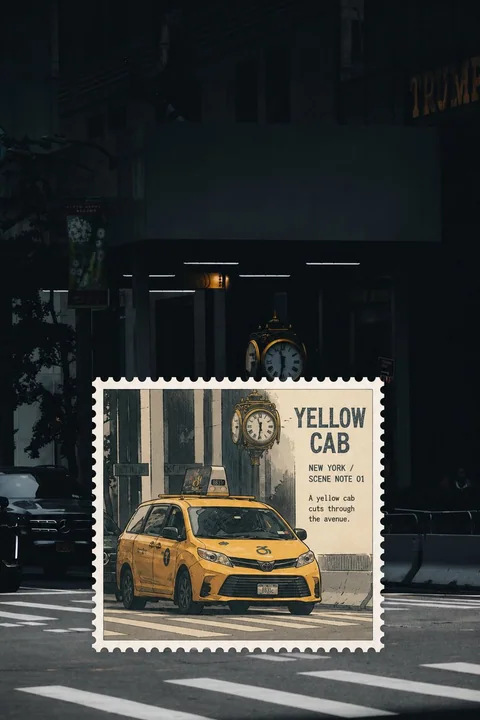
实景照片动漫邮票窗效果
Prompt
Please turn each travel photo I upload into an independent "real-scene anime stamp window" work, each photo output separately, without multi-image stitching.

The complete original photo covers the entire screen, preserving the identity, number, posture, real scale, spatial position, observation angle, natural light and shadow, environmental relationship, and photographic texture of the subject. Do not create top-bottom comparisons, left-right diptychs, or full-image anime conversions.

At the original position of the core subject in the photo, directly draw a flat stamp window with complete perforated edges. The stamp window must cover the main occupancy of the original subject; inside the window, the same subject and its corresponding small amount of local environment are converted into vintage anime editorial illustrations; outside the window remains a clear and complete real photo.

Inside and outside the frame must belong to the same moment:

- The subject maintains the same number, center position, scale, posture, orientation, and perspective.
- The character's feet, vehicle wheels, hull waterline, roads, tracks, steps, railings, or horizon must naturally continue at the edge of the stamp.
- Do not move the subject, do not enlarge it into another close-up subject.
- Do not show a complete photographic subject and a complete illustration copy at the same time.
- The stamp window should directly cover the original subject, rather than being moved to a position convenient for layout.

Choose a stable stamp ratio according to the direction of the subject:

- Standing figures, front-facing vehicles, towers, and longitudinal alleys use a vertical 3:4.
- Horizontal vehicles, ships, stalls, and coastal scenes use a horizontal 4:3.
- Only obviously long and narrow subjects can use a horizontal 5:3.
- Prohibit any square, ultra-narrow vertical frames, or excessively flat and long ratios.

The four sides of the stamp must have continuous, clear, equidistant, and uniformly sized complete perforations. The inner core is evenly indented, and the width of the paper borders on all four sides is consistent. The stamp window fits perfectly onto the photo surface, being just a flat area where the visual language changes; do not show thickness, shadows, curled edges, floating, tilting, or physical card effects.

Inside the frame, use loose ink lines, vintage anime cel shading, slight old printing grain, and restrained paper texture. Colors are extracted from the original photo and simplified into 3–5 types, preserving the subject's most recognizable colors. Delete complex photographic details, leaving only the subject's outline, movement, core structure, and necessary environmental cues.

Retain about 35%–60% of quiet color planes or visual negative space inside the frame; do not draw a complete and crowded background.

Generate a small amount of real English text based on the location, subject, and scene of the photo:

- A readable main title of 1–3 English words.
- A line for location and number, such as "LOCATION / SCENE NOTE 01".
- A short, natural observation text.

Text can only be located in low-information areas inside the stamp window; the font should be consistent with the illustration material, such as vintage anime opening titles, slightly ink-deficient serif fonts, or loose hand-drawn fonts. The title should not be too small and should be clearly readable even in chat thumbnails. Do not block character faces, action joints, vehicles, tracks, or core objects.

Avoid: Top-bottom photo and illustration comparisons, left-right diptychs, full-image anime conversion, moving stamp positions, repeated subjects, changes in subject scale, misalignment of tracks or ground lines, ordinary white frames, missing perforations, dashed borders, rounded corner UI cards, physical postcards, floating stickers, paper thickness, drop shadows, detailed Japanese anime characters, irrelevant backgrounds, author names, signatures, logos, URLs, QR codes, watermarks, and unreadable fake text.

Most important rule: The illustration in the stamp window must replace the subject and scene at the same position and scale in the original photo. It is like a small piece of the real scene suddenly switching to animation, rather than an extra drawing pasted onto the photo.

请将我上传的每一张旅行照片分别制作成一张独立的「实景动漫邮票窗」作品,每张照片单独输出,不进行多图拼接。

完整原始照片铺满整张画面,保留主体身份、数量、姿态、真实尺度、空间位置、观察角度、自然光影、环境关系和摄影质感。不要制作上下对比、左右双联或整幅动漫转绘。

在照片核心主体原本所在的位置,直接划出一枚具有完整齿孔边缘的平面邮票窗。邮票窗必须覆盖主体原本的主要占位,窗内将同一主体及其对应的少量局部环境转绘为复古动漫编辑插画;窗外仍然保持清晰、完整的真实照片。

框内外必须属于同一个瞬间:

- 主体保持相同数量、中心位置、尺度、姿态、朝向和透视。
- 人物脚底、车辆车轮、船体水线、道路、轨道、台阶、栏杆或地平线必须在邮票边缘自然接续。
- 不得移动主体,不得放大成另一个近景主体。
- 不得同时出现一个完整摄影主体和一个完整插画副本。
- 邮票窗应直接覆盖原主体,而不是被移动到方便排版的位置。

根据主体方向选择稳定的邮票比例:

- 站立人物、正面车辆、塔楼及纵向街巷使用竖向 3:4。
- 横向车辆、船只、摊位及沿岸场景使用横向 4:3。
- 只有明显狭长的主体可以使用横向 5:3。
- 禁止任意方形、超窄竖框或过度扁长的比例。

邮票四边必须具有连续、清晰、等距、大小统一的完整齿孔。内部画芯均匀缩进,四边纸边宽度一致。邮票窗完全贴合照片表面,只是一块视觉语言发生变化的平面区域;不要出现厚度、投影、翘边、悬浮、倾斜或实体卡片效果。

框内采用松动墨线、复古动画赛璐璐平涂、轻微旧印刷颗粒和克制纸纹。颜色从原照片提取并简化为3~5种,保留主体最具识别度的颜色。删除复杂摄影细节,只留下主体轮廓、动作、核心结构和必要环境线索。

框内保留约35%~60%的安静色面或视觉留白,不要绘制完整而拥挤的背景。

根据照片地点、主体和场景生成少量真实英文文字:

- 一个1~3个英文单词的可读主标题。
- 一行地点与编号,如“LOCATION / SCENE NOTE 01”。
- 一句简短、自然的观察文字。

文字只能位于邮票窗内部的低信息区域,字体应与插画材质一致,可采用复古动画片头字、轻微缺墨衬线字或松动手绘字。标题不能过小,在聊天缩略图中也应清楚可读。不得遮挡人物脸部、动作关节、车辆、轨道或核心物件。

避免:上下照片与插画对比、左右双联、整幅动漫化、移动邮票位置、重复主体、主体比例变化、轨道或地面线错位、普通白框、缺失齿孔、虚线边框、圆角UI卡片、实体明信片、悬浮贴纸、纸张厚度、落地投影、精细日系动漫人物、无关背景、作者名、签名、Logo、网址、二维码、水印和不可读假字。

最重要的规则:邮票窗里的插画必须替换原照片中同一位置、同一尺度的主体与场景。它像现实画面的一小块突然切换成动画,而不是在照片上额外贴了一张画。
Autres prompts
Case 1
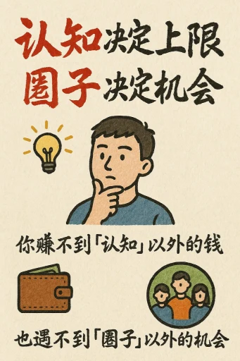
Cartes d'information au style dessiné à la main
Créez une carte d'information au style dessin à la main, avec un format vertical de 9:16. Le thème de la carte est clair et distinctif, le fond est en couleur miel ou crème avec une texture papier, tout le design reflète une beauté rustique
illustrationtypographyportraitpaper-craftinfographic
Case 28188
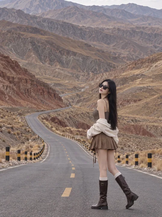
荒山公路东亚女性户外旅行摄影
Realistic outdoor travel fashion photography, 2:3 vertical aspect ratio, full-body environmental portrait. The image preserves large areas of undulating barren mountains and a winding highway. An East Asian woman is located in the lower rig