Case 11200
Affiche de promotion commerciale pour une marque de restauration
品牌设计美食海报商业推广成分说明餐饮广告
Prompt
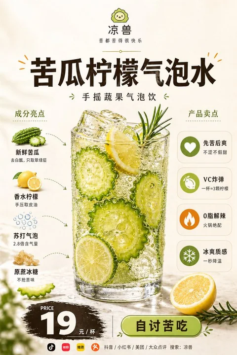
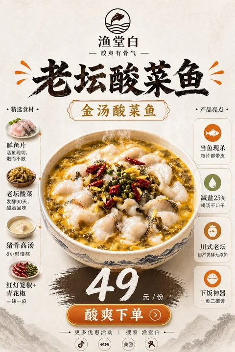
以下是您提供的完整中文版海报设计指南的翻译版本,适用于国际团队、海外客户或跨语言设计协作使用:

---

### **Translation of the Chinese Poster Design Guide (English Version)**

This is a comprehensive guide for the design of a **premium food promotion poster**, intended for **new product launches**, **online platform displays**, **brand promotion**, **social media posting**, and **restaurant single-item advertising**.

---

### **Core Reference Rule**

**Image A** is the user-uploaded main food reference image and serves as the **core visual basis** for this poster.

- **Must strictly preserve** the type of the dish, its **main appearance**, **overall structure**, **core plating style**, **main ingredient presentation**, **color tone**, and **realistic texture**.
- **Do not replace** this dish with another, **do not generate a different dish**, **do not change the plating logic**, or **alter the dish's authenticity**.
- **Can optimize** lighting, clarity, shadow layers, spatial sense, and **commercial photography quality**, **as long as the original dish remains recognizable**.
- The **focus is to retain the original dish's identity**, and **only enhance the poster packaging, layout design, and overall visual presentation**.

---

### **Overall Positioning**

This is **not a regular menu image**, nor a **simple food photography**, but a **comprehensive commercial promotional poster** that integrates:
- **Premium restaurant brand advertising**
- **Food main visual**
- **Ingredient explanation**
- **Product benefit information**
- **Price conversion area**

The **overall style** should present:
- **Premium**, **clean**, **modern**, **polished**, **appetizing**, **realistic**, and **professional food advertisement**.
- Suitable for **new product promotion**, **online delivery platform display**, **brand promotion**, **social media posting**, and **restaurant single-item advertising**.

---

### **Background and Overall Style**

- Use **soft warm beige**, **cream white**, and **light warm beige** as the **background**.
- The overall design is **clean and simple**, with **mild high-end paper texture** or **gentle studio lighting space feel**.
- The image should have **comfortable white space**, **balanced layout**, and **fresh visual appeal**.
- It should reflect a **modern restaurant brand feel**, **light luxury menu style**, and **high-quality commercial advertising**.
- **Do not use complex backgrounds**, **over-decorate**, **avoid cheap feel**, or **use cluttered colors that distract the subject**.

---

### **Layout Structure**

Use a **stable vertical 2:3 format** with **clear information zones**, **clear hierarchy**, and **natural reading flow**:

#### **1. Top Brand Area**
- Place a **simple brand logo / small icon** **centered at the top**.
- Below it is the **brand name**.
- Further below is the **brand slogan / tagline**.
- Optionally, add a **thin, elegant dividing line** or **short decorative line**.
- The overall style should be **simple, modern, and brand-identifiable**.

#### **2. Mid-Upper Title Area**
- Use a **large, bold title** to display **[Product Name]**.
- The title is **centered above the main dish**.
- Font should be **thick, eye-catching, modern**, with a **premium advertising feel**.
- Color suggestion: **dark coffee, dark brown-black, or near-black**.
- Optionally, add **small decorative lines, short dashes**, or **emphasis symbols** in the **main accent color**.
- The title must be **clear and impactful**, and one of the **first visual focal points**.

#### **3. Central Main Visual Area**
- **Image A** is the **core visual subject**.
- The **main dish** is placed **centered**, with a **large size**, **high visual weight**, and **dominant presence**.
- The food must have **high-quality commercial food photography quality**:
  - **Realistic**, **appetizing**, **clear**, **rich in detail**, and **visually enticing**.
- Retain the **original dish type** and **basic plating logic**, **only enhance** lighting, detail, layering, and **polished commercial feel**.
- Add **a few related garnishes** (e.g., vegetables, herbs, fruit slices, sauce) at the bottom or around the dish for **subtle decoration**, but **do not overshadow the main dish**.
- **Do not generate unattractive, unrealistic, cheap, or overly AI-like food effects**.

#### **4. Left Ingredient Information Area**
- Title: **"INGREDIENTS"** or **"Component Highlights"**.
- Vertically list **4–6 ingredient modules**.
- Each module includes:
  - **Real small ingredient image** (cleanly cut, commercial photography style, with **mild shadows**).
  - **Ingredient name**.
  - **A short, simple description**.
- Use **thin dashed arrows**, **curved arrows**, or **simple guide lines** to **connect with the main dish**.
- Information should be **short and clear**, **avoid long paragraphs**.
- The left section should be **neat, orderly**, and **not cluttered**.

#### **5. Right Product Benefit Area**
- Title: **"NUTRITIONAL BENEFITS" / "PRODUCT BENEFITS" / "Product Highlights"**.
- Use **simple, uniform circular icons** + **benefit title** + **a short description**.
- Vertically list **4–5 benefit modules**.
- Icon style should be **uniform, modern, and simple**, **avoid complex and flashy designs**.
- Benefits can focus on:
  - **High protein**, **rich in vitamins**, **energy replenishment**, **rich texture**, **light and refreshing**, **satiating**, **lightweight**, **real ingredients**, etc.
- Emphasize **commercial marketing benefits**, **avoid exaggerated medical claims or therapeutic language**.
- The right section should be **clear and readable**, **but not overshadow the central main dish**.

#### **6. Bottom Price & Conversion Area**
- Centered at the bottom with **"PRICE"** or **"价格"** as the title.
- Use **large, eye-catching font** for the **price**, placed on a **dark brush-stroke / textured background**.
- The **price must be clear and prominent**, with **accurate currency units**.
- Below the price: **add the price unit** (e.g., **"PER SERVING"** / **"每份"**).
- Further below: add a **modern, rounded-edge button**, with **[Button Text]** as the label.
- The button should be **simple**, **clickable**, and **commercially engaging**.
- The overall layout should form a **clear purchasing guide**, **but avoid looking like a low-end promotional flyer**.

#### **7. Bottom Localized Social Media Guidance Area**
- **Do not use** **"Follow Us"**.
- **Do not use** **Instagram, Facebook, TikTok**, or other **international social media platforms** unless explicitly requested.
- **Do not display** **"platform logo + platform name"** together.
- **Do not repeat** platform names.
- The bottom should only have a **simple three-tier structure**:
  1. A line of **Chinese guidance text** (e.g., **[Bottom Guidance Text]**).
  2. A row of **small-sized platform icons** (e.g., **Douyin, Xiaohongshu, Video Account, Official Account, Meituan, Dazhong Dianping**).
  3. A line of **Chinese search guidance** (e.g., **[Bottom Search Guidance]**).

- **Platform icons** should be **small-sized**, **uniform in style**, **simply arranged**, and can use **monochrome dark**, **low saturation**, or **simplified brand identity styles**.
- Icons are only for **bottom decoration**, **not too large**, **not eye-catching**, **not affecting the overall premium feel**.
- The **search guidance** should be **simple**, **clear**, **localized**, and **trustworthy**, similar to **the light ending information on a real Chinese restaurant poster**.

---

### **Color Control**

- **Overall background color**: **warm white, beige, cream white**, to create a **clean, premium, warm, and appetizing tone**.
- **Main text color**: **dark brown, dark coffee, or near-black**, to create a **high-contrast readability**.
- **Accent color**: **[Main Accent Color]**, used uniformly for **logo details, decorative lines, button elements, title small decorations, and local emphasis**.
- **Natural color of the food** must be the **core visual color source** of the image, **maintaining both unity and layering**, **avoiding gray or cheap feel**.

---

### **Texture Requirements**

- The **main food** must have **premium food photography texture**:
  - **Sharp details**
  - **Rich colors**
  - **Realistic texture**
  - **Natural highlights**
  - **Believable shadows**
  - **Appetizing presentation**
  - **Polished commercial finish**

- The **overall poster** should look like a **premium restaurant brand would release**, **not a regular AI collage or low-end menu page**.

---

### **Text and Information Density**

- The image should have **sufficient information**, but **must control clarity and readability**.
- All **small text** should be **short, accurate, and clear**, **avoiding long paragraphs**.
- The **left ingredient section** and **right benefit section** should be **neat and not cluttered**.
- The **bottom price and conversion area** should be **clear and not overwhelming**.

---

### **Summary**

This poster is designed to be **visually appealing**, **informative**, and **commercially engaging**, with **clear hierarchy**, **premium feel**, and **localized social media integration**. It is suitable for **new product launches**, **brand promotions**, and **online platform usage**.

---

If you need this guide in a **PDF format**, **PPT format**, or **design checklist**, please let me know. I can also help you create **mockups** or **sample layouts**.
Autres prompts
Case 13641
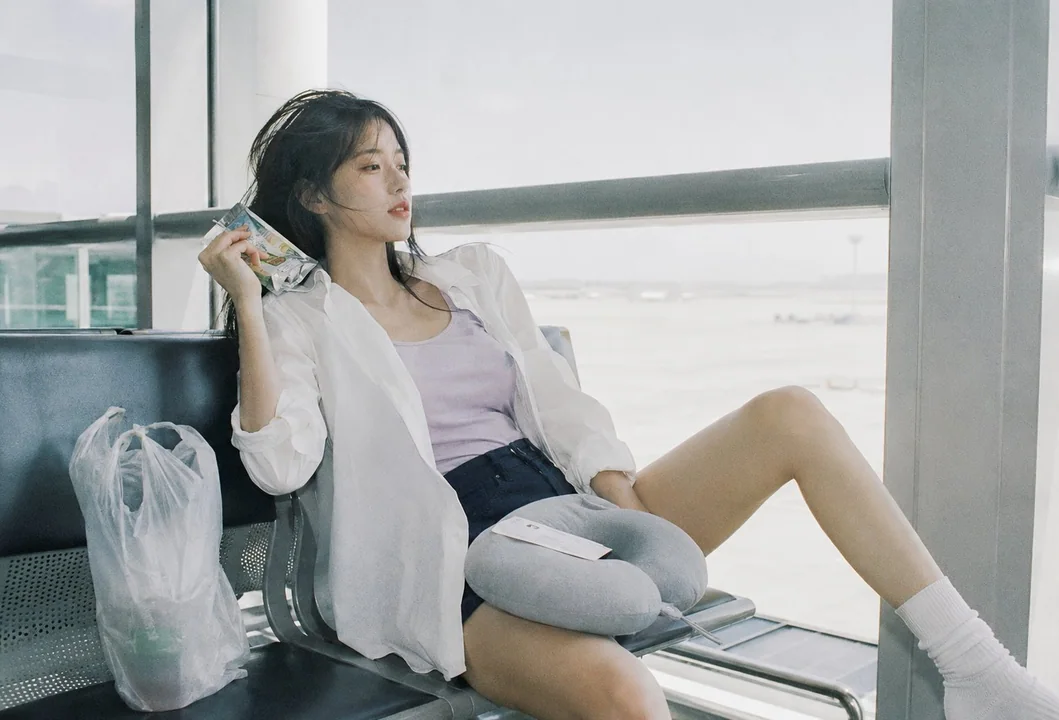
Portrait d’idole féminine coréenne à l’aéroport d’Incheon, avec une ambiance de pellicule japonaise
Cas d’usage : photoréaliste-naturel Type d’actif : variante de portrait éditorial, composition cible 1600x1088 en format paysage Demande principale : esthétique de film négatif japonais, été, lumière naturelle douce, hautes lumières légère
Case 14885
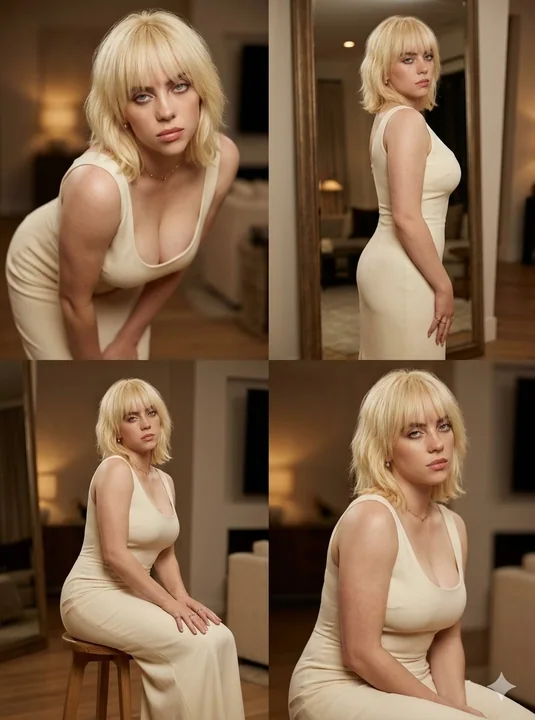
Portrait photo en quadrillage de quatre d’une femme en robe de soirée couleur crème
Créez un collage photo 2×2 mettant en scène la même belle femme dans les quatre cadres. Photographie cinématographique ultra-réaliste, éclairage intérieur chaleureux, faible profondeur de champ, décor d’appartement luxueux. Le sujet porte u