Case 11200
飲食ブランドの商業プロモーションポスター
品牌设计美食海报商业推广成分说明餐饮广告
Prompt
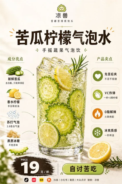
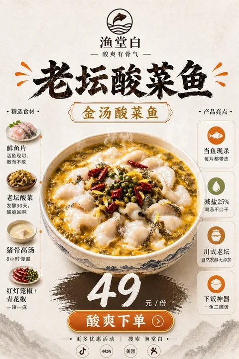
以下是根据您提供的详细需求和内容,对整张海报的**设计说明与翻译**,适用于设计团队、文案团队或品牌方内部沟通使用:

---

## 🎨 **海报设计说明(中英文对照)**

### 📌 **整体定位 / Overall Positioning**

这不是一张普通的菜单图,也不是单纯的食物摄影,而是一张融合了**高端餐饮品牌广告 + 美食主视觉 + 成分说明 + 卖点信息栏 + 价格转化区**的**商业促销海报**。

**It is not just a menu photo or a simple food photography. It is a comprehensive commercial promotional poster that integrates: high-end restaurant brand advertising, food visual, ingredient list, product benefits, and price conversion zone.**

整体气质应呈现:**premium, clean, modern, polished, appetizing, realistic, professional food advertisement**,适合新品推广、外卖平台展示、品牌宣传、社媒发布和餐厅单品广告。

**The overall style should present: premium, clean, modern, polished, appetizing, realistic, and professional food advertisement, suitable for new product promotion, food delivery platform display, brand promotion, social media posting, and restaurant single-item advertising.**

---

### 🎨 **背景与整体风格 / Background and Overall Style**

使用柔和的**暖米白、奶油白、浅暖 beige**作为背景,整体干净简洁,有轻微的**高级纸面质感**或**柔和棚拍空间感**。

**Use soft warm beige, cream white, and light warm beige as the background, with a clean and simple overall style, featuring a slight premium paper texture or soft studio lighting atmosphere.**

画面要留白舒服、排版均衡、视觉清爽,体现**现代餐饮品牌感、轻奢菜单感和高完成度商业广告感**。

**The layout should be comfortable with white space, balanced in composition, and visually clean, reflecting a modern restaurant brand feel, light luxury menu style, and high-quality commercial advertising.**

不要使用复杂背景,不要装饰过度,不要廉价感,不要杂乱色彩干扰主体。

**Avoid complex backgrounds, excessive decoration, cheap aesthetics, and cluttered colors that distract the main subject.**

---

### 📐 **版式结构 / Layout Structure**

采用**稳定的竖版中心构图**,信息分区清晰,主次分明,整体阅读路径自然。

**Adopt a stable vertical center composition with clear information zones, clear hierarchy, and a natural reading path.**

#### 1. **顶部品牌区 / Top Brand Area**

- 顶部居中放置简洁品牌 logo / 小图标
- 下方是品牌名
- 再下方是一句品牌副标题 / slogan
- 可加入一条细小精致的分隔线或短装饰线
- 整体简洁、现代、具有品牌识别度

**- Place a simple brand logo / small icon centrally at the top**
**- Below is the brand name**
**- Below that is a brand subtitle / slogan**
**- A fine, elegant separator line or short decorative line can be added**
**- Overall: clean, modern, and brand-identifiable**

---

#### 2. **中上部标题区 / Mid-Top Title Area**

- 使用大号粗体标题展示【产品名】
- 标题位于主菜上方居中位置
- 字体厚重、醒目、现代、有高级商业广告感
- 颜色建议为深咖啡色、深棕黑色或近黑色
- 可加入少量与主色点缀一致的小型装饰线、短划线或强调符号
- 标题必须清晰有冲击力,是画面的第一视觉焦点之一

**- Use a large, bold title to display [Product Name]**
**- The title is placed centrally above the main dish**
**- The font is bold, eye-catching, modern, and has a high-end commercial advertising feel**
**- Color suggestions: dark coffee, dark brown, or near-black**
**- Small decorative lines, short dashes, or emphasis symbols in line with the main color can be added**
**- The title must be clear and impactful, serving as one of the first visual focal points**

---

#### 3. **中央主视觉区 / Central Main Visual Area**

- Image A 对应的食物是整张图的核心主角
- 主菜放置在画面中央,尺寸大、视觉占比高、主导性强
- 食物必须呈现高质量商业美食摄影质感:真实、诱人、清晰、细节丰富、极具食欲
- 保留原有食物类型与基本摆盘逻辑,只优化灯光、细节、层次和精致感
- 可以在食物底部或周边加入少量相关辅料作点缀,例如蔬菜、香草、果片、酱汁元素等,但不可喧宾夺主
- 不要生成难看、失真、廉价、过度 AI 感的食物效果

**- The food from Image A is the core subject of the entire poster**
**- The main dish is placed centrally in the image, with a large size, high visual weight, and strong dominance**
**- The food must present a high-quality commercial food photography look: realistic, tempting, clear, detailed, and highly appetizing**
**- Keep the original food type and basic plating logic, only optimizing lighting, details, layers, and refinement**
**- A small amount of related ingredients (e.g., vegetables, herbs, fruit slices, sauce) can be added around the dish as a subtle accent, but not overshadow the main dish**
**- Do not generate unattractive, unrealistic, cheap, or overly AI-processed food effects**

---

#### 4. **左侧成分说明区 / Left Ingredient Area**

- 设置标题:INGREDIENTS 或 成分亮点
- 垂直排列 4–6 个成分模块
- 每个模块包含:真实小食材图 + 成分名称 + 一句极简短说明
- 小食材图建议为干净抠图式商业摄影风格,带轻微阴影
- 使用细虚线箭头、弧形箭头或简洁引导线与主菜建立关联
- 信息简短清楚,不要写成大段说明
- 左侧模块整体要精致、有秩序,不能杂乱堆叠

**- Set the title: INGREDIENTS or Ingredient Highlights**
**- Vertically list 4–6 ingredient modules**
**- Each module includes: a real small ingredient photo + ingredient name + a short, concise description**
**- Suggested style: clean, well-knocked ingredient photos with slight shadows, in commercial photography style**
**- Use fine dashed arrows, curved arrows, or simple guide lines to connect with the main dish**
**- Keep the information short and clear, not in long paragraphs**
**- The left module should be refined, orderly, and not cluttered**

---

#### 5. **右侧卖点说明区 / Right Benefits Area**

- 设置标题:NUTRITIONAL BENEFITS / PRODUCT BENEFITS / 产品卖点
- 使用简洁统一的圆形图标 + 卖点标题 + 一句短说明
- 垂直排列 4–5 个卖点模块
- 图标风格要统一、现代、简洁,不要复杂花哨
- 卖点可以围绕:高蛋白、富含维生素、补充能量、口感丰富、清爽解腻、饱腹满足、轻负担、真材实料等方向表达
- 表达偏商业营销卖点,不要使用夸张医疗功效或治疗化表述
- 右侧模块应清晰易读,但不能压过中央主菜的视觉权重

**- Set the title: NUTRITIONAL BENEFITS / PRODUCT BENEFITS / Product Highlights**
**- Use simple, unified circular icons + benefit title + a short description**
**- Vertically list 4–5 benefit modules**
**- Icons should be consistent, modern, and simple, not overly complex**
**- Benefits can be expressed around: high protein, rich in vitamins, energy replenishment, rich texture, refreshing and non-greasy, satisfying fullness, light weight, and real ingredients**
**- The expression should be commercial marketing-oriented, avoiding exaggerated medical claims or treatment-related language**
**- The right module should be clear and readable, but not overpower the central main dish visually**

---

#### 6. **底部价格与转化区 / Bottom Price & Conversion Area**

- 底部居中设置 PRICE 或 价格 标题
- 价格使用醒目的大号字体,放在深色 brush-stroke / 粗刷痕风格底板上
- 价格需要非常清晰突出,货币单位准确
- 下方补充价格单位,例如 PER SERVING / 每份
- 再下方加入现代圆角描边按钮,按钮文案为【按钮文案】
- 按钮应简洁、有点击感、具有商业转化感
- 整体要形成明确的购买引导,但不要太像低端促销传单

**- Set the PRICE or 价格 title centrally at the bottom**
**- Use a large, eye-catching font for the price, placed on a dark brush-stroke or textured background**
**- The price must be clearly visible and accurate in currency**
**- Below, add the price unit, e.g., PER SERVING / 每份**
**- Below that, add a modern, rounded-edge button with the text [Button Text]**
**- The button should be simple, clickable, and have a strong commercial conversion feel**
**- The overall design should guide the viewer toward purchase, but avoid the look of a low-end promotional flyer**

---

#### 7. **底部信息区 / Bottom Information Area**

- 包含品牌 Slogan、社交媒体图标、地址、联系方式等
- 风格统一,信息清晰,便于用户查看和联系

**- Includes brand slogan, social media icons, address, contact information, etc.**
**- Style is unified, information is clear, and easy for users to view and contact**

---

### 🎯 **总结 / Summary**

这张海报融合了**视觉吸引力、信息传达、品牌识别与商业转化**,是**品牌与消费者之间的一次高质量对话**。

**This poster combines visual appeal, information delivery, brand recognition, and commercial conversion, serving as a high-quality dialogue between the brand and consumers.**

---

如需将此说明翻译为英文版,或进一步细化为视觉设计稿说明,欢迎继续提供需求!
他のプロンプト
Case 13056
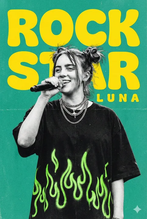
ネオングリーンの炎をまとったロックのスーパースターによるハイエナジーなライブポスター
大胆でエネルギッシュな縦長の音楽ポスターを制作し、若い女性シンガーがステージでライブパフォーマンスしている姿を描く。彼女はパフォーマンスの真っ最中を捉えられており、マイクを口元に近づけ、自信とカリスマに満ちた笑顔を見せている。髪型はラフな後れ毛を残した無造作なスペースバンズで、オーバーサイズの黒いTシャツにごつめのチェーンネックレスを重ね着けし、反抗的で気取らないステージ上の存在感を放っている。ポートレートはざらつきのあるモノクロ調で、ほのかなグレインと質感を加えつつ、画像の
颗粒感创意字现场感摇滚风荧光绿
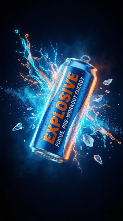
Case 13041
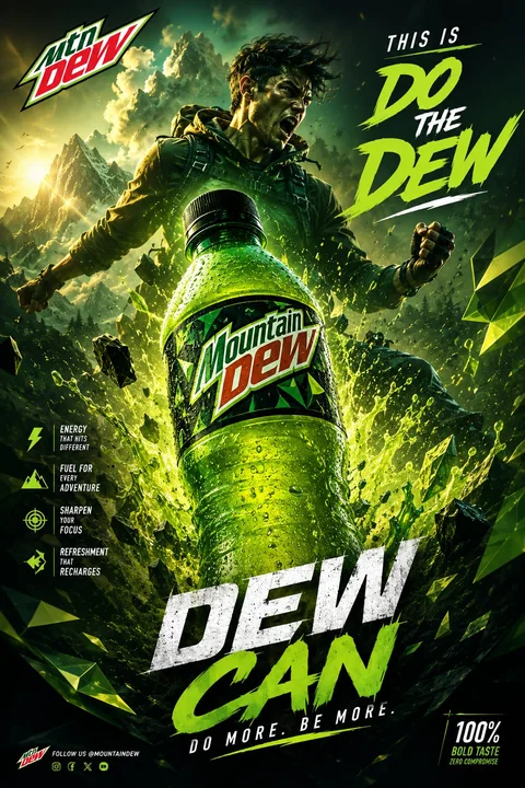
激浪飲料 黄金分割構図 ルクスなポスターデザイン
激浪のドリンクのために、驚くべき豪華なポスターを生成してください。標準的なフィボナッチの構図(補助線は表示しない)とS字構図法を使用してください。完璧な人物像と衝撃的な爆発表現を取り入れ、プロのグラフィックデザイナーがよく使用するフォントを使用してください。創造力を発揮し、一風変わった傑作を制作してください。