Case 27073
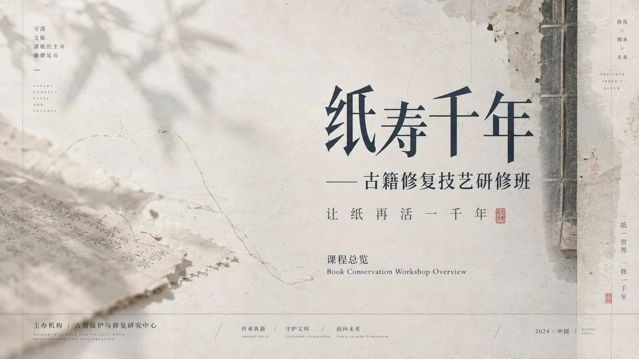
负空间叙事克制纸感PPT视觉系统
Prompt
Establish a restrained PPT visual system with negative space narrative and paper-based imagery, dominated by theories of Gestalt continuity, dynamic balance, modular grids, and baseline rhythm: use continuity to organize slow reading of thin lines, shadows, and text; use unequal weighting to allow large empty spaces and high-density structures on one side to constrain each other; use grids to constrain the alignment of information columns, titles, notes, and footers. Drawing from Müller-Brockmann’s rational grids to control margins, column widths, and small font order; drawing from Brodovitch’s editorial white space and image-text breathing to create pauses; drawing from Ikko Tanaka’s cultural symbol geometrization method to transform decorations into planar structures; drawing from Albers’ adjacency perception to maintain low-saturation hierarchies. Color schemes only define roles: background as the highest area low-saturation high-brightness carrier layer, structural lines and body text as the low-brightness information layer, semi-transparent imagery as the medium-brightness atmospheric layer, and small amounts of emphasized information appearing with stronger brightness contrast, area ratio approximately 7:2:1; future theme color schemes are mapped one-click by role, must retain brightness order, low saturation, transparent overlays, and shadow readability. The layout adopts an off-axis modular grid, where empty space dominates, content narrative determines that titles are near the inner side of empty spaces, information lists are arranged along quiet axes, focal graphics are edge-aligned or cross borders, the only breaking of rules is thin lines or imagery crossing column lines to form guidance. The background is composed of a layering process of fiber substrates, faded ink washes, and photographic transfers, first laying down absorbent textures, then overlaying blurred organic directional shadows, linear frames, and twig-like guide lines, with blurred edges, partial wear, and diffused lighting. Typography adopts a contrast pairing of high-contrast display fonts and low-contrast small fonts, titles retain slender skeletons, open counters, sharp strokes, and loose kerning, body text forms precise annotations with narrow line spacing and small font sizes, any writing system is reconstructed with equal density and breath according to its own legal strokes, counters, connections, marks, and reading directions. The mood is implicit, sparse, silent, scholarly, warm, orderly, and lingering.

以负空间叙事和纸面影像感建立克制PPT视觉系统,主导理论为格式塔连续性、动态平衡、模块网格与基线节奏:用连续性组织细线、投影与文字的缓慢阅读,用不等量配重让大片空场与一侧高密结构互相牵制,用网格约束信息栏、标题、注释与页脚的对齐。借鉴穆勒-布罗克曼的理性网格控制边距、栏宽和小字号秩序,借鉴布罗多维奇的编辑留白与图文呼吸制造停顿,借鉴田中一光的文化符号几何化方法把装饰转成平面结构,借鉴阿尔伯斯的邻接感知维持低彩度层次。配色只定义角色:背景为最高面积的低彩度高明度承载层,结构线和正文为低明度信息层,半透明影像为中明度氛围层,少量强调信息以更强明度差出现,面积约7:2:1;未来主题配色按角色一键映射,必须保留明度顺序、低彩度、透明叠压和投影可读性。版式采用偏轴模块网格,空场占主导,内容叙事决定标题靠空场内侧、信息列表沿安静轴线排列、焦点图形贴边或越界,唯一破格是细线或影像穿越栏线形成牵引。背景以纤维底材、淡化墨洗和摄影转印的层叠工艺构成,先铺吸收纹理,再叠模糊有机方向影、线性框架和细枝状引导线,边缘虚化、局部残旧、光照漫射。字体采用高反差显示字与低反差小字的对照配对,标题保留修长骨架、开放字腔、细锐收笔和宽松字距,正文以窄行距小字号形成精密注释,任意文字系统都按自身合法笔画、字腔、连结、标记和阅读方向重建同等密度与气息。情绪为含蓄、疏朗、静默、书卷、温润、秩序、余韵。
Другие промпты

Case 12597
将真实场景中的食物转换为乐高积木风格的微缩模型
Преобразуйте только еду на изображении в крошечные миниатюрные скульптуры в стиле LEGO, сохранив всё остальное полностью неизменным и реалистичным. Точно сохраните исходную композицию, освещение, угол камеры, перспективу, фон, руки, стол, л

Case 25716
夏日海滨步道回首的日本女性
Subject: A fictional adult Japanese woman walking alone on a sunny seaside walkway, heading into the distance while looking back over her shoulder. Wearing a white ribbed top, light-colored denim shorts, and a blue-and-white striped shirt s
Case 27075