Case 25565
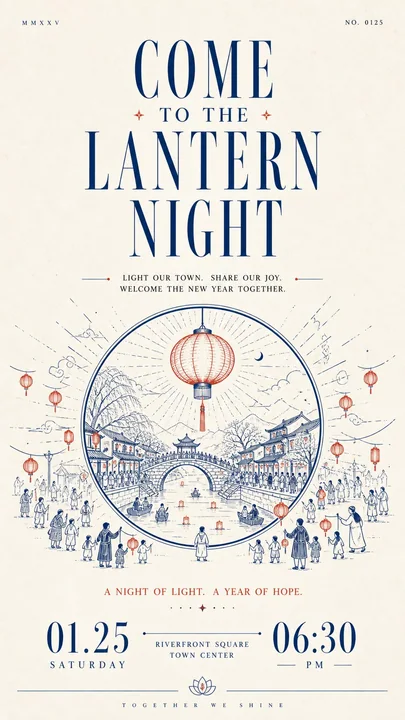
简约肃穆的纸质信息设计排版
Prompt
Build a restrained, solemn paper-based informational design with human warmth around any chosen thematic subject: let large areas of bright white space first establish quiet order, then let a striking headline, line-drawn narrative, and bottom numerals carry the reading onward in sequence. Organize clearly differentiated modules along a single main reading axis: near the top, place one extremely small, thin, widely letterspaced auxiliary text or numbering group on each side, separated by remote spacing to create slight asymmetry; beneath them, set an oversized, high-contrast Latin serif headline extending horizontally, with strong contrast between fine hairlines and thick stems, elongated letterforms, sharp terminals, and the same accent ink as the core illustration; then add a centered group of short Chinese phrases on the theme, built on a slender Songti skeleton with generous line spacing and breathing room between characters, so the dark text block both carries the headline and builds momentum toward the illustration. Distill the thematic subject's core image and its relationship to the environment into a monochrome printmaking-style line drawing rather than reproducing fixed objects: build outward spatial movement from the center with clear outer contours, continuous arcs, layered paths, and a few flat fills; keep foreground lines longer and more open, make the middle forms the heaviest, and finish the distance with fine short strokes; alternate dense detail with large expanses of empty paper, keep the contours legible, allow slight hand-drawn variation in line weight, and preserve the soft, blunted edges created by ink absorption at corners of a printed mark, so the image has a monumental stability without feeling heavy. Place the most important short notice phrase below the illustration, then anchor the bottom visual weight with a group of oversized, high-contrast numerals or equally scaled key information, spreading the left and right information apart and connecting the center with an ultra-fine horizontal line and small text, so the extreme scale differences create the ceremony of a formal announcement; finish with a hairline rule running across the bottom edge, lifted at its center by a small symmetrical emblem derived from the theme, and set a micro Latin wordmark beneath it with extremely wide letterspacing for a quiet, precise ending. Derive the color adaptively from the theme: the theme's meaning decides the specific hue and warm/cool character of the accent, which should stay medium-high in saturation, clean, and slightly pigment-like, occupying roughly one-tenth to two-tenths of the image and concentrated in the large headline, core line drawing, and bottom fine lines; give the background a near-white, low-saturation paper color that harmonizes with the accent, lets it dominate the composition, and keeps it high in lightness; use a near-black with the same warm/cool tendency for body text and numerals, limiting it to the typographic skeleton and local contrast. Keep an asymmetric area contrast rather than an even color balance: the more vivid the accent color, the more restrained the paper and the fewer, more precise the dark areas. Render the surface as fine uncoated paper fiber with slight uniform grain and a soft scanned feel; keep the texture mainly on the blank paper and visible through thin layers of ink, allow only tiny tonal variation in solid areas, and avoid heavy stains, strong creases, gloss, dimensional shadows, or decorative gradients; the whole design should remain bright, airy, and slightly edged by the paper's ink absorption, preserving the order among white space, line drawing, typographic scale jumps, and bottom closure, while preventing the illustration from expanding and squeezing the information or the text from averaging out and losing rhythm.

围绕任何选定的主题,构建一个带有温度的、克制且庄重的纸质信息设计:让大面积的明亮留白首先建立起安静的秩序,然后让醒目的标题、线描叙事和底部的数字按顺序引导阅读。沿单一主阅读轴组织区分明确的模块:在顶部附近,两侧各放置一组极小、纤细、字间距宽阔的辅助文字或编号,以遥远的间距分隔,营造出轻微的不对称感;在它们下方,设置一个超大、高对比度的拉丁衬线体标题,水平延伸,在极细的线条和粗壮的笔画、拉长的字母形态、锐利的末端之间形成强烈对比,并使用与核心插图相同的强调色油墨;然后添加一组以该主题为中心的短中文词组,构建在纤细的宋体骨架上,具有慷慨的行距和字符间的呼吸空间,使深色文本块既承载了标题,又为插图积蓄了势能。将主题的核心图像及其与环境的关系提炼成单色版画风格的线描,而不是复制固定的物体:从中心向外构建空间运动,具有清晰的外轮廓、连续的弧线、分层的路径和少量的平涂填充;保持前景线条更长且更开阔,使中间形态最重,并用精细的短笔触完成远景;将密集的细节与大面积的留白纸面交替排列,保持轮廓清晰,允许线条粗细有轻微的手绘变化,并保留印刷标记角落因油墨吸收而产生的柔软、钝化的边缘,使图像具有纪念碑般的稳重感而又不显沉重。在插图下方放置最重要的简短提示短语,然后用一组超大、高对比度的数字或同等比例的关键信息锚定底部视觉重量,将左右信息分散,并用一条极细的水平线和微型文字连接中心,使极端的比例差异营造出正式公告的仪式感;最后以横跨底部边缘的细线收尾,中心由源自该主题的小型对称徽标提拉,并在其下方设置一个间距极宽的微型拉丁文字标,作为安静、精准的结束。根据主题自适应地推导颜色:主题的含义决定了强调色的具体色调和冷暖特性,该颜色应保持中高饱和度、干净且略带颜料感,约占图像的十分之一至十分之二,并集中在大标题、核心线描和底部细线上;给背景一种近乎白色、低饱和度的纸张颜色,与强调色相协调,使其主导构图并保持高亮度;在正文和数字中使用具有相同冷暖倾向的近黑色,将其限制在排版骨架和局部对比中。保持不对称的面积对比,而不是均衡的色彩平衡:强调色越鲜艳,纸张就越克制,深色区域就越少、越精准。将表面渲染为带有轻微均匀纹理和柔软扫描感的精细无涂层纸张纤维;纹理主要保留在空白纸张上,并通过薄薄的墨层可见,仅允许在实色区域有微小的色调变化,避免沉重的污渍、强烈的折痕、光泽、立体阴影或装饰性渐变;整个设计应保持明亮、通透,并带有纸张吸墨产生的轻微边缘感,保留留白、线描、排版比例跳跃和底部收尾之间的秩序,同时防止插图膨胀挤压信息,或文字因趋于平均而失去节奏。
More prompts

Case 14882
A blonde girl sinking and floating in an icy lake with ultra-realistic lighting and shadows
{ "prompt": { "subject": { "type": "Human", "gender": "Female", "appearance": { "hair": { "color": "Blonde", "texture": "Wet, slightly wavy", "length": "Short to medium", "style": "Slicked back, interacting with water" }, "skin": { "tone":
电影感写实唯美人像冰湖
Case 735
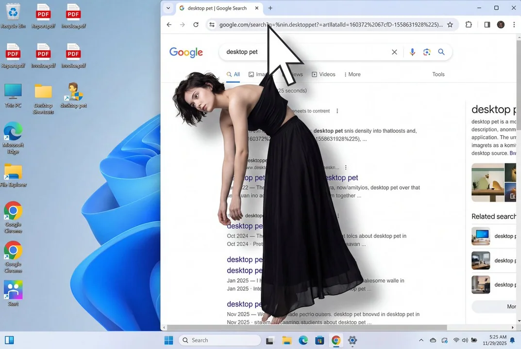
Surreal digital art hangman
A surreal digital art composition showing a young woman with dark short hair wearing a black strapless top and long flowing black skirt, viewed from a front-facing angle. The white arrow-shaped computer mouse cursor grips a small portion of
nature