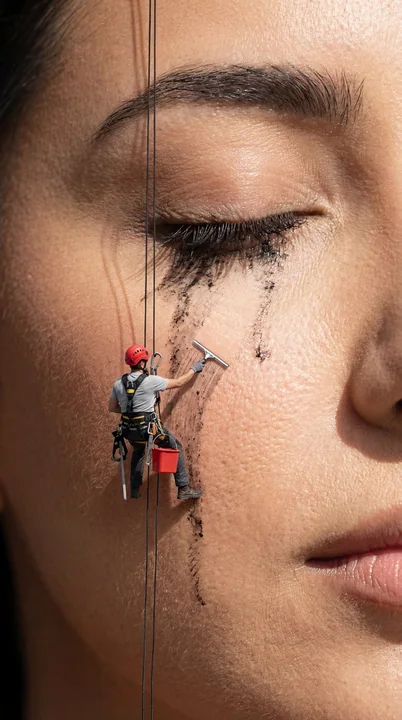
Case 25049
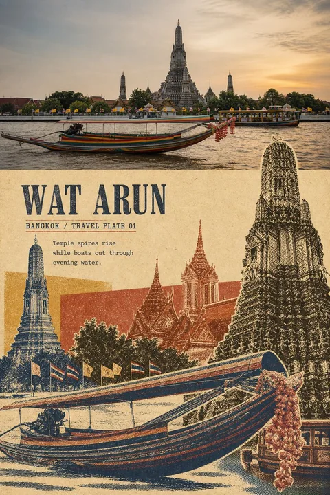
复古旅行摄影蒙太奇海报设计
Prompt
Please turn each travel photo I upload into an independent high-end travel stylized poster. One photo corresponds to one finished product; do not combine multiple photos into a grid or collection.

The overall composition uses a 3:4 vertical poster layout, clearly maintaining the contrast between the original photo and the stylized transformation.

The top portion occupies about 40%—45% of the frame, faithfully preserving the original photo. Accurately maintain the subject identity, quantity, posture, architectural structure, vehicle direction, topographical relationships, observation angle, real materials, natural lighting, and original color atmosphere of the photo, only performing minor travel magazine and artistic publication color grading, and adding a very thin layer of film grain. The top must remain a clearly identifiable real photo, not illustrated, redesigned in terms of the subject, or have the location replaced.

The bottom portion occupies about 55%—60% of the frame, reconstructing the same photo into a "vintage travel mask montage."

This is not about adding a halftone filter to the entire photo, nor is it about redrawing it according to the same composition. First, analyze the photo to lock onto one core subject that best represents the location or event, then extract 4—7 auxiliary elements with distinct outline differences.

Extractable elements include:
- Main landmark or building spire
- Secondary roofs, towers, doors/windows, or sculptures
- Boats, vehicles, bicycles, or other transportation
- People, animals, or local artifacts
- Trees, flags, umbrellas, signboards, or market goods
- Directional structures such as roads, water surfaces, railings, or horizons

All elements must come from the same original photo; do not add Buddha statues, lanterns, elephants, people, buildings, or any regional symbols unrelated to the original scene out of thin air.

Make the extracted objects into independent photographic mask layers. Use outline cutouts, coarse-grain black and white halftones, partial cutouts, monochromatic ink plates, screen printing color plates, ink shortages, paper fibers, rough edges, and slight color registration offsets.

Reposition and resize these objects, changing their cropping, front-to-back positioning, and overlapping relationships:
- The largest subject occupies about 55%—95% of the stylized area height and can be boldly cropped by the frame edges.
- The second subject uses a significantly different scale, passing in front of or behind the main element.
- Small vehicles, roofs, plants, flags, or artifacts serve as rhythmic connections.
- At least 5—8 identifiable photo elements must appear.
- Do not arrange elements evenly like a material board, cards, or a regular grid.
- Do not follow the complete perspective and original scale relationships of the original photo.

Add 1—2 translucent or opaque rectangular or irregular color blocks, passing behind some objects and creating overprinting and masking relationships with the halftone layers. Color blocks are used to separate space and establish hierarchy; they cannot simply cover the entire background.

The color palette is extracted entirely from the original photo and compressed into 3—5 vintage printing ink colors:
Warm cream white or old ivory paper color, the deepest shadow color, and 2—3 local colors most representative of the original scene. You can use black-brown, deep indigo, brick red, ochre yellow, grey-green, faded pink, or colors that actually exist in the photo. Overprinting to form mixed colors is allowed, but avoid rainbow-like effects, high-saturation clashing colors, and fixed orange-blue templates.

The bottom image can be dense and impactful, but must retain about 15%—25% of continuous old paper or solid color fields. Negative space should form a clear contrast of weight and density with the dense objects and provide a stable position for text.

Extract the following text based on the location, subject, and mood of the photo:
1. A readable main title of 1—3 English words.
2. A short printed field, such as "EDITION 01" or "TRAVEL STUDY".
3. One observation sentence of 5—10 English words, describing only the scenery, actions, colors, or spatial relationships actually visible in the photo.

Concentrate text in continuous old paper empty spaces, solid color blocks, or quieter gaps between objects; do not distribute them evenly to the four corners. Use condensed old serif, compressed sans-serif capitals, or bold lead type. The text and images should use the same ink language, with slight ink shortages, paper teeth, halftones, and color registration offsets. The main title must be clearly readable at chat preview size.

The overall presentation combines the temperament of old travel publications, vintage cultural posters, coarse halftone photographic montage, and contemporary editorial design. The image should be dense but clearly hierarchical, gritty but not cheap, with a distinct sense of location identification and collectability.

Mandatory Avoidance:
Full photo filters, redrawing with the same composition, single landmark engravings, extracting only two or three elements, even-sized arrangements, regular grids, nine-square grids, framing each object independently, scrapbook tape, modern smooth vectors, transparent watercolors, cartoon illustrations, 3D collages, cultural symbol templates, cross-location landmark mixing, full-background color blocks, no continuous negative space, unreadable small text, fake Chinese, gibberish, author names, signatures, logos, URLs, QR codes, and watermarks.

Most important rule: Multiple real objects must be extracted from the same travel photo, made into mask halftone layers of different colors and sizes, and then a dense and orderly travel montage must be reconstructed through enlargement, cropping, overlapping, overprinting, and color block interspersing.

请将我上传的每一张旅行照片分别制作成一张独立的高级旅行转绘海报,一张照片对应一张成品,不得将多张照片拼成九宫格或合集。

整体采用3:4竖版编辑海报构图,并清楚保留原始照片与风格化转绘之间的对比。

上方约占画面40%—45%,忠实保留原始照片。准确保持照片中的主体身份、数量、姿态、建筑结构、交通工具方向、地形关系、观察角度、真实材质、自然光线和原有色彩氛围,仅进行轻微的旅行杂志与艺术出版物调色,并加入极薄的胶片颗粒。上方必须仍然是一张清楚可辨的真实照片,不得插画化、重新设计主体或替换地点。

下方约占画面55%—60%,将同一张照片重新构建为“复古旅行遮罩蒙太奇”。

这不是给整张照片添加网点滤镜,也不是按照相同构图重新画一遍。首先分析照片,从中锁定一个最能代表地点或事件的核心主体,再提取4—7个轮廓差异明显的辅助元素。

可提取的元素包括:

- 主地标或建筑尖顶
- 次级屋顶、塔楼、门窗或雕塑
- 船只、车辆、自行车或其他交通工具
- 人物、动物或地方器物
- 树木、旗帜、雨伞、招牌或市场商品
- 道路、水面、栏杆或地平线等方向结构

所有元素必须来自同一张原始照片,不得凭空加入佛像、灯笼、大象、人物、建筑或任何与原场景无关的地域符号。

将提取出的对象分别制作成独立的摄影遮罩图层。使用轮廓抠图、粗颗粒黑白网点、局部镂空、单色墨版、丝网印刷色版、缺墨、纸纤维、剪裁毛边和轻微套色偏移表现。

重新改变这些对象的大小、裁切、前后位置与遮挡关系:

- 最大主体占转绘区域高度约55%—95%,可以被画面边缘大胆裁切
- 第二主体使用明显不同的尺度,从主元素前方或后方穿过
- 小型交通工具、屋顶、植物、旗帜或器物作为节奏连接
- 至少出现5—8个可识别的照片元素
- 不得把元素平均排列成素材板、卡片或规则网格
- 不得沿用原照片的完整透视和原始尺度关系

加入1—2块半透明或不透明的矩形、不规则色版,从部分对象后方穿过,并与网点图层发生套印和遮罩关系。色版用于分隔空间与建立层级,不能简单覆盖整个背景。

配色完全从原照片中提取,并压缩为3—5种复古印刷墨色:

暖米白或旧象牙纸色、最深阴影色,以及2—3种最能代表原场景的地点色。可以使用黑褐、深靛蓝、砖红、赭黄、灰绿、褪色粉色或照片中真实存在的颜色。允许叠印形成混合色,但避免彩虹化、高饱和撞色和固定橙蓝模板。

下方画面可以密集、有冲击力,但必须保留约15%—25%的连续旧纸或纯色色场。留白应与密集对象形成明确的轻重和疏密对比,并为文字提供稳定位置。

根据照片的地点、主体和情绪提炼以下文字:

1. 一个1—3个英文单词的可读主标题
2. 一个简短印刷字段,例如“EDITION 01”或“TRAVEL STUDY”
3. 一句5—10个英文单词的观察句,只描述照片中真实可见的景物、动作、颜色或空间关系

文字集中放在连续旧纸空场、纯色色版或较安静的对象间隙中,不要平均分散到四角。使用窄体旧衬线、压缩无衬线大写或粗铅字,文字与图像使用相同油墨语言,带有轻微缺墨、纸齿、网点与套色偏移。主标题在聊天预览尺寸下必须清楚可读。

整体呈现旧旅行刊物、复古文化海报、粗网点摄影蒙太奇与当代编辑设计相结合的气质。画面应密集但层级清楚,粗粝但不廉价,具有鲜明地点识别度和收藏感。

强制避免:

完整照片滤镜、相同构图重画、单一地标版画、只提取两三个元素、平均大小排列、规则网格、九宫格、每个对象独立装框、剪贴簿胶带、现代光滑矢量、透明水彩、卡通插画、3D拼贴、文化符号模板、跨地点地标混合、背景全覆盖色块、没有连续留白、不可读小字、假中文、乱码、作者名、签名、Logo、网址、二维码和水印。

最重要的规则:必须从同一张旅行照片中提取多个真实对象,将它们分别制成不同颜色、不同尺寸的遮罩网点图层,再通过放大、裁切、压叠、套印和色版穿插,重建一张密集而有秩序的旅行蒙太奇。
مطالب أخرى
Case 7204
VIDEO
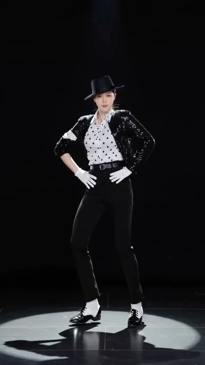
الراقص الذي يقوم بخطواته في ظلال الأبيض والأسود الكلاسيكية
أنشئ فيديو رقصة أنيق، حيث يكون الراقص @الصورة 1، وهو يرتدي ملابس كلاسيكية بلونين أسود وأبيض: معطف أسود مزين بالخرز، ملابس داخلية بيضاء، بناطيل سوداء، جوارب بيضاء، أحذية جلدية سوداء، قبعة سوداء، وقفازات بيضاء؛ والخلفية سوداء تمامًا مع مصباح
复古舞蹈黑白光影太空步舞台表演经典穿搭
Case 28194
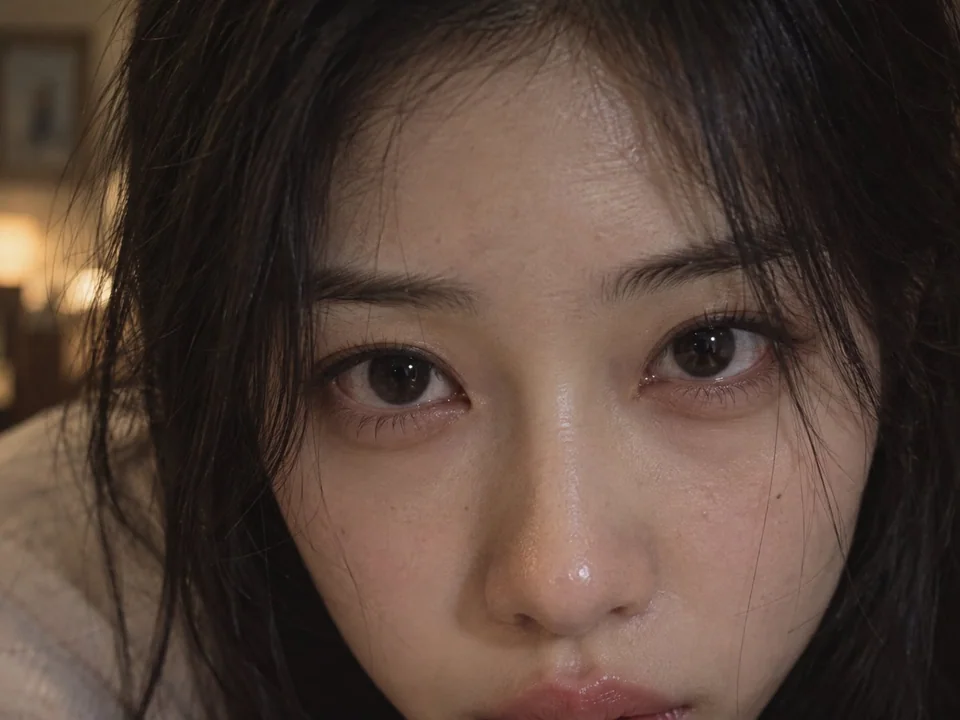
电影质感超近景深情注视东亚女性
A cinematic plot fragment ultra-close-up, an adult East Asian female leaning down and forward toward the camera, her face almost filling the entire screen, the camera can only capture the part above the upper edge of her slightly pouting li