Case 13311
Ru Kiln-Themed Paper-Texture Premium Visual Design Guide
Prompt
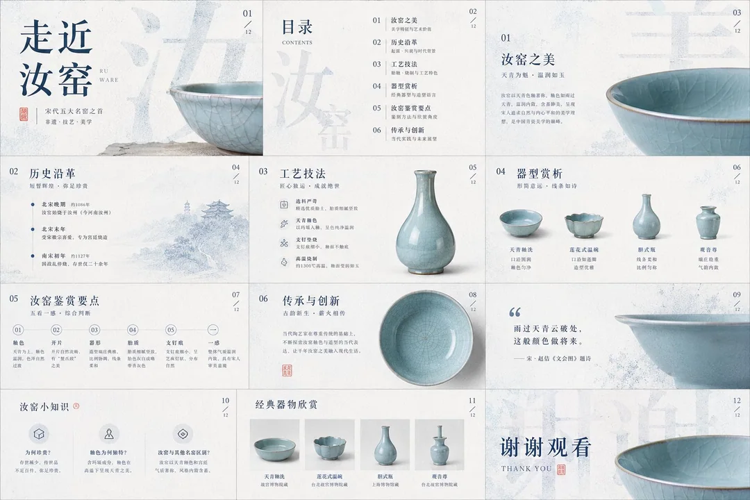
Please process the image into a restrained, clean, high-end visual style with a paper-like tactile feel: the background should not be blank, but a layer of light-colored material with a sense of “breath,” like a quiet base formed by delicate paper fibers, soft mist, embossing, or slight grain. Let the main content emerge from this base, pursuing not bustle, but clarity, lightness, and touchable layering. The image can serve covers, PPTs, infographics, report pages, product pages, posters, rankings, or data visualizations, but do not be limited by any single object type; whether the theme is a product, character, space, food, knowledge, business plan, or annual summary, treat the subject’s structural order, material edges, shadow depth, and information rhythm as the true visual core.

Text should become part of the image structure. Use extra-large main titles, keywords, Chinese characters, numbers, or symbols as the background skeleton, allowing them to occupy a large area of the screen, but transform them into visual pressure through granulation, halftone diffusion, slight blur, translucent occlusion, or edge dissolution, rather than letting them directly steal attention. Foreground information should remain refined, clean, and readable, like receipts, cards, labels, annotations, numbering, short sentences, or small layout systems, with clear line spacing, hierarchy, and white space. Allow vertical English, narrow-tracked annotations, numbering, small-font explanations, and handwritten-style emphasis to be interspersed, so text simultaneously serves reading, decoration, and navigation. Titles may be huge, body text must remain restrained, and emphasis should be sparse but precise, forming a dual-layer reading experience of “graphic from afar, informative up close.”

The color system should use low-saturation light tones as the air and page temperature, with one deep and stable main color carrying the structure, titles, shadows, data center of gravity, or brand memory. This main color may shift toward a more rational, cleaner, warmer, sharper, or softer direction depending on the specific content, but it must preserve the original relationship of large-area calmness, small amounts of highly recognizable color, and clear light-dark order. Accent colors should occupy only a small area, used to handle emotional turns, handwritten marks, key words, numbering, curves, or tiny symbols; they should shift semantically according to the theme—for example, more decisive for business content, calmer for academic content, warmer for festive content, cleaner for medical content, lighter for children’s content—but do not dye the entire screen with color. Dark colors are responsible for structure and weight, light colors for breathing, warm or contrasting colors for momentary attention, and shadows, transparent wireframes, paper-edge highlights, and grain textures for depth.

The layout must have a clear foreground-background relationship: in the background, huge softened glyphs or information blocks, like a wall made of text; in the mid-ground, transparent ovals, fine lines, semi-transparent boundaries, or slight halos to create a framed field of attention; in the foreground, place the most important subject or information module, allowing it to form a real sense of space through slight tilting, stacking, bending, misalignment, or suspension. Do not make a standard centered template; the image’s center of gravity may lean right, lean downward, or be pushed outward by large characters, while preserving a quiet vertical information band on the left side or edge. White space must be controlled: dense areas should feel like compressed paper pages or data layers, sparse areas should feel like air. Maintain precise distances between all elements, achieving both the completeness of a commercial poster and the calmness of editorial design.

In the specific task below, let the image naturally grow into the form it needs: based on the theme, text, data, brand, product, or materials I provide, generate a visual work with a blue-and-white granular text background, light foreground layers, a small amount of content-responsive accent color, delicate paper texture, and high-end informational order.

Theme: Approaching Ru Ware

Use: PPT, courseware.
More prompts
Case 25
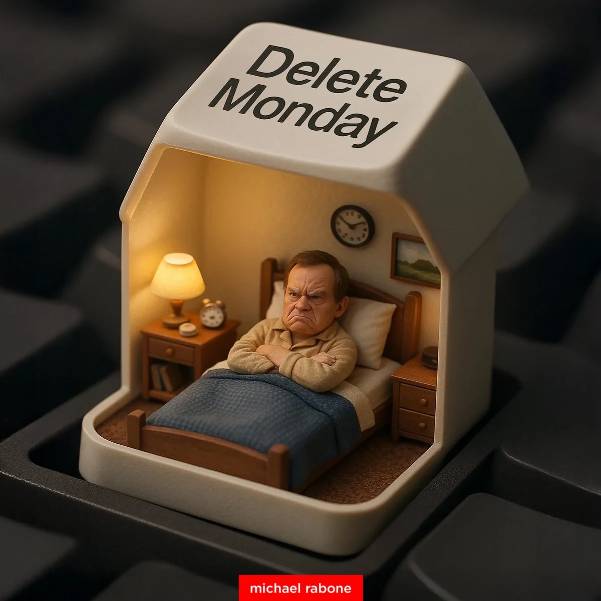
Delete Monday by pressing the key
Detailed photographic image of a miniature person in bed feeling cranky under an opened "Delete Monday" keyboard keycap, using the inside of the keycap as a mini bedroom complete with the usual bedroom stuff
photographyinterior

Case 804
Movie-Grade Double Exposure Poster Design
{ "prompt": "A cinematic double-exposure portrait featuring a woman in profile on the left and a man in profile on the right, both turned away from each other. Their silhouettes, including detailed facial features and hair outlines, blend
landscapenatureportraitposter